Fun with custom:button-card

Just use custom fields to add a Jinga card

Rough Example

type: custom:button-card
name: Kitchen Lights
styles:
  name:
    - position: absolute
    - left: 20%   
  custom_fields:
    area:
      - position: absolute
      - left: 60%
custom_fields:
  area:
    card:
      type: custom:mushroom-template-card
      primary: |
        Area:  {{ device_attr(device_id('switch.kitchen_lights'), 'area_id') }}
      card_mod:
        style: |
          ha-card {
            border: none;
            text-transform: capitalize;
            --card-primary-font-size: 16px;
            --card-primary-color: yellow;
                      }
                      

This seems like a way:

let ent_id = 'cover.drzwi_na_dole';
let ent = hass.entities[ent_id];
if (ent && ent.area_id) {
  let areaName = hass.areas[ent.area_id]?.name;
  if (areaName) console.log(areaName);
}

(I love this card, too :smiley: )

I can’t seem to find the answer, but is there a way to embed a drop down inside of a custom button card? … basically I have an input select. I want a drop-down to pop open when you click the button that has all of the options for the input select. Is this possible?
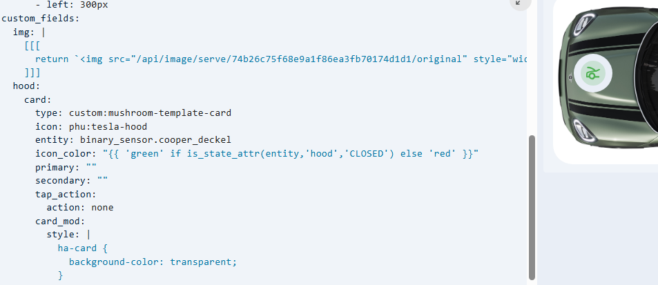
Can you please share the core button card code you are working with?

It is possible… This hides the drop down if the main entity is off

type: custom:button-card
entity: input_boolean.test
show_label: false
show_name: false
show_icon: true
size: 4em
styles:
  custom_fields:
    area:
      - margin-top: "-70px"
custom_fields:
  area:
    card:
      type: custom:mushroom-select-card
      entity: input_select.test
      layout: vertical
      icon_type: none
      card_mod:
        style:
          mushroom-state-info$: |
            .container {
             display: none !important;
              }
          mushroom-select-option-control$: |
            mushroom-select {
             display: {{ 'block' if is_state('input_boolean.test', 'on') else 'none' }}!important;
          .: |
            ha-card {
             border: none;
              }

yes but you’ll need to find all the styling proporties to make it look better

type: custom:button-card
aspect_ratio: 1/1
styles:
  custom_fields:
    test:
      - position: absolute
      - left: -25%
      - scale: 0.6
custom_fields:
  test:
    card:
      type: custom:mushroom-select-card
      entity: input_select.motion_last


Hi! Is it possible to create such a map using the button map? Thanks!

Yes with custtom field containing svg

Hi,
I am trying to get transparent backgrounds for my mushroom-cards within custom_fields. Card_mod is not doing the trick obviously.
Is there a way to get it working though?

You’ll have better luck in the mushroom thread …unless you want the card-mod in button-card?

Which is kind of a challenge by itself

But it works as intended if I set up a normal mushroom-card.

Can’t you set it on the styles directly ? Mostly the preferred technique

That changes the custom-field’s background, but not the mushroom-card’s background inside it.

A ok.
Sorry I’ll refrain from further suggestions as I don’t use mushroom, and certainly not as contained card in a custom field.

Personally I feel button-card was never designed to do so , although it can because it’s so versatile

These are the peculiarities you run into when taking it too far.

A lot can be done , but in the end , button-card and card-mod are not friends

I did the custom-fields with conditional button-cards instead of mushroom cards now.

I think that the real problem is that Home Assistant by itself is not designed to be fully themable/stylable, which leads to a definatly needed work-around like using card_mod. But in the end… If the themability is fixed in core and made more robust/consistent and easier usability wise, then card_mod will be superseeded by this.

That would be a great day…

great to hear, does it work now? please share that yaml?
nice there are always more ways than that single problematic one :wink:

yeah, but that wont ever happen, as it is not clear what that would mean. For all of us.
We all want different details, and by default, it wont be possible to accomodate all of that.

Just look at how the new icon states are now integrated. for each and every state there has to be a direct icon. And a merged PR… for each and every change option we would want to add.

While I’ve been using a custom plugin since I started with HA 8 years ago that did all of that and more with a simple template oneliner.

A possible route could be that card-mod would be integrated into HA Frontend, but if that would be the case, the same challenges would be met as we do now.

Until then, my motto is to keep as close to documentation as possible, core and custom.

When confronted with an obvious mismatch, just dont use it, it wont be reliable, or break soon…

see also this where we encountered the same in another combination of cards

try this

  styles:
    custom_fields:
      xxx:
        - "--ha-card-border-width": 0px
        - "--ha-card-background": rgba(0, 0, 0, 0.0)
        - "--ha-card-border-color": rgba(0, 0, 0, 0.0)

Hello all,

I have run into a bit of snag.
I’ve created two utility meters. one shows energy pulled from the grid the other shows energy sent back to the grid. both have an attribute “collecting” when one is Idle i.o.w for example no energy is going back to the grid the value is last value. vice versa when energy is going back to the grid the counter starts running up.
what I’d like to do is change the background color of the button based on if it’s increasing iow not being used or based being

type: custom:button-card
show_name: false
show_icon: false
entity: sensor.teruglevering_piek_per_dag
show_state: true
card_mod: null
style: |
  ha-card { 
    background-color:{% if is_state('sensor.teruglevering_piek_per_dag', 'attributes.collecting' > '0') %} green {% else %} red {% endif %};
    }

Help from the buffs is greatly appreciated.

You’ll have to provide your card code. Card mod is notrequired for what you are trying to accomplish. Paste your code between back ticks```