NoClaim
November 23, 2024, 4:43pm
41
something I’m doing wrong, but I think I followed the installation steps, have all the HACS required resources (even the recommended). Added the lines to the configuration.yaml and restarted HA.
Result: Mutliple ButtonCardJSTemplateError, so no luck for me…
Please help
damiantje99
November 24, 2024, 9:36pm
42
Hi @NoClaim ,
Can you post the full error? Its possible that it is asking for a sensor which is not available because I created it myself.
NoClaim
November 29, 2024, 2:40pm
43
Sorry for the late reply… I was a cache issue… seems to be solved
if anyone interested, I made a lock card based on the security card.
Template:
---
custom_card_lock:
  type: custom:button-card
  show_state: false
  show_icon: true
  icon: |
    [[[
      if (entity.state === "locked") return "fas:lock";
      if (entity.state === "unlocked") return "fas:lock-open";
      if (entity.state === "jammed") return "mdi:lock-alert";
      return "mdi:lock-question";
    ]]]
  show_name: true
  show_last_changed: true
  show_label: true
  styles:
    grid:
      - grid-template-areas: |
          "icon icon"
          "n action_card"
          "l action_card"
      - grid-template-rows: auto min-content 1fr
    card:
      - overflow: hidden
      - padding: 10px
    name:
      - justify-self: start
      - font-size: 1.2rem
      - font-weight: bold
      - font-family: montserrat
    label:
      - justify-self: start
      - align-self: start
      - font-family: montserrat
      - font-size: 0.9rem
      - font-weight: 500
      - color: var(--color-dark-gray)
    img_cell:
      - position: absolute
      - top: 40%
      - right: 40%
      - overflow: visible
    icon:
      - position: relative
      - width: 10rem
      - justify-self: center
      - align-self: center
      - opacity: 30%
      - color: var(--color-gold)

  state:
    - value: locked
      name: Locked
    - value: unlocked
      name: Unlocked
    - value: jammed
      name: Jammed
    - value: unknown
      name: Unknown
      styles:
        name:
          - color: var(--color-dark-gray)
  custom_fields:
    action_card:
      card:
        type: custom:button-card
        styles:
          grid:
            - grid-template-areas: '"item1" "item2"'
            - row-gap: 8px
          card:
            - padding: 5px
            - border-radius: 20px
            - background: var(--contrast-background)
        custom_fields:
          item1:
            card:
              type: custom:button-card
              entity: "[[[ return entity.entity_id ]]]"
              show_name: false
              show_state: false
              icon: fas:lock
              styles:
                icon:
                  - width: 30px # Increased icon width
                  - height: 30px # Increased icon height
                  - color: var(--text)
                card:
                  - padding: 10px
                  - border-radius: 500px
                  - box-shadow: none
              state:
                - value: locked
                  styles:
                    card:
                      - background: var(--navbar-icon-color)
                    icon:
                      - color: var(--color-white)
                      - animation: rotate 4s linear infinite
              extra_styles: |
                @keyframes rotate {
                  from {transform: rotateY(-deg);}
                  to {transform: rotateY(360deg);}
                }
              tap_action:
                action: call-service
                service: lock.lock
                target:
                  entity_id: "[[[ return entity.entity_id ]]]"
          item2:
            card:
              type: custom:button-card
              entity: "[[[ return entity.entity_id ]]]"
              show_name: false
              show_state: false
              icon: fas:lock-open
              styles:
                icon:
                  - width: 30px # Increased icon width
                  - height: 30px # Increased icon height
                  - color: var(--text)
                card:
                  - padding: 10px
                  - border-radius: 500px
                  - box-shadow: none
              state:
                - value: unlocked
                  styles:
                    card:
                      - background: var(--color-red)
                      - box-shadow: none
                    icon:
                      - color: var(--color-white)
                      - animation: rotate 4s linear infinite
                - value: arming
                  styles:
                    icon:
                      - animation: rotate 4s linear infinite
                    card:
                      - background: var(--color-orange)
                      - animation: flash 2s linear infinite
                      - box-shadow: none
              extra_styles: |
                @keyframes rotate {
                  from {transform: rotateY(-deg);}
                  to {transform: rotateY(360deg);}
                }
                @keyframes flash {
                  0% {opacity: 100%;}
                  50% {opacity: 0%;}
                  100% {opacity: 100%;}
                }
              tap_action:
                action: call-service
                service: lock.unlock
                target:
                  entity_id: "[[[ return entity.entity_id ]]]"
View:
- type: custom:button-card
  template:
    - custom_card_lock
  entity: lock.front_door
  name: Front Door
2 Likes
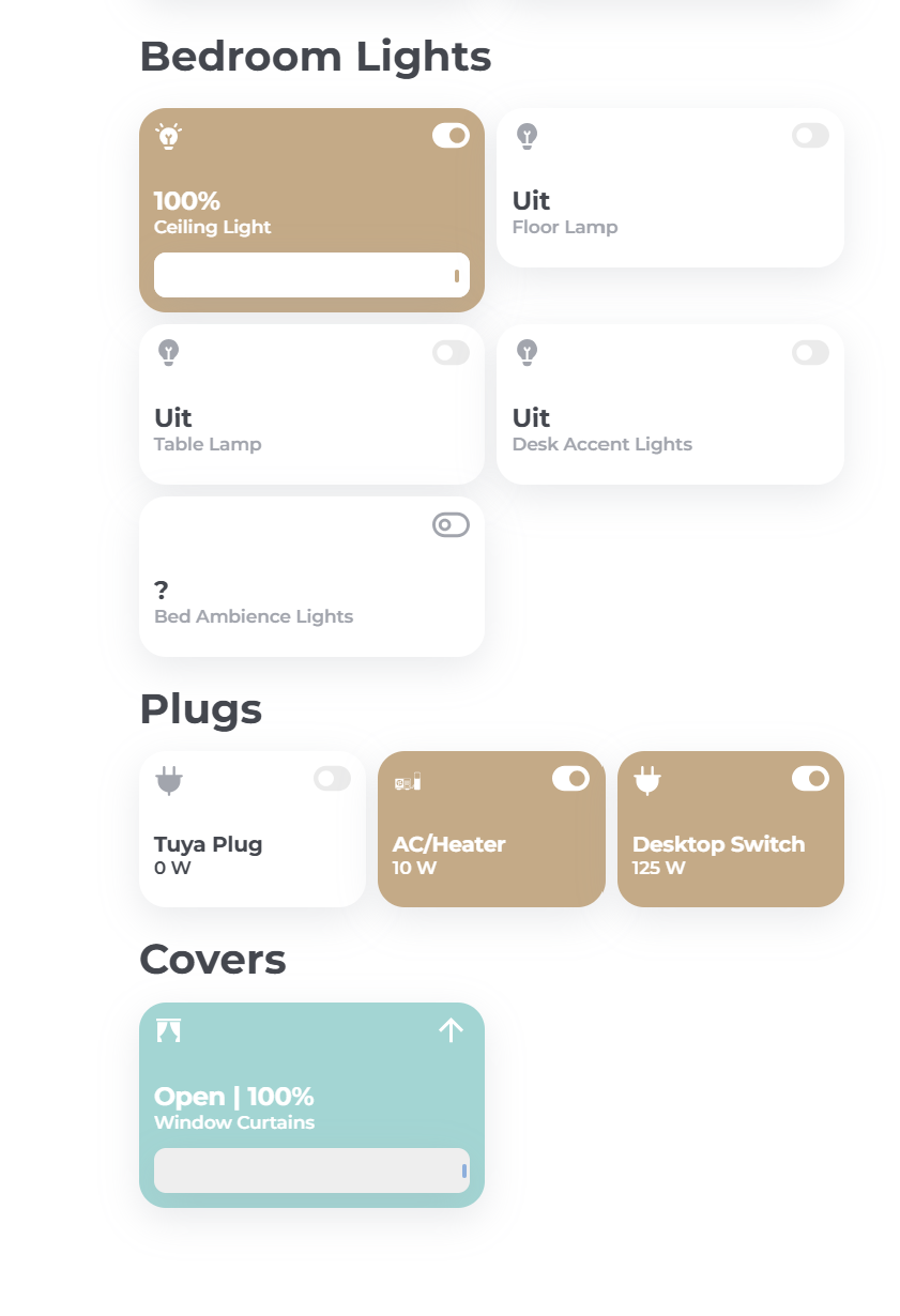
Here’s cover card I created for my use…only thing I can’t make it work is that arrow-up icon to change when cover is closed to arrow-down.
---
custom_card_cover:
  entity: "[[[ return entity.entity_id ]]]"
  name: |
    [[[
      var position = entity.attributes.current_position;
      var state;
      if (entity.state === 'open') state = 'Open';
      else if (entity.state === 'closed') state = 'Closed';
      else if (entity.state === 'opening') state = 'Opening';
      else if (entity.state === 'closing') state = 'Closing';
      else state = 'Unknown';

      return `${state} | ${position !== undefined ? position + '%' : 'Unknown'}`;
    ]]]

  show_name: true
  show_icon: true
  show_label: true
  show_state: false
  styles:
    grid:
      - grid-template-areas: |
          "i switch"
          "n n"
          "l l"
          "slider slider"
      - grid-template-rows: 3rem 1fr min-content min-content
      - grid-template-columns: 1fr 1fr
    card:
      - height: 100%
      - padding: 10px
    img_cell:
      - justify-self: start
      - align-self: start
      - width: 20px
      - height: 20px
      - overflow: visible
    icon:
      - justify-self: start
      - align-self: start
      - width: 18px
      - height: 18px
      - overflow: visible
    name:
      - text-align: left
      - font-size: "var(--fs-400)"
      - font-family: Montserrat
      - font-weight: 700
      - justify-self: start
      - align-self: end
      - overflow: visible
      - font-size: 1.2rem
    label:
      - text-align: left
      - font-size: "var(--fs-300)"
      - font-family: Montserrat
      - font-weight: 500
      - justify-self: start
      - align-self: center
      - color: var(--color-dark-gray)
      - overflow: visible
      - padding-bottom: 10px
    custom_fields:
      switch:
        - width: 25px
        - justify-self: end
        - align-self: start
        - color: var(--color-dark-gray)
        - margin-top: -4px
  state:
    - value: "closed"
      icon: mdi:curtains-closed
      styles:
        icon:
          - color: var(--color-dark-gray)
        custom_fields:
          switch:
            - color: var(--color-light-gray-nav)
            - transform: rotate(180deg)
    - value: "open"
      icon: mdi:curtains
      styles:
        card:
          - background: "#A3D5D3"
        name:
          - color: "var(--color-white)"
        label:
          - color: "var(--color-white)"
        icon:
          - color: "var(--color-white)"
        custom_fields:
          switch:
            - color: "var(--color-white)"
    - value: "unavailable"
      name: "?"
      icon: mdi:window-shutter-alert
      styles:
        icon:
          - color: var(--color-dark-gray)
  custom_fields:
    slider:
      card:
        type: custom:my-slider-v2
        entity: "[[[ return entity.entity_id ]]]"
        mode: position
        vertical: false
        styles:
          card:
            - height: 30px
          container:
            - border-radius: 8px
            - width: 100%
          progress:
            - height: 100%
            - background: white
          track:
            - background: "#EEEEEE"
          thumb:
            - height: 30%
            - background: var(--color-blue)
            - position: absolute
            - right: 7px
            - top: 11px
            - width: 3px
            - border-radius: 500px

    switch: >
      [[[
        if (entity.state == "open") {
          return '<ha-icon icon="mdi:arrow-up"></ha-icon>';
        } else if (entity.state == "closed") {
          return '<ha-icon icon="mdi:arrow-down"></ha-icon>';
        } else if (entity.state == "opening") {
          return '<ha-icon icon=mdi:window-shutter-alert"></ha-icon>';
        } else if (entity.state == "closing") {
          return '<ha-icon icon="mdi:window-shutter-alert"></ha-icon>';
        } else {
          return '<ha-icon icon="mdi:alert"></ha-icon>';
        }
      ]]]
  hold_action:
    action: more-info
matti1207
December 19, 2024, 6:07pm
47
hi chintito,
---
custom_card_cover:
  entity: "[[[ return entity.entity_id ]]]"
  name: |
    [[[
      var position = entity.attributes.current_position;
      var state;
      if (entity.state === 'open') state = 'Open';
      else if (entity.state === 'closed') state = 'Closed';
      else if (entity.state === 'opening') state = 'Opening';
      else if (entity.state === 'closing') state = 'Closing';
      else state = 'Unknown';
      return `${state} | ${position !== undefined ? position + '%' : 'Unknown'}`;
    ]]]

  show_name: true
  show_icon: true
  show_label: true
  show_state: false
  styles:
    grid:
      - grid-template-areas: |
          "i switch"
          "n n"
          "l l"
          "slider slider"
      - grid-template-rows: 3rem 1fr min-content min-content
      - grid-template-columns: 1fr 1fr
    card:
      - height: 100%
      - padding: 10px
    img_cell:
      - justify-self: start
      - align-self: start
      - width: 20px
      - height: 20px
      - overflow: visible
    icon:
      - justify-self: start
      - align-self: start
      - width: 18px
      - height: 18px
      - overflow: visible
    name:
      - text-align: left
      - font-size: "var(--fs-400)"
      - font-family: Montserrat
      - font-weight: 700
      - justify-self: start
      - align-self: end
      - overflow: visible
      - font-size: 1.2rem
    label:
      - text-align: left
      - font-size: "var(--fs-300)"
      - font-family: Montserrat
      - font-weight: 500
      - justify-self: start
      - align-self: center
      - color: var(--color-dark-gray)
      - overflow: visible
      - padding-bottom: 10px
    custom_fields:
      switch:
        - width: 25px
        - justify-self: end
        - align-self: start
        - color: var(--color-dark-gray)
        - margin-top: -4px
  state:
    - value: "closed"
      icon: mdi:curtains-closed
      styles:
        icon:
          - color: var(--color-dark-gray)
        custom_fields:
          switch:
            - color: var(--color-dark-gray)
    - value: "open"
      icon: mdi:curtains
      styles:
        card:
          - background: "#A3D5D3"
        name:
          - color: "var(--color-white)"
        label:
          - color: "var(--color-white)"
        icon:
          - color: "var(--color-white)"
        custom_fields:
          switch:
            - color: "var(--color-white)"
    - value: "unavailable"
      name: "?"
      icon: mdi:window-shutter-alert
      styles:
        icon:
          - color: var(--color-dark-gray)
  custom_fields:
    slider:
      card:
        type: custom:my-slider-v2
        entity: "[[[ return entity.entity_id ]]]"
        mode: position
        vertical: false
        styles:
          card:
            - height: 30px
          container:
            - border-radius: 8px
            - width: 100%
          progress:
            - height: 100%
            - background: white
          track:
            - background: "#EEEEEE"
          thumb:
            - height: 30%
            - background: var(--color-blue)
            - position: absolute
            - right: 7px
            - top: 11px
            - width: 3px
            - border-radius: 500px
    switch: >
      [[[
        if (entity.state == "open") {
          return '<ha-icon icon="mdi:arrow-up"></ha-icon>';
        } else if (entity.state == "closed") {
          return '<ha-icon icon="mdi:arrow-down"></ha-icon>';
        } else if (entity.state == "opening") {
          return '<ha-icon icon=mdi:window-shutter-alert"></ha-icon>';
        } else if (entity.state == "closing") {
          return '<ha-icon icon="mdi:window-shutter-alert"></ha-icon>';
        } else {
          return '<ha-icon icon="mdi:alert"></ha-icon>';
        }
      ]]]
  hold_action:
    action: more-infotype or paste code here
1 Like
matti1207
December 19, 2024, 6:15pm
48
hi everyone,
i edited the climate card so i can turn it on and off from the card
this is my code
custom_card_climate_auto:
  show_label: true
  show_state: true
  state_display: >
    [[[ return "Currently " +
    states[entity.entity_id].attributes.current_temperature + '<p
    style="font-size:10px;display:inline;vertical-align:text-top">°C</p>' ]]]
  label: |
    [[[
      return states[entity.entity_id].attributes.temperature + '<sup style="font-size: 40px;">°C</sup>'
    ]]]
  show_icon: false
  styles:
    grid:
      - grid-template-areas: |
          'l auto buttons'
          'n auto buttons'
          's auto buttons'
      - grid-template-rows: min-content min-content
    card:
      - padding: 20px
    name:
      - justify-self: start
      - align-self: start
      - font-family: montserrat
      - font-weight: 500
    label:
      - font-size: 5em
      - justify-self: start
      - align-self: start
      - font-weight: 700
      - font-family: montserrat
    state:
      - justify-self: start
      - color: var(--color-dark-gray)
      - font-size: 12px
      - font-family: montserrat
  custom_fields:
    buttons:
      card:
        type: custom:button-card
        styles:
          grid:
            - grid-template-areas: |
                'item_3 item_1'
                'item_4 item_2'
            - row-gap: 3rem
          card:
            - padding: 10px
            - background: var(--contrast-background)
        custom_fields:
          item_1:
            card:
              type: custom:button-card
              icon: mdi:chevron-up
              styles:
                icon:
                  - width: 40px
                card:
                  - box-shadow: none
                  - background: none
              tap_action:
                action: call-service
                service: climate.set_temperature
                data:
                  temperature: |
                    [[[
                      return states[entity.entity_id].attributes.temperature + 0.5;
                    ]]]
                target:
                  entity_id: "[[[ return entity.entity_id ]]]"
          item_2:
            card:
              type: custom:button-card
              icon: mdi:chevron-down
              styles:
                icon:
                  - width: 40px
                card:
                  - box-shadow: none
                  - background: none
              tap_action:
                action: call-service
                service: climate.set_temperature
                data:
                  temperature: |
                    [[[
                      return states[entity.entity_id].attributes.temperature - 0.5;
                    ]]]
                target:
                  entity_id: "[[[ return entity.entity_id ]]]"
          item_3:
            card:
              type: custom:button-card
              entity: "[[[ return entity.entity_id ]]]"
              show_name: false
              icon: mdi:fire
              styles:
                icon:
                  - width: 20px
                card:
                  - box-shadow: none
                  - background: none
                state:
                  - value: heat
                    styles:
                      icon:
                        - color: var(--color-red)
              tap_action:
                action: call-service
                service: climate.turn_on
                data: null
                target:
                  entity_id: "[[[ return entity.entity_id ]]]"
          item_4:
            card:
              type: custom:button-card
              icon: mdi:power
              styles:
                icon:
                  - width: 20px
                card:
                  - box-shadow: none
                  - background: none
              tap_action:
                action: call-service
                service: climate.turn_off
                data: null
                target:
                  entity_id: "[[[ return entity.entity_id ]]]"
1 Like
ptC7H12
December 19, 2024, 10:33pm
49
Hi, what is that kind of dock at the bottom? looks very nice!
matti1207
December 20, 2024, 4:24pm
50
hi,
its the dock from the theme from damiantje99,
1 Like
Thank you so much! wish more people would contribute to this project.
ptC7H12
December 21, 2024, 10:44am
52
There is much work ongoing in the background, so stay tuned…
1 Like
Vishan07
December 25, 2024, 1:41pm
53
I have this as wel… were you able to get this solved?
PaNiCo
December 25, 2024, 3:47pm
54
It looks like you do not have the HaCasa theme selected.