did you read what i wrote?
the 3 columns are just an example
I read it, but I can not see a way to render your proposed 3 column layout with another number of columns without breaking your layout rules.
nothing changes with that. so how does it work now? so will it work later…
only when pressing the 3 dots and then edit dashboard, then you can change positions (like normal) only normally you are dependend on the height of the card which decides in which column your card goes, but with left/right buttons you can put it in the correct column. further nothing changes. it still has the same number and it still scales the same way to different situations.
so after that it will look something like this:
1 2 3
4 5
6 7
8
and yes this also works with 4 or other number of columns, just like it works now…
Sorry, but your startup layout is
1   2   5
    3
    4
6   7   8
You press the button to move card 3 to the right above 5, then you end up with this.
1 2 5
4
7
6 3 8
Not the layout you suggest, because that would require the columns to be separate elements and then they would not scale right when using other numbers of columns.
no that is not correct because the number give the order in which they are presented
The order is from top to bottom in column 1, then follows top to button in column 2 and so on.
This means that when 2,3,4 and 7 is making up column 2, then moving 3 to to the top of column 3 will cause the layout to rearrange 3 to the button of column 2 again, because those same cards could be there before and therefore can be there again, al though in another order.
If you want to change that then you have to come up with some rules of how to do that, like I asked you to earlier.
Maybe i misunderstand OP’s intention, and other suggestions here, but there is a reason why masonry-layout came to the table
1. a page will always consist of rows and columns ( Masonry toggles around the cards to fill the page )
2. If someone wants a specific card always in the same column, Or the same row, it has to somehow get fixed ( deviate from the Masonry-layout functionality/purpose )
3. Horizontal stack fixes cards in a row
4. Vertical stack fixes cards in a colum
5. Grid is versatile and supports media-query, and grid-area ( Do what ever you want basically )
I know/guess most of you know that, so what it seems/sounds like to me OP, want to invent a Grid, with some kind of masonry-functionality ( which ofcause have to be controlled somehow ) ( Meaning someone Dev has to decide whether the Card 5 should move up to 3’s place, or just be pushed to the right, Or jump back a step, to previous free grid area … Edit: oh no there was an empty card ![]()
Buttons to the left-right-up-down is just another Tool, upon the functionality of the different View/Page type, no matter how one looks at it
Im sure there are some Sites/pages, which are build with right-left-up-down arrows, mark a card/object move … or drag and drop , But the underlying page IS a Grid , Rows And Columns, In old days, a table … Look at Windows, Arranged in Grid , Fixed or Not, Masonry-style
So When You have read about the different types, And in particular Masonry, as this is what You wants to change somehow , well can’t change it, Masonry will always be masonry, Grid a grid, vertical stack a Column, horizontal-stack a Row
Trick is to combine these to the desired Look/Function, Which is possible with Layout-Card
No, your don’t have a perfect, simple solution, you just want buttons to arrange your Cards in a Grid, divided in columns/rows, with an auto functionality masonry-style, for the card you want to replace
You want 5 go to 3’s place, I want it pushed into next, or previous column !, same row, if possible , or why not on 4th place, move 4 down, i don’t just want the cards to swap places, you see someone have to decide what Happens when you click that button
Someone invented the masonry-layout, maybe for simplicity, as there will be no gap everything divided into available columns, tossed around in a seamlessly logic order , decided by the dev of masonry
What you want you can only accomplice by learning about Grid, and use vertical/horizontal stacks, and copy/paste code
Drag n drop, also have to be defined by the dev, what to happen with the replaced card, where does it go, what to happen when you hold your Pad horizontal vs Vertical , still same columns ? masonry with vertical stacks ? , so it’s the stacks who gets stacked upon each other in a single columns, instead of the cards in some pre defined order, etc. etc.
1   2   5
    3
    4
6   7   8
Where do you want 5 to end up, when you have a screen-resolution, width for 2 columns ?
Where do you want 8 to end up, when you have a screen-resolution, width for 2 columns ?
Where do you want 2,3,4,7 to end up, when you have a screen-resolution, width for 1 column ?
Don’t forget about the empty cards you for some reason have on both side of 3 and 4
And Dont describe vertical stack, To simple, and you dont like using vertical-stack
You see, again you have to decide, if you were about to create/develop a new type of view-functionality, also what happens if you edit it, Click the Right-Left Button, on a PAD, in horizontal/vertical -mode , 3 VS 2 visible column , width
There is a grid card, which can set fixed columns.
You can’t tell it to make a grid member extend across columns or rows, but you can insert blank spaces with button cards that have no entity/’ ’ for name/ and no icon. They’ll be the same size/shape as the other entries in the same row.
It’s pretty good for remotes if you want all the buttons to be the same size. It’s possible to nest grids to make smaller buttons in a sub-segment.
What do you mean ?, i have, cards that spans 2 columns, and other card that spans 2 rows
Within a single grid card all the cards are of the same dimensions.
1 column x 1 row.
It’s possible to nest grids to subdivide an individual card’s column or row.
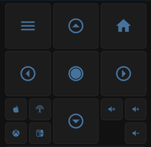
Here’s an example remote control.
The main body is a 3-column grid card, but the input selects in the bottom left and the volume controls on the bottom right are also grid cards with 2 columns each.
The empty space in the bottom right under the mute button is a vertical stack with no cards in it.
Had I wanted to have a card that’s the full width, I could make the remote above a member of a parent grid card (with render as square unchecked.)

That winds up looking like this.
The case I’m not sure (it may not be possible) to handle is if I wanted a row where there’s a card that’s 1 column wide and a card that’s 2 columns wide.
Yeah i might have misunderstood you, ofcause one can have a fixed-grid, with fixed size, that’s just a limitation of the functionality, as i see it, and yes use of grids, in grid, as well as vertical/horizontal stacks in a grid area/Cells is also common
However, this would surely give OP headache , if he wish to have “Buttons” to rearrange the cards
Edit:
Here is and example of row and column span, Beside when using Grid-area, each Card/or H-V-stack can be placed where ever ( you just change 2 short rows, place it in another grid-area )
view_layout:
   grid-area: header2
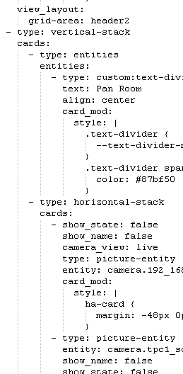
    layout:
      grid-template-columns: 33% 33% 33%
      grid-template-rows: auto
      grid-template-areas: |
        "header1 header2 header3"
        "main1 main3 main3"
        "main1 main2 main4"
        "footer1 footer2 footer3"
      mediaquery:
        '(max-width: 600px)':
          grid-template-columns: 100%
          grid-template-areas: |
            "header1"
            "main1"
	    "main2"
            "footer1"
            "header3"
            "main3"
            "footer3"
            "header2"
but not grid view, and doing a panel view with one card is not the same, you can’t take a card from another view and move it in the grid card, you’ll have to copy/cut and add a card from clipboard.
Moreover, you cant span over 2 rows or more like in my twisted mind ![]()
My example above is grid-view ( main1 fills 2 row, main3 fills 2 columns, thou only 1, if max width is below 600px ), and yes you can use conditional cards, and exclude cards in combination with above, i.e if media max width: 600 , then don’t show whatever card/stack/grid is in main4 and footer2
One have total control with layout-card (layout view included)
Even worse ( or cooler ) with CSS one can i.e use margin -50px, to move object into/overlap another column/rows/cards , looks abit weird for a split second when it’s loaded, as i.e text (object) jump up/down or a-side
Solutions exists but not as convenient as a true grid view could be.
what is a true grid view ?
not defined yet, but in my mind, like a grid card where you specify the number of columns, then create cards in it. Filled from left to right, and top to bottom, predictable, not like masonry.
And an additional option in the card editor, like in the sidebar view, something like
view_layout:
  columns: 2
  rows: 3
Could be represented in edit mode by left/right arrows to span over more/less columns and up/down arrows to span over more/less rows.
The custom:layout-view is no longer maintained unfortunately.
What does it more than a grid card in a panel view? Manage cards easily, I did grid in grid in vertical stack in horizontal stack, you have 4 layers of 1 2 3 4 when you edit the main grid card, can’t find the card you want to move, change, remove.
EDIT: Like the windows phone interface, the OS was a piece of crap but the homescreen was well designed: the possibility to change each app from 1x1 to 1x2 to 2x2. This is the idea here.
Ok, i understand
Maybe it doesn’t need any “new features” and still works as intended
I haven’t ( bumped ) into any issues, however most of my views is build upon ( Layout-Card )(2 grids)(2 vertical-stack)(2 horizontal-stack ) (2 masonry (layout) and 1 or 2 cards(not grids)
I do have 2 or 3 Default-masonry thou ![]()
I really don’t know, as the Panel view i had i dumped, And now it seems we are more going over to the UI card interface, And that really sucks no matter what, one easily ends up in the 4 layers, of xxxx, beside the code is way longer than the card, so one don’t even see the changes in right column … as it doesn’t follow the code-editor in left pane … totally horrible interface
Sure it’s very convenient if everything could be done in Visual Editor Mode, Same size as an average laptop, with tons of options, buttons and what ever, and why not a top slide-down menu
Well im use to edit in code, and i dont ever expect that HA should be a full feathered click-drag-n-drop GUI for editing a view/card
Edit i never seen a windows phone, and years (many) since i saw an Iphone, im stucked with plain old android , and have no intention to ever own a windows or iphone
You can’t really use that as an example here.
The situation you are referring to is an UI on one specific phone with one specific resolution. If this should be related to HA, then we should only use Microsoft Edge Browser and all run in 1920*1080x32bit.
1 Like
I made myself clear. Idea is not a solution. And windows phones came in many resolutions, not like iPhones.
Anyway : grid view, number of columns, make the view only available for your computer, or your phone, as I did using the screen resolution conditions. Fill from left to right, possibility to skip a slot to have an “android” look and the possibility to span over rows and/or columns.
You can agree or disagree, I’ll not argue, it is not the point. If you prefer to make as I do for now grids in grids in a 4 columns grid in a panel view, good for you, but I believe that there are many ways of improvement possible.