Can Someone Please Put Me out of My Misery with these LVGL Bottons on My WaveShare & Elecrow Displays.
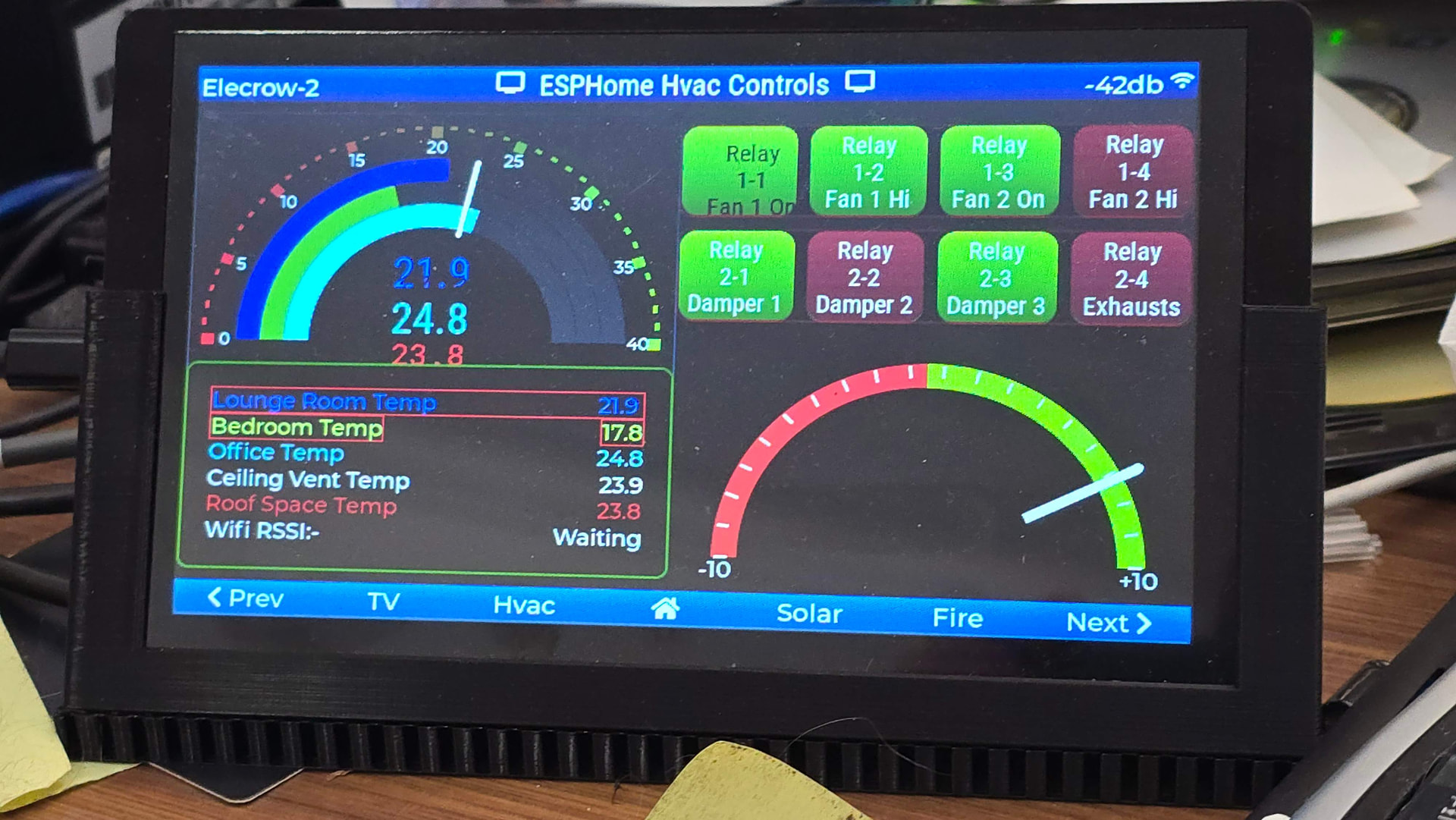
My intention is to have the Text Change to Black against Green When the Buttons are On.
(Works fine on Another Page, but they are not under an object.
In this page I can get the Text to Change if I remove the Style from the Checked State, but then the Alignment goes South. I beleive the Styles was overriding the Black Color.
Have tried Padding on the Label, but that give a poor resulting Fudge.
Hours of Hair Tearing & Seaches, but I can’t Seem to Solve it.
Relay 1-1 is what I’m Testing on & you can see the Alignment issue.
Other Buttons Align Ok. but don’t change Text Colour.
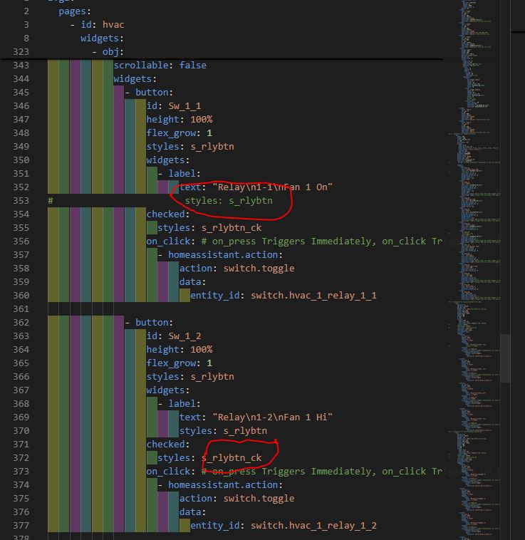
This is the part in the File.
Relevant Files also Attached.
Thanks.
Edit Only things in the Themes.yaml is the Arcs.
The Styles File.
lvgl:
  style_definitions:
    - id: header_footer
      bg_color: 0x2F8CD8 #2F8CD8
      bg_grad_color: 0x005782 #005782
      bg_grad_dir: VER
      bg_opa: COVER
      border_opa: TRANSP
      radius: 0
      pad_all: 0
      pad_row: 0
      pad_column: 0
      border_color: 0x0077b3 #0077b3
      text_color: WHITE
      text_font: montserrat_20
      width: 100%
      height: 30
    - id: s_lab_b
      text_color: BLACK
      text_align: CENTER
      text_font: roboto_icons_36
      width: 240
    - id: s_lab_w
      text_color: WHITE
      text_align: CENTER
      text_font: roboto_icons_36
      width: 240
    - id: s_val_b
      text_color: BLACK
      text_align: CENTER
      text_font: roboto_48
      width: 240
    - id: s_val_w
      text_color: WHITE
      text_align: CENTER
      text_font: roboto_48
      width: 240

    - id: objs
      radius: 0
      pad_all: 0
      pad_row: 0
      pad_column: 0
    - id: s_rlybtn ##### For Relay Buttons When Off
      bg_color: red_dull
      bg_grad_color: red_duller
      bg_grad_dir: VER
      text_color: WHITE
      align: CENTER
      text_align: CENTER
    - id: s_rlybtn_ck ##### For Relay Buttons When On
      bg_color: 0x2fff00 #2fff00
      bg_grad_color: 0x188300 #188300
      bg_grad_dir: VER
      text_color: BLACK
    - id: s_tvbtn ##### For TV Buttons Page
      bg_color: 0x007add #007add
      bg_grad_color: 0x004b70 #004b70
      bg_grad_dir: VER
      text_color: WHITE
      align: CENTER
      text_align: CENTER
The Pages File.
Button is at Line 345.
lvgl:
pages:
- id: hvac
bg_color: 0x000000
bg_opa: 100%
pad_all: 0
scrollable: false
widgets:
- obj: ##### Header #####
align: TOP_MID
styles: header_footer
widgets:
- label:
text: "\U000F0502 ESPHome Hvac Controls \U000F0502"
align: CENTER
text_align: CENTER
text_color: WHITE
text_font: roboto_24
- obj: #----- Hvac Meter -------------------------------------------------------------------
id: obj_t1
x: 0
y: 0
width: 400
height: 400
align: LEFT_MID
bg_opa: 0%
border_width: 1
border_color: 0x4B5563
radius: 8
pad_all: 0
scrollable: false
widgets:
- arc:
id: arc_t1
x: 0
y: 0
width: 320
height: 320
align: CENTER
value: 60
min_value: 0
max_value: 40
adjustable: false
start_angle: 180
end_angle: 0
arc_color: 0x404040
arc_width: 20
arc_opa: 100%
arc_rounded: false
indicator:
arc_color: 0x04149F #04149F
arc_width: 20
arc_opa: 100%
arc_rounded: false
knob:
bg_opa: 0%
radius: 0
pad_all: 0
bg_opa: 0%
border_opa: 100%
- arc:
id: arc_t2
x: 0
y: 0
width: 280
height: 280
align: CENTER
value: 43
min_value: 0
max_value: 40
adjustable: false
start_angle: 180
end_angle: 0
arc_color: 0x404040
arc_width: 20
arc_opa: 100%
arc_rounded: false
indicator:
arc_color: 0x1FC705
arc_width: 20
arc_opa: 100%
arc_rounded: false
knob:
bg_color: 0xFFFFFF
bg_opa: 0%
radius: 9999
border_width: 2
bg_opa: 0%
- arc:
id: arc_t3
x: 0
y: 0
width: 240
height: 240
align: CENTER
value: 58
min_value: 0
max_value: 40
adjustable: false
start_angle: 180
end_angle: 0
arc_color: 0x404040
arc_width: 20
arc_opa: 100%
arc_rounded: false
indicator:
arc_color: 0x00ddff #00ddff
arc_width: 20
arc_opa: 100%
arc_rounded: false
knob:
bg_color: 0xFFFFFF
bg_opa: 0%
radius: 9999
border_width: 2
bg_opa: 0%
- label:
text: "Temp1"
id: tg1_v1
y: -60
width: 400
align: CENTER
text_align: CENTER
text_color: 0x5566ff #5566ff
text_font: roboto_36 # override font size
- label:
text: "Temp2"
id: tg1_v2
y: -50
width: 400
align: CENTER
text_align: CENTER
text_color: BLACK # 0xccff55 #ccff55
text_font: robo_25 # override font size
- label:
text: "Temp3"
id: tg1_v3
width: 400
y: -20
align: CENTER
text_align: CENTER
text_color: 0x00ddff #00ddff
text_font: roboto_36 # override font size
- meter:
align: center
height: 400
width: 400
text_color: WHITE
bg_color: BLACK #BLACK
bg_opa: 0%
border_width: 0
scales:
range_from: 0
range_to: 40
angle_range: 180 #Was 120
rotation: 180 #Was 210
ticks:
count: 41
length: 3
major:
stride: 5
length: 10
label_gap: 5 #13
indicators:
- line:
id: tempg1_needle
width: 4
length: 65
radial_offset: 95
color: 0xfe5f02 #fe5f02
value: 10
- line:
id: tempg1_needle2
width: 4
length: 65
radial_offset: 95
color: 0xffffff #ffffff
value: 15
#r_mod: -4
#opa: TRANSP
- tick_style:
start_value: -10
end_value: 40
color_start: 0xff0000 #ff0000
color_end: 0x44ff00 #44ff00
- label:
text: "Temp 4"
id: tg1_v4
y: 10
width: 400
align: CENTER
text_align: CENTER
text_color: RED
text_font: robo_25 # override font size
- label:
text: "Temp 5"
id: tg1_v5
y: 40
width: 400
align: CENTER
text_align: CENTER
text_color: WHITE
text_font: robo_25 # override font size
#----- Container for Temperature Grid
- obj:
width: 400
height: 180
align: BOTTOM_LEFT
y: -40
scrollable: "OFF"
layout:
type: grid
grid_row_align: end
grid_rows: [ fr(1), fr(1), fr(1), fr(1), fr(1), fr(1) ]
grid_columns: [ fr(1), fr(1) ]
pad_row: 0px
pad_column: 10px
bg_color: 0x000000
border_width: 2
border_color: GREEN
border_opa: 100%
text_font: montserrat_18
text_color: 0xFFFFFF
# bg_opa: 0 # Make background transparent to see only outline
widgets:
- label:
id: HvG1_A1
text: "Lounge Room Temp"
text_color: 0x5566ff #5566ff
# grid_cell: [0, 0]
grid_cell_row_pos: 0
grid_cell_column_pos: 0
border_width: 1
border_color: red
width: 100%
- label:
id: HvG1_B1
text: "00.0"
text_color: 0x5566ff #5566ff
grid_cell_row_pos: 0
grid_cell_column_pos: 1
border_width: 1
border_color: red
width: 100%
grid_cell_x_align: end # Aligns the label widget to the right of the cell
text_align: right # Aligns the text within the label's width
- label:
id: HvG1_A2
text: "Bedroom Temp"
text_color: 0xccff55 #ccff55
grid_cell_row_pos: 1
grid_cell_column_pos: 0
border_width: 1
border_color: red
- label:
id: HvG1_B2
text: "00.0"
text_color: 0xccff55 #ccff55
grid_cell_row_pos: 1
grid_cell_column_pos: 1
border_width: 1
border_color: red
grid_cell_x_align: end # Aligns the label widget to the right of the cell
text_align: right # Aligns the text within the label's width
- label:
id: HvG1_A3
text: "Office Temp"
text_color: 0x00ddff #00ddff
grid_cell_row_pos: 2
grid_cell_column_pos: 0
- label:
id: HvG1_B3
# long_mode: wrap
text: "00.0"
text_color: 0x00ddff #00ddff
grid_cell_row_pos: 2
grid_cell_column_pos: 1
grid_cell_x_align: end # Aligns the label widget to the right of the cell
text_align: right # Aligns the text within the label's width
- label:
id: HvG1_A4
text: "Ceiling Vent Temp"
text_color: WHITE
grid_cell_row_pos: 3
grid_cell_column_pos: 0
- label:
id: HvG1_B4
text: "Waiting"
text_color: WHITE
grid_cell_row_pos: 3
grid_cell_column_pos: 1
grid_cell_x_align: end # Aligns the label widget to the right of the cell
text_align: right # Aligns the text within the label's width
- label:
id: HvG1_A5
text: "Roof Space Temp"
text_color: RED
grid_cell_row_pos: 4
grid_cell_column_pos: 0
- label:
id: HvG1_B5
text: "Waiting"
text_color: RED
grid_cell_row_pos: 4
grid_cell_column_pos: 1
grid_cell_x_align: end # Aligns the label widget to the right of the cell
text_align: right # Aligns the text within the label's width
- label:
id: HvG1_A6
text: "Wifi RSSI:-"
grid_cell_row_pos: 5
grid_cell_column_pos: 0
- label:
id: HvG1_B6
text: "Waiting"
grid_cell_row_pos: 5
grid_cell_column_pos: 1
grid_cell_x_align: end # Aligns the label widget to the right of the cell
text_align: right # Aligns the text within the label's width
#----- Container for Switch Buttons First Row
- obj:
pad_all: 0
bg_color: GREEN
bg_opa: 35%
border_color: RED # Was CYAN for Testing.
border_opa: 50%
align: TOP_RIGHT
bg_grad_dir: NONE
width: 400
height: 80
y: 50
layout:
type: FLEX
flex_flow: ROW
flex_align_cross: STRETCH # Was CENTER
# align: CENTER
text_align: CENTER
# text_font: roboto_icons_36
text_font: roboto_20
scrollbar_mode: "OFF"
scrollable: false
widgets:
- button:
id: Sw_1_1
height: 100%
flex_grow: 1
styles: s_rlybtn
widgets:
- label:
text: "Relay\n1-1\nFan 1 On"
# styles: s_rlybtn
checked:
styles: s_rlybtn_ck
on_click: # on_press Triggers Immediately, on_click Triggers on Release if within defined time frame
- homeassistant.action:
action: switch.toggle
data:
entity_id: switch.hvac_1_relay_1_1
- button:
id: Sw_1_2
height: 100%
flex_grow: 1
styles: s_rlybtn
widgets:
- label:
text: "Relay\n1-2\nFan 1 Hi"
styles: s_rlybtn
checked:
styles: s_rlybtn_ck
on_click: # on_press Triggers Immediately, on_click Triggers on Release if within defined time frame
- homeassistant.action:
action: switch.toggle
data:
entity_id: switch.hvac_1_relay_1_2
- button:
id: Sw_1_3
height: 100%
flex_grow: 1
styles: s_rlybtn
widgets:
- label:
text: "Relay\n1-3\nFan 2 On"
styles: s_rlybtn
checked:
styles: s_rlybtn_ck
text_color: BLACK
on_click: # on_press Triggers Immediately, on_click Triggers on Release if within defined time frame
- homeassistant.action:
action: switch.toggle
data:
entity_id: switch.hvac_1_relay_1_3
- button:
id: Sw_1_4
height: 100%
flex_grow: 1
styles: s_rlybtn
widgets:
- label:
text: "Relay\n1-4\nFan 2 Hi"
styles: s_rlybtn
checked:
styles: s_rlybtn_ck
on_click: # on_press Triggers Immediately, on_click Triggers on Release if within defined time frame
- homeassistant.action:
action: switch.toggle
data:
entity_id: switch.hvac_1_relay_1_4
#----- Container for Switch Buttons Second Row
- obj:
pad_all: 0
bg_color: GREEN
bg_opa: 35%
border_color: RED # Was CYAN for Testing.
border_opa: 50%
align: TOP_RIGHT
bg_grad_dir: NONE
width: 400
height: 80
y: 140
layout:
type: FLEX
flex_flow: ROW
flex_align_cross: STRETCH # Was CENTER
# align: CENTER
text_align: CENTER
# text_font: roboto_icons_36
text_font: roboto_20
scrollbar_mode: "OFF"
scrollable: false
widgets:
- button:
id: Sw_2_1
height: 100%
flex_grow: 1
styles: s_rlybtn
widgets:
- label:
text: "Relay\n2-1\nDamper 1"
styles: s_rlybtn
checked:
styles: s_rlybtn_ck
on_click: # on_press Triggers Immediately, on_click Triggers on Release if within defined time frame
- homeassistant.action:
action: switch.toggle
data:
entity_id: switch.hvac_1_relay_2_1
- button:
id: Sw_2_2
height: 100%
flex_grow: 1
styles: s_rlybtn
widgets:
- label:
text: "Relay\n2-2\nDamper 2"
styles: s_rlybtn
checked:
styles: s_rlybtn_ck
on_click: # on_press Triggers Immediately, on_click Triggers on Release if within defined time frame
- homeassistant.action:
action: switch.toggle
data:
entity_id: switch.hvac_1_relay_2_2
- button:
id: Sw_2_3
height: 100%
flex_grow: 1
styles: s_rlybtn
widgets:
- label:
text: "Relay\n2-3\nDamper 3"
styles: s_rlybtn
checked:
styles: s_rlybtn_ck
on_click: # on_press Triggers Immediately, on_click Triggers on Release if within defined time frame
- homeassistant.action:
action: switch.toggle
data:
entity_id: switch.hvac_1_relay_2_3
- button:
id: Sw_2_4
height: 100%
flex_grow: 1
styles: s_rlybtn
widgets:
- label:
text: "Relay\n2-4\nExhausts"
styles: s_rlybtn
checked:
styles: s_rlybtn_ck
on_click: # on_press Triggers Immediately, on_click Triggers on Release if within defined time frame
- homeassistant.action:
action: switch.toggle
data:
entity_id: switch.hvac_1_relay_2_4
- obj: #----- Right Meter ------------------------------------------------------------------
height: 360 # needed to be explicitily defined for my round display to not have weird corder line overlappting gauge
width: 360
#align: RIGHT_MID
align: BOTTOM_RIGHT
x: -20
y: 120
#bg_opa: TRANSP
bg_color: 0
border_width: 0
outline_width: 0
shadow_width: 0
pad_all: 4
#scrollbar_mode: "off"
widgets:
- meter: # Gradient color arc
height: 100%
width: 100%
border_width: 0
outline_width: 0
align: center
bg_color: 0
#styles: meter_style
#bg_opa: TRANSP
scales:
angle_range: 180 # sets the total angle to 180 = starts mid left and ends mid right
range_to: 10
range_from: -10
ticks:
count: 20
color: WHITE
indicators:
- line:
id: power_meter_input
width: 8
color: 0xFFFFFF
length: 180 #
#r_mod: 12 #sets line length by this much difference from the scale default radius
value: 7
#- img:
#id: power_meter_input_img
- arc:
color: 0xFF3000
r_mod: 10 #radius difference from the scale default radius
width: 20
start_value: -10
end_value: 0
- arc:
color: 0x00FF00
r_mod: 10 #radius difference from the scale default radius
width: 20
start_value: 0
end_value: 10
#- canvas:
- arc: # black arc to erase middle part of meter indicator line
height: 170
width: 170
align: center
arc_color: 0x000000 # background color
arc_width: 150
start_angle: 0
end_angle: 360
indicator:
arc_width: 150
arc_color: 0x000000
- label: # gauge lower and higher range indicators
#styles: font_style
text_font: MONTSERRAT_18 # override font size
text_color: WHITE
align: LEFT_MID
y: 10 #negative = higher
#x: -99
text: "-10"
- label:
#styles: font_style
text_font: MONTSERRAT_18 # override font size
text_color: WHITE
align: RIGHT_MID
y: 10 #negative = higher
#x: 99
text: "+10"
And the TopLayer is Case it’s Relevant.
lvgl:
  top_layer:
    widgets:
      - label:
          text: "${devicename}"
          align: top_left
          x: 2
          y: 7
          text_align: left
          text_color: WHITE
          text_font: montserrat_20
      - label:
          text: "0db"
          id: wf_sig
          align: top_right
          x: -25
          y: 7
          text_align: right
          text_color: WHITE
          text_font: montserrat_20
      - label:
          text: "\uF1EB" # API Status Icon
          id: lbl_hastatus
          hidden: true
          align: top_right
          x: -2
          y: 7
          text_align: right
          text_color: WHITE
      - buttonmatrix:
          align: bottom_mid
          styles: header_footer
          pad_all: 0
          outline_width: 0
          id: top_layer
          items:
            styles: header_footer
          rows:
            - buttons:
              - id: page_prev
                text: "\uF053 Prev"
                on_press:
                  then:
                    lvgl.page.previous:
              - id: page_tv
                text: "TV"
                on_press:
                  then:
                    lvgl.page.show: Bbq_Tv
              - id: page_hvac
                text: "Hvac"
                on_press:
                  then:
                    lvgl.page.show: hvac
              - id: page_home
                text: "\uF015" # Home \uF015"
                on_press:
                  then:
                    lvgl.page.show: main_page
              - id: page_solar
                text: "Solar"
                on_press:
                  then:
                    lvgl.page.show: solar_page
              - id: page_fire
                text: "Fire"
                on_press:
                  then:
                    lvgl.page.show: wood_heater
              - id: page_next
                text: "Next \uF054"
                on_press:
                  then:
                    lvgl.page.next: