I am having a similar issue configuring my layout. I am not sure what I am missing.
I have created a layout based on the example on the github page.
This is what mine looks like:
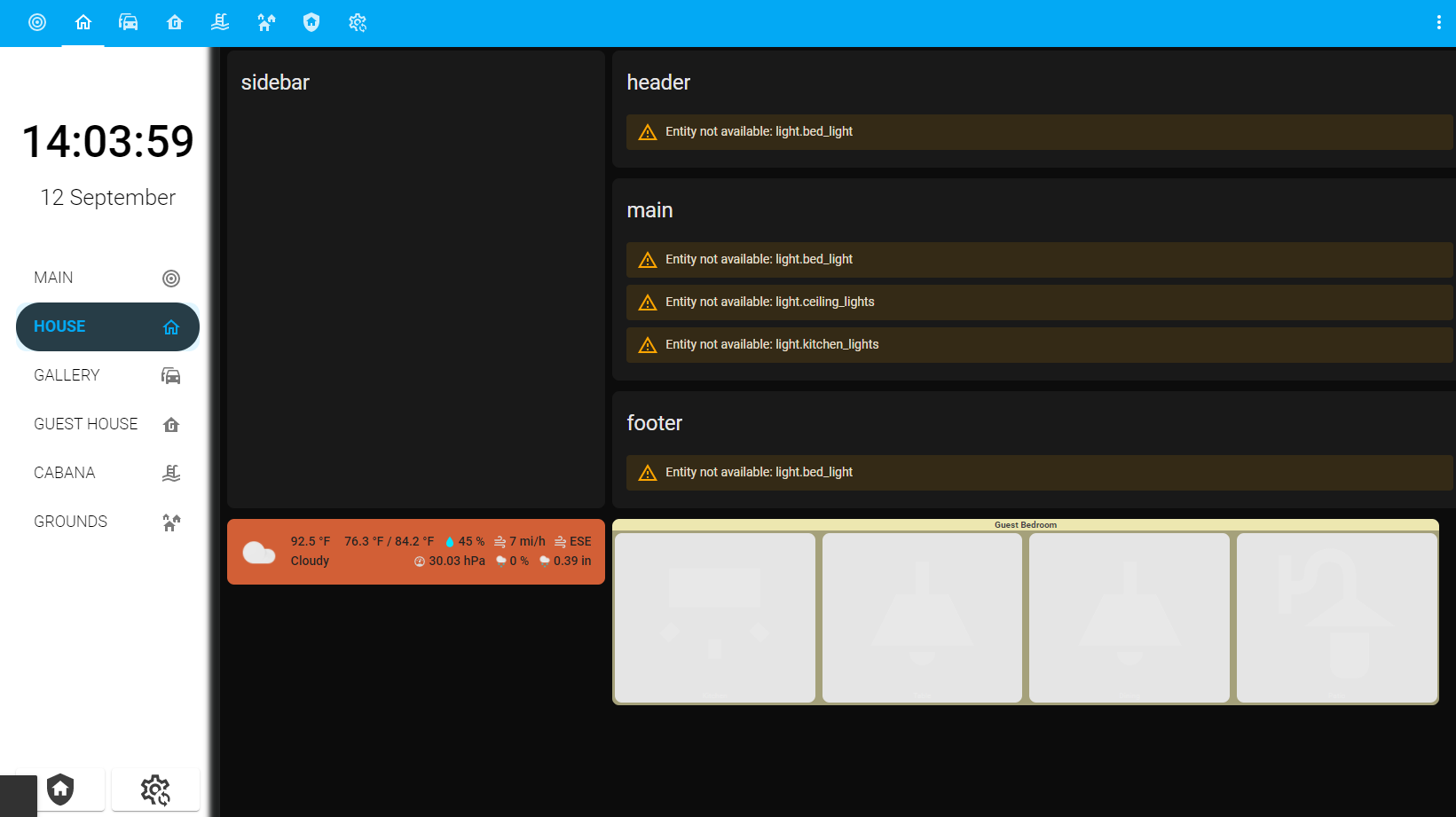
Now that I have a layout with a sidebar, header, footer and main sections, I want to start populating it with cards. I will be using mostly custom button cards to make it look like this:
This is my code:
title: Estate Dashboard
name: estate-dashboard
swipe_nav:
  wrap: true
  animate: swipe
sidebar:
  title: null
  clock: false
  digitalClock: true
  digitalClockWithSeconds: true
  twelveHourVersion: false
  period: false
  date: true
  hideTopMenu: false
  hideHassSidebar: false
  showTopMenuOnMobile: true
  dateformat: dddd, DD MMMM YYYY
  width:
    desktop: 15
    mobile: 15
    tablet: 20
  breakpoints:
    mobile: 768
    tablet: 1024
  template: |
    <li>
      {% if now().hour  < 5 %} Good night {{'\U0001F634'}}
      {% elif now().hour < 12 %} Good morning {{'\u2615\uFE0F'}}
      {% elif now().hour < 18 %} Good afternoon {{'\U0001F44B\U0001F3FB'}}
      {% else %} Good evening {{'\U0001F44B\U0001F3FB'}}{% endif %}{{user}}
    </li>
  style: |
    :host {
        --sidebar-background: #FFF;
        --sidebar-text-color: #000;
        --face-color: #FFF;
        --face-border-color: #FFF;
        --clock-hands-color: #000;
        --clock-seconds-hand-color: #FF4B3E;
        --clock-middle-background: #FFF;
        --clock-middle-border: #000;
        box-shadow: inset -11px 0px 6px 1px #1d1f1f;
    }
    #customSidebar {
       z-index: 9999!important;
     }
    .sidebarMenu li {
        line-height: 35px!important;
     }
    .sidebarMenu li ha-icon {

     }
    .sidebarMenu li.active {
        background-color: #2C2E30!important;
        border-radius: 40px!important;
        font-weight: bold!important;
     }
    .sidebarMenu li.active ha-icon {

     }
    .digitalClock {
        padding-bottom: 5px;
        padding-top: 15px
    }
    .digitalClock {
        font-size: 50px !important;
        font-weight: 500!important;
        text-align: center;
    }
    .date {
        padding-bottom: 10px;
        font-size: 25px;
        font-weight: 300;
        text-align: center;
    }
  sidebarMenu:
    - action: navigate
      active: true
      name: MAIN
      icon: mdi:bullseye
      navigation_path: /estate-dashboard/main
    - action: navigate
      active: true
      name: HOUSE
      icon: mdi:home-outline
      navigation_path: /estate-dashboard/house
    - action: navigate
      active: true
      name: GALLERY
      icon: mdi:car-multiple
      navigation_path: /estate-dashboard/gallery
    - action: navigate
      active: true
      name: GUEST HOUSE
      icon: mdi:home-floor-g
      navigation_path: /estate-dashboard/guest-house
    - action: navigate
      active: true
      name: CABANA
      icon: mdi:pool
      navigation_path: /estate-dashboard/cabana
    - action: navigate
      active: true
      name: GROUNDS
      icon: mdi:home-group
      navigation_path: /estate-dashboard/grounds
  bottomCard:
    type: horizontal-stack
    cardOptions:
      cards:
        - type: custom:button-card
          color_type: card
          color: rgb(255, 255, 255)
          icon: mdi:shield-home
          tap_action:
            action: navigate
            navigation_path: /estate-dashboard/security
        - type: custom:button-card
          color_type: card
          color: rgb(255, 255, 255)
          tap_action:
            action: navigate
            navigation_path: /estate-dashboard/settings
          icon: mdi:cog-sync-outline
    cardStyle: |
      :host {
        width: 100%;
        background-color:#FFF;
      }
views:
  - title: MAIN
    path: main
    theme: Caule Black Orange
    icon: mdi:bullseye
    badges:
      - entity: person.haz
  - title: HOUSE
    path: house
    theme: Caule Black Orange
    icon: mdi:home-outline
    type: custom:grid-layout
    layout:
      grid-template-columns: 10% fr fr fr
      grid-template-rows: min-content min-content min-content
      grid-template-areas: |
        "sidebar header header header"
        "sidebar main main main"
        "sidebar footer footer footer"
      mediaquery:
        '(max-width: 600px)':
          grid-template-columns: 100%
          grid-template-rows: min-content min-content min-content min-content
          grid-template-areas: |
            "header"
            "sidebar"
            "main"
            "footer"
        '(max-width: 800px)':
          grid-template-columns: 10% 90%
          grid-template-rows: min-content min-content min-content
          grid-template-areas: |
            "sidebar header"
            "sidebar main"
            "sidebar footer"
    cards:
      - type: vertical-stack
        cards:
          - type: custom:simple-weather-card
            entity: weather.home_austin
            card_mod:
              style: |
                ha-card {
                  padding: 0px;
                }
            name: ' '
            backdrop:
              day: var(--primary-color)
              night: '#40445a'
            primary_info:
              - extrema
              - humidity
              - wind_speed
              - wind_bearing
            secondary_info:
              - pressure
              - precipitation_probability
              - precipitation
        layout:
          grid-area: header
      - type: custom:button-card
        template: container
        color: '#EDE7B0'
        name: Guest Bedroom
        custom_fields:
          buttons:
            card:
              type: horizontal-stack
              cards:
                - entity: switch.ge_14291_in_wall_smart_switch_switch_2
                  name: Kitchen
                  template: standard
                  icon: mdi:wall-sconce-flat
                  type: custom:button-card
                - entity: light.ge_14294_in_wall_smart_dimmer_level_10
                  name: Table
                  template: standard
                  icon: mdi:ceiling-light
                  type: custom:button-card
                - entity: light.ge_14294_in_wall_smart_dimmer_level_7
                  name: Dining
                  template: standard
                  icon: mdi:ceiling-light
                  type: custom:button-card
                - entity: switch.patio_light
                  template: standard
                  name: Patio
                  icon: mdi:outdoor-lamp
                  type: custom:button-card
The main question I have is the following:
How do I move the map or the custom button card from the bottom of the dashboard which is where the layout places them ignoring the grid above it, to a grid area?
for example, I want the custom:simple-weather-card to be in the grid area sidebar.
I want to move the custom:button-card to the header grid area.
Any thoughts?