Hey Ben!
Do you have a GitHub with your config? I love this layout and trying to replicate the side panel. I am just trying to figure out the bottom bit with the stack-in card. I see it links to an includes file and wondering what that looks like.
Thanks in advance!
fenty17
September 28, 2022, 9:27pm
545
Hi folks,
Anyone encountered an issue where sidebar items need to be tapped twice to trigger the action? (In my case navigate to a view). This is now happening on my wall mounted tablet running Fully Kiosk which could be related to other recent changes I’ve made but thought I’d check here in case someone knows a way to resolve it.
Kate222
October 2, 2022, 7:58pm
546
I have found the HA default side bar is really good. I find myself using setting button a lot and a bit annoyed having to scroll down so many times.
This is my sidebar setup right now. Very happy with it.
10 Likes
this looks great, could you share your code?
1 Like
Share code please for this great work. love it! where do we need to put the code in config.yaml or ui-lovelace.yaml, and can we write it then in raw config?
Has anyone gotten the Bottom card to work with the type vertical-stack? If so, I would be grateful if you could share a code example.
I’m getting it to work using the type horizontal-stack, but as I want to add multiple cards to the Bottom card I need to place them vertically to fit.
HI Ben,
Is there any way to add line breaks in the template code? This is what I have:
  template: >
    <li>
      {% if now().hour  < 5 %} Good Night {{'\U0001F634'}}
      {% elif now().hour < 12 %} Good Morning {{'\u2615\uFE0F'}}
      {% elif now().hour < 18 %} Good Afternoon {{'\U0001F44B\U0001F3FB'}}
      {% else %} Good Evening {{'\U0001F44B\U0001F3FB'}}{% endif %}
    </li>

    <li>The {{states('input_select.bins')}} bin is
    {{states('sensor.bin_day')}}</li>

    <li>The outside temperature is currently

    {{states('sensor.temperature_pagoda')}} degrees</li> <li>The forecast today

    is {{states('weather.met_office_heanor_daily')}}</li></br>


    <li>{% if "on" in states('binary_sensor.front_door_sensor') %}

    Front Door is open {% endif %}

    </li>

    <li>{% if "on" in states('binary_sensor.back_door_sensor') %}

    Back door is open {% endif %}

    </li>

    <li>{% if "on" in states('binary_sensor.bifold_door_sensor') %}

    Bifolds are open {% endif %}

    </li>

    <li>{% if "on" in states('binary_sensor.garage_door_internal') %}

    Internal garage door is open {% endif %}

    </li>
RASBR
October 14, 2022, 12:39pm
555
Hi,
Another question, is there a way to make the whole sidebar card background transparent?
sidebar:
  width:
    mobile: 0
    tablet: 25
    desktop: 20
  breakpoints:
    mobile: 768
    tablet: 1024
  style: |
    :host {
      –sidebar-background: #00FF00;
      –sidebar-text-color: #FFF;
      –face-color: #FFF;
      –face-border-color: #FFF;
      –clock-hands-color: #000;
      –clock-seconds-hand-color: #FF4B3E;
      –clock-middle-background: #FFF;
      –clock-middle-border: #000;
    }
    .sidebarMenu li.active {
     background-color: rgba(0, 0, 0, 0)!important;
     icon-size: 225px;
     }
    .digitalClock {
        text-align: center;
        padding-bottom: 1px;
        padding-top: 20px
        font-size: 205px;
        line-height: 95px;
    }
    .date {
        text-align: center;
    }
    .title h1{
        text-align: center;
    }
    .bottomCard {
     background-color: #00FF00;
     icon-size: 225px;
     }
  digitalClock: true
  date: true
  dateFormat: DD-MMM-YYYY
  clock: false
  hideOnPath:
    - /lovelace-testing/bedroom2
  hideHassSidebar: false
  hideTopMenu: false
  template: >
    <li>
      {% if now().hour  < 5 %} Goede nacht {{'\U0001F634'}}
      {% elif now().hour < 12 %} Goedemorgen {{'\u2615\uFE0F'}}
      {% elif now().hour < 18 %} Goedenmiddag {{'\U0001F44B\U0001F3FB'}}
      {% else %} Goedenavond {{'\U0001F44B\U0001F3FB'}}{% endif %}
    </li>

    {% if "Vandaag" in states('sensor.blink_gft') %} <li>Vandaag groenebak aan
    de straat</li> {% endif %}

    {% if "Vandaag" in states('sensor.blink_papier') %} <li>Vandaag oudpapier
    aan de straat</li> {% endif %}

    {% if "Vandaag" in states('sensor.blink_pmd') %} <li>Vandaag plastic aan de
    straat</li> {% endif %}

    {% if "Vandaag" in states('sensor.blink_restafval') %} <li>Vandaag grijzebak
    aan de straat</li> {% endif %}

    {% if "Morgen" in states('sensor.blink_gft') %} <li>Morgen groenebak aan de
    straat</li> {% endif %}

    {% if "Morgen" in states('sensor.blink_papier') %} <li>Morgen oudpapier aan
    de straat</li> {% endif %}

    {% if "Morgen" in states('sensor.blink_pmd') %} <li>Morgen plastic aan de
    straat</li> {% endif %}

    {% if "Morgen" in states('sensor.blink_restafval') %} <li>Morgen grijzebak
    aan de straat</li> {% endif %}

    {% if states('sensor.current_lights_on') | float > 0 %}
    <li>{{states('sensor.current_lights_on')}} lampen aan</li> {% endif %}

    {% if states('sensor.current_media_players_on') | float > 0 %}
    <li>{{states('sensor.current_media_players_on')}} speakers aan</li> {% endif
    %}
  sidebarMenu:
    - action: navigate
      navigation_path: /lovelace/home
      name: Home
      active: true
    - action: navigate
      navigation_path: /lovelace/lampen
      name: Lampen
  bottomCard:
    type: grid
    cardOptions:
      columns: 1
      square: false
      cards:
        - type: weather-forecast
          show_current: true
          show_forecast: true
          entity: weather.home
          secondary_info_attribute: humidity
        - square: true
          columns: 4
          type: grid
          cards:
            - type: custom:mushroom-template-card
              icon: none
              primary: Fade
              icon_color: ''
              layout: vertical
              card_mod:
                style:
                  mushroom-shape-icon$: |
                    .shape {
                      --shape-animation: fade 25s linear infinite reverse;
                      --shape-color: none;
                    }
                    @keyframes fade {
                      6.24%, 12.49%, 18.74%, 24.99%, 31.24%, 37.49%, 43.74%, 49.99%, 56.24%, 62.49%, 68.74%, 74.99%, 81.24%, 87.49%, 93.74%, 100%  { box-shadow: 0 0 20px 20px transparent inset; }
                      0% { box-shadow: 0 0 0 0 rgba(var(--rgb-red), 0.7) inset; }
                      6.25% { box-shadow: 0 0 0 0 rgba(var(--rgb-deep-orange), 0.7) inset; }
                      12.5% { box-shadow: 0 0 0 0 rgba(var(--rgb-orange), 0.7) inset; }
                      18.75% { box-shadow: 0 0 0 0 rgba(var(--rgb-amber), 0.7) inset; }
                      25% { box-shadow: 0 0 0 0 rgba(var(--rgb-yellow), 0.7) inset; }
                      31.25% { box-shadow: 0 0 0 0 rgba(var(--rgb-lime), 0.7) inset; }
                      37.5% { box-shadow: 0 0 0 0 rgb(var(--rgb-light-green), 0.7) inset; }
                      43.75% { box-shadow: 0 0 0 0 rgb(var(--rgb-green), 0.7) inset; }
                      50% { box-shadow: 0 0 0 0 rgb(var(--rgb-teal), 0.7) inset; }
                      56.25% { box-shadow: 0 0 0 0 rgb(var(--rgb-cyan), 0.7) inset; }
                      62.5% { box-shadow: 0 0 0 0 rgb(var(--rgb-light-blue), 0.7) inset; }
                      68.75% { box-shadow: 0 0 0 0 rgb(var(--rgb-blue), 0.7) inset; }
                      75% { box-shadow: 0 0 0 0 rgb(var(--rgb-indigo), 0.7) inset; }
                      81.25% { box-shadow: 0 0 0 0 rgb(var(--rgb-deep-purple), 0.7) inset; }
                      87.5% { box-shadow: 0 0 0 0 rgb(var(--rgb-purple), 0.7) inset; }
                      93.75% { box-shadow: 0 0 0 0 rgb(var(--rgb-pink), 0.7) inset; }
                    }
            - type: custom:mushroom-template-card
              icon: mdi:dots-circle
              primary: Dotty
              fill_container: false
              layout: vertical
              icon_color: ''
              card_mod:
                style:
                  mushroom-shape-icon$: |
                    ha-icon {
                      --icon-animation: spin 1s linear infinite reverse, color 60s infinite;
                    }
                    @keyframes color {
                      0% { border-color: rgb(var(--rgb-red)); color: rgb(var(--rgb-red)); }
                      6.25% { border-color: rgb(var(--rgb-deep-orange)); color: rgb(var(--rgb-pink)); }
                      12.5% { border-color: rgb(var(--rgb-orange)); color: rgb(var(--rgb-purple)); }
                      18.75% { border-color: rgb(var(--rgb-amber)); color: rgb(var(--rgb-deep-purple)); }
                      25% { border-color: rgb(var(--rgb-yellow)); color: rgb(var(--rgb-indigo)); }
                      31.25% { border-color: rgb(var(--rgb-lime)); color: rgb(var(--rgb-blue)); }
                      37.5% { border-color: rgb(var(--rgb-light-green)); color: rgb(var(--rgb-light-blue)); }
                      43.75% { border-color: rgb(var(--rgb-green)); color: rgb(var(--rgb-cyan)); }
                      50% { border-color: rgb(var(--rgb-teal)); color: rgb(var(--rgb-teal)); }
                      56.25% { border-color: rgb(var(--rgb-cyan)); color: rgb(var(--rgb-green)); }
                      62.5% { border-color: rgb(var(--rgb-light-blue)); color: rgb(var(--rgb-light-green)); }
                      68.75% { border-color: rgb(var(--rgb-blue)); color: rgb(var(--rgb-lime)); }
                      75% { border-color: rgb(var(--rgb-indigo)); color: rgb(var(--rgb-yellow)); }
                      81.25% { border-color: rgb(var(--rgb-deep-purple)); color: rgb(var(--rgb-amber)); }
                      87.5% { border-color: rgb(var(--rgb-purple)); color: rgb(var(--rgb-orange)); }
                      93.75% { border-color: rgb(var(--rgb-pink)); color: rgb(var(--rgb-deep-orange)); }
                      100% { border-color: rgb(var(--rgb-red)); color: rgb(var(--rgb-red)); }
                    }
                    .shape {
                      --shape-color: none;
                      border: 5px dotted transparent;
                      --shape-animation: spin 2s linear infinite, color 60s infinite;
                      --icon-symbol-size: 30px;
                      --icon-size: 32px;
                    }
            - type: custom:mushroom-template-card
              icon: none
              primary: Comet
              icon_color: ''
              layout: vertical
              card_mod:
                style:
                  mushroom-shape-icon$: |
                    .shape {
                      border-right: 4px solid;
                      border-bottom: 4px solid transparent;
                      --shape-animation: spin 1s linear infinite, comet 10s infinite;
                      --shape-color: none;
                      --icon-size: 38px;
                    }
                    @keyframes comet {
                      0% { border-right-color: rgb(var(--rgb-red)); }
                      6.25% { border-right-color: rgb(var(--rgb-deep-orange)); }
                      12.5% { border-right-color: rgb(var(--rgb-orange)); }
                      18.75% { border-right-color: rgb(var(--rgb-amber)); }
                      25% { border-right-color: rgb(var(--rgb-yellow)); }
                      31.25% { border-right-color: rgb(var(--rgb-lime)); }
                      37.5% { border-right-color: rgb(var(--rgb-light-green)); }
                      43.75% { border-right-color: rgb(var(--rgb-green)); }
                      50% { border-right-color: rgb(var(--rgb-teal)); }
                      56.25% { border-right-color: rgb(var(--rgb-cyan)); }
                      62.5% { border-right-color: rgb(var(--rgb-light-blue)); }
                      68.75% { border-right-color: rgb(var(--rgb-blue)); }
                      75% { border-right-color: rgb(var(--rgb-indigo)); }
                      81.25% { border-right-color: rgb(var(--rgb-deep-purple)); }
                      87.5% { border-right-color: rgb(var(--rgb-purple)); }
                      93.75% { border-right-color: rgb(var(--rgb-pink)); }
                      100% { border-right-color: rgb(var(--rgb-red)); }
                    }
            - type: custom:mushroom-template-card
              icon: none
              primary: Radial
              icon_color: ''
              layout: vertical
              card_mod:
                style:
                  mushroom-shape-icon$: |
                    ha-icon {
                      --icon-animation: spin 1.5s linear infinite;
                      border-radius: 50%;
                      border: 3px solid rgb(var(--rgb-blue));
                      border-right-color: transparent;
                    }
                    .shape {
                      border: 3px solid rgb(var(--rgb-red));
                      border-right-color: transparent;
                      --shape-animation: spin 2s linear infinite;
                      --shape-color: none;
                      --icon-symbol-size: 24px;
                      --icon-size: 36px;
                    }
    cardStyle: |
      :host {
        width: 100%;
        background-color:#FFF;
      }
COUBOT
October 14, 2022, 8:54pm
556
Maybe try this instead:
cardStyle: |
      :host {
        width: 100%;
       }
       ha-card {
         border-radius: 12px;
         overflow: hidden !important;
         box-shadow: none !important;
         margin-bottom: 0px;
       }
1 Like
RASBR
October 14, 2022, 8:59pm
557
Yep, that did it. @COUBOT Thank you
Any advice about the transparent background for all sidebar?
RASBR
October 16, 2022, 8:43pm
558
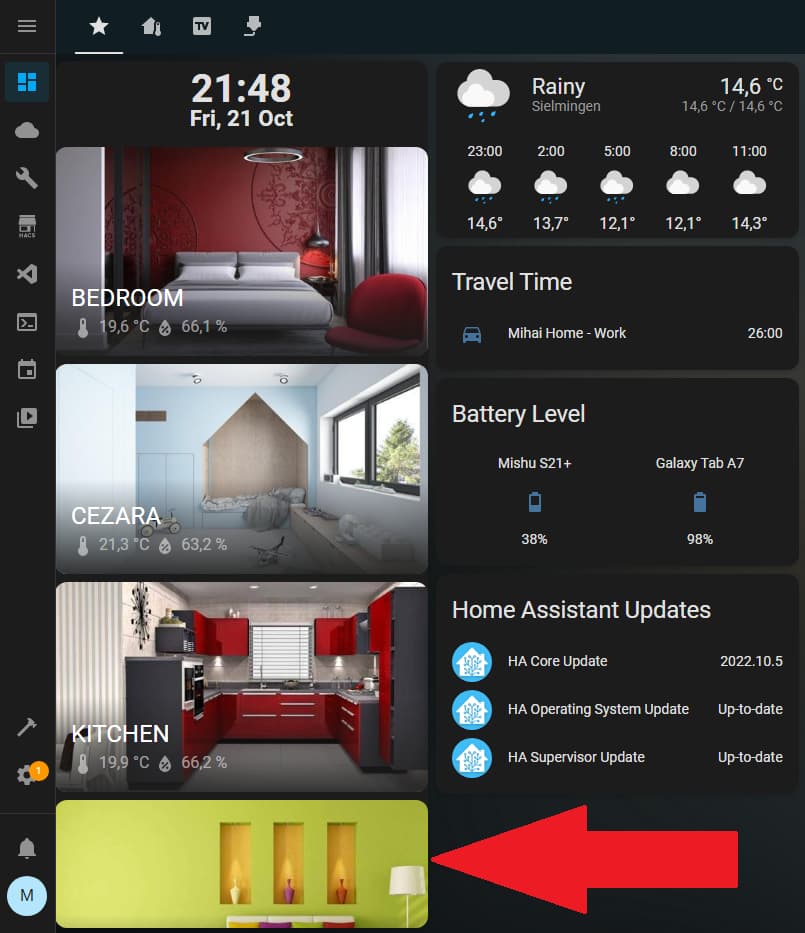
Anyway to achieve the described in the below image?
The thing is having the list wastes a lot of space without providing all the required buttons and makes it impossible to have a consist Sidebar on different devices.
I am trying to move from very custom beginner-mode dashboard to more robust and intuitive one using Mushroom cards.
My original dashboard (for mobile and larger devices Custom icons and entity pictures
moving to something like this:
Main screen (NEW)
GF Screen (NEW)
FF screen (NEW)
One of the bedrooms (NEW)
WIP Info screen (NEW)
I’m using browser_mod to navigate to the “home view url” after my wall tablet has been idle for a time. Though, doing so leaves the custom sidebar menu focus on the wrong item.
Say that I have chosen to view the CCTV view. When idle Home Assistant will run an automation and call browser_mod.navigate to go to the home URL. The home view is shown but the menu item focus will still be on CCTV.
Is there a way to change the menu item focus without the menu item actually being pressed?
Mishu
October 21, 2022, 8:11pm
561
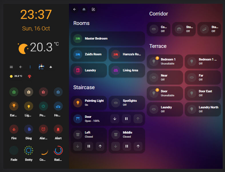
Hello guys, I am trying to resize some cards on my sidebar or the hole sidebar.
sidebar:
      stickyCards:
        - type: custom:digital-clock
        - type: area
          area: dormitor
        - type: area
          area: cezara
        - type: area
          area: kitchen
        - type: area
          area: sufragerie
Do you have some tips?
good afternoon! I’m still relatively new to Home Assistant, so bear with me. Since so many structure and config changes have taken place since this awesome project was created, is the installation still the same? I don’t have a lovelace-ui.yaml file. Do I create one and then put info in there? How do I get rid of the sidebard that is currently there? Also, can I get back to the original sidebar if I needed it for some reason/ Sorry for all the questions…I did give the disclaimer in the beginning, that I’m new
Can you share the themes?
does anyone figure out how to use decluttering-cards inside sidebar?
Tablet view is kinda weird, any way to fix?
Another thing, the spacers on my does not show up…


