Puh thats too much for me.
Can‘t get this even to change color. Display: none is also not working
Also to display the daily values inside the bars i have no idea. I think i need to study this 
Puh thats too much for me.
Can‘t get this even to change color. Display: none is also not working
Also to display the daily values inside the bars i have no idea. I think i need to study this
Another way is to use the delta function if you have a summation delivered on your electricity meters, or you have a Riemann sum. You will get a daily usage breakdown then as it will minus today’s value with yesterday’s
Hello,
So i was trying to make a graph that has both the humidity and the temperture on it and that has the color thresholds has well. Is it possible ? because when i put theme on the same graph the color fonction is not taken into consideration
Thaks for you help
HI all,
I have three entities in my graph card, temp, humidity and battery, but there is only one thermometer icon and there is not really a visible difference between the other entities.
Is there a way to add extra icons with the other entities, at the places of the arrows in the image?
Hi,
is there a hint to get the graph away from the card border? I want to have a little free area and not the lines till the border line?
Thanks, Steffen
Imitating statistics card:

type: custom:mini-graph-card
entities:
  - entity: sensor.xxx
    aggregate_func: max
    name: max
    color: lightblue
  - entity: sensor.xxx
    aggregate_func: median
    name: median
    color: blue
    show_fill: false
  - entity: sensor.xxx
    aggregate_func: min
    name: min
    color: lightblue
...
card_mod:
  style: |
    mask:nth-of-type(2) .fill {
      opacity: 1 !important;
      animation: none;
    }
    .fill--rect:nth-of-type(2) {
      fill: var(--card-background-color);
    }
Note: take into account this issue - [bug] min/max/avg values are wrong for the graph start (before first point).
Hi all.
Maybe I’m doing something wrong but I can’t figure out what.
I have a graph with a temperature from a Netatmo Valvle
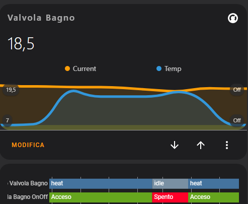
The current and desired temperatures work well.
I want to add the indication about on\off of the valve.
I have create a sensor for the state (idle and heat) and a binary_sensor to mapping idle\heat of sensor in on\off value.
You can see the state on the history below the graph, but I don’t see the state of sensor on graph.
In the image, the yellow line in bottom indicate the sensor, but all with the same colors.
This is my code.
type: custom:mini-graph-card
entities:
  - entity: climate.bagno
    attribute: current_temperature
    name: Current
  - entity: climate.bagno
    attribute: temperature
    name: Temp
  - entity: binary_sensor.stato_valvola_bagno_onoff
    name: Valvola ON
    color: yellow
    unit: ''
    show_state: false
    show_indicator: false
    show_graph: true
    show_line: false
    show_fill: true
    show_points: false
    show_legend: false
    state_adaptive_color: false
    fixed_value: false
    aggregate_func: min
    y_axis: secondary
name: Valvola Bagno
smoothing: true
show:
  labels: true
  labels_secondary: true
state_map:
  - value: 'off'
    label: 'Off'
  - value: 'on'
    label: 'On'
If I add the points_per_hour: 10 to code, I have this result.
I see the off\on state, but the graph is “squared”
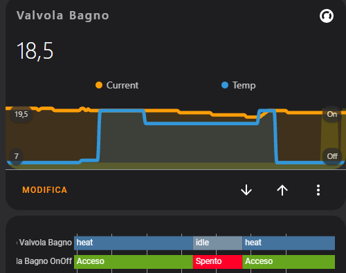
Can you help me?
Should be at least the same as the biggest update interval of displayed sensors.
I usually set it to at least 60 (every minute) to reduce an interpolation effect.
“Squared graph” - create a history-graph and compare.
I have setting points_per_hour: 60 but the result is similar.
The historical and the mini-chart have an identical trend, but I don’t like the “Squared graph”, but the on\off state appears only on this graph type.
I’m probably doing something wrong
I more or less understood how it works.
Unfortunately points_for_hour works on all lines the same way.
The problem is that binary_sensor only have 2 states and go from 0 to 1 immediately, the temperature, for example, no, the movement is gradual. Combining the two doesn’t seem possible.
You have either only “squared” and in this case the binary_sensor are correctly display

or only “curvilinear” graphics which are not good for on / off.

Unclear what you call a “square graph”.
Check this and tell what is a more precise graph for a sensor updating every 30 sec:
type: vertical-stack
cards:
  - type: history-graph
    entities:
      - entity: sensor.xiaomi_cg_1_pm25
    hours_to_show: 1
  - type: custom:mini-graph-card
    entities:
      - entity: sensor.xiaomi_cg_1_pm25
    hours_to_show: 1
  - type: custom:mini-graph-card
    entities:
      - entity: sensor.xiaomi_cg_1_pm25
    hours_to_show: 1
    points_per_hour: 5
    line_width: 1
  - type: custom:mini-graph-card
    entities:
      - entity: sensor.xiaomi_cg_1_pm25
    hours_to_show: 1
    points_per_hour: 120
    line_width: 1
  - type: custom:mini-graph-card
    entities:
      - entity: sensor.xiaomi_cg_1_pm25
    hours_to_show: 1
    points_per_hour: 120
    line_width: 1
    aggregate_func: last
    smoothing: false
People are battling about “2022.11 shows statistical data in more-info - i.e. not precise data, instead of precise history-graph” - and even this “great improvement” has it’s adepts.
It’s clear.
It is clear, but perhaps I have explained myself badly.
The classic graph is the broken line or “interpolate line”, but, for certain type of infomation (temperature for example), the “cubic interpolate” or “akima interpolate”, like this.

it’s just a matter of “visual fulfillment”
I see your point.
Currently there are options like “smoothing”, “points_per_hour”, “aggregate_func” which are related to a presentation. Only the “aggregate_func” option may be defined per entity; others are global.
Probably at least the “smoothing” option could be changed to per entity too. Please create an issue (FR) for this on GitHub if you are interested.
As for “points_per_hour” - I do not see myself any scenarios where it may be different per entity. But anyway - you may create an issue for this option too and please describe cases where it may be useful.
Meanwhile - try to use these options:
smoothing: true (since you like smooth curves),
points_per_hour - define big value like 60 (or even 120) - then probably binary curve will be “square-ish” (as it should be), sensor curve will be “curved”.
BTW - since you have “state_map” for ONE graph, your browser’s log (in code inspector) is full of errors. Check Github for a related issues (this, this) - also see my workaround with using a sensor “0 / 1” instead of “off /on”.
Thanks for the suggests!
I’ll try them
Thank YOU!
I will save your post as a prove that I can speak Italian too ))
could you share your config please?
Thanks in advance!
Sure:
entities:
  - sensor.pi_hole_dns_queries_today
font_size: 85
icon: mdi:magnify
line_color: green
line_width: 1
points_per_hour: 2.5
show:
  average: true
  extrema: true
  graph: bar
name: DNS Queries Today
type: custom:mini-graph-card
Very nice card!
Can you share the code?
Hi,
Question, is it possible to show also the min/max/avrg of the second entity?

Here you go…
type: custom:mini-graph-card
name: Woonkamer
align_icon: left
align_header: left
show:
  extrema: true
  average: true
entities:
  - entity: sensor.woonkamer_temperature
  - entity: sensor.woonkamer_humidity
    show_graph: false
    show_state: true
  - entity: sensor.woonkamer_battery
    show_graph: false
    show_state: true
  - color: gray
    entity: sensor.nightstate
    name: Night
    show_legend: false
    show_line: false
    show_points: false
    y_axis: secondary


