Any idea how to convert unit values in example this one to mm/h:

Same for the weather from mph to kmh.
Have a ecowitt weather station and would be nice to have some graphics.
Any idea how to convert unit values in example this one to mm/h:
Same for the weather from mph to kmh.
Have a ecowitt weather station and would be nice to have some graphics.
Create template sensors with converted units.
Or, if this integration supports changing units - select required units in corresponding settings for this platform.
Hello,
is it possible to change the Icon Color or the Background of a Card Based on entity stat.
In my case i “set up” a graph for a socket and when i tap the card the machine turns on and off.
Now i want to show the Status from the ON/OFF Swicht in card. So my Idea were to change the color of the icon or the Background, but i dont know if this is possible?
I am not good at coding  .
.
Here is my code for my card.
type: custom:mini-graph-card
name: La Pavoni
icon: mdi:coffee


tap_action:
  action: call-service
  service: switch.toggle
  service_data:
    entity_id: switch.socket_isomactea
entities:
    - entity: sensor.socket_isomactea_energy_power
      name: now
    - entity: sensor.socket_isomactea_energy_today
      name: today
      show_state: true
      show_indicator: true
      show_graph: false
    - entity: sensor.socket_isomactea_energy_yesterday
      name: yesterday
      show_state: true
      show_indicator: true
      show_graph: false
hours_to_show: 24
line_width: 3
hour24: true
aggregate_func: max
height: 50
Possible with card-mod.
Go to card-mod thread - 1st post - link at the bottom - styles for this card
You will have to )
Example of making a card more compact when used in a horizontal stack or a grid.
Consider this code:
type: vertical-stack
cards:
  - type: horizontal-stack
    cards:
      - &ref_card
        type: custom:mini-graph-card
        entities:
          - entity: sensor.processor_use
        hours_to_show: 1
        points_per_hour: 60
        show:
          state: true
      - *ref_card
      - *ref_card
  - type: grid
    square: false
    cards:
      - *ref_card
      - *ref_card
      - *ref_card
  - type: grid
    columns: 4
    square: false
    cards:
      - *ref_card
      - *ref_card
      - *ref_card
      - *ref_card
which gives this card:

Add some styles:
type: vertical-stack
cards:
  - type: horizontal-stack
    cards:
      - &ref_card
        type: custom:mini-graph-card
        entities:
          - entity: sensor.processor_use
        hours_to_show: 1
        font_size: 50
        points_per_hour: 60
        show:
          state: true
        card_mod:
          style: |
            .name {
              font-size: 10px;
            }
            .header {
              padding-bottom: 0px;
            }
            .states {
              padding-bottom: 0px;
            }
            ha-card {
              height: 100px !important;
              padding-top: 4px !important;
            }
      - *ref_card
      - *ref_card
  - type: grid
    square: false
    cards:
      - *ref_card
      - *ref_card
      - *ref_card
  - type: grid
    columns: 4
    square: false
    cards:
      - *ref_card
      - *ref_card
      - *ref_card
      - *ref_card
and get this more compact view:

Hi to all, i’m using this awesome mod for display time of my Heather stay on.
I created a sensor with hystory stats that is displayed in hour and minuts, but in the graph the result Is wrong because for him minutes ar 100 not 60.
For example if the correct value Is 4h20 minutes, in the graph Is displayed 4h34 minutes.
Thanks for some solution
Post:
Hi all,
I would like to add an icon (battery) next to the temperature to show the battery level of this probe?
Or an other place in this card, and maybe more and more icon to show state of heating, cooling,… everything in same card.

type: custom:mini-graph-card
name: Température 24h
icon: mdi:home-thermometer-outline
entities:
  - entity: sensor.temperature_11
    name: Séjour
    show_state: true
  - entity: sensor.temperature_8
    name: Extérieur
    show_state: true
    y_axis: secondary
hours_to_show: 24
points_per_hour: 2
hour24: true
line_width: 2
show:
  labels: true
  name: true
  icon: true
  labels_secondary: true
Any one know how do this?
Thanks
wow, nice indeed!
I threw all graphs in asingle grid 3, and would love to set the colors in the main anchor… havent been able to find a way to do that. can we at all?
type: grid
columns: 3
square: false
cards:
  - <<: &graph
      type: custom:mini-graph-card
      card_mod:
        style: |
          .name {
            font-size: 10px;
          }
          .header {
            padding-bottom: 0px;
          }
          .states {
            padding-bottom: 0px;
            font-size: 6px;
          }
          ha-card {
            height: 100px !important;
            padding-top: 4px !important;
          }
      hours_to_show: 4
      font_size: 50
      points_per_hour: 30
      show:
        icon: false
        state: true
        legend: false
        fill: fade
    name: Living
    entities:
      - entity: sensor.temperatuur_living
        color: gold # <-- move to main config?
      - entity: sensor.luchtvochtigheid_living
        color: blue # move to main config?
        y_axis: secondary
was looking for a primary graph and secondary graph color (or axis maybe?), so we could add that to the anchor, and not have to repeat the on all entities individually
a bit like we can do:
labels_secondary: true
Probably best suited for a decluttering-card.
solution
yup:
default:
  graph: line

card:
  type: custom:mini-graph-card
  card_mod:
    style: |
      .name {
        font-size: 10px;
      }
      .header {
        padding-bottom: 0px;
      }
      .states {
        padding-bottom: 0px;
        font-size: 6px;
      }
      ha-card {
        height: 100px !important;
        padding-top: 4px !important;
      }
  hours_to_show: 4
  font_size: 50
  points_per_hour: 30
  show:
    graph: '[[graph]]'
    icon: false
    state: true
    legend: false
    fill: fade
    animate: true
  name: '[[name]]'
  entities:
    - entity: '[[sensor1]]'
      color: gold
    - entity: '[[sensor2]]'
      y_axis: secondary
and card config in dashboard:
type: grid
columns: 2
square: false
cards:
  - type: custom:decluttering-card
    template: temp_humidity_graph
    variables:
      - graph: bar
      - name: Living
      - sensor1: sensor.temperatuur_living
      - sensor2: sensor.luchtvochtigheid_living

  - type: custom:decluttering-card
    template: temp_humidity_graph
    variables:
      - name: Masters
      - sensor1: sensor.master_bedroom_hygro_temp_temperature
      - sensor2: sensor.master_bedroom_hygro_temp_humidity

  - type: custom:decluttering-card
    template: temp_humidity_graph
    variables:
     etc etc
very nice indeed, thanks!
sensor:
  - platform: history_stats
    name: Contaore Caldaia
    entity_id: switch.shelly1_e09xxxx
    state: "on"
    type: time
    start: "{{ now().replace(hour=0, minute=0, second=0, microsecond=0) }}"
    end: "{{ now() }}"
    - type: custom:mini-graph-card
      entities:
        - entity: sensor.contaore_caldaia
          color: red
      name: Tempo accensione Caldaia
      hours_to_show: 168
      aggregate_func: max
      group_by: date
      font_size_header: 14
      animate: true
      show:
        graph: bar
        icon: false
not sure my setup above works as expected…
after hovering a bit, the graphs seem to change and all show the same graph…
reloading the view brings back the correct graphs:
seems we have another cluttering anomaly?
Tell me how to disable all these marks, as it is done in the standard functionality

what am I overlooking here… trying to approach the bar-card graph in this screenshot (above) with the maintained mini-graph-card (below), I cant seem to find the correct syntax for coloring the bars:
  - type: custom:mini-graph-card
    name: Kans op zon
    show:
      graph: bar
    hours_to_show: 1
    color_thresholds:
      - color: '#808080' #grey
        value: 25
      - color: '#87ceeb' #skyblue
        value: 50
      - color: '#ffd700' #gold
        value: 100
    entities:
      - sensor.buienradar_sunchance_1d
      - sensor.buienradar_sunchance_2d
      - sensor.buienradar_sunchance_3d
      - sensor.buienradar_sunchance_4d
      - sensor.buienradar_sunchance_5d
as can be seen, the graphs value seems to be ok, and hovering those bars indeed show the correct % of chance.
the colors wont be picked though.
any sharp eyes spotting my error please?
_update-
found it… I was using the number as per limit, while it is the lower limit.:
    color_thresholds:
      - value: 0
        color: grey
      - value: 26
        color: skyblue
      - value: 51
        color: gold
makes it happen. never mind me…
would be nice of we somehow can use the name inside the bar. and make the graphs just that bit more illustrative of their meaning.
first though trying t figure out why this config is terribly slow in rendering.(when used on a view with another mini-graph-card and an apexcharts card…commenting those out makes the world of difference)
I’m using the mini graph card with my Nest thermostats and I love the way it looks. I was previously using the standard graph card. The only thing I want to try and add to the mini graph is the state (heating/cooling) on the same timeline similar to what the standard graph does.
Something like this
Something similar to how this example looks. Hopefully be able to tint the shaded area with either red or blue for heating or cooling.
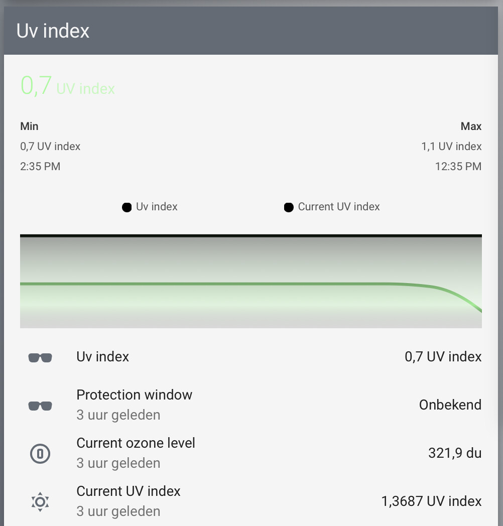
anyone understands why I see black line and legends?
type: entities
title: Uv index
card_mod:
  class: class-header-margin
entities:
  - type: custom:mini-graph-card
    card_mod:
      style: |
        ha-card {
          box-shadow: none;
          margin: -8px -16px 0px -16px;
        }
    entities:
      - entity: sensor.openweathermap_uv_index
        state_adaptive_color: true
      - entity: sensor.current_uv_index
        state_adaptive_color: true
    height: 100
    line_width: 3
    font_size: 75
    show:
      fill: fade
      extrema: true
      icon: false
      name: false
#       name_adaptive_color: true
    color_thresholds:
      - value: 0
        color: palegreen
      - value: 1
        color: lightgreen
      - value: 2
        color: green
      - value: 3
        color: gold
      - value: 4
        color: orange
      - value: 5
        color: darkorange
      - value: 6
        color: orangered
      - value: 7
        color: red
      - value: 8
        color: crimson
      - value: 9
        color: firebrick
      - value: 10
        color: darkred
      - value: 11
        color: maroon
if I hover the graph the colors are reflected in the points:
I was about to post about the same issue. I have color thresholds set, yet the line shows solid color, but when I hover, the points show appropriate color thresholds.

Same problem here, couldn’t find a way.
Hi,
i am using the following config:
type: custom:mini-graph-card
entities:
  - entity: sensor.ep500p_dc_input_power
name: PV Power
hours_to_show: 168
points_per_hour: 60
show:
  graph: bar
  extrema: true
This shows the following chart.
The MAX: tells me that the max was at Sun 26 with 2397 W.
Sun 26 is the second hill in the chart and if I hover the mouse over it I get 1472,8W. (see Screenshot)
But according to the bars the highest bar is the forth hill which is the 28th.
If I put the mouse over the highest bar (the 28th) it shows me a value of 1944,67W.
I increased the “points_per_hour” to 60 to have a better resolution, but the result is still the same.
Any idea what could be wrong ???