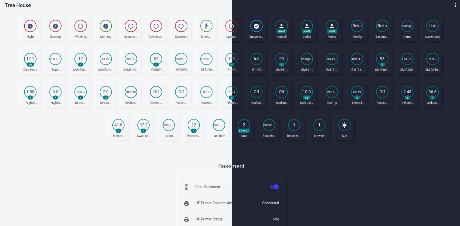
I replied down below.
Based on what you previously posted:
card:
  entity: sensor.frigate_coral_fps
  graph: line
  style: |
    ha-card {
      background-color: var(--primary-background-color);
      border-radius: 15px;
      box-shadow: {% if is_state('sun.sun', 'above_horizon') %}
          -8px -8px 8px 0 rgba(255,255,255,.5),8px 8px 8px 0 rgba(0,0,0,.03);
        {% else %}
          -8px -8px 8px 0 rgba(50, 50, 50,.5),8px 8px 8px 0 rgba(0,0,0,.15);
        {% endif %}
    }
  type: sensor
style: |
  ha-card {
    margin: 10px;
  }
type: 'custom:mod-card'

I just tried it, the bottom part of the card is still not rounded.
@invinciberry Could you try this part to look like:
      box-shadow:
        {% if is_state('sun.sun', 'above_horizon') %}
          -8px -8px 8px 0 rgba(255,255,255,.5),8px 8px 8px 0 rgba(0,0,0,.03);
        {% else %}
          -8px -8px 8px 0 rgba(50, 50, 50,.5),8px 8px 8px 0 rgba(0,0,0,.15);
        {% endif %}
You could also try mini graph card.
1 Like
It works! Thanks!
1 Like
Self-promotion (for the sake of it): I made some themes based off of JuanMTech’s, but I added soft UI styling.
Features:
- Can instantly add soft-ui to an auto-generated dashboard, without needing to edit it (and disable auto-generation).
- Works with auto-generated dashboards and handmade ones
- Works with badges
- Gives cards in dashboards and cards everywhere soft UI
- Adds a compact header with no work required
They’re available as default HACS repos. Here’s the links on GitHub:
2 Likes
@N-l1 I noticed you put your old automations in a singular new one. I tried it but it gives me an error:
Says missed a comma in this line: {% if states('sun.sun') == "above_horizon" %}
I just don’t see the error though. I’m sure you do 
Good work, it certainly adds a bit of flair to cards. I just started making my remote card.
I few more color choices would be nice though.

I’ve updated the automation to use the new choose feature instead of using templates, should work now (if you are on >= 0.113)
1 Like
Thanks! I have a slightly shorter version:
- id: set_theme
  alias: "Set theme"
  initial_state: 'on'
  trigger:
    - platform: homeassistant
      event: start
    - platform: sun
      event: sunrise
    - platform: sun
      event: sunset
  action:
    - choose:
      - conditions:
          - condition: state
            entity_id: sun.sun
            state: 'below_horizon'
        sequence:
          - service: frontend.set_theme
            data:
              name: "Google Dark Theme"
      default:
        - service: frontend.set_theme
          data:
            name: "Google Light Theme"
1 Like

N-L1 already updated the code, but basically instead of
--paper-card-background-color
use one of these:
--ha-card-background
--card-background-color
background-color
To make this easier, open the raw config editor, move it into another text editor and do a find/replace.
1 Like
Amazing thanks!
I may just install this lovelace. I like simple.
This looks amazing - between everyone’s hard work and little bit of personal tweaking my dashboard is looking super slick.
15 Likes
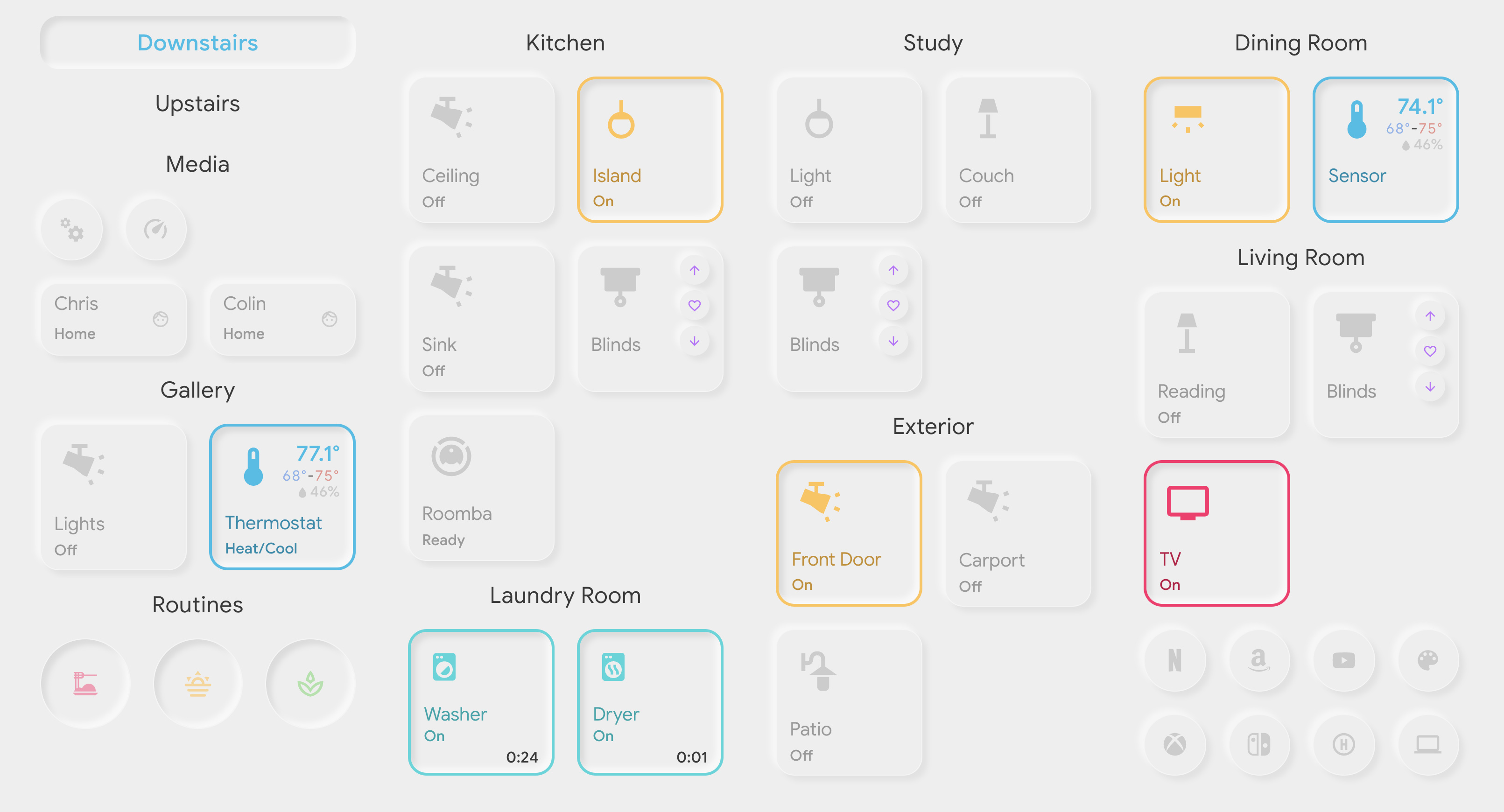
Great, very nice! How did you color the border around your cards?
Thanks! – Almost my entire dashboard is built with custom button cards and I make heavy use of templates. In some ways this probably makes things harder than they need to be, but my previous setup was already setup this way.
Light entities point to a ‘light’ template that says to change the border when the state is on. And my other entities that require different colors in my set up also have their own template(s).
Lovelace yaml entry:
- entity: switch.kitchen_overhead
  icon: 'mdi:track-light'
  name: Ceiling
  template: light
  type: 'custom:button-card'
And my button template is as follows:
button_card_templates:
  light:
    template: base
    state:
      - value: 'on'
        styles:
          card: [border-color: var(--primary-yellow), border-width: 3px, box-shadow: var(--ha-card-box-shadow-inset)]
          icon: [color: var(--primary-yellow)]
          state: [color: var(--dark-primary-yellow)]
          name: [color: var(--dark-primary-yellow)]
3 Likes


Possible causes:
- Card-mod is uninstalled
- You aren’t using the right styling code - make sure to choose the right style code based on your HA version
- You’re using the night theme during daytime. If you always use dark mode, just use that for the shadows.
Another self-promotion: if you use the theme(s) I made, the shadows should match the theme automatically…