Yes, exactly that. So I can control the starting time of an automation from the frontend.
Sure, but just to reiterate what @petro said - this is a generic card for setting an input_datetime. So don’t expect it to do the automations for you 
Here’s an example in yaml:
# Create input_datetime.
input_datetime:
  alarm_time:
    name: Wake up time
    has_date: false
    has_time: true

# Create a time sensor, so you can use it in automations:
sensor:
  - platform: time_date
    display_options:
      - "time"

# Automation that triggers at the time specified by input_datetime.alarm_time
automation:
  - alias: wake up
    trigger:
      platform: template
      value_template: "{{ states('sensor.time') == states('input_datetime.alarm_time')[0:5] }}"
    action:
       - service: media_player.select_source
         data:
           entity_id: media_player.bedroom
           source: "Wake Up Playlist"
Then, you can use this card to change input_datetime.alarm_time - put this in your lovelace config:
type: custom:time-picker-card
entity: input_datetime.alarm_time
1 Like
By that I take it you mean tight jeans with joggers right? 
1 Like
Do you have to use the themes set in your card? Or at least make them optional?
What happens if you just leave any themes out of your card and let the system decide the theme?
You don’t have to set any themes.
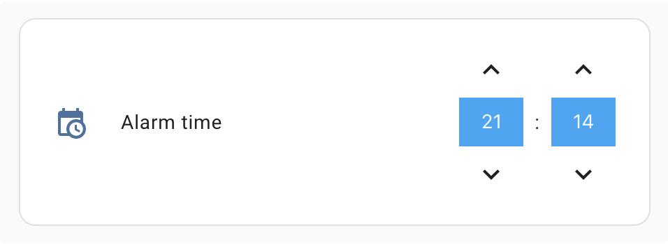
This is how the card looks without any theme customization, with the default Lovelace theme:


Ah, OK.
That wasn’t clear from the docs. Also not clear from the docs is if you can select a theme and how to do it if you can.
On a related note, I suggest using ‘–disabled-text-color’ for the unselected AM/PM option and use the primary color for the one that is selected. I think that would make it more obvious which one is selected.
Right now the accent color being used for the selected value is kind of visually jarring. And since the times use the primary color then the everything that is currently active would all be the same color.
@finity, I think using --disabled-text-color is a great idea, thanks! I just released v 0.0.4 using that.
Here are some screenshots after the update:


I’m not sure where the confusion for the themes is coming from. I added this to the doc, hope it clears things up:
Time Picker card will automatically pick up colors from your lovelace theme, but if you want to customize some of them, you can use the following theme variables
1 Like
I’m glad you liked that idea.
The reason for the theme confusion is that you don’t show any way to incorporate those theme variables into your card setup.
You have an example of a card config but none to show how the variables are used.
Again, unless I’m completely missing something.
Theme variables are usually setup in your theme config, not in the card config. Say you’re using a custom theme like noctis, you can add theme variables to the theme yaml file.
For example, noctis changes the theme variables for mini-media-player by default.
You can do the same to customize Time Picker card, for example adding:
time-picker-elements-background-color: 'var(--background-color)'
to your theme.yaml file will change the corresponding colors.
Hmmm…
I never knew that was available in the theme file itself. Good to know.
I’ve created a few lovelace control rows for various items and I just coded the custom themes directly into my “card” config.
See here for an example:
In my mind it makes more sense to configure those variables at the card level instead of the theme file level. That way all of the config for the card is all in the same place instead of being spread out between the card config and multiple theme files.
Yup, I think both approaches are valid and it’s a matter of preference.
For example, mini-media-player and banner-card use theme variables, and button-card and mini-graph-card use your approach with custom config in the card. And custom-header uses both 
The drawback of your approach is that if you want to change the card everywhere you use it, you have to either use some kind of template, or copy-paste the config everywhere.
The drawback of mine is it’s a bit harder to change it in a single place. If you have card-mod installed, you can set the variables in the card config like this:
type: custom:time-picker-card
entity: input_datetime.alarm_time
style: |
  :host {
    --time-picker-icon-color: red
  }
2 Likes
Yeah, I agree.
It would probably be helpful (since I now know there is more than one way…  ) for you to give a summary of how to do that in the docs for your card.
Kind of like you did for me here. 
I’ve been a HA user for several years and didn’t know about that so I’m sure new users would have no idea what you are talking about or how to do it.
Good card, BTW. I’m sure I’ll find a use for it. I’ve already got it installed and playing around with it a bit.
1 Like
Is there anyway to increase the size of the card? Mine isn’t that large on screen, and it would be good to make use of more of the width.
Currently the card behaves like a default lovelace card - it’ll take as much space horizontally as it can (within the column), and fixed space vertically.
Do you want to increase the amount of space the card takes or the size of the buttons/inputs in the card?

1 Like
I think what’s happening here is the card is expanding, but you’re not seeing it, because stack-in-card hides the box-shadow.
What’s happening is something similar to this.
How would you expect the card to look in this case?
Ah OK, yeah I did hide the box shadow so you’re probably right. Would be good to make it a bit wider though.
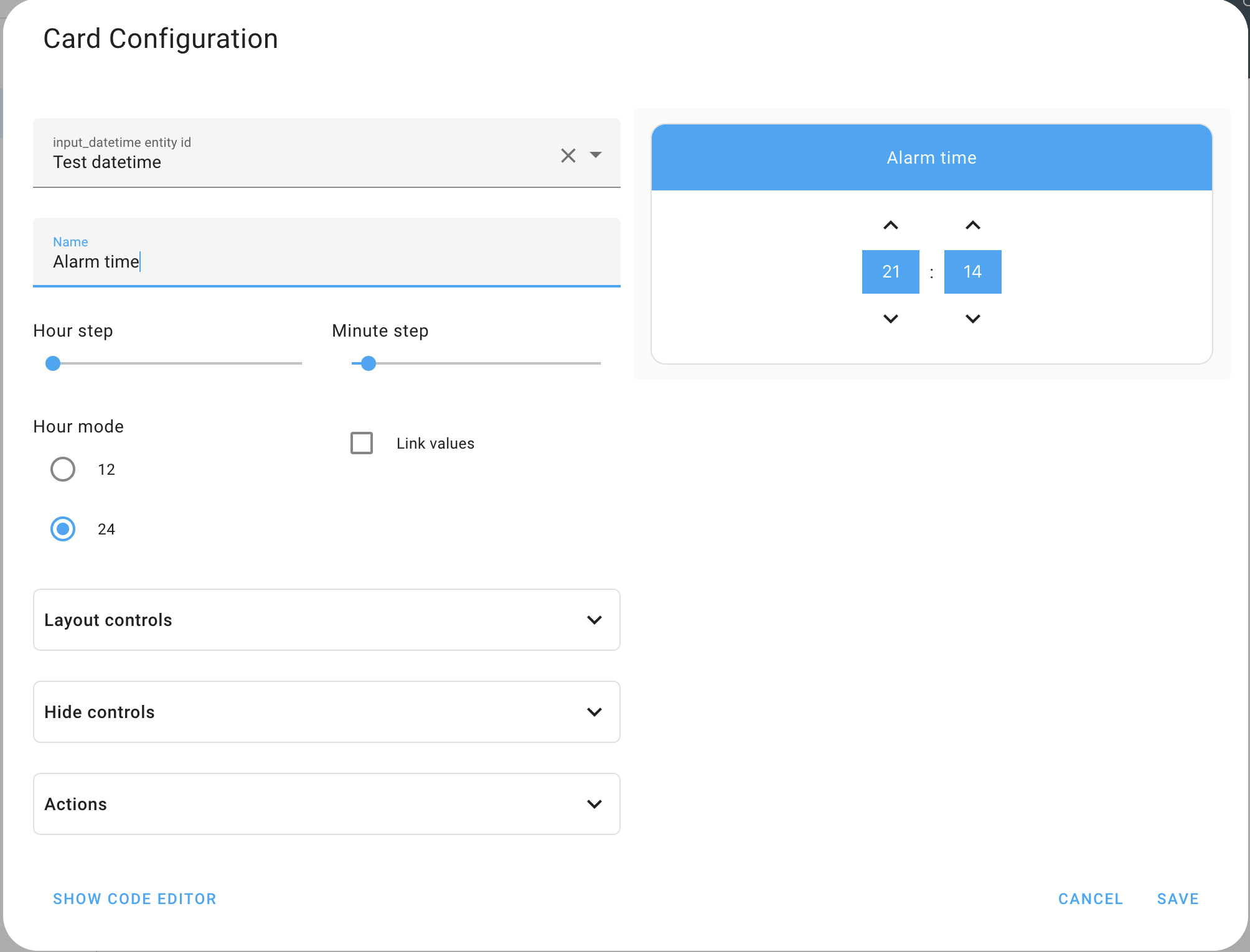
Just released version 0.1.0!
Some changes since my initial post:
- The card now has a Visual Editor.
- Additional layout configurations. You can change how the name and the controls are displayed.
To see all options go to the Github repo or try the visual editor
1 Like
I really don’t understand why it has taken this long for something this simple to arrive but I am very happy. It’s simple but does what it needs to do. Great work!
1 Like
This is great. I’ve already included it in my Irrigation System!
Thanks!
1 Like