Have you tried with “/primary_bedroom” ?
Hi, thanks for this awesome Theme.
I am struggling with the graph_card and my co2 sensor.
Is it possible to change the ulm_card_graph_color: “var(–google-green)” depending on the sensor value? Like => 1000ppm color is yellow => 2000ppm orange => 3000ppm red
Thx in advance
Me again.
I am using the new Adaptive Dashboard.
And i have a question about chips
Is it possible to use a horizontal stack with grid template columns and put multiple chips in one column?

You should try the “power details” graph card:
https://ui-lovelace-minimalist.github.io/UI/usage/custom_cards/custom_card_damix48_power_details/
1 Like
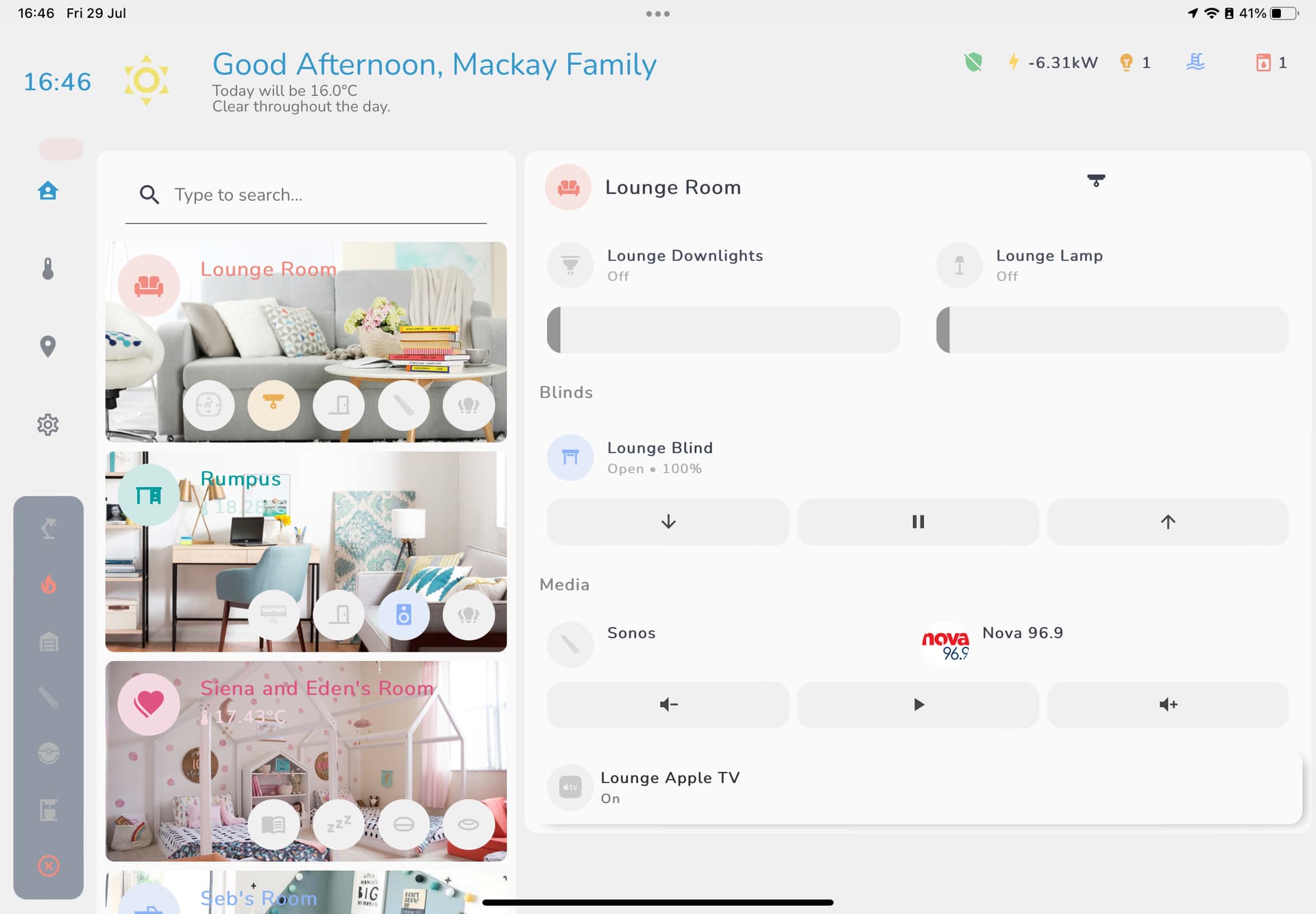
Starting to think about a tablet dashboard using minimalist as the base, has anyone got any inspirations to share of their own design?!?!?
@basbrus I’m revisiting this. I added the code as you suggested but still can’t seem to get the room popups to work. I also tried with the stock room card and it was the same result. Hoping you (or anyone that has been able to get this working) can help me figure out what I did wrong.
When double clicking the room card it does indeed change the input on the input_select to the room it should be so that appears to be working.

Below are the yaml’s
adaptive-ui.yaml
---
button_card_templates: !include_dir_merge_named "../../../custom_components/ui_lovelace_minimalist/__ui_minimalist__/ulm_templates/"

title: "UI Lovelace Minimalist"
theme: "minimalist-desktop"
background: "var(--background-image)"
views:
  - type: "custom:grid-layout"
    title: "home"
    icon: "mdi:home"
    background: >-
      center / cover no-repeat
      url("/local/images/chamleon.jpg")
      fixed
    path: "0"
    layout:
      grid-template-columns: "1fr 1fr"
      grid-template-rows: "min-content"
      grid-template-areas: |
        "home popup"
      mediaquery:
        "(max-width: 1100px), (orientation: portrait)":
          grid-template-columns: "100%"
          grid-template-areas: "home"
    cards:
      - !include "views/home.yaml"
      - !include "popup/popup.yaml"

  - type: "custom:grid-layout"
    title: "Kitchen"
    icon: "mdi:silverware-fork-knife"
    path: "Kitchen"
    background: >-
      center / cover no-repeat
      url("/local/images/green.jpg")
      fixed
    layout:
      grid-template-columns: "1fr 1fr"
      grid-template-rows: "min-content"
      grid-template-areas: |
        "kitchen popup"
      mediaquery:
        "(max-width: 1100px), (orientation: portrait)":
          grid-template-columns: "100%"
          grid-template-areas: "kitchen"
    cards:
      - !include "views/kitchen.yaml"
      - !include "popup/popup.yaml"

  - type: "custom:grid-layout"
    title: "Entry"
    icon: "mdi:door"
    path: "Entry"
    background: >-
      center / cover no-repeat
      url("/local/images/light_blue.jpg")
      fixed
    layout:
      grid-template-columns: "1fr 1fr"
      grid-template-rows: "min-content"
      grid-template-areas: |
        "entry popup"
      mediaquery:
        "(max-width: 1100px), (orientation: portrait)":
          grid-template-columns: "100%"
          grid-template-areas: "entry"
    cards:
      - !include "views/entry.yaml"
      - !include "popup/popup.yaml"

  - type: "custom:grid-layout"
    title: "Livingroom"
    icon: "mdi:sofa"
    path: "Livingroom"
    background: >-
      center / cover no-repeat
      url("/local/images/purple.jpg")
      fixed
    layout:
      grid-template-columns: "1fr 1fr"
      grid-template-rows: "min-content"
      grid-template-areas: |
        "livingroom popup"
      mediaquery:
        "(max-width: 1100px), (orientation: portrait)":
          grid-template-columns: "100%"
          grid-template-areas: "livingroom"
    cards:
      - !include "views/livingroom.yaml"
      - !include "popup/popup.yaml"

  - type: "custom:grid-layout"
    title: "Master"
    icon: "mdi:bed"
    path: "Master"
    background: >-
      center / cover no-repeat
      url("/local/images/violet.png")
      fixed
    layout:
      grid-template-columns: "1fr 1fr"
      grid-template-rows: "min-content"
      grid-template-areas: |
        "master popup"
      mediaquery:
        "(max-width: 1100px), (orientation: portrait)":
          grid-template-columns: "100%"
          grid-template-areas: "master"
    cards:
      - !include "views/master.yaml"
      - !include "popup/popup.yaml"

  - type: "custom:grid-layout"
    title: "Garage"
    icon: "mdi:garage"
    path: "Garage"
    background: >-
      center / cover no-repeat
      url("/local/images/grey.jpg")
      fixed
    layout:
      grid-template-columns: "1fr 1fr"
      grid-template-rows: "min-content"
      grid-template-areas: |
        "garage popup"
      mediaquery:
        "(max-width: 1100px), (orientation: portrait)":
          grid-template-columns: "100%"
          grid-template-areas: "garage"
    cards:
      - !include "views/garage.yaml"
      - !include "popup/popup.yaml"

  - type: "custom:grid-layout"
    title: "Network"
    icon: "mdi:lan"
    path: "Network"
    background: >-
      center / cover no-repeat
      url("/local/images/grey.jpg")
      fixed
    layout:
      grid-template-columns: "1fr 1fr"
      grid-template-rows: "min-content"
      grid-template-areas: |
        "network popup"
      mediaquery:
        "(max-width: 1100px), (orientation: portrait)":
          grid-template-columns: "100%"
          grid-template-areas: "network"
    cards:
      - !include "views/network.yaml"
      - !include "popup/popup.yaml"
popup.yaml
type: custom:state-switch
view_layout:
  grid-area: popup
  show:
    mediaquery: "(min-width: 1100px)"
entity: input_select.minimalist_ui_switch # put your input_select here
default: default
transition: slide-down
transition_time: 500
states:
  ## Lights
  light 1:
    type: "custom:button-card"
    template: "popup_light_brightness"
    variables:
      ulm_popup_light_entity: "light.lamps"

  light 2:
    type: "custom:button-card"
    template: "popup_light_brightness"
    variables:
      ulm_popup_light_entity: "light.master_fan_light"

  light 3:
    type: "custom:button-card"
    template: "popup_light_brightness"
    variables:
      ulm_popup_light_entity: "light.dining_room_light"

  light 4:
    type: "custom:button-card"
    template: "popup_light_brightness"
    variables:
      ulm_popup_light_entity: "light.entry_fan_light"

  light 5:
    type: "custom:button-card"
    template: "popup_light_brightness"
    variables:
      ulm_popup_light_entity: "light.table_lamp"

  light 6:
    type: "custom:button-card"
    template: "popup_light_brightness"
    variables:
      ulm_popup_light_entity: "light.living_room_light"

  light 11:
    type: "custom:button-card"
    template: "popup_light_brightness"
    variables:
      ulm_popup_light_entity: "light.master_light_strip"

###  Mediaplayers
  mediaplayer 1:
    type: "custom:button-card"
    template: "popup_media_player_infos"
    variables:
      ulm_popup_media_player_entity: media_player.living_room_tv

  mediaplayer 2:
    type: "custom:button-card"
    template: "popup_media_player_infos"
    variables:
      ulm_popup_media_player_entity:  media_player.chromecast

  mediaplayer 3:
    type: "custom:button-card"
    template: "popup_media_player_infos"
    variables:
      ulm_popup_media_player_entity:  media_player.roku

# Add livingroom popup to popup.yaml
kitchen: !include "../views/kitchen.yaml"
entry: !include "../views/entry.yaml"
livingroom: !include "../views/livingroom.yaml"
master: !include "../views/master.yaml"
garage: !include "../views/garage.yaml"
network: !include "../views/network.yaml"
home.yaml
---
type: "custom:layout-card"
layout_type: "custom:grid-layout"
layout:
  # Tablet portrait
  grid-template-columns: "1fr 1fr 1fr 1fr"
  grid-template-areas: |
    "welcome welcome welcome welcome"
    "person1 person2 person3 ."
    "title1 title1 . ."
    "card1 card1 card2 card2"
    "card3 card3 card4 card4"
    "card5 card5 card6 card6"
    "card7 card7 card8 card8"
#    "card9 card9 . ."

  mediaquery:
    # Mobile
    "(max-width: 800px)":
      grid-template-columns: "1fr 1fr"
      grid-template-areas: |
        "welcome welcome"
        "person1 person2"
        "person3 ."
        "title1 title1"
        "card1 card2"
        "card3 card4"
        "card5 card6"
        "card7 card8"
view_layout:
  grid-area: "home"
cards:
#welcome card
  - view_layout:
      grid-area: "welcome"
    type: "custom:button-card"
    template: "card_esh_welcome"
    entity: input_boolean.welcome_toggle
    triggers_update: "input_boolean.welcome_toggle"
    variables:
      ulm_card_esh_welcome_collapse: input_boolean.welcome_toggle
      ulm_weather: "weather.home"
      entity_1:
        nav: "/config/integrations"
        icon: "mdi:devices"
        name: "Integration"
        color: "blue"
      entity_2:
        nav: "/45df7312_zigbee2mqtt/dashboard"
        icon: "mdi:zigbee"
        name: "Zigbee"
        color: "yellow"
      entity_3:
        nav: "/config/devices/dashboard?historyBack=1&config_entry=f39501df7cad46dc2f3eb529a85ff8ac"
        icon: "mdi:z-wave"
        name: "Z-wave"
        color: "green"
      entity_4:
        nav: "/config/automation/dashboard"
        icon: "mdi:robot"
        name: "Automations"
        color: "purple"
      entity_5:
        nav: "/hacs/entry"
        icon: "mdi:skull-crossbones"
        name: "HACS"
        color: "red"

#title
  - view_layout:
      grid-area: "title1"
    type: "custom:button-card"
    template: "card_title"
    label: "Rooms"

#room cards
  - view_layout:
      grid-area: "card1"
    type: 'custom:button-card'
    template:
      - card_esh_room
      - blue
    entity: switch.kitchen_light
    name: Kitchen
    icon: mdi:silverware-fork-knife
    tap_action:
      action: navigate
      navigation_path: 'Kitchen'
    variables:
      ulm_custom_card_esh_room_light_entity: switch.kitchen_light
    label: '[[[ return "🌡️ " + states["sensor.kitchen_temp"].state + "°F" ]]]'

  - view_layout:
      grid-area: "card2"
    type: 'custom:button-card'
    template:
      - card_esh_room
      - blue
    entity: switch.entry_light
    name: Entry
    icon: mdi:door-open
    tap_action:
      action: navigate
      navigation_path: 'Entry'
    variables:
      ulm_custom_card_esh_room_light_entity: switch.entry_light
    label: '[[[ return "🌡️ " + states["sensor.living_room_temp"].state + "°F" ]]]'

  - view_layout:
      grid-area: "card3"
    type: 'custom:button-card'
    template:
      - card_esh_room
      - blue
    entity: light.living_room_light
    name: Living room
    icon: mdi:sofa
    tap_action:
      action: navigate
      navigation_path: 'Livingroom'
    variables:
      ulm_custom_card_esh_room_light_entity: light.living_room_light
      ulm_input_select_option: livingroom
      ulm_input_select: input_select.minimalist_ui_switch
    label: '[[[ return "🌡️ " + states["sensor.living_room_temp"].state + "°F" ]]]'

  - view_layout:
      grid-area: "card6"
    type: 'custom:button-card'
    template:
      - card_esh_room
      - blue
    entity: light.master_fan_light
    name: Master
    icon: mdi:bed
    tap_action:
      action: navigate
      navigation_path: 'Master'
    variables:
      ulm_custom_card_esh_room_light_entity: light.master_fan_light
      ulm_input_select_option: master
      ulm_input_select: input_select.minimalist_ui_switch
      label: '[[[ return "🌡️ " + states["sensor.master_temp"].state + "°F" ]]]'


  - view_layout:
      grid-area: "card7"
    type: 'custom:button-card'
    template:
      - card_esh_room
      - blue
    entity: cover.garage_door
    name: Garage
    icon: mdi:garage
    tap_action:
      action: navigate
      navigation_path: 'Garage'
    variables:
      ulm_custom_card_esh_room_light_entity: cover.garage_door
    label: '[[[ return "🌡️ " + states["sensor.garage_temp"].state + "°F" ]]]'

  - view_layout:
      grid-area: "card8"
    type: 'custom:button-card'
    template:
      - card_esh_room
      - blue
#    entity: switch.router
    name: Network
    icon: mdi:lan
    tap_action:
      action: navigate
      navigation_path: 'Network'
    variables:
#      ulm_custom_card_esh_room_light_entity: switch.router
      ulm_input_select_option: network
      ulm_input_select: input_select.minimalist_ui_switch

#person cards
  - view_layout:
      grid-area: "person1"
    type: "custom:button-card"
    template: custom_card_imswel_person
    variables:
      ulm_card_imswel_person_entity: person.rob
      ulm_card_imswel_person_wifi_tracker: device_tracker.wifi_rob_phone
      ulm_card_imswel_person_gps_tracker: device_tracker.rob_pixel
      ulm_card_imswel_person_findmy_script: script.find_my_phone
      ulm_card_imswel_person_use_entity_picture: false
      ulm_card_imswel_person_zones:
        - zone.work
        - zone.mtbing
        - zone.mtbing_2
All rooms are setup the same so here is an example of the master bed room
---
type: "custom:layout-card"
layout_type: "custom:grid-layout"
layout:
  grid-template-rows: "min-content"
  grid-template-columns: "1fr 1fr 1fr 1fr"
  grid-template-areas: >
    "chip . . ."
    "title1 title1 . ."
    "card1 card1 card2 card2"
    "title2 . . ."
    "card3 card3 card4 card4"
    "card5 card5 card6 card6"
    "card7 card7 card8 card8"
    "card9 card9 card10 card10"
    "title3 . . ."
    "card11 card11 card11 card11"
    "title4 . . ."
    "card12 card12 card12 card12"
  mediaquery:
    # Mobile
    "(max-width: 800px)":
      grid-template-columns: "1fr 1fr"
      grid-template-areas: |
        "chip ."
        "title1 title1"
        "card1 card2"
        "title2 ."
        "card3 card4"
        "card5 card6"
        "card7 card8"
        "card9 card10"
        "title3 ."
        "card11 card11"
        "title4 ."
        "card12 card12"

#title cards
view_layout:
  grid-area: "master"
cards:
  - view_layout:
      grid-area: "title1"
    type: "custom:button-card"
    template: "card_title"
    name: "Master"

  - view_layout:
      grid-area: "title2"
    type: "custom:button-card"
    template: "card_title"
    label: "Devices"

  - view_layout:
      grid-area: "title3"
    type: "custom:button-card"
    template: "card_title"
    label: "Sensors"

  - view_layout:
      grid-area: "title4"
    type: "custom:button-card"
    template: "card_title"
    label: "Scripts"

    #chip
  - view_layout:
      grid-area: "chip"
    type: 'custom:button-card'
    template: chip_back
    variables:
      ulm_chip_back_path: /adaptive-dash/0

#cards
  - view_layout:
      grid-area: "card1"
    type: 'custom:button-card'
    template: card_graph
    entity: sensor.master_temp
    variables:
      ulm_card_graph_color: "var(--google-red)"
      ulm_card_graph_name: Temperature
      ulm_card_graph_entity: sensor.master_temp
      ulm_card_graph_type: fill
      ulm_card_graph_hours: 24
      type: "custom:button-card"

  - view_layout:
      grid-area: "card2"
    type: 'custom:button-card'
    template: card_graph
    entity: sensor.master_humidity
    variables:
      ulm_card_graph_color: "var(--google-blue)"
      ulm_card_graph_name: Humidity
      ulm_card_graph_entity: sensor.master_humidity
      ulm_card_graph_type: fill
      ulm_card_graph_hours: 24

  - view_layout:
      grid-area: "card3"
    type: "custom:button-card"
    template: card_light
    entity: light.master_fan_light
    variables:
      ulm_card_light_enable_slider: true
      ulm_card_light_enable_collapse: true
      ulm_card_light_enable_color: true
      ulm_card_light_force_background_color: true
      ulm_card_light_enable_popup: true
      ulm_input_select_option: light 2
      ulm_input_select: input_select.minimalist_ui_switch

  - view_layout:
      grid-area: "card4"
    type: "custom:button-card"
    template: card_light
    entity: switch.bathroom_light
    variables:
      ulm_card_light_enable_slider: false
      ulm_card_light_enable_collpase: true
      ulm_card_light_enable_color: true
      ulm_card_light_force_background_color: true

  - view_layout:
      grid-area: "card5"
    type: "custom:button-card"
    template: card_light
    entity: light.lamps
    variables:
      ulm_card_light_enable_slider: true
      ulm_card_light_enable_collapse: true
      ulm_card_light_enable_color: true
      ulm_card_light_force_background_color: true
      ulm_card_light_enable_popup: true
      ulm_input_select_option: light 1
      ulm_input_select: input_select.minimalist_ui_switch

  - view_layout:
      grid-area: "card6"
    type: 'custom:button-card'
    template: card_power_outlet
    variables:
      ulm_card_power_outlet_consumption_sensor: sensor.charger_power
    entity: switch.charger
    name: Charger

  - view_layout:
      grid-area: "card7"
    type: "custom:button-card"
    template: card_light
    entity: light.master_light_strip
    variables:
      ulm_card_light_enable_slider: true
      ulm_card_light_enable_collapse: true
      ulm_card_light_enable_color: true
      ulm_card_light_force_background_color: true
      ulm_card_light_enable_popup: true
      ulm_input_select_option: light 11
      ulm_input_select: input_select.minimalist_ui_switch

  - view_layout:
      grid-area: "card8"
    type: 'custom:button-card'
    template: card_power_outlet
    variables:
      ulm_card_power_outlet_consumption_sensor: sensor.master_plug_power
    entity: switch.master_plug
    name: Outlet

  - view_layout:
      grid-area: "card9"
    type: custom:button-card
    template: custom_card_saxel_fan_blue
    entity: fan.master_fan
    name: Fan
    variables:
      collapsable: false
      oscillate_attribute: false

  - view_layout:
      grid-area: "card10"
    type: "custom:button-card"
    template: card_media_player
    entity: media_player.master_bedroom_clock
    name: Alarm clock
    variables:
      ulm_card_media_player_enable_controls: true
      ulm_card_media_player_icon: mdi:speaker

  - view_layout:
      grid-area: "card11"
    type: 'custom:button-card'
    template: card_battery
    entity: sensor.master_sensor_battery
    variables:
      ulm_card_battery_name: Temp Sensor
      ulm_card_battery_charger_type_entity_id: sensor.master_sensor_battery
      ulm_card_battery_battery_level_danger: 20
      ulm_card_battery_battery_level_warning: 60

  - view_layout:
      grid-area: "card12"
    type: 'custom:button-card'
    template: card_script
    variables:
      ulm_card_script_title: Fan override
      ulm_card_script_icon: 'mdi:fan'
    tap_action:
      action: call-service
      service: script.turn_on
      service_data:
        entity_id: script.master_fan_override
Any suggestions why this isn’t working?
I think it’s because these cards are heavily nested with multiple custom:button-cards inside. To overcome this problem you should add the template to each nested layer.
Also the indentation seems off in this part of your code.:
All entries here should have an additional tab in front.
Thank you basbrus! Adding the indentation as you suggested got everything working.
Last question about popups. When you double click the room card the popup shows on right (or light, mediaplayer popups etc). It just seem to stay there. Is there a way to close them or get them to go away when done?
I got the exact same problem, did you somehow solve it? Or what is the problem here?

Also hoping someone can help, I want the rooms to be scrollable within a container that only fills to the bottom of the tablet rather than continuing to scroll down the page. What is the best way to do this? Is it a vertical swiper card?
hey everyone,
I have a very strange behavior, this screenshot is from the same browser only two different taps:

(I know the theme is not selected)
However, if I now reload the page it can be that the components can not be loaded again or also loaded again, what is the reason?
Browser cache has already been cleared, what am I doing wrong that this is not always loaded?
Hello benm7,
I really like your tablet dashboard. I went to see your sources on your Github (https://github.com/benmac7/Home-Assistant) . Good job !
In your “ui-lovelace.yaml”, I would very much like to see your code for your “custom_header2.yaml” (line 4 and 5: custom_header:
!include “…/…/lovelace/custom_header/custom_header2.yaml”).
This file is not in your sources. If you agree to share it like the rest of your dashboard, I’m interested.
Congratulations again for your work!
1 Like
Sorry I haven’t uploaded my Tablet files yet, will do it over the next few days 
I have also stopped using custom header now as it was messing up the tablet layout. I’d suggest not using it and trying to modify the header within the theme file to suit. My header is now a mess that I need to fix
1 Like
Assume I do have a chip that show the number of lights/switches that are turned on.
How can I create a popup that shows these lights/switch, maybe even with the option to turn them off.
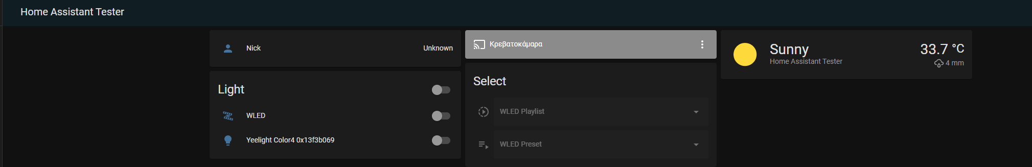
Hello,
i have an issue with ui minimalist in my ha.
I cannot figure out why i have only 3 columns when i set more than 3.
As you can see in the picture when i try to add a new card in a different column then it automatically aligns to the previous columns.
Very nice! Would you mind sharing your custom aussie broadband sensors / template to convert MB to GB please?
here you go!
  - platform: template
    sensors:
     nbn_downloaded_gb:
      friendly_name: "Downloaded"
      value_template: '{{ (((states.sensor.nbn_downloaded.state) | int(0)) / 1000) | round(1) }}'
      unit_of_measurement: 'Gb'
      icon_template: mdi:arrow-left-thin

  - platform: template
    sensors:
     nbn_uploaded_gb:
      friendly_name: "Uploaded"
      value_template: '{{ (((states.sensor.nbn_uploaded.state) | int(0)) / 1000) | round(1) }}'
      unit_of_measurement: 'Gb'
      icon_template: mdi:arrow-right-thin
Awesome! Thank you very much
Ok, no problem !
Thanks for your reply