Hello I have a question. I am not a very good programmer. But is this possible? And the second question is there somebody how can build this?

3 Likes
Can someone help me put together climate card.

                  - entity: climate.haos_vir_hallway_climate
                    name: Hlajenje
                    template:
                      - airco_buttons
                    type: 'custom:button-card'
Not working:
                  - entity: climate.haos_vir_hallway_climate
                    variables:
                      entity: climate.haos_vir_hallway_climate
                    name: Hlajenje
                    template: airco_buttons
                    type: 'custom:button-card'

If I remove entity like in your example I get error:


The error is rather explicit here… bad yaml indentation. Try to literally copy what I did… this means, start with “- type:”… you’re adding an array value but the attributes (variables, template) are not part of that object.
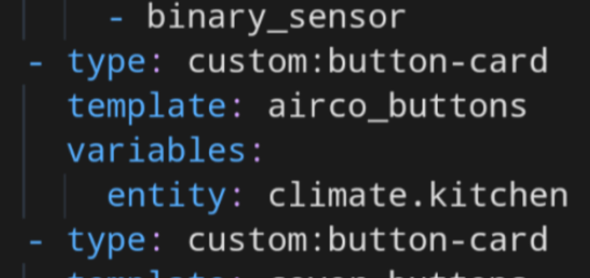
- type: custom:button-card
  template: airco_buttons
  variables:
    entity: climate.haos_vir_hallway_climate
now is working:
                  - type: 'custom:button-card'
                    variables:
                      entity: climate.haos_vir_hallway_climate
                    template: airco_buttons
thx @tpx01 
1 Like
What about media_buttons, is same situation here?
                  - entity: media_player.haos_vir_livingroom_tv
                    name: Dnevna
                    template: media_buttons
                    type: 'custom:button-card'

Not.
                  - type: 'custom:button-card'
                    variables:
                      entity: media_player.haos_vir_livingroom_tv
                      name: Dnevna
                    template: media_buttons

How to get look like this?

Slowly i getting this lovely interface running! 
One question:
Can I get historic information by clicking on the “chips cards” like on the temparatur button-cards?
My chips cards:

Example for button card “click on” infos:

My VIEWS Code:
  - title: OWN
    icon: 'mdi:snake'
    path: own
    cards:
      - cards:
          - cards:
              - template:
                  - chips_temp_nas
                type: 'custom:button-card'
              - template: chips_used_space_nas
                type: 'custom:button-card'
            type: horizontal-stack
        type: vertical-stack
My TEMPLATE Code:
  chips_temp_nas:
    template: chips
    tap_action:
        action: navigate
    label: |
      [[[
        var temp = states['sensor.ds218plus_temperature'].state;
        return '🌡️' + " " + temp + '° | DS218+';
      ]]]

  chips_used_space_nas:
    template: chips
    tap_action:
        action: navigate
    label: |
      [[[
        var spacetotal = states['sensor.ds218plus_volume_1_used_space'].state;
        var spacepercent = states['sensor.ds218plus_volume_1_volume_used'].state;
        return '💾' + " " + spacetotal + " TB | " + spacepercent + " %";
      ]]]
Thanks!
3 Likes
If i look at the code:
state:
      - operator: template
        value: >
          [[[
            return entity.state !='off'
          ]]]
        name: >
            [[[
              return entity.attributes.media_title;
            ]]]
        label: >
            [[[
              return entity.attributes.media_album_name;
            ]]]
        styles:
          img_cell:
            - background: >
                [[[
                  var image = entity.attributes.entity_picture;
                  return 'center / cover url(' + image + ')';
                ]]]
          icon:
            - color: 'rgba(var(--color-theme),0.0)'
Your media player will need the following attributes:
- media_title
- media_album_name
- entity_picture
Can you check if your media player has these attributes?
Otherwise you will need to change the template to suit your needs.
@flirtysanchez You have defined your “tap_action” for the chip card as navigate. But you did not specify where to navigate to. 
You can either specify an url to navigate to. Or leave the “tap_action” on ‘more_info’.
See the docs for more examples: here
1 Like
OK. Thanks for the hint. But it doesn’t work with this option. If i try to click nothing happens.
  chips_temp_nas:
    template: chips
    tap_action:
      action: more-info
    label: |
      [[[
        var temp = states['sensor.ds218plus_temperature'].state;
        return '🌡️' + " " + temp + '° | DS218+';
      ]]]

  chips_used_space_nas:
    template: chips
    tap_action:
      action: more-info
    label: |
      [[[
        var spacetotal = states['sensor.ds218plus_volume_1_used_space'].state;
        var spacepercent = states['sensor.ds218plus_volume_1_volume_used'].state;
        return '💾' + " " + spacetotal + " TB | " + spacepercent + " %";
      ]]]
1 Like
@flirtysanchez Ah yes, I see the next problem.
You didn’t provide an entity to navigate to.
Either specify one for the button-card:
  chips_temp_nas:
    template: chips
    entity: sensor.ds218plus_temperature
    tap_action:
      action: more-info
    label: ......
or specify an entity in your tap_action:
  chips_temp_nas:
    template: chips
    tap_action:
      action: more-info
      entity: sensor.ds218plus_temperature
    label: ......
2 Likes
Thanks! you are awesome!

No time to continue tonight.
Be careful, these are the old names.
It is necessary to adapt the ‘generic’ template to finish the job…
To share work already done

Left card
#left card
type: custom:button-card
styles:
  card:
    - border-radius: 20px
    - box-shadow: var(--box-shadow)
    - padding: 0px
  grid:
    - grid-template-areas: '"item1" "item2" "item3" "item4" "item5" "item6"'
    - grid-template-columns: 1fr
    - grid-template-rows: min-content
custom_fields:
  item1:
    card:
      entity: sensor.canon_mg5700_series
      name: Canon MG5750
      template:
        - icon_info
        - generique
      styles:
        card:
          - padding: 12px
      type: custom:button-card
  item2:
    card:
      type: custom:bar-card
      name: BK
      height: 20px
      positions:
        name: outside
        value: outside
        icon: 'off'
        indicator: 'off'
        minmax: 'off'
      color: black
      entities:
        - entity: sensor.canon_mg5700_series_black_bk
      style: |
        bar-card-currentbar{
          border: 0.01rem solid rgb(226,226,226);
        }
        bar-card-backgroundbar{
          display: none;
        }
        bar-card-name{
          width: 2rem;
          margin-right: 40px !important;
        }
        bar-card-value{
          width: 2rem;
          margin-left: 40px !important;
          justify-content: center;
          display: flex;
        }
        bar-card-background{
          margin: 4px 0 4px 0 !important;
          text-align: initial;
        }
        ha-card{
          --bar-card-border-radius: 5px;
          border-radius: 0px;
          box-shadow: none;
        }
        #states{
          padding: 0 16px;
        }
      animation:
        state: 'off'
  item3:
    card:
      type: custom:bar-card
      name: B
      height: 20px
      positions:
        name: outside
        value: outside
        icon: 'off'
        indicator: 'off'
        minmax: 'off'
      color: black
      entities:
        - entity: sensor.canon_mg5700_series_black_pgbk
      style: |
        bar-card-currentbar{
          border: 0.01rem solid rgb(226,226,226);
        }
        bar-card-backgroundbar{
          display: none;
        }
        bar-card-name{
          width: 2rem;
          margin-right: 40px !important;
        }
        bar-card-value{
          width: 2rem;
          margin-left: 40px !important;
          justify-content: center;
          display: flex;
        }
        bar-card-background{
          margin: 4px 0 4px 0 !important;
          text-align: initial;
        }
        ha-card{
          --bar-card-border-radius: 5px;
          border-radius: 0px;
          box-shadow: none;
        }
        #states{
          padding: 0 16px;
        }
      animation:
        state: 'off'
  item4:
    card:
      type: custom:bar-card
      name: 'Y'
      height: 20px
      positions:
        name: outside
        value: outside
        icon: 'off'
        indicator: 'off'
        minmax: 'off'
      color: rgb(250,179,0)
      entities:
        - entity: sensor.canon_mg5700_series_yellow
      style: |
        bar-card-currentbar{
          border: 0.01rem solid rgb(226,226,226);
        }
        bar-card-backgroundbar{
          display: none;
        }
        bar-card-name{
          width: 2rem;
          margin-right: 40px !important;
        }
        bar-card-value{
          width: 2rem;
          margin-left: 40px !important;
          justify-content: center;
          display: flex;
        }
        bar-card-background{
          margin: 4px 0 4px 0 !important;
          text-align: initial;
        }
        ha-card{
          --bar-card-border-radius: 5px;
          border-radius: 0px;
          box-shadow: none;
        }
        #states{
          padding: 0 16px;
        }
      animation:
        state: 'off'
  item5:
    card:
      type: custom:bar-card
      name: M
      height: 20px
      positions:
        name: outside
        value: outside
        icon: 'off'
        indicator: 'off'
        minmax: 'off'
      color: rgb(248,75,122)
      entities:
        - entity: sensor.canon_mg5700_series_magenta
      style: |
        bar-card-currentbar{
          border: 0.01rem solid rgb(226,226,226);
        }
        bar-card-backgroundbar{
          display: none;
        }
        bar-card-name{
          width: 2rem;
          margin-right: 40px !important;
        }
        bar-card-value{
          width: 2rem;
          margin-left: 40px !important;
          justify-content: center;
          display: flex;
        }
        bar-card-background{
          margin: 4px 0 4px 0 !important;
          text-align: initial;
        }
        ha-card{
          --bar-card-border-radius: 5px;
          border-radius: 0px;
          box-shadow: none;
        }
        #states{
          padding: 0 16px;
        }
      animation:
        state: 'off'
  item6:
    card:
      type: custom:bar-card
      name: C
      height: 20px
      positions:
        name: outside
        value: outside
        icon: 'off'
        indicator: 'off'
        minmax: 'off'
      color: rgb(66,126,222)
      entities:
        - entity: sensor.canon_mg5700_series_cyan
      style: |
        bar-card-currentbar{
          border: 0.01rem solid rgb(226,226,226);
        }
        bar-card-backgroundbar{
          display: none;
        }
        bar-card-name{
          width: 2rem;
          margin-right: 40px !important;
        }
        bar-card-value{
          width: 2rem;
          margin-left: 40px !important;
          justify-content: center;
          display: flex;
        }
        bar-card-background{
          margin: 4px 0 4px 0 !important;
          text-align: initial;
        }
        ha-card{
          --bar-card-border-radius: 5px;
          border-radius: 0px;
          box-shadow: none;
        }
        #states{
          padding: 0 16px 16px 16px;
        }
      animation:
        state: 'off'
Right Card
type: custom:button-card
styles:
  card:
    - border-radius: 20px
    - box-shadow: var(--box-shadow)
    - padding: 0px
  grid:
    - grid-template-areas: '"item1" "item2" "item3" "item4" "item5" "item6"'
    - grid-template-columns: 1fr
    - grid-template-rows: min-content
custom_fields:
  item1:
    card:
      entity: sensor.canon_mg5700_series
      name: Canon MG5750
      template:
        - icon_info
        - generique
      styles:
        card:
          - padding: 12px
      type: custom:button-card
  item2:
    card:
      type: custom:bar-card
      name: BK
      height: 20px
      positions:
        name: outside
        value: outside
        icon: 'off'
        indicator: 'off'
        minmax: 'off'
      color: black
      entities:
        - entity: sensor.canon_mg5700_series_black_bk
      style: |
        bar-card-name{
          width: 2rem;
          margin-right: 40px !important;
        }
        bar-card-value{
          width: 2rem;
          margin-left: 40px !important;
          justify-content: center;
          display: flex;
        }
        bar-card-background{
          margin: 4px 0 4px 0 !important;
          text-align: initial;
        }
        ha-card{
          --bar-card-border-radius: 5px;
          border-radius: 0px;
          box-shadow: none;
        }
        #states{
          padding: 0 16px;
        }
      animation:
        state: 'off'
  item3:
    card:
      type: custom:bar-card
      name: B
      height: 20px
      positions:
        name: outside
        value: outside
        icon: 'off'
        indicator: 'off'
        minmax: 'off'
      color: black
      entities:
        - entity: sensor.canon_mg5700_series_black_pgbk
      style: |
        bar-card-name{
          width: 2rem;
          margin-right: 40px !important;
        }
        bar-card-value{
          width: 2rem;
          margin-left: 40px !important;
          justify-content: center;
          display: flex;
        }
        bar-card-background{
          margin: 4px 0 4px 0 !important;
          text-align: initial;
        }
        ha-card{
          --bar-card-border-radius: 5px;
          border-radius: 0px;
          box-shadow: none;
        }
        #states{
          padding: 0 16px;
        }
      animation:
        state: 'off'
  item4:
    card:
      type: custom:bar-card
      name: 'Y'
      height: 20px
      positions:
        name: outside
        value: outside
        icon: 'off'
        indicator: 'off'
        minmax: 'off'
      color: rgb(250,179,0)
      entities:
        - entity: sensor.canon_mg5700_series_yellow
      style: |
        bar-card-name{
          width: 2rem;
          margin-right: 40px !important;
        }
        bar-card-value{
          width: 2rem;
          margin-left: 40px !important;
          justify-content: center;
          display: flex;
        }
        bar-card-background{
          margin: 4px 0 4px 0 !important;
          text-align: initial;
        }
        ha-card{
          --bar-card-border-radius: 5px;
          border-radius: 0px;
          box-shadow: none;
        }
        #states{
          padding: 0 16px;
        }
      animation:
        state: 'off'
  item5:
    card:
      type: custom:bar-card
      name: M
      height: 20px
      positions:
        name: outside
        value: outside
        icon: 'off'
        indicator: 'off'
        minmax: 'off'
      color: rgb(248,75,122)
      entities:
        - entity: sensor.canon_mg5700_series_magenta
      style: |
        bar-card-name{
          width: 2rem;
          margin-right: 40px !important;
        }
        bar-card-value{
          width: 2rem;
          margin-left: 40px !important;
          justify-content: center;
          display: flex;
        }
        bar-card-background{
          margin: 4px 0 4px 0 !important;
          text-align: initial;
        }
        ha-card{
          --bar-card-border-radius: 5px;
          border-radius: 0px;
          box-shadow: none;
        }
        #states{
          padding: 0 16px;
        }
      animation:
        state: 'off'
  item6:
    card:
      type: custom:bar-card
      name: C
      height: 20px
      positions:
        name: outside
        value: outside
        icon: 'off'
        indicator: 'off'
        minmax: 'off'
      color: rgb(66,126,222)
      entities:
        - entity: sensor.canon_mg5700_series_cyan
      style: |
        bar-card-name{
          width: 2rem;
          margin-right: 40px !important;
        }
        bar-card-value{
          width: 2rem;
          margin-left: 40px !important;
          justify-content: center;
          display: flex;
        }
        bar-card-background{
          margin: 4px 0 4px 0 !important;
          text-align: initial;
        }
        ha-card{
          --bar-card-border-radius: 5px;
          border-radius: 0px;
          box-shadow: none;
        }
        #states{
          padding: 0 16px 16px 16px;
        }
      animation:
        state: 'off'
11 Likes
Please do not cross post over different threads! Stay in the one you asked the question first. People have already answered there and it is cluttering the threads more than it is useful. 
Despite that mostly the same people will try to answer your question and spreading information over different threads makes answering more difficult!
Thank you!
EDIT: Here we go:
1 Like
Sorry for that.
Later I was thinking that this question is more suitable for this thread, because if I put entity out of variables card is not working. Probably not the right way to put entity in variables, but card is working. Only problem that I have, I can not read states and attributes from entity if entity is in variables, or I am doing something wrong in JSTemplate. JSTempling is relatively new to me and I am still learning. 
Have you changed something in the icon_info_bg template regards the binary_input to show automatic light status? I get the following error when I try to add this card:
ButtonCardJSTemplateError: TypeError: Cannot read property 'state' of undefined in 'return entity.state === 'off' ? 'Active' : 'Ikke active''