Material Rounded - Google Material You Theme

I’m using this theme on a small tablet which has a viewport of around 960px

How can I alter the theme to show me the reduced 3 dots menu (same as mobile) for this screen size?

Would also like to add some padding/margin to the sidebar toggle to move it off the extreme edge.

great theme, thank you

EDIT: realised this might actually be a limitation of HA itself and not the theme?

Screenshot 2024-05-21 at 11.14.56Screenshot 2024-05-21 at 11.15.04
Screenshot 2024-05-21 at 11.24.46

Hi guys, thanks for sharing your work. I’m very interested in this post cause I also tried to create a dashboard inspired by Google’s layout, but without paying much attention to the Material Design theme. Now, your work will help me modernize this dashboard, which makes me very happy :grinning: Thanks.

image

3 Likes

Version 2 has been released! V2 is a significant overhaul that brings Home Assistant styles even closer to Material You:

  • Streamlines development via reusable styles and a build pipeline.
  • Performance improvements by removing unneeded styles and optimizing slow card-mod styles.
  • Upgrades many components to follow Material Design 3 specifications.
    • Separate top app bar and navigation toolbar.
    • Navigation drawer and rail updates.
    • MD3 toggle switches wherever possible and add card button.
  • Allows users to set their own primary and accent color using a base color set using template sensors, either globally or per user.

Love the menu hamburger moving to the top, however, it doesn’t seem easily aligned when using the new Sections View Type. Would you have any recommendations on how to resolve this?

You’re going to have to provide a screenshot, it looks the same as other view types to me.

Here’s an example:

See how the section title “Test” doesn’t align with the hamburger icon very well while on the screenshots on the repo showing text aligning pretty well: GitHub - Nerwyn/material-rounded-theme: A Material You and Google Home app influenced theme for Home Assistant

Not sure if your screenshots are using the new HA Section View Type, however.

I’m not using section views, I mostly use layout-card grid views. My section headers are made using button card. I mention this in the README.

It looks like sections view section headers have more padding on the top. There’s nothing I can do about that, but you can try to do something about it using card-mod.
image

Hi!
First of all Thank you @Nerwyn for creating this great theme. I’m a huge fan of it and I’m using it right now to build my new dashboard.

I have a question regarding the top app bar. When I load up the dashboard, the content sits in a lower place for a few seconds (like 1 or 2) and then moves to the top. Screenshot 1 is when I open the dashboard or come back from another page and screenshot 2 is after a second or two.


My question is:
Can I somehow speed up the process so that the section moves faster to the top?

OR (if not possible)

What line of your code move the top-app-bar so that everything is next to the hamburger menu and makes the overall width a bit smaller? I’m thinking of deleting that line so that everything stays as in screenshot 1.

Thank you

That’s the card-mod part of the theme applying after render. I don’t think there’s anything that can be done about that. Even if you do add a spacer or header element to the top (I use button-card) it will jump after card-mod applies.

The first 35 lines of this file modify and separate out the toolbar into a separate header and footer. If you want to put the navigations buttons and the menu buttons back together you may also have to modify the logic from lines 49-59 for calculating navigation button width without flexboxes (done for performance reasons, as card-mod styles inside of shadow-roots take much longer to apply and don’t always apply consistently). After modifying the source files you have to run build.sh (requires Python) to turn it all into one Home Assistant YAML theme file.

If you decide you don’t want the card-mod changes, there are no-mod versions included that do not modify the toolbar and other components.

1 Like

Thanks for the detailed answer!
I’ll take a look at modifying the code and report back later. (probably after the weekend :wink: )
Have nice day!

Thought I would put this light card I was able to create with the help of the community over at Big Slider Card’s github.

It adds some flexibility and customization.

I am very much still learning card-mod and you or others may be able to better condense the below or streamline it. Please feel free to adapt, update or include this in the theme if you want :slight_smile:

Still to do: work on changing the light bulb icon to the non filled version when the entity state is off

Preview

Light On

FkzvisF

Light Off

j7kGuhB

type: custom:big-slider-card
entity: light.<entity>
attribute: brightness
icon: m3s:lightbulb-outlined-filled
background_color: '#4f462a'
colorize: true
show_percentage: true
height: 88
card_mod:
  style: |
    :host {
      --brightness-only-color: var(--state-light-on-color, var(--state-light-active-color, var(--state-active-color)));
      --colorable-color: var(--bsc-entity-color);
      --main-color: var(--colorable-color);
      --slider-bg-opacity: 0.1;
      --icon-bg-color: color-mix(in srgb, var(--main-color), var(--card-background-color) 80%);
    }
    :host([pressed]) {
      --slider-bg-opacity: 0.39;
      --icon-bg-color: color-mix(in srgb, var(--main-color), color-mix(in srgb, var(--main-color) 11%, transparent) 90%);
    }
    #slider {
      opacity: var(--slider-bg-opacity) !important;
      filter: none !important;
      background-color: color-mix(in srgb, var(--main-color) 90%, transparent) !important;
    }
    #icon {
      color: #ffecb3 !important;
      margin: auto 0 auto -12px;
      border-radius: 100%;
      box-sizing: border-box;
      -moz-box-sizing: border-box;
      -webkit-box-sizing: border-box;
      width: 40px;
      height: 40px;
      filter: none !important;
    }
    #icon[data-state="off"] {
      color: #fddccb !important;
      border: none;
    }
    #content {
      padding:12px 12px 12px 64px !important;
      min-width: 0px !important;
    }
    #name {
      font-weight: 500;
      font-size: 14px;
      line-height: 20px;
      letter-spacing: 0.1px;
      text-overflow: ellipsis;
      overflow: hidden;
      white-space: nowrap;
      color: #ffecb3 !important;
    }
    #percentage {
      font-weight: 500;
      font-size: 12px;
      line-height: 16px;
      letter-spacing: 0.4px;
      color: #ffecb3 !important;
    }
    {% if states('light.<entity>') == 'off' %}
      ha-card {
        background-color: #272a2c !important;
        color: #fddccb !important;
      }
      #name {
        color: #fddccb !important;
      }
      #percentage {
        color: #fddccb !important;
      }
    {% endif %}

Preview of the buttons in a larger view

3 Likes

Finally getting around to setting this up! Loving it so far.

I’m using sub-views in Home Assistant to bring up options for all lights in a room (see screenshots) and I’d like to move the navigation bar back to the top in these sub-views so that the back button appears in the top left (as is on the Google Home app on mobile.)

You can also see that the navigation bar on Home Assistant is shaded, whereas in the screenshot in Google Home, there’s no background to that navigation bar.

Any ideas how I can modify this per sub-view?

Thanks! <3

Google Home app: Exit button is top left.

Home Assistant Dashboard: Back button is bottom left.

1 Like

That probably should be default behavior for this theme. Can you make a feature request on the repo so I don’t forget?

1 Like

Done! Thank you!

1 Like

What are you using for the non-light entities?

For changing the icon on state, do this:

card_mod:
  style: |
    :host {
      --card-mod-icon:
        {% if is_state(config.entity, "on") %}
        m3s:lightbulb-rounded-filled;
        {% else %}
        m3s:lightbulb-rounded;
        {% endif %}
    }
1 Like

Are you asking what card i’m using for non-light entities? like the climate button?

If its for the climate cards ect i’m using Button Card

This code below is pretty extensive and some of the options i’m not using but kept in there in case I wanted to use them in the future. Items like changing the card bcakground color based on state are both pointing to the same color code.

However i’m sure you guys can figure out what you want to use and what you want to discard.

I really liked the Tile Card for climate devices and your Service Call feature was amazing but in the end the Tile Card was too chunky for my mobile dashboard

I still have some adjustments to text/icon alignment to fine tune between the Button Card and Big Slider cards but for the most part all the pieces are there for both buttons. Just requires a bit of nudging depending on your dashboard layout / size.

8qERmOr

type: custom:button-card
entity: climate.<device>
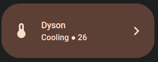
name: Dyson
label: |
  [[[ 
    if (entity.state =='off') {
      return 'Indoor ' + (entity.attributes.current_temperature);
    } else if (entity.state =='state' || 'cool') {
      return (entity.state)+ 'ing' + ' ● ' + (entity.attributes.temperature);
    }
  ]]]
icon: |
  [[[
    if (entity.state == 'off') {
      return "m3s:thermometer-outlined";
    } else if (entity.state =='heat' || 'cool') {
      return "m3s:thermometer-outlined-filled";
    }
  ]]]
size: 32px
show_name: true
show_label: true
custom_fields:
  chip:
    card:
      type: custom:mushroom-chips-card
      chips:
        - type: template
          icon: mdi:chevron-right
          icon_color: |-
            {% if is_state('climate.pure_hot_cool', 'cool') %}
              254,220,202
            {% elif is_state('climate.pure_hot_cool', 'heat') %}
              254,220,202
            {% else %}
              228,228,231
            {% endif %}
          card_mod:
            style: |
              ha-card {
              --chip-icon-size: 0.7em;
              --chip-padding: 0px 6px;
              --chip-height: 40px;
              --chip-background: none;
              --chip-border-radius: 100px;
              }  
styles:
  grid:
    - grid-template-areas: |
        "i n chip"
        "i l chip"
    - grid-template-rows: 1fr 1fr
    - grid-template-columns: 26% min-content 2fr
  card:
    - height: 88px
    - border-radius: 30px
    - background-color: |
        [[[
          if (entity.state =='off') {
            return "#272a2c";
          }else if (entity.state =='cool') {
            return "#5c4035";
          }else if (entity.state =='heat') {
            return "#5c4035";
          }
        ]]]  
  icon:
    - color: |
        [[[
          if (entity.state =='off') {
            return "#fddccb";
          }else if (entity.state =='cool') {
            return "#fedcca";
          }else if (entity.state =='heat') {
            return "#fedcca";
          }
        ]]]  
  name:
    - justify-self: start
    - font-weight: 500
    - font-size: 14px
    - margin: 15px 0px 0px 0px
    - color: |
        [[[
          if (entity.state =='off') {
            return "#fddccb";
          }else if (entity.state =='cool') {
            return "#fedcca";
          }else if (entity.state =='heat') {
            return "#fedcca";
          }
        ]]]  
  label:
    - justify-self: start
    - text-transform: capitalize
    - font-weight: 500
    - font-size: 13px
    - margin: 0px 0px 15px 0px
    - color: |
        [[[
          if (entity.state =='off') {
            return "#fedcca";
          }else if (entity.state =='cool') {
            return "#fedcca";
          }else if (entity.state =='heat') {
            return "#fedcca";
          }
        ]]]
  custom_fields:
    chip:
      - justify-self: end
      - padding-right: 9px

I also used the Button Card to create a list of Automations / Scripts that I have under the “Tasks” view following the same style.

type: custom:button-card
tap_action:
  action: toggle
size: 32px
show_name: true
show_label: true
styles:
  grid:
    - grid-template-areas: |
        "i n chip"
        "i l chip"
    - grid-template-rows: 1fr 1fr
    - grid-template-columns: 22% min-content 2fr
  card:
    - height: 88px
    - border-radius: 30px
    - background-color: |
        [[[
          if (entity.state =='off') {
            return "#272a2c";
          }else if (entity.state =='on') {
            return "#CAECFE";
          }
        ]]]  
  icon:
    - color: |
        [[[
          if (entity.state =='off') {
            return "#CAECFE";
          }else if (entity.state =='on') {
            return "#CAECFE";
          }
        ]]]  
  name:
    - justify-self: start
    - font-weight: 500
    - font-size: 14px
    - margin: 28px 0px 0px 0px
    - color: |
        [[[
          if (entity.state =='idle') {
            return "#CAECFE";
          }else if (entity.state =='off') {
            return "#CAECFE";
          }else if (entity.state =='on') {
            return "#CAECFE";
          }
        ]]]  

All of these cards can be combined with the Auto Entities card. So on my first tab “Home” all the entities that appear are controlled by Auto Entities. Then on my “Devices” tab I have all entities showing regardless of state so that they can be manually turned on.

You can even go one step further and hide entire sections in the new Sections view under the Visibility tab. It’s a bit annoying to set up, but once all the conditions are in place it will hide the entire section if all entities in that section are turned off. This helps free up a ton of space on the “Home” tab.

2 Likes

@Nerwyn Thanks for the update to version 2.1.0
It fixed my problem which I wasn’t able to solve. The extra space at the top works great.
Thanks for sharing your work.

1 Like

Hey guys, I’ve just installed this theme and I absolutely love it!
However, there is an issue, that is happening with the burger menu and the three menu dots on the dashboard. When I open up a page, everything is fine. Once I scroll down to the bottom and then to the top again, the burger menu button takes up to a second to show up again and the three dots only appear again, when I reload the page.

Is this a known issue, or is it just me?

And also, can I delete the themes that I’m not using, like the one with no mods? Or is it not that big, that it makes any difference?

I’m pretty new to HA, so sorry for beginner-like questions :smiley:

Can you take a video of this happening? Both menu buttons disappear/reappear on scroll CSS are tied to the header element, and they should appear at the same time. This sounds like it could be a slow device issue.

Why not just ignore the themes you aren’t using? They don’t do anything if they aren’t selected. If you really wanted to you could delete them from the themes file themes/material_rounded/material_rounded.yaml, or fork and modify the source code in the repository and rebuild the theme file to your liking.

1 Like

Me again!

I’m looking at fonts, and I’m wondering if its possible to change the font used across the theme?

I’d like, if possible, to use GitHub - hprobotic/Google-Sans-Font: Google sans font pack - From Google products

Any tips on this would be great. Thank you! <3