Working on my conversion to full mushroom. Starts to look beautiful but the time I’m spending on this…
Anyway, while re-thinking what I want on my main page (which is dynamic based on if I’m home or not) created below. As I wanted to use different types of graphs I had to use ApexCards (check it out).
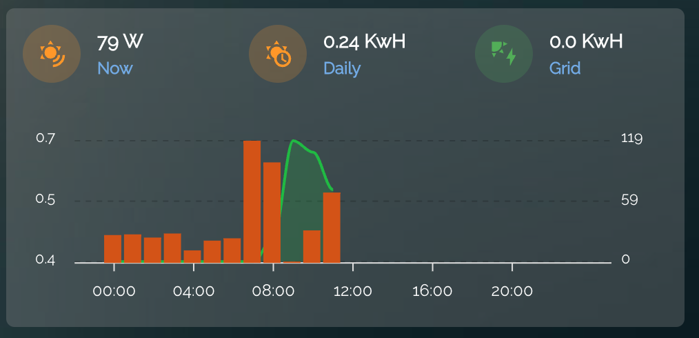
Code:
Summary
type: custom:stack-in-card
cards:
  - type: horizontal-stack
    cards:
      - type: custom:mushroom-template-card
        entity: sensor.solarday
        secondary: Now
        primary: |
          {{ states('sensor.benext_solar_electric_production_w') | round(0) }} W
        icon: mdi:sun-wireless
        icon_color: orange
        tap_action:
          action: more-info
      - type: custom:mushroom-template-card
        entity: sensor.solarday
        secondary: Daily
        primary: |
          {{ states('sensor.solarday') | round(2) }} KwH
        icon: mdi:sun-clock
        icon_color: orange
        tap_action:
          action: more-info
      - type: custom:mushroom-template-card
        entity: sensor.solar_net
        secondary: Grid
        primary: |
          {{ states('sensor.solar_net') | round(2) }} KwH
        name: Grid
        icon: mdi:solar-power
        icon_color: green
        tap_action:
          action: more-info
  - type: custom:apexcharts-card
    graph_span: 1d
    span:
      start: day
    apex_config:
      chart:
        height: 150px
        fontFamily: Raleway,sans-serif
      legend:
        show: false
      stroke:
        width: 2
      plotOptions:
        bar:
          columnWidth: 100%
      grid:
        show: true
        borderColor: '#00000030'
        strokeDashArray: 4
        position: back
    experimental:
      color_threshold: true
    header:
      show: false
      show_states: false
      colorize_states: true
    yaxis:
      - id: first
        decimals: 1
        apex_config:
          tickAmount: 2
      - id: second
        opposite: true
        decimals: 0
        apex_config:
          tickAmount: 2
    series:
      - entity: sensor.power_consumption
        name: Power
        yaxis_id: first
        show:
          legend_value: false
        type: column
        group_by:
          func: avg
          duration: 60min
        color_threshold:
          - value: 0
            color: '#228B22'
          - value: 0.1
            color: '#d35400'
          - value: 1.5
            color: '#c0392b'
      - entity: sensor.benext_solar_electric_production_w
        name: Solar
        yaxis_id: second
        type: area
        curve: smooth
        opacity: 0.2
        color: '#00bb33'
        extend_to: false
        show:
          legend_value: false
        group_by:
          func: avg
          duration: 60min