thank you very much!
…for the problem with the first light, what do you recommend to have a better view? it is a switch (shelly) transformed into light. …I ask because I use your modification with auto-entities.
Well since its a light that doesnt support any slider at all then perhaps just dont apply the code to that card.
But if you need the text to then still align just do this:
card_mod:
  style:
    mushroom-state-info$: |
      .container {
        {% if states(config.entity) == 'on' %}
          margin-left: 10px;
          margin-right: -8px;
        {% endif %}
      }
Mushroom-Printer-State-Card v2


Made with Mushroom-Card and Button-Card.
The card shows
- the state of my printer (sensor from IPP-Integration)
- the fill of the toners Cyan, Magenta, Yellow, Black (sensors from IPP-Integration)
You just to need to fill in your entities in the “variables:”-section.
YAML-Code
(little update - just found out that i need to add “triggers_update” so that updates to the entities will show as they happen)
type: custom:button-card
variables:
  printer_state: sensor.ecosys_m5521cdn
  c_state: sensor.ecosys_m5521cdn_cyan_tk_5230cs
  y_state: sensor.ecosys_m5521cdn_yellow_tk_5230y
  m_state: sensor.ecosys_m5521cdn_magenta_tk_5230m
  k_state: sensor.ecosys_m5521cdn_black_tk_5230k
triggers_update:
  - sensor.ecosys_m5521cdn
  - sensor.ecosys_m5521cdn_cyan_tk_5230cs
  - sensor.ecosys_m5521cdn_yellow_tk_5230y
  - sensor.ecosys_m5521cdn_magenta_tk_5230m
  - sensor.ecosys_m5521cdn_black_tk_5230k
show_name: false
show_state: false
show_icon: false
styles:
  card:
    - padding: 3px
  grid:
    - grid-template-areas: '"oben" "unten"'
    - grid-template-columns: 100%
    - grid-template-rows: 2fr 1fr
  custom_fields:
    oben:
      - filter: opacity(100%)
      - overflow: visible
    unten:
      - filter: opacity(100%)
      - overflow: visible
custom_fields:
  oben:
    card:
      type: custom:mushroom-entity-card
      entity: '[[[ return variables.printer_state ]]]'
      tap_action:
        action: more-info
      icon: mdi:printer-outline
      card_mod:
        style: |
          ha-card {
            padding: 0px !important;
            padding-bottom: 3px !important;
            text-align: left !important;
            border: none !important;
            box-shadow: none !important;
          }
  unten:
    card:
      type: grid
      columns: 4
      square: false
      cards:
        - type: custom:button-card
          entity: '[[[ return variables.k_state ]]]'
          size: 100%
          styles:
            grid:
              - grid-template-areas: '"s"'
              - grid-template-columns: 100%
              - grid-template-rows: 100%
            icon:
              - color: var(--primary-text-color)
            state:
              - font-size: 1rem
              - font-weight: bold
              - color: var(--primary-text-color)
            name:
              - font-size: 0.7rem
              - color: var(--primary-text-color)
            card:
              - background: >-
                  [[[ return "linear-gradient(to top, rgba(150,150,150,0.2) 0%,
                  rgba(150,150,150,0.2) " + states[variables.k_state].state + "%,
                  rgba(150,150,150,0.1) " + states[variables.k_state].state + "%,
                  rgba(150,150,150,0.1) 100%)" ]]]
              - height: 3rem
          show_name: false
          show_state: true
          show_label: false
          show_icon: false
          name: >-
            [[[ return states[variables.k_state].attributes.friendly_name
            ]]]
          state_display: >-
            [[[ return
            Math.round(Number(states[variables.k_state].state)).toFixed(0) +
            states[variables.k_state].attributes.unit_of_measurement; ]]]
          icon: mdi:water
          card_mod:
            style: |
              ha-card {
                padding: 3px !important;
                margin: 0px !important;
                border: none !important;
                box-shadow: none !important;
              }
        - type: custom:button-card
          entity: '[[[ return variables.c_state ]]]'
          size: 100%
          styles:
            grid:
              - grid-template-areas: '"s"'
              - grid-template-columns: 100%
              - grid-template-rows: 100%
            icon:
              - color: darkcyan
            state:
              - font-size: 1rem
              - font-weight: bold
              - color: darkcyan
            name:
              - font-size: 0.7rem
              - color: darkcyan
            card:
              - background: >-
                  [[[ return "linear-gradient(to top, rgba(0,139,139,0.2)
                  0%, rgba(0,139,139,0.2) " +
                  states[variables.c_state].state + "%, rgba(0,139,139,0.1)
                  " + states[variables.c_state].state + "%,
                  rgba(0,139,139,0.1) 100%)" ]]]
              - height: 3rem
          show_name: false
          show_state: true
          show_label: false
          show_icon: false
          label: >-
            [[[ return states[variables.c_state].attributes.friendly_name
            ]]]
          state_display: >-
            [[[ return
            Math.round(Number(states[variables.c_state].state)).toFixed(0) +
            states[variables.c_state].attributes.unit_of_measurement; ]]]
          icon: mdi:water
          card_mod:
            style: |
              ha-card {
                padding: 3px !important;
                margin: 0px !important;
                border: none !important;
                box-shadow: none !important;
              }
        - type: custom:button-card
          entity: '[[[ return variables.m_state ]]]'
          size: 100%
          styles:
            grid:
              - grid-template-areas: '"s"'
              - grid-template-columns: 100%
              - grid-template-rows: 100%
            icon:
              - color: magenta
            state:
              - font-size: 1rem
              - font-weight: bold
              - color: magenta
            name:
              - font-size: 0.7rem
              - color: magenta
            card:
              - background: >-
                  [[[ return "linear-gradient(to top, rgba(255,0,255,0.2)
                  0%, rgba(255,0,255,0.2) " +
                  states[variables.m_state].state + "%, rgba(255,0,255,0.1)
                  " + states[variables.m_state].state + "%,
                  rgba(255,0,255,0.1) 100%)" ]]]
              - height: 3rem
          show_name: false
          show_state: true
          show_label: false
          show_icon: false
          label: >-
            [[[ return states[variables.m_state].attributes.friendly_name
            ]]]
          state_display: >-
            [[[ return
            Math.round(Number(states[variables.m_state].state)).toFixed(0) +
            states[variables.m_state].attributes.unit_of_measurement; ]]]
          icon: mdi:water
          card_mod:
            style: |
              ha-card {
                padding: 3px !important;
                margin: 0px !important;
                border: none !important;
                box-shadow: none !important;
              }
        - type: custom:button-card
          entity: '[[[ return variables.y_state ]]]'
          size: 100%
          styles:
            grid:
              - grid-template-areas: '"s"'
              - grid-template-columns: 100%
              - grid-template-rows: 100%
            icon:
              - color: darkorange
            state:
              - font-size: 1rem
              - font-weight: bold
              - color: darkorange
            name:
              - font-size: 0.7rem
              - color: darkorange
            card:
              - background: >-
                  [[[ return "linear-gradient(to top, rgba(255, 140, 0,0.2)
                  0%, rgba(255, 140, 0,0.2) " +
                  states[variables.y_state].state + "%, rgba(255, 140,
                  0,0.1) " + states[variables.y_state].state + "%, rgba(255,
                  140, 0,0.1) 100%)" ]]]
              - height: 3rem
          show_name: false
          show_state: true
          show_label: false
          show_icon: false
          label: >-
            [[[ return states[variables.y_state].attributes.friendly_name
            ]]]
          state_display: >-
            [[[ return
            Math.round(Number(states[variables.y_state].state)).toFixed(0) +
            states[variables.y_state].attributes.unit_of_measurement; ]]]
          icon: mdi:water
          card_mod:
            style: |
              ha-card {
                padding: 3px !important;
                margin: 0px !important;
                border: none !important;
                box-shadow: none !important;
              }
You can also have the cards above in this way


All you need to to ist to change this
    grid:
      - grid-template-areas: '"oben" "unten"'
      - grid-template-columns: 100%
      - grid-template-rows: 1.3fr 1fr
to that
grid:
- grid-template-areas: '"oben unten"'
- grid-template-columns: 1fr 1fr
- grid-template-rows: 100%
```**Mushroom-Printer-State-Card v2**


Made with Mushroom-Card and Button-Card.
The card shows
* the state of my printer (sensor from IPP-Integration)
* the fill of the toners Cyan, Magenta, Yellow, Black (sensors from IPP-Integration)
You just to need to fill in your entities in the “variables:”-section.
[u]YAML-Code[/u]
(little update - just found out that i need to add “triggers_update” so that updates to the entities will show as they happen)
type: custom:button-card
variables:
printer_state: sensor.ecosys_m5521cdn
c_state: sensor.ecosys_m5521cdn_cyan_tk_5230cs
y_state: sensor.ecosys_m5521cdn_yellow_tk_5230y
m_state: sensor.ecosys_m5521cdn_magenta_tk_5230m
k_state: sensor.ecosys_m5521cdn_black_tk_5230k
triggers_update:
- sensor.ecosys_m5521cdn
- sensor.ecosys_m5521cdn_cyan_tk_5230cs
- sensor.ecosys_m5521cdn_yellow_tk_5230y
- sensor.ecosys_m5521cdn_magenta_tk_5230m
- sensor.ecosys_m5521cdn_black_tk_5230k
show_name: false
show_state: false
show_icon: false
styles:
card:- padding: 3px
grid: - grid-template-areas: ‘“oben” “unten”’
- grid-template-columns: 100%
- grid-template-rows: 2fr 1fr
custom_fields:
oben:- filter: opacity(100%)
- overflow: visible
unten: - filter: opacity(100%)
- overflow: visible
custom_fields:
oben:
card:
type: custom:mushroom-entity-card
entity: ‘[[[ return variables.printer_state ]]]’
tap_action:
action: more-info
icon: mdi:printer-outline
card_mod:
style: |
ha-card {
padding: 0px !important;
padding-bottom: 3px !important;
text-align: left !important;
border: none !important;
box-shadow: none !important;
}
unten:
card:
type: grid
columns: 4
square: false
cards:- type: custom:button-card
entity: ‘[[[ return variables.k_state ]]]’
size: 100%
styles:
grid:
- grid-template-areas: ‘“s”’
- grid-template-columns: 100%
- grid-template-rows: 100%
icon:
- color: var(–primary-text-color)
state:
- font-size: 1rem
- font-weight: bold
- color: var(–primary-text-color)
name:
- font-size: 0.7rem
- color: var(–primary-text-color)
card:
- background: >-
[[[ return "linear-gradient(to top, rgba(150,150,150,0.2) 0%,
rgba(150,150,150,0.2) " + states[variables.k_state].state + "%,
rgba(150,150,150,0.1) " + states[variables.k_state].state + “%,
rgba(150,150,150,0.1) 100%)” ]]]
- height: 3rem
show_name: false
show_state: true
show_label: false
show_icon: false
name: >-
[[[ return states[variables.k_state].attributes.friendly_name
]]]
state_display: >-
[[[ return
Math.round(Number(states[variables.k_state].state)).toFixed(0) +
states[variables.k_state].attributes.unit_of_measurement; ]]]
icon: mdi:water
card_mod:
style: |
ha-card {
padding: 3px !important;
margin: 0px !important;
border: none !important;
box-shadow: none !important;
} - type: custom:button-card
entity: ‘[[[ return variables.c_state ]]]’
size: 100%
styles:
grid:
- grid-template-areas: ‘“s”’
- grid-template-columns: 100%
- grid-template-rows: 100%
icon:
- color: darkcyan
state:
- font-size: 1rem
- font-weight: bold
- color: darkcyan
name:
- font-size: 0.7rem
- color: darkcyan
card:
- background: >-
[[[ return "linear-gradient(to top, rgba(0,139,139,0.2)
0%, rgba(0,139,139,0.2) " +
states[variables.c_state].state + "%, rgba(0,139,139,0.1)
" + states[variables.c_state].state + “%,
rgba(0,139,139,0.1) 100%)” ]]]
- height: 3rem
show_name: false
show_state: true
show_label: false
show_icon: false
label: >-
[[[ return states[variables.c_state].attributes.friendly_name
]]]
state_display: >-
[[[ return
Math.round(Number(states[variables.c_state].state)).toFixed(0) +
states[variables.c_state].attributes.unit_of_measurement; ]]]
icon: mdi:water
card_mod:
style: |
ha-card {
padding: 3px !important;
margin: 0px !important;
border: none !important;
box-shadow: none !important;
} - type: custom:button-card
entity: ‘[[[ return variables.m_state ]]]’
size: 100%
styles:
grid:
- grid-template-areas: ‘“s”’
- grid-template-columns: 100%
- grid-template-rows: 100%
icon:
- color: magenta
state:
- font-size: 1rem
- font-weight: bold
- color: magenta
name:
- font-size: 0.7rem
- color: magenta
card:
- background: >-
[[[ return "linear-gradient(to top, rgba(255,0,255,0.2)
0%, rgba(255,0,255,0.2) " +
states[variables.m_state].state + "%, rgba(255,0,255,0.1)
" + states[variables.m_state].state + “%,
rgba(255,0,255,0.1) 100%)” ]]]
- height: 3rem
show_name: false
show_state: true
show_label: false
show_icon: false
label: >-
[[[ return states[variables.m_state].attributes.friendly_name
]]]
state_display: >-
[[[ return
Math.round(Number(states[variables.m_state].state)).toFixed(0) +
states[variables.m_state].attributes.unit_of_measurement; ]]]
icon: mdi:water
card_mod:
style: |
ha-card {
padding: 3px !important;
margin: 0px !important;
border: none !important;
box-shadow: none !important;
} - type: custom:button-card
entity: ‘[[[ return variables.y_state ]]]’
size: 100%
styles:
grid:
- grid-template-areas: ‘“s”’
- grid-template-columns: 100%
- grid-template-rows: 100%
icon:
- color: darkorange
state:
- font-size: 1rem
- font-weight: bold
- color: darkorange
name:
- font-size: 0.7rem
- color: darkorange
card:
- background: >-
[[[ return "linear-gradient(to top, rgba(255, 140, 0,0.2)
0%, rgba(255, 140, 0,0.2) " +
states[variables.y_state].state + "%, rgba(255, 140,
0,0.1) " + states[variables.y_state].state + “%, rgba(255,
140, 0,0.1) 100%)” ]]]
- height: 3rem
show_name: false
show_state: true
show_label: false
show_icon: false
label: >-
[[[ return states[variables.y_state].attributes.friendly_name
]]]
state_display: >-
[[[ return
Math.round(Number(states[variables.y_state].state)).toFixed(0) +
states[variables.y_state].attributes.unit_of_measurement; ]]]
icon: mdi:water
card_mod:
style: |
ha-card {
padding: 3px !important;
margin: 0px !important;
border: none !important;
box-shadow: none !important;
}
- type: custom:button-card
- padding: 3px
You can also have the cards above in this way


All you need to to ist to change this
  grid:
    - grid-template-areas: '"oben" "unten"'
    - grid-template-columns: 100%
    - grid-template-rows: 1.3fr 1fr
to that
grid:
- grid-template-areas: ‘“oben unten”’
- grid-template-columns: 1fr 1fr
- grid-template-rows: 100%
11 Likes
HI Ingo,
How do you calculate how much energy from you solar goes to house & battery ? Are these standard sensors from your solar inverter ?
Thanks a lot !
Kr,
Bart
I have 1 template sensor for the energy that goes to my house and I calculate the procent-values in the card.
Template-Sensor:
  # Selbst verbrauchte Solarenergie in Watt
      - unique_id: senec_solar_house_used_power
        name: Senec Solar House Used Power
        state: '{% if (states("sensor.senec_solar_generated_power") | float(default=0)) == 0 %} {{ 0 | float(default=0) }} {% else %} {{ min((states("sensor.senec_solar_generated_power") | float(default=0)),(states("sensor.senec_house_power") | float(default=0))) }} {% endif %}'
        unit_of_measurement: W
        state_class: measurement
        device_class: power
Calculation of procent-values
              name: >-
                [[[ return variables.to_house_label + " (" +
                Math.round(states[variables.to_house_entity].state /
                states[variables.from_solar_entity].state * 100) + "%)" ]]]
2 Likes
Are these other house_used_power sensors custom?
senec_grid_house_used_power
senec_battery_house_used_power
If so, could we have the template code for them?
no problem. Here is the yaml code for them:
  # selbst verbrauchte Speicherenergie in Watt
      - unique_id: senec_battery_house_used_power
        name: Senec Battery House Used Power
        state: '{{ max( 0 , min( (states("sensor.senec_battery_export_power") | float(default=0) | round(0) ) , (states("sensor.senec_house_power") | float(default=0) | round(0) ) - (states("sensor.senec_solar_house_used_power") | float(default=0) | round(0) )))  }}'
        unit_of_measurement: W
        state_class: measurement
        device_class: power

  # selbst verbrauchte Netzenergie in Watt
      - unique_id: senec_grid_house_used_power
        name: Senec Grid House Used Power
        state: '{{ (states("sensor.senec_house_power") | float(default=0) | round(0) ) - (states("sensor.senec_solar_house_used_power") | float(default=0) | round(0) ) - (states("sensor.senec_battery_house_used_power") | float(default=0) | round(0) ) }}'
        unit_of_measurement: W
        state_class: measurement
        device_class: power
1 Like
Tabbed-Calendar-Card
This card displays the events from your calenders splitted by day for the next 7 days (incl. today). The arrow on the top right links to your calendar-view in home assistant.
Preview
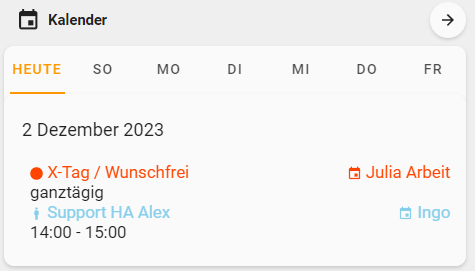

This card uses the following components:
- Button-Card (HACS)
- Atomic Calendar Revive (HACS)
- Tabbed-Card (HACS)
- Mushroom-Card (HACS)
- Card-Mod (HACS)
- a sensor with the current date (sensor.date)
YAML-Code
type: vertical-stack
cards:
- type: custom:mushroom-chips-card
alignment: justify
chips:
- type: template
content: Kalender
icon: mdi:calendar
tap_action: none
card_mod:
style: |
ha-card {
padding: 0px !important;
border: none !important;
box-shadow: none !important;
font-size: 3.5rem !important;
background: none !important;
}
- type: template
icon: mdi:arrow-right
tap_action:
action: navigate
navigation_path: /calendar
- type: custom:button-card
show_state: false
show_icon: false
show_name: false
styles:
card:
- padding: 0px
grid:
- grid-template-areas: '"karte"'
- grid-template-columns: 100%
- grid-template-rows: 100%
custom_fields:
karte:
- filter: opacity(100%)
- overflow: visible
custom_fields:
karte:
card:
type: custom:mod-card
card_mod:
style:
tabbed-card:
$:
mwc-tab:
$:
mwc-tab-indicator $: ''
.: |
.mdc-tab {
min-width: 35px !important;
}
.material-icons {
display: contents !important;
}
.mdc-tab--active {
--mdc-icon-size: {{states('input_number.active_icon_size')}}px;
}
.: |
tabbed-card {
--mdc-tab-horizontal-padding: 0px;
}
card:
type: custom:tabbed-card
attributes:
minWidth: true
styles:
'--mdc-tab-horizontal-padding': 0px !important
'--mdc-theme-primary': var(--energy-solar-color)
tabs:
- attributes:
minWidth: true
stacked: false
label: Heute
card:
type: custom:atomic-calendar-revive
enableModeChange: true
entities:
- entity: calendar.ingo_niehues_gmail_com
name: Ingo
color: skyblue
showMultiDay: false
- entity: calendar.familie
name: Familie
color: darkorange
showMultiDay: false
- entity: calendar.ingo_dienst
name: Ingo dienst
color: skyblue
showMultiDay: false
- entity: calendar.julia_soppe_googlemail_com
name: Julia
showMultiDay: false
color: orangered
- entity: calendar.ferien_nrw
name: Ferien NRW
color: purple
- entity: calendar.vivendi_pep
name: Julia Arbeit
color: orangered
showMultiDay: false
cardHeight: 100%
showDeclined: false
showDate: true
offsetHeaderDate: true
showLocation: false
hideFinishedEvents: true
showRelativeTime: false
compactMode: false
untilText: bis
fullDayEventText: ganztägig
noEventsForNextDaysText: keine anstehenden Termine
noEventText: heute keine Termine
hiddenEventText: Termine sind ausgeblendet
showProgressBar: false
showCurrentEventLine: false
showMonth: false
showWeekDay: false
showDescription: false
showEventIcon: true
showCalendarName: true
showHiddenText: false
showDatePerEvent: false
showEventDate: false
hideDuplicates: true
showMultiDayEventParts: true
showMultiDay: true
maxDaysToShow: 1
- attributes:
minWidth: true
stacked: false
label: |
[[[
var days = ['So', 'Mo', 'Di', 'Mi', 'Do', 'Fr', 'Sa'];
var currentDate = new Date(states['sensor.date'].state);
currentDate.setDate(currentDate.getDate() + 1);
return days[currentDate.getDay()];
]]]
card:
type: custom:atomic-calendar-revive
enableModeChange: true
entities:
- entity: calendar.ingo_niehues_gmail_com
name: Ingo
color: skyblue
showMultiDay: false
- entity: calendar.familie
name: Familie
color: darkorange
showMultiDay: false
- entity: calendar.ingo_dienst
name: Ingo dienst
color: skyblue
showMultiDay: false
- entity: calendar.julia_soppe_googlemail_com
name: Julia
showMultiDay: false
color: orangered
- entity: calendar.ferien_nrw
name: Ferien NRW
color: purple
- entity: calendar.vivendi_pep
name: Julia Arbeit
color: orangered
showMultiDay: false
cardHeight: 100%
showDeclined: false
showDate: true
offsetHeaderDate: true
showLocation: false
hideFinishedEvents: true
showRelativeTime: false
compactMode: false
untilText: bis
fullDayEventText: ganztägig
noEventsForNextDaysText: keine anstehenden Termine
noEventText: heute keine Termine
hiddenEventText: Termine sind ausgeblendet
showProgressBar: false
showCurrentEventLine: false
showMonth: false
showWeekDay: false
showDescription: false
showEventIcon: true
showCalendarName: true
showHiddenText: false
showDatePerEvent: false
showEventDate: false
hideDuplicates: true
showMultiDayEventParts: true
showMultiDay: true
maxDaysToShow: 1
startDaysAhead: 1
- attributes:
minWidth: true
stacked: false
label: |
[[[
var days = ['So', 'Mo', 'Di', 'Mi', 'Do', 'Fr', 'Sa'];
var currentDate = new Date(states['sensor.date'].state);
currentDate.setDate(currentDate.getDate() + 2);
return days[currentDate.getDay()];
]]]
card:
type: custom:atomic-calendar-revive
enableModeChange: true
entities:
- entity: calendar.ingo_niehues_gmail_com
name: Ingo
color: skyblue
showMultiDay: false
- entity: calendar.familie
name: Familie
color: darkorange
showMultiDay: false
- entity: calendar.ingo_dienst
name: Ingo dienst
color: skyblue
showMultiDay: false
- entity: calendar.julia_soppe_googlemail_com
name: Julia
showMultiDay: false
color: orangered
- entity: calendar.ferien_nrw
name: Ferien NRW
color: purple
- entity: calendar.vivendi_pep
name: Julia Arbeit
color: orangered
showMultiDay: false
cardHeight: 100%
showDeclined: false
showDate: true
offsetHeaderDate: true
showLocation: false
hideFinishedEvents: true
showRelativeTime: false
compactMode: false
untilText: bis
fullDayEventText: ganztägig
noEventsForNextDaysText: keine anstehenden Termine
noEventText: heute keine Termine
hiddenEventText: Termine sind ausgeblendet
showProgressBar: false
showCurrentEventLine: false
showMonth: false
showWeekDay: false
showDescription: false
showEventIcon: true
showCalendarName: true
showHiddenText: false
showDatePerEvent: false
showEventDate: false
hideDuplicates: true
showMultiDayEventParts: true
showMultiDay: true
maxDaysToShow: 1
startDaysAhead: 2
- attributes:
minWidth: true
stacked: false
label: |
[[[
var days = ['So', 'Mo', 'Di', 'Mi', 'Do', 'Fr', 'Sa'];
var currentDate = new Date(states['sensor.date'].state);
currentDate.setDate(currentDate.getDate() + 3);
return days[currentDate.getDay()];
]]]
card:
type: custom:atomic-calendar-revive
enableModeChange: true
entities:
- entity: calendar.ingo_niehues_gmail_com
name: Ingo
color: skyblue
showMultiDay: false
- entity: calendar.familie
name: Familie
color: darkorange
showMultiDay: false
- entity: calendar.ingo_dienst
name: Ingo dienst
color: skyblue
showMultiDay: false
- entity: calendar.julia_soppe_googlemail_com
name: Julia
showMultiDay: false
color: orangered
- entity: calendar.ferien_nrw
name: Ferien NRW
color: purple
- entity: calendar.vivendi_pep
name: Julia Arbeit
color: orangered
showMultiDay: false
cardHeight: 100%
showDeclined: false
showDate: true
offsetHeaderDate: true
showLocation: false
hideFinishedEvents: true
showRelativeTime: false
compactMode: false
untilText: bis
fullDayEventText: ganztägig
noEventsForNextDaysText: keine anstehenden Termine
noEventText: heute keine Termine
hiddenEventText: Termine sind ausgeblendet
showProgressBar: false
showCurrentEventLine: false
showMonth: false
showWeekDay: false
showDescription: false
showEventIcon: true
showCalendarName: true
showHiddenText: false
showDatePerEvent: false
showEventDate: false
hideDuplicates: true
showMultiDayEventParts: true
showMultiDay: true
maxDaysToShow: 1
startDaysAhead: 3
- attributes:
minWidth: true
stacked: false
label: |
[[[
var days = ['So', 'Mo', 'Di', 'Mi', 'Do', 'Fr', 'Sa'];
var currentDate = new Date(states['sensor.date'].state);
currentDate.setDate(currentDate.getDate() + 4);
return days[currentDate.getDay()];
]]]
card:
type: custom:atomic-calendar-revive
enableModeChange: true
entities:
- entity: calendar.ingo_niehues_gmail_com
name: Ingo
color: skyblue
showMultiDay: false
- entity: calendar.familie
name: Familie
color: darkorange
showMultiDay: false
- entity: calendar.ingo_dienst
name: Ingo dienst
color: skyblue
showMultiDay: false
- entity: calendar.julia_soppe_googlemail_com
name: Julia
showMultiDay: false
color: orangered
- entity: calendar.ferien_nrw
name: Ferien NRW
color: purple
- entity: calendar.vivendi_pep
name: Julia Arbeit
color: orangered
showMultiDay: false
cardHeight: 100%
showDeclined: false
showDate: true
offsetHeaderDate: true
showLocation: false
hideFinishedEvents: true
showRelativeTime: false
compactMode: false
untilText: bis
fullDayEventText: ganztägig
noEventsForNextDaysText: keine anstehenden Termine
noEventText: heute keine Termine
hiddenEventText: Termine sind ausgeblendet
showProgressBar: false
showCurrentEventLine: false
showMonth: false
showWeekDay: false
showDescription: false
showEventIcon: true
showCalendarName: true
showHiddenText: false
showDatePerEvent: false
showEventDate: false
hideDuplicates: true
showMultiDayEventParts: true
showMultiDay: true
maxDaysToShow: 1
startDaysAhead: 4
- attributes:
minWidth: true
stacked: false
label: |
[[[
var days = ['So', 'Mo', 'Di', 'Mi', 'Do', 'Fr', 'Sa'];
var currentDate = new Date(states['sensor.date'].state);
currentDate.setDate(currentDate.getDate() + 5);
return days[currentDate.getDay()];
]]]
card:
type: custom:atomic-calendar-revive
enableModeChange: true
entities:
- entity: calendar.ingo_niehues_gmail_com
name: Ingo
color: skyblue
showMultiDay: false
- entity: calendar.familie
name: Familie
color: darkorange
showMultiDay: false
- entity: calendar.ingo_dienst
name: Ingo dienst
color: skyblue
showMultiDay: false
- entity: calendar.julia_soppe_googlemail_com
name: Julia
showMultiDay: false
color: orangered
- entity: calendar.ferien_nrw
name: Ferien NRW
color: purple
- entity: calendar.vivendi_pep
name: Julia Arbeit
color: orangered
showMultiDay: false
cardHeight: 100%
showDeclined: false
showDate: true
offsetHeaderDate: true
showLocation: false
hideFinishedEvents: true
showRelativeTime: false
compactMode: false
untilText: bis
fullDayEventText: ganztägig
noEventsForNextDaysText: keine anstehenden Termine
noEventText: heute keine Termine
hiddenEventText: Termine sind ausgeblendet
showProgressBar: false
showCurrentEventLine: false
showMonth: false
showWeekDay: false
showDescription: false
showEventIcon: true
showCalendarName: true
showHiddenText: false
showDatePerEvent: false
showEventDate: false
hideDuplicates: true
showMultiDayEventParts: true
showMultiDay: true
maxDaysToShow: 1
startDaysAhead: 5
- attributes:
minWidth: true
stacked: false
label: |
[[[
var days = ['So', 'Mo', 'Di', 'Mi', 'Do', 'Fr', 'Sa'];
var currentDate = new Date(states['sensor.date'].state);
currentDate.setDate(currentDate.getDate() + 6);
return days[currentDate.getDay()];
]]]
card:
type: custom:atomic-calendar-revive
enableModeChange: true
entities:
- entity: calendar.ingo_niehues_gmail_com
name: Ingo
color: skyblue
showMultiDay: false
- entity: calendar.familie
name: Familie
color: darkorange
showMultiDay: false
- entity: calendar.ingo_dienst
name: Ingo dienst
color: skyblue
showMultiDay: false
- entity: calendar.julia_soppe_googlemail_com
name: Julia
showMultiDay: false
color: orangered
- entity: calendar.ferien_nrw
name: Ferien NRW
color: purple
- entity: calendar.vivendi_pep
name: Julia Arbeit
color: orangered
showMultiDay: false
cardHeight: 100%
showDeclined: false
showDate: true
offsetHeaderDate: true
showLocation: false
hideFinishedEvents: true
showRelativeTime: false
compactMode: false
untilText: bis
fullDayEventText: ganztägig
noEventsForNextDaysText: keine anstehenden Termine
noEventText: heute keine Termine
hiddenEventText: Termine sind ausgeblendet
showProgressBar: false
showCurrentEventLine: false
showMonth: false
showWeekDay: false
showDescription: false
showEventIcon: true
showCalendarName: true
showHiddenText: false
showDatePerEvent: false
showEventDate: false
hideDuplicates: true
showMultiDayEventParts: true
showMultiDay: true
maxDaysToShow: 1
startDaysAhead: 6
20 Likes
Compact climate card

Card code
type: custom:stack-in-card
cards:
  - type: horizontal-stack
    cards:
      - type: custom:mushroom-template-card
        entity: sensor.ble_room_temperature
        layout: vertical
        primary: '{{ states(entity) | round(0, default=0) }}°С'
        secondary: Temperature
        tap_action:
          action: more-info
        style: |
          ha-card {
            background: transparent;
            border-style: none;
          }
          :host {
            --mush-card-primary-font-size: 20px;
            --primary-text-color: rgb(var(--rgb-green));
            --mush-spacing: 8px;
          }
      - type: custom:mushroom-template-card
        entity: sensor.ble_room_humidity
        layout: vertical
        primary: '{{ states(entity) | round(0, default=0) }}%'
        secondary: Humidity
        tap_action:
          action: more-info
        style: |
          ha-card {
            background: transparent;
            border-style: none;
          }
          :host {
            --mush-card-primary-font-size: 20px;
            --primary-text-color: rgb(var(--rgb-light-blue));
            --mush-spacing: 8px;
          }
      - type: custom:mushroom-template-card
        entity: sensor.narodmon_temperature
        layout: vertical
        primary: '{{ states(entity) | round(0, default=0) }}°С'
        secondary: Outdoor
        tap_action:
          action: more-info
        style: |
          ha-card {
            background: transparent;
            border-style: none;
          }
          :host {
            --mush-card-primary-font-size: 20px;
            --primary-text-color: #f0e68c;
            --mush-spacing: 8px;
          }
  - type: custom:mini-graph-card
    hours_to_show: 96
    line_width: 2
    animate: false
    show:
      name: false
      icon: false
      points: false
      labels: false
      labels_secondary: false
      state: false
      legend: false
      fill: fade
    entities:
      - entity: sensor.ble_room_temperature
        color: '#4caf50'
      - entity: sensor.narodmon_temperature
        color: khaki
        y_axis: secondary
  - type: custom:mushroom-template-card
    entity: climate.radiator_komnata
    primary: Heater
    secondary: |
      {{ state_attr(entity, 'current_temperature') | round(0, default=0) }}°C
    icon: mdi:heating-coil
    icon_color: >-
      {% set status = state_attr('climate.radiator_komnata','hvac_action') %} {%
      if status == 'off' %} grey {% elif status == 'cooling' %} light-blue {%
      elif status == 'heating' %} deep-orange {% else %} grey {% endif %}
    badge_color: red
    tap_action:
      action: more-info
    card_mod:
      style:
        mushroom-shape-icon$: |
          ha-card {
             background: transparent;
             border-style: none;
            }
  - type: conditional
    conditions:
      - entity: climate.radiator_komnata
        state_not:
          - 'off'
          - unavailable
    card:
      type: custom:mushroom-chips-card
      alignment: center
      chips:
        - type: template
          icon: mdi:valve
          content: '{{ states(config.entity) }}'
          entity: sensor.radiator_komnata_position
          tap_action:
            action: none
          icon_color: deep-orange
          card_mod:
            style: |
              ha-card {
                --text-color: rgba(255, 255, 255, 0.8);
                --chip-font-size: 12px;
                --chip-icon-size: 16px;
                --chip-background: rgba(var({{ '--rgb-disabled' }}), 0.1);
              }
              .content {
                flex-direction: column !important;
              }
        - type: template
          entity: climate.radiator_komnata
          icon: |-
            {% set mode = state_attr(entity, 'preset_mode') %}
            {% if mode == 'eco' %} mdi:thermometer-minus
            {% elif mode == 'comfort' %} mdi:thermometer-plus
            {% else %} mdi:fan-speed-3
            {% endif %}
          icon_color: orange
          tap_action:
            action: call-service
            service: script.climate_preset_switch
          card_mod:
            style: |
              ha-card {
                --chip-background: rgba(var({{ '--rgb-disabled' }}), 0.1);
                --chip-icon-size: 18px;
              }
      card_mod:
        style:
          .chip-container :nth-child(1)$: |
            ha-state-icon {
              margin: 3px !important;
            }
          .: |
            ha-card {
                --chip-border-radius:10px;
                --chip-box-shadow: none;
                top: -50px;
                width: -webkit-fill-available;
                right: 15px;
            }
            .chip-container {
                right: 0px;
                position: absolute;
            }
  - type: custom:mushroom-template-card
    entity: humidifier.xiaomi_humidifier
    primary: Humidifier
    secondary: >-
      {% if is_state(entity, 'unavailable') %} none {% else %} {{
      states('sensor.xiaomi_humidifier_temperature') | round(0, default=0) }}°C
      •  {{ states('sensor.xiaomi_humidifier_humidity') | round(0, default=0)
      }}%  {% endif %}
    icon: mdi:air-filter
    tap_action:
      action: toggle
    hold_action:
      action: more-info
    icon_color: '{% if is_state(entity, ''on'') %} blue {% endif %}'
  - type: conditional
    conditions:
      - entity: humidifier.xiaomi_humidifier
        state: 'on'
    card:
      type: custom:mushroom-chips-card
      chips:
        - type: template
          entity: sensor.xiaomi_humidifier_water_level
          icon: mdi:water
          icon_color: blue
          content: '{{ states(config.entity) }}'
          tap_action:
            action: none
          card_mod:
            style: |
              ha-card {
                --chip-font-size: var(--card-secondary-font-size);
              --chip-font-size: 12px;
              --chip-icon-size: 20px;
              --chip-background: rgba(var({{ '--rgb-disabled' }}), 0.1);
              {% if states(config.entity) <= '10' %}
                --text-color: #FF8A65;
              {% elif states(config.entity) <= '100' %}
                --text-color: rgba(255, 255, 255, 0.8);
              {% endif %}
              }
              .content {
                flex-direction: column !important;
              }
        - type: template
          entity: humidifier.xiaomi_humidifier
          content: null
          icon: |-
            {% set mode = state_attr(entity, 'mode') %}
            {% if mode == 'Silent' %} mdi:fan-speed-1
            {% elif mode == 'Medium' %} mdi:fan-speed-2
            {% elif mode == 'High' %} mdi:fan-speed-3
            {% endif %}
          icon_color: orange
          tap_action:
            action: call-service
            service: script.humidifier_fan_speed_switch
          card_mod:
            style: |
              ha-card {
                --chip-icon-size: 20px;
                --chip-background: rgba(var({{ '--rgb-disabled' }}), 0.1);
              }
      card_mod:
        style:
          .chip-container :nth-child(1)$: |
            ha-state-icon {
              margin: 0px !important;
            }
          .: |
            ha-card {
                --chip-border-radius:10px;
                --chip-box-shadow: none;
                top: -50px;
                width: -webkit-fill-available;
                right: 15px;
            }
            .chip-container {
                right: 0px;
                position: absolute;
            }
One button switches two modes (script example)
alias: humidifier_fan_speed_switch
sequence:
  - if:
      - condition: state
        entity_id: humidifier.xiaomi_humidifier
        state: Silent
        attribute: mode
    then:
      - service: humidifier.set_mode
        target:
          entity_id: humidifier.xiaomi_humidifier
        data:
          mode: Medium
    else:
      - service: humidifier.set_mode
        data:
          mode: Silent
        target:
          entity_id: humidifier.xiaomi_humidifier
mode: single
icon: mdi:fan
19 Likes
Hi
please share me code for script.humidifier_fan_speed_switch
thanks
The code for this script is already there. In the second spoiler.
I would also like to share my experience for the Smartmi Humidifier

Card code
type: custom:stack-in-card
mode: vertical
cards:
  - type: custom:layout-card
    layout_type: custom:grid-layout
    cards:
      - type: tile
        entity: humidifier.moika_vozduha_gostinaya
        name: Humidifier
        state_content:
          - state
          - humidity
        features:
          - type: target-humidity
        view_layout:
          grid-area: humidifier
        card_mod:
          style: |
            ha-card {
              border-style: none;
              box-shadow: 0px 0px;
            }
      - type: custom:mushroom-template-card
        primary: '{{ states(entity)|int }}%'
        secondary: Water level
        icon: |-
          {% if states(entity)|int == 0 %}
          mdi:hexagon-outline
          {% elif states(entity)|int <= 20 %}
          mdi:hexagon-slice-1
          {% elif states(entity)|int <= 40 %}
          mdi:hexagon-slice-2
          {% elif states(entity)|int <= 60 %}
          mdi:hexagon-slice-3
          {% elif states(entity)|int <= 80 %}
          mdi:hexagon-slice-4
          {% elif states(entity)|int <= 100 %}
          mdi:hexagon-slice-5
          {% elif states(entity)|int == 100 %}
          mdi:hexagon-slice-6
          {% else %}
          mdi:progress-question
          {% endif %}
        entity: sensor.uvlazhnitel_water_level
        layout: vertical
        icon_color: |-
          {% if states(entity)|int == 0 %}
          red
          {% elif states(entity)|int <= 20 %}
          deep-orange
          {% elif states(entity)|int <= 40 %}
          orange
          {% elif states(entity)|int <= 60 %}
          amber
          {% elif states(entity)|int <= 80 %}
          light-green
          {% elif states(entity)|int <= 100 %}
          green
          {% elif states(entity)|int == 100 %}
          blue
          {% else %}
          grey
          {% endif %}
        card_mod:
          style: |
            ha-card {
              border-style: none;
              box-shadow: 0px 0px;
            }
        view_layout:
          grid-area: water_level
      - type: custom:mushroom-chips-card
        alignment: end
        chips:
          - type: template
            icon: >-
              {{ iif(states(entity) == 'on', 'mdi:volume-high',
              'mdi:volume-variant-off') }}
            icon_color: '{{ iif(states(entity) == ''on'', ''light-green'', ''gray'') }}'
            tap_action:
              action: toggle
            entity: switch.uvlazhnitel_child_lock
            card_mod:
              style: |
                ha-card {
                  border-style: none;
                  box-shadow: 0px 0px;
                }
          - type: template
            icon: '{{ iif(states(entity) == ''on'', ''mdi:lock'', ''mdi:lock-open'') }}'
            icon_color: '{{ iif(states(entity) == ''on'', ''light-green'', ''gray'') }}'
            tap_action:
              action: toggle
            entity: switch.uvlazhnitel_buzzer
            card_mod:
              style: |
                ha-card {
                  border-style: none;
                  box-shadow: 0px 0px;
                }
        view_layout:
          grid-area: chips_button
      - type: custom:mushroom-chips-card
        chips:
          - type: template
            icon: mdi:numeric-1-box
            icon_color: >-
              {% set current_mode =
              state_attr('humidifier.moika_vozduha_gostinaya', 'mode') %}

              {{ iif(current_mode == 'Silent', 'light-green', '') }}
            tap_action:
              action: call-service
              service: humidifier.set_mode
              target:
                entity_id: humidifier.moika_vozduha_gostinaya
              data:
                mode: Silent
            card_mod:
              style: |
                ha-card {
                  border-style: none;
                  box-shadow: 0px 0px;
                }
          - type: template
            icon: mdi:numeric-2-box
            icon_color: >-
              {% set current_mode =
              state_attr('humidifier.moika_vozduha_gostinaya', 'mode') %}

              {{ iif(current_mode == 'Medium', 'light-green', '') }}
            tap_action:
              action: call-service
              service: humidifier.set_mode
              target:
                entity_id: humidifier.moika_vozduha_gostinaya
              data:
                mode: Medium
            card_mod:
              style: |
                ha-card {
                  border-style: none;
                  box-shadow: 0px 0px;
                }
          - type: template
            icon: mdi:numeric-3-box
            icon_color: >-
              {% set current_mode =
              state_attr('humidifier.moika_vozduha_gostinaya', 'mode') %}

              {{ iif(current_mode == 'High', 'light-green', '') }}
            tap_action:
              action: call-service
              service: humidifier.set_mode
              target:
                entity_id: humidifier.moika_vozduha_gostinaya
              data:
                mode: High
            card_mod:
              style: |
                ha-card {
                  border-style: none;
                  box-shadow: 0px 0px;
                }
          - type: template
            icon: mdi:alpha-a-box
            icon_color: >-
              {% set current_mode =
              state_attr('humidifier.moika_vozduha_gostinaya', 'mode') %}

              {{ iif(current_mode == 'Auto', 'light-green', '') }}
            tap_action:
              action: call-service
              service: humidifier.set_mode
              target:
                entity_id: humidifier.moika_vozduha_gostinaya
              data:
                mode: Auto
            card_mod:
              style: |
                ha-card {
                  border-style: none;
                  box-shadow: 0px 0px;
                }
        view_layout:
          grid-area: chips_state
    layout:
      grid-template-columns: 70% 30%
      grid-template-rows: auto
      grid-template-areas: |
        "humidifier water_level"
        "chips_state chips_button"
Required resources
card_mod
mushroom-cards
stack-in-card
7 Likes
Question. I created a graph card with ApexChart in combination with the tabbed card. The tabs are on the top and i want them at the bottom Like this

it look like this right now

Maybe somebody now some options?
4 Likes
only Tabbed card developer can help you in this case
nice cards & can you share code pleas ?
type: custom:tabbed-card
styles:
  '--mdc-theme-primary': '#00A964'
  '--mdc-tab-text-label-color-default': black
  '--mdc-typography-button-font-size': 10px
  '--mdc-tab-stacked-height': 10px
  '--mdc-tab-height': 50px
tabs:
  - card:
      type: custom:apexcharts-card
      apex_config:
        chart:
          stacked: true
          height: 250px
      header:
        show: false
        show_states: true
        colorize_states: true
      now:
        show: true
        label: nu
        color: red
      series:
        - entity: sensor.electricity_meter_energy_consumption_tarif_1
          type: column
          color: '#00A964'
          name: Tarief 1
          group_by:
            duration: 1h
            func: delta
        - entity: sensor.electricity_meter_energy_consumption_tarif_2
          type: column
          color: '#00A964'
          name: Tarief 2
          group_by:
            duration: 1h
            func: delta
        - entity: sensor.solis_energy_today
          type: column
          color: '#FF9900'
          name: Zonnepanelen
          group_by:
            duration: 1h
            func: delta
      graph_span: 24h
      span:
        start: day
    attributes:
      label: Vandaag
  - card:
      type: custom:apexcharts-card
      apex_config:
        chart:
          stacked: true
          height: 250px
      header:
        show: false
        show_states: true
        colorize_states: true
      now:
        show: true
        label: nu
        color: red
      series:
        - entity: sensor.electricity_meter_energy_consumption_tarif_1
          type: column
          color: '#00A964'
          name: Tarief 1
          group_by:
            duration: 1d
            func: delta
        - entity: sensor.electricity_meter_energy_consumption_tarif_2
          type: column
          color: '#00A964'
          name: Tarief 2
          group_by:
            duration: 1d
            func: delta
        - entity: sensor.solis_energy_today
          type: column
          color: '#FF9900'
          name: Zonnepanelen
          group_by:
            duration: 1d
            func: delta
      graph_span: 7d
      span:
        start: week
    attributes:
      label: Week
  - card:
      type: custom:apexcharts-card
      apex_config:
        chart:
          stacked: true
          height: 250px
      header:
        show: false
        show_states: true
        colorize_states: true
      now:
        show: true
        label: nu
        color: red
      series:
        - entity: sensor.electricity_meter_energy_consumption_tarif_1
          type: column
          color: '#00A964'
          name: Tarief 1
          group_by:
            duration: 7d
            func: delta
        - entity: sensor.electricity_meter_energy_consumption_tarif_2
          type: column
          color: '#00A964'
          name: Tarief 2
          group_by:
            duration: 7d
            func: delta
        - entity: sensor.solis_energy_today
          type: column
          color: '#FF9900'
          name: Zonnepanelen
          group_by:
            duration: 7d
            func: delta
      graph_span: 30d
      span:
        start: month
    attributes:
      label: Maand
  - card:
      type: custom:apexcharts-card
      apex_config:
        chart:
          stacked: true
          height: 250px
      header:
        show: false
        show_states: true
        colorize_states: true
      now:
        show: true
        label: nu
        color: red
      series:
        - entity: sensor.electricity_meter_energy_consumption_tarif_1
          type: column
          color: '#00A964'
          name: Tarief 1
          statistics:
            type: state
            period: day
          group_by:
            duration: 1month
            func: delta
        - entity: sensor.electricity_meter_energy_consumption_tarif_2
          type: column
          color: '#00A964'
          name: Tarief 2
          statistics:
            type: state
            period: day
          group_by:
            duration: 1month
            func: delta
      graph_span: 1y
      span:
        end: year
    attributes:
      label: Jaar
4 Likes
1 Like
There is a mod for this, check the link above.

2 Likes
Have been using this since the day you posted, but today i’m getting “i.setConfig is not a function”. Have recreated the card, but seems to give the same error. Any pointers?
And as sudden as it came, it went away. Let it gooo 
1 Like
Greetings to you all,
today i wanted to share with you a very simple but effective light control card for 4 lights that came about more or less by chance. Through a lot of combining and experimenting with cards from this thread, I came up with this absolutely beautiful combination of different cards. I really like it, so it would be a shame not to share it with you. It’s also interesting that the layout changes a lot depending on how you view your dashboard (grid layout, horizontal and vertical layout), as you can see in the two pictures. But don’t ask me why this happens. Maybe you can tell me. and now have fun with it


type: custom:layout-card
layout_type: custom:vertical-layout
layout: {}
cards:
  - type: custom:stack-in-card
    card_mod:
      style: |
        ha-card {
          background-image: url('https://hueblog.de/wp-content/uploads/2018/01/Philips_Hue-Lounge.jpg');
          background-size: cover;
          background-position: center center;
        }
    cards:
      - type: custom:layout-card
        layout_type: custom:grid-layout
        layout:
          grid-template-columns: repeat(auto-fill, minmax(200px, 1fr))
        cards:
          - type: custom:mushroom-light-card
            entity: light.kugellampe
            layout: vertical
            use_light_color: true
            secondary_info: none
            card_mod:
              style: |
                ha-card {
                  {% set r = state_attr(config.entity, 'rgb_color')[0] %}
                  {% set g = state_attr(config.entity, 'rgb_color')[1] %}
                  {% set b = state_attr(config.entity, 'rgb_color')[2] %}
                  background: rgba( {{r}}, {{g}}, {{b}}, 0.2 );
                }
          - type: custom:mushroom-light-card
            entity: light.spot
            layout: vertical
            primary_info: name
            use_light_color: true
            secondary_info: none
            card_mod:
              style: |
                ha-card {
                  {% set r = state_attr(config.entity, 'rgb_color')[0] %}
                  {% set g = state_attr(config.entity, 'rgb_color')[1] %}
                  {% set b = state_attr(config.entity, 'rgb_color')[2] %}
                  background: rgba( {{r}}, {{g}}, {{b}}, 0.2 );
                }
          - type: custom:mushroom-light-card
            entity: light.strahler
            layout: vertical
            primary_info: name
            use_light_color: true
            secondary_info: none
            card_mod:
              style: |
                ha-card {
                  {% set r = state_attr(config.entity, 'rgb_color')[0] %}
                  {% set g = state_attr(config.entity, 'rgb_color')[1] %}
                  {% set b = state_attr(config.entity, 'rgb_color')[2] %}
                  background: rgba( {{r}}, {{g}}, {{b}}, 0.2 );
                }
          - type: custom:mushroom-light-card
            entity: light.ball
            layout: vertical
            use_light_color: true
            secondary_info: none
            card_mod:
              style: |
                ha-card {
                  {% set r = state_attr(config.entity, 'rgb_color')[0] %}
                  {% set g = state_attr(config.entity, 'rgb_color')[1] %}
                  {% set b = state_attr(config.entity, 'rgb_color')[2] %}
                  background: rgba( {{r}}, {{g}}, {{b}}, 0.2 );
                }
5 Likes