Plotly interactive Graph Card

Hi . I like this card very much. Have used plotly in the past so this is a useful integration to HASS.
I have been looking for an example that uses multiple y axes and how to assign entities to different y axes. Sometmes this happens automatically sometimes it doesnt. I want to force an entity to a particular y axis. Any ideas ?

Just answered my own question after i found this post Heatpump data with multiple axes and end value · Discussion #17 · dbuezas/lovelace-plotly-graph-card · GitHub .about multiple axes.

so for others , this forces an axis to the RHS

type: custom:plotly-graph
entities:
  - entity: sensor.pvtotal
  - entity: sensor.pvdaytotal
    yaxis: y2
hours_to_show: 24
refresh_interval: 10
layout:
  yaxis2:
    mirroraxis: true
    fixedrange: true
    range:
      - 0
      - 10 

image

2 Likes

Is there an option to hide the Y axis ?

Yes, the card automatically adds yaxes for each different unit_of_measurement in the entities you pass.
You can override the unit_of_measurement and also the yaxis yourself

To hide an axis:

layout:
  yaxis:
    visible: false

Pro tip: google “hide yaxis plotly.js”
Most of the api goes directly to plotly.

Love the card! I’m currently trying to build a plot based on the weather forecast. For this, I need to access a nested attribute like shown below. Is this possible? What can I do to make it work?

This is what the attributes from the weatherflow forecast are looking like:

temperature: 21.7
humidity: 32
pressure: 1019.2
wind_bearing: 131
wind_speed: 9
visibility: 40.2
attribution: Powered by WeatherFlow
friendly_name: Weatherflow Hourly based Forecast
forecast:
  - datetime: '2022-06-02T14:00:00+00:00'
    temperature: 22
    precipitation: 0
    precipitation_probability: 0
    condition: partlycloudy
    wind_speed: 7.2
    wind_gust: 7.2
    wind_bearing: 29
    feels_like: 22
    uv_index: 4
  - datetime: '2022-06-02T15:00:00+00:00'
    temperature: 22
    precipitation: 0
    precipitation_probability: 0
    condition: partlycloudy
    wind_speed: 7.2
    wind_gust: 7.2
    wind_bearing: 39
    feels_like: 22
    uv_index: 3
  - datetime: '2022-06-02T16:00:00+00:00'
    temperature: 22
    precipitation: 0
   ...

I wand to access the data in the forecast attribute like here in ApexCharts :

                data_generator: |
                  return entity.attributes.forecast.map((entry) => {
                    return [new Date(entry.datetime).getTime(), entry.temperature];
                  });

However, the “forecast” attribute seems to be not available in the plotly graph card.
As the code below shows, it is missing from the attribute’s keys:

type: custom:plotly-graph
entities:
  - entity: weather.weatherflow_hourly_based_forecast
    lambda: |-
      (ys, xs, entity) => {
        var attributes = new Map(Object.entries(entity[10].attributes));      
        return ({x: xs, y: Array.from(attributes.keys())})
      }
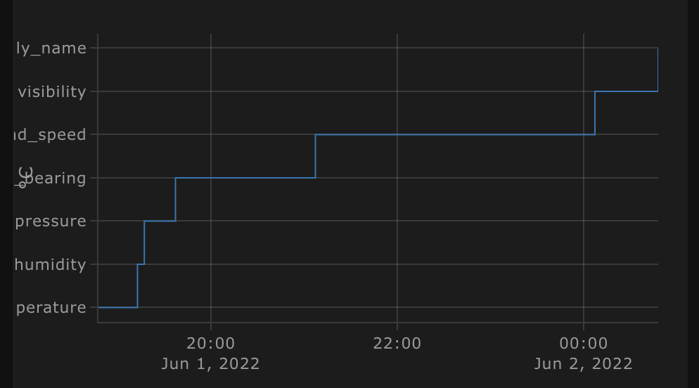
2 Likes

Interesting, I’ve never seen nested attributes.
Would you put this in the discussions in github instead?
We can go back and forth much easier there :slight_smile:

In principle it should work just fine so this may be a fixable bug or we may be missing something in the lambda.

Btw: you can use console.log in lambdas, the logs are in the browser dev console. You can even use breakpoints

First off, thank you, this is exactly what I was looking for! (almost :wink:)
Just discovered it this morning when looking to try and get a little more functionality into mini-graph-card, and came across this which would display the plots so much better and closer to what I want.
Ran into a little issue, been searching a couple hours to see if its common or a faq without luck, maybe you can point me in the right direction?

So I have a dashboard with a vertical stack, each stack has horizontal stacks of cards, a fairly typical grid/item layout.
Using mini-graph-cards one of the horizontal stacks has 3 graphs in it which display without issue.
Trying to recreate it with plotly if there’s only one graph in the stack it works fine, but as soon as I add a second it starts resizing constantly.

I can reproduce it also by just adding a new card, then a horizontal stack, then add a custom plotly graph card and its fine (the default with just sun entity), add a second plotly graph to the same horizontal stack and it also starts scaling over and over:

type: horizontal-stack
cards:
  - type: custom:plotly-graph
    entities:
      - entity: sun.sun
    hours_to_show: 24
    refresh_interval: 10
  - type: custom:plotly-graph
    entities:
      - entity: sun.sun
    hours_to_show: 24
    refresh_interval: 10

I’ve tried adding:

layout:
  height: 200

to each but they still start off much taller, then slowly shrink down to the fixed height.
Tried to catch the limits of each, snips taken a couple of seconds apart:


I’m probably missing something simple here, but can’t seem to figure out what lol, any assistance/advice?

Happy to hear it is of use!
There’s no FAQ, but the discussions section in the repository is fairly rich.
This is probably a bug, I’m doing something a bit dodgy to make the cards responsive and the horizontal card probably hit a corner case I didn’t consider.

Feel free to report an issue in the repository with this, but until I fix this, I recommend you check out grids:

This allows you to have one card with multiple subplots that can even share axes

‘unknown’ states messes up my graphs. How can I make plotly show a fixed value like 0 or 1 instead of unknown?

To filter values, see here:

You may want to check out the other discussions too, there are a lot of tricks there :slight_smile:

1 Like

Is it possible to set a line color to a theme variable or use variables in color schemes?

I’m obviously missing something really obvious, but do you have a bar chart example?

I think you could use yaml templates for that.

Bar chart example in the discussions section: Stacked bar charts · Discussion #35 · dbuezas/lovelace-plotly-graph-card · GitHub

Do you know what that might look like?

I tried variations of this, but I don’t think this works the same way as it does inside the actual themes. A search online is just giving me anything but all the themes that have been created.

  - entity: sensor.sensor_temperature
    connectgaps: true
    line:
      width: 3
      color: {{ var(--background-color) }}

Thanks. I knew there would be one somewhere.

1 Like

Mmm I see… Maybe there’s no way yet. If you make a feature request in the repo (in the issues section), and you come up with a nice way to specify it via yaml, I’ll implement it in the next release :slight_smile:

But first, try out these variable names please :pray:
lovelace-plotly-graph-card/plotly-graph-card.ts at b92b1af50378b7c34e2de6d6dcdff0fd0de767b6 · dbuezas/lovelace-plotly-graph-card · GitHub

If you succeed, please consider a post in the discussion section “show&tell” to help others out :slight_smile:

Nope, no luck with those variables either. I’m guessing they are referenced some other way or just not available.

The config it saves is kind of unusual.

        '[object Object]': null

I’ll give some thought to how to reference those values and make the FR as requested.

Thanks for the input!