css_vars["primary-color"]
Yes, that’s an oversight on my side
css_vars["primary-color"]
Yes, that’s an oversight on my side
Ich try to set modebar orientation to vertical like in default config, but when raw_plotly_config enabled. But I cannot find a way or position in yaml which is working. Neither on entity, not under config not in root, … Do you have a hint?
And secondly. Are there parameters to adjust position of the modebar in terms of margin, etc. as well? Was noch able to find something related in plotly doc.
Here’s the lead:
This files contains the defaults. The “optional” ones are disabled in raw_plotly_config mode.
Ofc I searched there and saw this before, but it is not working in yaml until now. Therefor my question
It goes inside layout
It’s better if you post your screenshot and yaml in github. Inside discussion/q&a
omg. Most probably the only place, where I missed to put it. Skipped it because of the notation in your code
// modebar is missing from the Layout Typings
It is working. Thank you. Any ide on styling this one (position, …) as well?
Works great.
Thanks!
Not by heart . Google plotlyjs how to xyz.
ofc. Did so, didn’t find. But will do more searching.
See here: Layout in JavaScript
Just upgraded - why does my bar plot now look like a stick chart? I read the deprecations but didn’t notice anything in my yaml.
type: custom:plotly-graph
title: Heating
entities:
  - entity: sensor.heating_time_today
    name: Heating Time
    statistic: state
    period: day
    type: bar
    hoverinfo: none
    texttemplate: '%{y}h'
    textposition: inside
    textfont:
      color: white
    marker:
      color: rgba(255,101,0,0.3)
  - entity: sensor.heating_time_today
    name: Heating Time
    statistic: max
    period: day
    showlegend: false
    type: bar
    hoverinfo: none
    texttemplate: '%{y}h'
    textposition: inside
    textfont:
      color: white
    marker:
      color: rgba(255,101,0,0.3)
    yaxis: y1
  - entity: sensor.oil_tank_litres
    name: Oil Level
    statistic: min
    period: day
    line:
      width: 2
      color: orange
      shape: spline
    yaxis: y2
  - entity: sensor.oil_energy
    name: Oil Usage
    statistic: state
    period: day
    line:
      width: 2
      color: green
      shape: spline
layout:
  font:
    color: white
  legend:
    x: 0.1
    'y': -0.4
  xaxis:
    rangeselector:
      bgcolor: black
      'y': 1.05
      buttons:
        - count: 7
          step: day
        - count: 30
          step: day
        - count: 90
          step: day
  margin:
    l: 45
    r: 45
  yaxis3:
    mirroraxis: true
    fixedrange: true
defaults:
  entity:
    show_value: true
config:
  displayModeBar: false
  scrollZoom: false
  locale: en-GB
hours_to_show: 168
refresh_interval: auto
card_mod:
  style: |
    button#reset {
      background: black;
    }
Show_value is not compatible with type: bar. Are you sure this worked before?
I also see strange things with the bar width. Example when first viewed:
Then when I scroll just a small bit:
And when I scroll a bit more:
You need to drop the first data point. Home Assistant reports it as having the timestamp of the beginning of the queried interval, and that makes plotly draw thinner bars because it sees data points close to each other.
Use filters:
filter: i>0
I’m trying to create a bar graph that only shows the current sensor values that are incrementing all the time. If I set the hours to show to 1 day it does not show any data but increasing this to 5 shows the data.

type: custom:plotly-graph
entities:
  - entity: sensor.total_pv_power_kwh
    statistic: state
    name: |
      $fn ({ ys,meta }) =>
        "Solar" + " " + "(" +ys[ys.length - 1]+"kWh)"
    period: day
    type: bar
    texttemplate: '%{y}'
    filters:
      - filter: i>1
    marker:
      color: rgb(255, 155, 48)
  - entity: sensor.total_load_power_kwh
    statistic: state
    name: |
      $fn ({ ys,meta }) =>
        "Load" + " " + "(" +ys[ys.length - 1]+"kWh)"
    period: day
    type: bar
    filters:
      - filter: i>1
    texttemplate: '%{y}'
    marker:
      color: rgb(95, 182, 173)
  - entity: sensor.total_grid_import_kwh
    statistic: state
    name: |
      $fn ({ ys,meta }) =>
        "Grid Import" + " " + "(" +ys[ys.length - 1]+"kWh)"
    period: day
    type: bar
    texttemplate: '%{y}'
    filters:
      - filter: i>1
    marker:
      color: rgb(84, 144, 194)
  - entity: sensor.total_battery_discharge_kwh
    statistic: state
    name: |
      $fn ({ ys,meta }) =>
        "Bat Discharge" + " " + "(" +ys[ys.length - 1]+"kWh)"
    period: day
    type: bar
    texttemplate: '%{y}'
    filters:
      - filter: i>1
    marker:
      color: rgb(151, 90, 182)
  - entity: sensor.total_battery_charge_kwh
    statistic: state
    name: |
      $fn ({ ys,meta }) =>
        "Bat Charge" + " " + "(" +ys[ys.length - 1]+"kWh)"
    period: day
    type: bar
    texttemplate: '%{y}'
    filters:
      - filter: i>1
    marker:
      color: yellow
hours_to_show: 5d
defaults:
  entity:
    line:
      width: 2
  yaxes:
    fixedrange: true
title: null
layout:
  barmode: group
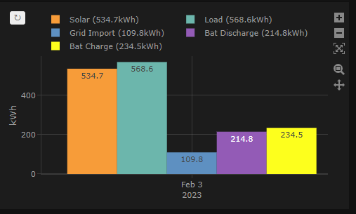
I want the chart to look like this
I can hide the x axis if necessary but it would be nice to show the current date
Nice! Lots of $fn! 
With filter: i>1 you are removing 2 data points, not 1.
The thing is that plotly doesn’t know how wide to make the bar if there is only one so it makes it 2ms wide or something like that.
I suggest you manually set the bar width, set the filter to >0 and set the x range using dynamic time and a half a day offset
type: custom:plotly-graph
entities:
  - entity: sensor.keller_temperature
    period: day
    type: bar
    width: $fn() => 1000*60*60*6
    filters:
      - filter: i>0
hours_to_show: current_day
time_offset: '-12h'
And offset the other bars
type: custom:plotly-graph
entities:
  - entity: sensor.keller_temperature
    period: day
    type: bar
    width: $fn() => 1000*60*60*6
    filters:
      - filter: i>0
  - entity: sensor.keller_temperature
    period: day
    type: bar
    offset: $fn() => 1000*60*60*6
    width: $fn() => 1000*60*60*6
    filters:
      - filter: i>0
hours_to_show: current_day
time_offset: '-12h'
That worked. Thank you
Hi,
Is it still possible in the new version to make the nice stacked graphs?

I cannot get it to work anymore :-S All is plotted in 1 graph


