Thanks, I added the following filter to the end for one of the series:
- fn: |-
    ({xs, ys}) => {
       console.log([xs,ys]);
     }
and got the following:
Is that the expected structure for xs and ys?
Thanks, I added the following filter to the end for one of the series:
- fn: |-
({xs, ys}) => {
console.log([xs,ys]);
}
and got the following:
Is that the expected structure for xs and ys?
Yes, numbers are ok. I don’t know what could then be the problem.
Feel free to open a GitHub issue or discussion and post your code and the whole output there and I can try to reproduce it
I’m creating a network information panel that contains a lot of graphs and data points. I thought I had everything working, but then I came in today and the graphs aren’t updating unless I manually refresh the browser. It has to do with the use of the sensors’ statistics – the values are updated automatically if you pull the current state from the sensor, but not if you are pulling statistics. I want the graphs updated every 5 minutes
Here is an example of a graph created with Plotly. It’s hard to see the problem, but the graph has missed the last 3 updates, and if left alone, the gap between the latest value and the “now” line would get further and further. Do you have any suggestions?

Code below:
- type: custom:plotly-graph
  entities:
    - entity: sensor.internet_median_ping
      name: Min(-1d)
      statistic: min
      period: 5minute
      time_offset: 1d
      line:
        color: '#ffe8cc'
      filters:
        - map_y_numbers: Math.round(y)
        - resample: 5m
    - entity: sensor.internet_maximum_ping
      name: Max(-1d)
      statistic: min
      period: 5minute
      time_offset: 1d
      line:
        color: '#ffcccc'
      filters:
        - map_y_numbers: Math.round(y)
        - resample: 5m
    - entity: sensor.internet_median_ping
      name: Min
      statistic: min
      period: 5minute
      show_value: true
      line:
        color: darkorange
        width: 2
      filters:
        - map_y_numbers: Math.round(y)
        - resample: 5m
    - entity: sensor.internet_maximum_ping
      name: Max
      statistic: min
      period: 5minute
      show_value: true
      line:
        color: red
        width: 2
      filters:
        - map_y_numbers: Math.round(y)
        - resample: 5m
    - entity: ''
      name: Now
      line:
        width: 1
        dash: dot
        color: black
      x: $ex [Date.now(), Date.now()]
      y:
        - 20
        - 100
      yaxis: y9
  hours_to_show: current_day
  refresh_interval: 10
  defaults:
    entity:
      line:
        shape: linear
  layout:
    height: 189
    margin:
      r: 25
      l: 35
      t: 25
      b: 20
    showlegend: false
    title:
      text: Internet Latency (5min min)
      yref: paper
      y: 1.01
      yanchor: bottom
    yaxis:
      range:
        - 20
        - 100
      showticklabels: true
      visible: true
      title: ''
      fixedrange: true
      showlabel: false
      tick0: 20
      dtick: 40
    xaxis:
      showticklabels: false
      fixedrange: true
      nticks: 1
    yaxis9:
      visible: false
      fixedrange: true
I see this is a bug reported here:
There seems to be a bug in the HA api
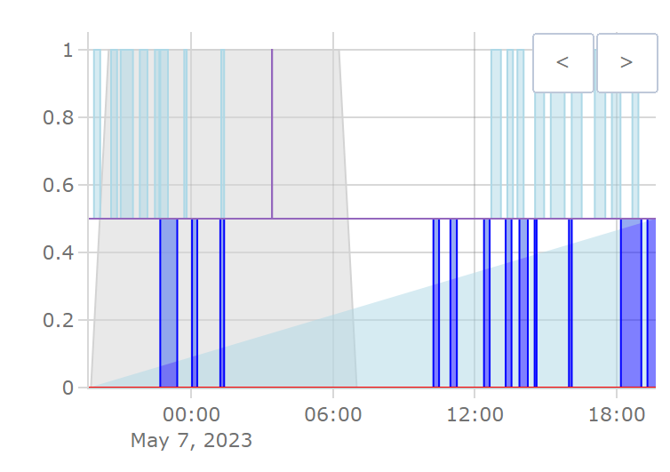
Does anyone know if there is a way to fill a line to a specific value in plotly?
For example, I am trying to create a chart with the time of day in the background as gray for nightime and then my downstairs AC ontime as dark blue on the bottom and the upstairs AC ontime light blue on the top. And the same for heating.
I graph downstairs HVAC on and off as 0 to 0.5 and upstairs 0.5 to 1. The downstairs (dark blue) fills nicely with the “fill: tozeroy”. However the upstairs (light blue) doesn’t seem to fill how I want it to. I added a line at 0.5 and used the fill option: “fill: tonext” or “fill: tonexty”.
Is it possible to do what I want to do? I could probably use a subplot, but I would like this all on 1 plot.
The code I am using is:
  - type: custom:plotly-graph
	hours_to_show: 1d
	autorange_after_scroll: true
	disable_pinch_to_zoom: true
	config:
	  scrollZoom: false
	defaults:
	  yaxes:
		side: left
		overlaying: "n"
		visible: true
		showgrid: true
	entities:
	  - entity: sensor.upstairs_hvac_action
		visible: false
		filters:
		  - map_y: 0.5
		  - resample: 5m
	  - entity: binary_sensor.day
		line:
		  smoothing: 0
		  shape: spline
		  color: lightgray
		fill: tozeroy
		filters:
		  - map_y: 'y === "on" ? 0 : 1'
		  - resample: 15m
		  - sliding_window_moving_average:
			  window_size: 3
			  extended: true
			  centered: true
	  - entity: sensor.downstairs_hvac_action
		line:
		  color: blue
		fill: tozeroy
		filters:
		  - map_y: 'y === "cooling" ? 0.5 : 0'
	  - entity: sensor.upstairs_hvac_action
		line:
		  color: lightblue
		fill: tonext
		filters:
		  - map_y: 'y === "cooling" ? 1 : 0.5'
	  - entity: sensor.downstairs_hvac_action
		line:
		  color: red
		fill: tozeroy
		filters:
		  - map_y: 'y === "heating" ? 0.5 : 0'
	  - entity: sensor.upstairs_hvac_action
		line:
		  color: lightred
		fill: tonext
		filters:
		  - map_y: 'y === "heating" ? 1 : 0.5'
	fn: |
	  $fn({getFromConfig, vars})=> {
		const range = getFromConfig("visible_range");
		const width = range[1] - range[0];
		vars.scroll = (label, p) => ({
		  args: [
			{
			  layout: {
				"xaxis.range": [range[0] + width*p, range[1] + width*p],
			  }
			}, {
			  transition: {
				duration: 150,
			  }
			}
		  ],
		  label,
		  method: "animate",
		})
		vars.zoom = (label, h) => ({
		  args: [
			{
			  layout: {
				"xaxis.range": [Date.now()-1000*60*60*h, Date.now()],
			  }
			}
		  ],
		  label,
		  method: "animate",
		})
	  }
	layout:
	  height: 300
	  updatemenus:
		- buttons:
			- $fn({vars}) => vars.scroll( '<', -1)
			- $fn({vars}) => vars.scroll( '>', 1)
		  direction: right
		  active: -1
		  type: buttons
		  x: 1
		  xanchor: right
		  'y': 1
		  yanchor: top
	  margin:
		r: 10
		t: 50
	  showlegend: false
	  legend:
		  x: 1
		  xanchor: 'right'
		  y: 1
Plotly’s filling feature is a bit limited and quirky, but here are two ideas:
The later is similar to subplots but simpler I think.
Good luck!
Thanks for the help. I ended up going with the subplot method and then I was able to add other traces such as the temperature and thermostat high and low settings. I’m pretty happy with it. No I just need to improve the formatting and make it look pretty.

Looks very nice!
You could post it in the Show&Tell section:)
how do i move the lengend to the bottom of the card amd have them lined up vertically instead of horizontally? i have too many entites so its causing a scrool bar to show
See here
This card sets these by default:
  layout:
    legend:
      orientation: h
      bgcolor: transparent
      x: 0
      y: 1
      yanchor: bottom
Hello everyone,
I wish you a nice Friday.
Maybe one or the other can help me. I am trying to switch from Apex-Chart to Plotly, because Apex has a very bad performance for me. It shows a lot of errors in the console.
My current configuration for Apex was this:
type: custom:apexcharts-card
experimental:
  color_threshold: true
apex_config:
  legend:
    show: false
header:
  show: true
  title: Tibber Preisvorschau
  standard_format: true
  show_states: true
  colorize_states: false
now:
  show: true
hours_12: false
graph_span: 48h
span:
  start: day
yaxis:
  - id: kWh
    decimals: 3
    opposite: true
    apex_config:
      tickAmount: 4
  - id: EUR
    decimals: 3
series:
  - entity: sensor.tibber_preise
    name: Tibber
    stroke_width: 3
    float_precision: 3
    curve: smooth
    color: '#ffbd5c'
    opacity: 1
    color_threshold:
      - value: 0.35
        color: '#a83232'
      - value: 0.27
        color: '#f0ec16'
      - value: 0.2
        color: '#00ff2f'
    show:
      legend_value: false
      extremas: false
      in_header: false
    extend_to: now
    yaxis_id: EUR
    data_generator: |
      var today = entity.attributes.today.map((record, index) => {
              return [record.startsAt, record.total];
            });
      var tomorrow = entity.attributes.tomorrow.map((record, index) => {
              return [record.startsAt, record.total];
            });

      return today.concat(tomorrow);
  - entity: sensor.electricity_price_tibber
    name: Aktueller Preis
    extend_to: now
    float_precision: 3
    show:
      extremas: false
      in_chart: false
    stroke_width: 3
    yaxis_id: EUR
My problem is mainly the part at data_generator and the color of the chart.
I have now already read that you can work with “filter” in plotly, but how to rewrite that I have unfortunately not found out yet.
For help I am grateful to you.
Many greetings
I think this example showcases the tools you need
“Meta” holds the attributes in the last datapoint of the entity.
Have fun!
I’m searching for a card that can plot a single x/y point using HA entity data (temperature entity for x, humidity entity for y) on a graph with a custom image as the background. My goal is to plot the position of my home’s current conditions on this image:
Is that possible with this card? The plotting part seems possible but I didn’t see any evidence in the documentation of custom image backgrounds. I could potentially recreate the chart with polygons if images aren’t possible, I think.
You can indeed use two entities to create a single xy plot. You’ll need to use vars (to use one entity’s data, in a different trace), internal (to not plot that entity), resample (to align the timestamps of both x and y entities) and $ex or $fn on the x axis (search the readme). See the 2d histogram example here Plotly Graph Card - v3.0.0 Beta preview · GitHub
For the background polygons, you could use shapes, see here: How to add background colors (gradient or areas) or colorize specific grid lines? · dbuezas/lovelace-plotly-graph-card · Discussion #45 · GitHub and go through the plotlyjs official docs for layout.
I haven’t used images as background in plotly, it may ve possible but I don’t know.
It’s not trivial but ich be done, wish you luck!
Hi, first of all it’s a fantastic card! Really appreciated! And there are so many possibilities.
Is there an easy way to inverse the values from an entity? I want to make the values from a specific entity negative so they can be displayed under the null axis.
And is there any way to use a color gradient for fill?
Happy zo hear you like it!
Gradient fill is not possible with Plotly, but inverting y values is super easy. Add this to an entity:
filters:
  - map_y: -y
Really nice solution. Would you mind sharing the code?
Making slow progress on this. I’m trying to start with the background but I’m not sure how to translate the plotly syntax for JS images into HA yaml. Here’s what I have so far:
type: custom:plotly-graph
hours_to_show: current_day
layout:
  yaxis:
    type: entity
    fixedrange: true
    range:
      - 0.2
      - 0.81
    title: Indoor Humidity
  xaxis:
    type: entity
    fixedrange: true
    range:
      - -35
      - 35
    autotick: true
    title: Outdoor Temperature
  images:
    x: 1
    'y': 1
    sizex: 1
    sizey: 0.2
    source: /local/vt9w_graph.png
    xanchor: right
    xref: paper
    yanchor: bottom
    yref: paper
entities:
  - entity: ''
    mode: lines
    x:
      - -35.001
      - -2.001
      - -5.001
      - -15.001
      - -25.001
      - -35.001
      - -35.001
    'y':
      - 0.20001
      - 0.20001
      - 0.24756
      - 0.27098
      - 0.22927
      - 0.35659
      - 0.20001
The image part doesn’t work, though the local path is correct since it works on a basic picture card. Any ideas? My guess-and-check approach is not very effective.