Plotly interactive Graph Card

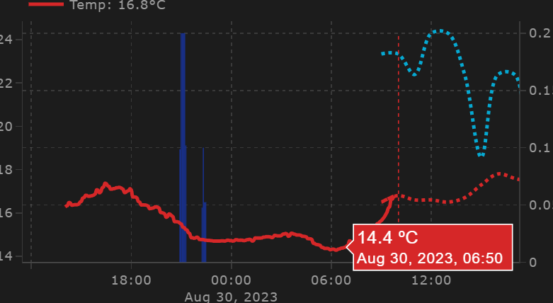
In case anyone is interested in getting something useful out of this Plotly chart, I am now starting to see the light in the tunnel.

The code is more than 300 lines long, that’s the thing about Plotly, you get excited and it grows, but it’s really cool!

type: custom:plotly-graph
title: null
time_offset: 3h
autorange_after_scroll: true
config:
  displaylogo: false
  scrollZoom: true
  displayModeBar: true
entities:
  - entity: sensor.temperatura_tado
    mode: lines+markers+text
    textposition: top right
    textfont:
      color: rgba ( 0, 221, 51 , 1)
      size: 10
    marker:
      size: 8
      color: rgba(  0, 221, 51  , 1)
    showlegend: true
    hovertemplate: >-
      <span style="text-align: center; font-size: 20px;">%{y:.1f}
      ºC</span><br>%{x}<extra></extra>  
    texttemplate: ' %{y:.0f}'
    yaxis: y1
    name: TC
    line:
      width: 2
      color: rgba ( 0, 221, 51   , 1)
  - entity: sensor.aire_acondicionado_ac
    legendgroup: 2
    showlegend: true
    visible: true
    name: P
    mode: lines+markers
    fill: tozeroy
    fillcolor: rgba(   225, 255, 0   ,.1)
    marker:
      size: 3
      color: rgba(  225, 255, 0   , 1)
    yaxis: y4
    line:
      width: 2
      color: rgba (  225, 255, 0   , 0.1)
  - entity: sensor.netatmo_casa_de_sh_interior_exterior_temperature
    showlegend: true
    visible: legendonly
    mode: lines
    hovertemplate: >-
      <span style="text-align: center; font-size: 20px;">%{y:.1f}
      ºC</span><br>%{x}<extra></extra>  
    texttemplate: ' %{y:.1f}'
    yaxis: y1
    marker:
      size: 20
      color: rgba(165,165,0,0.9)
    name: 'N'
    line:
      shape: spline
      width: 3
      color: ' #ffab3b '
  - entity: sensor.switchbot_meter_bt_temperatura
    showlegend: true
    hovertemplate: >-
      <span style="text-align: center; font-size: 20px;">%{y:.1f}
      ºC</span><br>%{x}<extra></extra>    
    yaxis: y1
    textposition: bottom left
    texttemplate: ' %{y:.1f}'
    name: SB
    line:
      width: 3
      shape: spline
      color: rgba ( 249, 37, 8, 0.8)
  - entity: sensor.netatmo_casa_de_sh_interior_temperature
    showlegend: true
    visible: legendonly
    hovertemplate: >-
      <span style="text-align: center; font-size: 20px;">%{y:.1f}
      ºC</span><br>%{x}<extra></extra>    
    yaxis: y1
    name: 'N'
    texttemplate: ' %{y:.1f}'
    line:
      shape: spline
      width: 3
      color: rgba (   0, 201, 255  , 0.9)
  - entity: sensor.aire_acondicionado_temperature
    showlegend: true
    hovertemplate: >-
      <span style="text-align: center; font-size: 20px;">%{y:.1f}
      ºC</span><br>%{x}<extra></extra>    
    yaxis: y1
    name: T
    texttemplate: ' %{y:.1f}'
    line:
      shape: spline
      width: 3
      color: rgba (  0, 111, 255 , 0.9)
  - entity: ''
    hovertemplate: '<span style="display: none;"> <extra></extra>     '
    name: Now
    yaxis: y9
    texttemplate: ' Now'
    showlegend: false
    show_value: true
    line:
      width: 2
      color: rgba (   255,255,255 , 1 )
    x: $ex [Date.now(), Date.now()]
    'y':
      - 0
      - 1
defaults:
  entity:
    show_value: false
  yaxes:
    fixedrange: true
    rangemode: tozero
fn: |
  $fn({getFromConfig, vars})=> {
    const range = getFromConfig("visible_range");
    const width = range[1] - range[0];
    vars.scroll = (label, p) => ({
      args: [
        {
          layout: {
            "xaxis.range": [range[0] + width*p, range[1] + width*p],
          }
        }, {
          transition: {
            duration: 150,
          }
        }
      ],
      label,
      method: "animate",
    })
    vars.zoom = (label, h) => ({
      args: [
        {
          layout: {
            "xaxis.range": [Date.now()-1000*60*60*h, Date.now()],
          }
        }
      ],
      label,
      method: "animate",
    })
  }      
layout:
  modebar:
    orientation: v
  marker:
    size: 20
  xaxis:
    tickangle: 0
    minor:
      nticks: 3
      tickmode: auto
      showgrid: false
      tickformat: auto
      gridcolor: '   #454545   '
  yaxis:
    side: left
    ticksuffix: null
    showticklabels: true
    tickangle: 0
    minor:
      nticks: 4
      tickmode: auto
      showgrid: true
      gridcolor: '   #454545   '
      tickformat: auto
    range:
      - 15
      - 35
  annotations:
    - text: |-
        $fn ({hass}) =>
          "<span style='font-size: 18px;'><span style='font-weight: bold; color: rgba( 0, 221, 51   , 1)'>"
          + hass.states['sensor.temperatura_tado'].state + "</span></span>º<br>"
          +  "</span><span style='font-weight: bold; font-size: 16px;color: rgba( 0, 221, 51   , 1)'>Tado</span><br>"
          + (hass.states['sensor.aire_acondicionado_temperature']  ? "<br><span style='font-size: 30px;color: rgba(  47, 255, 241    , 1)'>❄</span>":'')
          
      xref: x domain
      yref: y1 domain
      xanchor: center
      yanchor: top
      x: 1.08
      'y': 0.9
      showarrow: false
    - text: |-
        $fn ({hass}) =>
          "<span style='font-size: 18px;'><span style='font-weight: bold; color: rgba(  255, 187, 47    , 1)'>"
          + hass.states['sensor.netatmo_casa_de_sh_interior_exterior_temperature'].state + "</span></span>º<br>"
          +  "</span><span style='font-weight: bold; color: rgba( 255, 187, 47   , 1)'>NET🌡</span><br>"
          + (hass.states['sensor.aire_acondicionado_temperature']  ? "<br><span style='font-size: 30px;color: rgba( 0, 221, 51   , 1)'></span>":'')
          
      xref: x domain
      yref: y1 domain
      xanchor: center
      yanchor: top
      x: 1.08
      'y': 0.6
      showarrow: false
    - text: |-
        $fn ({hass}) =>
          "<span style='font-size: 18px;'><span style='font-weight: bold; color: rgba(  249, 37, 8  , 1)'>"
          + hass.states['sensor.switchbot_meter_bt_temperatura'].state + "</span></span>º<br>"
          +  "</span><span style='font-weight: bold; color: rgba( 249, 37, 8   , 1)'>SB🌡</span><br>"
          + (hass.states['sensor.aire_acondicionado_temperature']  ? "<br><span style='font-size: 30px;color: rgba( 0, 221, 51   , 1)'></span>":'')
          
      xref: x domain
      yref: y1 domain
      xanchor: center
      yanchor: top
      x: 1.08
      'y': 0.45
      showarrow: false
    - text: |-
        $fn ({hass}) =>
          "<span style='font-size: 18px;'><span style='font-weight: bold; color: rgba(  0, 201, 255  , 1)'>"
          + hass.states['sensor.netatmo_casa_de_sh_interior_temperature'].state + "</span></span>º<br>"
          +  "</span><span style='font-weight: bold; color: rgba( 0, 201, 255   , 1)'>NET🌡</span><br>"
          + (hass.states['sensor.aire_acondicionado_temperature']  ? "<br><span style='font-size: 30px;color: rgba( 0, 221, 51   , 1)'></span>":'')
          
      xref: x domain
      yref: y1 domain
      xanchor: center
      yanchor: top
      x: 1.08
      'y': 0.3
      showarrow: false
    - text: |-
        $fn ({hass}) =>
          "<span style='font-size: 18px;'><span style='font-weight: bold; color: rgba(  0, 111, 255  , 1)'>"
          + hass.states['sensor.tado_temperature_1_decimal'].state + "</span></span>º<br>"
          +  "</span><span style='font-weight: bold; color: rgba( 0, 111, 255   , 1)'>Tado🌡</span><br>"
          + (hass.states['sensor.aire_acondicionado_temperature']  ? "<br><span style='font-size: 30px;color: rgba( 0, 221, 51   , 1)'></span>":'')
          
      xref: x domain
      yref: y1 domain
      xanchor: center
      yanchor: top
      x: 1.08
      'y': 0.15
      showarrow: false
  yaxis2:
    side: left
    showticklabels: false
    title: ''
    tickangle: 0
    minor:
      nticks: 3
      tickmode: auto
      showgrid: true
      gridcolor: '   #454545   '
      tickformat: auto
  yaxis3:
    side: left
    showticklabels: false
    tickangle: 0
    minor:
      nticks: 3
      tickmode: auto
      showgrid: true
      gridcolor: '   #454545   '
      tickformat: auto
  yaxis4:
    side: left
    showticklabels: false
    tickangle: 0
    minor:
      nticks: 3
      tickmode: auto
      showgrid: true
      gridcolor: '   #454545   '
      tickformat: auto
  yaxis5:
    side: left
    showticklabels: false
    tickangle: 0
    minor:
      nticks: 3
      tickmode: auto
      showgrid: true
      gridcolor: '   #454545   '
      tickformat: auto
  height: 500
  margin:
    l: 40
    r: 60
    t: 100
  updatemenus:
    - buttons:
        - $fn({vars}) => vars.scroll( '<', -.5)
        - $fn({vars}) => vars.scroll( '>', .5)
      direction: right
      active: -1
      pad:
        r: 10
        t: -90
      type: buttons
      x: 1
      xanchor: right
      'y': 1
      yanchor: top
    - buttons:
        - $fn({vars}) => vars.zoom( '2w', 24*14)
        - $fn({vars}) => vars.zoom( '2d', 24*2)
        - $fn({vars}) => vars.zoom( '12h', 12)
        - $fn({vars}) => vars.zoom( '3h', 3)
        - $fn({vars}) => vars.zoom( '1h', 1)
      direction: right
      active: -1
      pad:
        l: -15
        t: -90
      type: buttons
      x: 0
      xanchor: left
      'y': 1
      yanchor: top
  font:
    family: Roboto,Noto,sans-serif
    size: 14
    color: $fn ({css_vars}) => css_vars['primary-text-color']
  paper_bgcolor: rgba(0, 0, 0, 0.4)
  plot_bgcolor: rgba(0, 0, 0, 0)
  legend:
    itemwidth: 1
hours_to_show: 30

4 Likes

Hey there, first of all GREAT addon!

I have a question though.

Openweathermap is presenting the forecast precipitation every HOUR, my local weather sensor is providing data every 5min.
I want to display both as a bar graph - is it possibly to SUM the data from my local sensor and display the sum at every hour, like the openweather forecast?

the statistics: sum - period: hourly does not work properly, it displays values, but they are way to low (see in orange)

  1. Question:
    i used your forecast “template” from github, is there a possibility to START the forcast data at the “Now” Line (or at the next hour), right now they overlap slighlty

Hi there, thanks a lot for this great graphic feature !

I just created a card on my pc and it look great.
But oben Home Assistant on a iPhone or iPad give me the error:

Custom element doesn’t exist: plotly-graph.
type: custom:plotly-graph
entities:
:
:

Both devices have new IOS firmware installed.
It would be very nice to get this cool graphic working on those devices.

Do you have any solution for that problem ?

Best
Uwe

After playing a little with some other cards on my dashboard, the plotly graph error disapears, strange.
I’m not sure if there is a dependency with that.

Mmm, that’s odd. Sounds like the card wasn’t loaded. That happens automatically on the first reload

Thanks! Happy to hear you find it useful :slight_smile:
To sum up you could use the integrate filter and then the multiply by 12 (that’s how many 5 minute intervals fit in an hour). Otherwise you can do it via a custom function (fn).
To filter some of the fata from the forecast, you can add filter filter: filter: x > Date.now

See the filters section in the resdme

Thanks for your reply, unfortunately I am too dumb or it does not work:

the integrate does not work, however i try integrate by h or otherwise i get more datapoints than before
Raw Datapoints:

Integrate by hour

  - entity: sensor.local_precipitation
    xaxis: x
    yaxis: y1
    type: bar
    hovertemplate: >-
      <span style="text-align: center; font-size: 15px;">%{y:.1f}
      mm</span><br>%{x}<extra></extra>
    showlegend: false
    width: 25000
    opacity: 1
    marker:
      color: rgb (24, 47, 135)
    legendgroup: 2
    name: 🌧 Precipitation
    unit_of_measurement: mm
    filters:
      - integrate: h

optimally i would like to have 1 datapoint every hour with the sum of the datapoints of the hour before
im not skilled enough to write a function for that

  1. the filter x > Date.now has no effect unfortunately, even when i try to add an hour or more (in ms i suppose), i guess it does not work bc the datapoints are created by a function below??
  - entity: weather.openweathermap
    xaxis: x
    yaxis: y2
    legendgroup: 3
    showlegend: false
    name: Precipitation Propability
    line:
      color: rgb(0, 204, 255)
      dash: dot
    unit_of_measurement: '%'
    opacity: 0.8
    filters:
      - filter: x > Date.now
      - store_var: precipitation_p
      - fn: |-
          ({ meta, vars }) => ({
            xs: [vars.precipitation_p.xs.slice(-1)[0],...meta.forecast.map(({ datetime }) => new Date(datetime))],
            ys: [vars.precipitation_p.ys.slice(-1)[0],...meta.forecast.map(({ precipitation_probability }) => precipitation_probability)],
          })

Hi, I am designing a bar type graphic, using the sensor used by the Home Assistant App to measure walking distance, it generates the bars well grouped and with the correct data but it does not fit the date, for example what it indicates the 30th of August is the 29th, it is as if it were the advanced date.

imagen

What ways are there to group data, because if I use “period: day” and “statistic: styate” the bars do not appear, I only see them if I use this simple code below.

And I have to set the “time_offset to 2h” otherwise the bars do not appear, very strange.

Is there a better way to group data than this?

Thanks

type: custom:plotly-graph
time_offset: 1d
hours_to_show: 7d
entities:
  - entity: sensor.hok_distance
    type: bar
    time_offset: 2h
    filters:
      - resample: 24h

For (1) you can use the integrate filter with an hourly reset and then resample, you’ll have to go through the docs on filters. If you don’t succeed, feel free to make a Q&A post in the discussions section of the repo, I can better keep track of things there
For (2) it is important to understand how the filters work: they are applied one after the other in order. This means that the one removing should go last (you guessed right!). I strongly suggest you go through the examples I wrote

1 Like

This is what is offsetting the data by one day:
time_offset: 1d
Regarding the offset inside the identity, it may be that the sensor resets each day, and the resample filter is picking the moment after the reset.

Please can someone help me.
I am in the process of using the Plotly interactive graph card from [slipx06](slipx06 · GitHub, however I am using values taken from two sensors and adding them in a template sensor.

sensor.sunsynk1_slave_total_load_energy
sensor.sunsynk_master_total_load_energy.

#  sensor.sunsynk_total_pv_energy
      sunsynk_total_pv_energy:    
        friendly_name: Sunsynk Total PV Energy
        value_template: "{{ states('sensor.sunsynk_master_total_pv_energy') | float + states('sensor.sunsynk1_slave_total_pv_energy') | float }}"  
        unit_of_measurement: "kWh"

I have renamed the template sensor sensor.sunsynk.total_pv_energy

This value however does not display correctly on the graph and shows as “undefined”
Below is the .yaml code used for the graph.

type: custom:plotly-graph
view_layout:
  grid-area: daily
entities:
  - entity: sensor.sunsynk_total_pv_energy
    statistic: sum
    name: |
      $fn ({ ys,meta }) =>
        "Solar" + "🔆" + "(" +ys[ys.length - 1]+"kWh)"
    period: day
    type: bar
    texttemplate: '%{y}'
    filters:
      - filter: i>0
    marker:
      color: rgb(255, 155, 48)

Can someone please point me in the right directions.

This means the entity doesn’t have sum statistics, you’ll need to give the template the right device_class (energy_storage sounds correct).
Grom that point onwards, HA will start storing those stats.

Thank you for the feedback,

I have tried to include device_class as per your suggestion but it still does not read the value.
However when entering the entity it shows a tate in this case 9793.6.

below is the code showing device_class

#  sensor.sunsynk_total_pv_energy
      sunsynk_total_pv_energy:    
        friendly_name: Sunsynk Total PV Energy
        value_template: "{{ states('sensor.master_master_total_pv_energy') | float + states('sensor.sunsynk1_slave_total_pv_energy') | float }}"  
        unit_of_measurement: "kWh"
        device_class: energy_storage

Try statistic: state. I suggest you sear around in the whole forum dor “energy statistics” or similar. Your issue is not specific to this card so you may find more info in a more generic post

Thanks for your input, that did not help. I have posted on other groups, lets hope someone can help me.

Good luck!
By the way I think you need statistic: state (not sum).

Thanks for creating such a fantastic card. Is someone with a bigger brain than me able to point me in the right direction please? I’m trying to plot two entities against each other (1st entity x-axis, 2nd entity y-axis), so not using time on the x-axis. I think I’m along the right lines but haven’t managed to get the config quite right. I have been playing around with vars and filters etc but can’t get it to work. I’m probably being stupid and missing something obvious…

                      - type: custom:plotly-graph
                        title: Weather Compensation Curve
                        entities:
                          - entity: input_number.heat_pump_dummy_temperature_sensor_for_weather_compensation_predictions
                            period: 5minute
                            internal: true
                            fn: >-
                              $fn ({ xs, ys, vars }) => { vars.dummy_temp = ys; vars.xs = xs; }
                            resample: 5m
                          - entity: sensor.heat_pump_weather_compensation_simulation
                            period: 5minute
                            internal: true
                            fn: $fn ({ xs, ys, vars }) => { vars.sim_flow = ys; vars.xs = xs; }
                            resample: 5m
                         
                          - entity: ''
                            x: $fn ({ vars }) => vars.dummy_temp
                            y: $fn ({ vars }) => vars.sim_flow
                           
                            type: histogram2dcontour
                            mode: lines+markers
                            line:
                              color: green

Any suggestions grateful received…

Can anyone help with getting this to work.

This works fine:

type: custom:plotly-graph
entities:

  • entity: sensor.farm_uni_converted
  • entity: sensor.hoophouse_shelly_uni_tasmota_1_analog_a0

This does not work:

type: custom:plotly-graph
entities:

  • entity: sensor.farm_uni_converted
    statistic: mean
    period: hour
  • entity: sensor.hoophouse_shelly_uni_tasmota_1_analog_a0
    statistic: mean
    period: hour

I tried with various values for STATISTIC and PERIOD – none work.

Configuration YAML:

  • platform: template
    sensors:
    farm_uni_converted:
    friendly_name: “FARM UNI CONVERTED”
    unit_of_measurement: “F”
    value_template: “{{ states(‘sensor.hoophouse_shelly_uni_tasmota_1_analog_a0’) |float(0) / 70.1 }}”

Thank you.

You are almost there! There are 2 errors:

  • resample goes inside of filters:
filters:
  - resample: 5m

and storing the variable should go after the filters. Alternatively, you could use a filter to store the variable instead. The result is:

- type: custom:plotly-graph
  title: Weather Compensation Curve
  entities:
    - entity: input_number.heat_pump_dummy_temperature_sensor_for_weather_compensation_predictions
      period: 5minute
      internal: true
      filters:
          - resample: 5m
          - store_var: dummy_temp
    - entity: sensor.heat_pump_weather_compensation_simulation
      period: 5minute
      internal: true
      filters:
          - resample: 5m
          - store_var: sim_flow
      
    - entity: ''
      x: $fn ({ vars }) => vars.dummy_temp.xs
      y: $fn ({ vars }) => vars.sim_flow.ys```

Not all sensors get their statistics stored. That depends on the sensor class, see here: Sensor Entity | Home Assistant Developer Docs