Plotly interactive Graph Card

Sorry mateine,

I’m using Plotly for the first time and I don’t understand it.
I realize that the visual editor can’t do everything and the error message can be ignored.
But no matter how I try to configure it, no graphs are displayed. I am not a programmer and apparently too stupid :disappointed:

I’ll try to describe my plan again, maybe I’ve overlooked something:
I am using two entities, one with temperature values and one that has 0 and 1 as status.

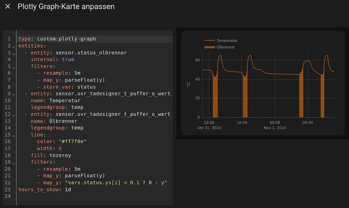
I would like to have the temperature value displayed as a curve in a diagram and at the same time the part of the curve when the burner has the status 1 should be colored.

I have adapted the example script to my needs (hopefully correctly) and the yaml editor shows no errors:

type: custom:plotly-graph
entities:
  - entity: sensor.status_olbrenner
    internal: true
    period: 5minute
    filters:
      - map_y: parseFloat(y)
      - store_var: status
  - entity: sensor.uvr_tadesigner_t_puffer_o_wert # this one is twice so that one does the line and the other the filling
    period: 5minute # statistics don't need the resampling filter since the data is aligned by index already.
    name: Temperatur
    legendgroup: temp # so this one and the next share the legend
  - entity: sensor.uvr_tadesigner_t_puffer_o_wert
    period: 5minute
    name: Brenner
    legendgroup: temp
    line:
        color: '#ff7f0e'
        width: 0
    fill: tozeroy
    filters:
      - map_y: parseFloat(y)
      - map_y: |-
          vars.status.ys[i] < 10 ? 0 : y // if below 10%, map the temperature to zero. Otherwise use the original value (y)
hours_to_show: 1d # just showcasing that you can use 1 day instead of 24 hours for convenience

So you’re right, that’s how it should work. But no graphs are displayed:


What am I doing wrong?

Hi @hennerich,
the yaml looks good so you could be a programmer if you didn’t have anything better to do :slight_smile:

I don’t see any issues with it, and I just tested it with some random sensors and it actually works the way you intended.

I would guess the issue is that the sensors may not have state statistics stored, and suggest three experiments:

  1. Make a second card with all the sensors and period: 5minute but nothing else (no internal, no filters, …). This will tell you if the sensors do have 5 minute state statistics
  2. Try the same sensors in the standard home assistant statistics card for you peace of mind.
  3. Remove period: 5minute from all so you use the normal history db, and add resample: 5m as the first filter to all entities. This way you can confirm that the logic you have is indeed correct.

Ok,

Test 1: only the two Entitys
Code:

type: custom:plotly-graph
entities:
  - entity: sensor.uvr_tadesigner_t_puffer_o_wert
  - entity: sensor.status_olbrenner
hours_to_show: 24
refresh_interval: 10

Successful result:

Test 2: period: 5minute but nothing else AND with Enter after the entities without paying attention to the tab stop
Code:

type: custom:plotly-graph
entities:
  - entity: sensor.uvr_tadesigner_t_puffer_o_wert
  period: 5minute
  - entity: sensor.status_olbrenner
  period: 5minute
hours_to_show: 24
refresh_interval: 10

Result:

Test 3: period: 5minute but nothing else AND correct tabstops (I would expect from yaml code, but what do I know)
Code:

type: custom:plotly-graph
entities:
  - entity: sensor.uvr_tadesigner_t_puffer_o_wert
    period: 5minute
  - entity: sensor.status_olbrenner
    period: 5minute
hours_to_show: 24
refresh_interval: 10

Result:

Test 4: `standard home assistant statistics card
Error result

Test 5: add resample: 5m
Code:

type: custom:plotly-graph
entities:
  - entity: sensor.uvr_tadesigner_t_puffer_o_wert
    filters:
      - resample: 5m
    name: Pufferspeicher
  - entity: sensor.status_olbrenner
    filters:
      - resample: 5m
    name: Brenner
hours_to_show: 24
refresh_interval: 10

Successful result:

Test 6: remove all periods in my initial code
Code:

type: custom:plotly-graph
entities:
  - entity: sensor.status_olbrenner
    internal: true
    filters:
      - map_y: parseFloat(y)
      - store_var: status
  - entity: sensor.uvr_tadesigner_t_puffer_o_wert # this one is twice so that one does the line and the other the filling
    name: Temperatur
    legendgroup: temp # so this one and the next share the legend
  - entity: sensor.uvr_tadesigner_t_puffer_o_wert
    name: Temperatur
    legendgroup: temp
    line:
        color: '#ff7f0e'
        width: 0
    fill: tozeroy
    filters:
      - map_y: parseFloat(y)
      - map_y: |-
          vars.status.ys[i] < 10 ? 0 : y // if below 10%, map the temperature to zero. Otherwise use the original value (y)
hours_to_show: 1d # just showcasing that you can use 1 day instead of 24 hours for convenience

Result:
WOHOO, one step ahead (but the completed time periods do not yet fit)

Test 7: remove all periods in my initial code and add resample
Code:

type: custom:plotly-graph
entities:
  - entity: sensor.status_olbrenner
    internal: true
    filters:
      - resample: 5m
      - map_y: parseFloat(y)
      - store_var: status
  - entity: sensor.uvr_tadesigner_t_puffer_o_wert # this one is twice so that one does the line and the other the filling
    name: Temperatur
    legendgroup: temp # so this one and the next share the legend
  - entity: sensor.uvr_tadesigner_t_puffer_o_wert
    name: Temperatur
    legendgroup: temp
    line:
        color: '#ff7f0e'
        width: 0
    fill: tozeroy
    filters:
      - resample: 5m
      - map_y: parseFloat(y)
      - map_y: |-
          vars.status.ys[i] < 10 ? 0 : y // if below 10%, map the temperature to zero. Otherwise use the original value (y)
hours_to_show: 1d # just showcasing that you can use 1 day instead of 24 hours for convenience

Result Error:

It looks like you found a bug in the yaml editor webapp. The last version should work. Have you tried it in home assistant?

lol, the noob finds a bug, incredible
I have tested the code and it works. But the switching times are still not displayed

delete line 24, the comment went to a new line and that may break it.
Also, status_oelbrenner seems to go from 0 to 1 in your first plot and you are comparing it to 10. I assume the intent is percentage, so it should be vars.status.ys[i] < 0.1 ? 0 : y instead

1 Like

Indeed you found a bug, you’ve graduated out of noob level :laughing: . The following filters had issues in the yaml editor

  • resample
  • force_numeric
  • deduplicate_adjacent
  • delta
  • derivate

Creating automated types for the filters to then generate the schema with which the yaml editor understands filters was quite tricky. I made a mistake there. It is fixed now.
Would you confirm your final yaml now gives no errors in the editor?
Thanks!

Hello Mateine,
that’s how it worked, thank you very much. And I had already wondered why such a strange comment with // can be there, where all other comments start with #.

Can I ask you two more small questions?
In my opinion, the Y axis does not necessarily have to start at 0, because the temperature will never fall below 25°C. How can I ensure that the Y-axis starts with 25?

I would also think it would be cool if the max and min values were displayed in the graph, as in my first screenshot. Can this be realized? The graph should be displayed in my Home Assistant dashboard and the eye should be able to quickly capture the values. It would also be nice if the current value could be shown somewhere :wink:

yes, there is no longer an error to be seen

Here’s something to get you going:

type: custom:plotly-graph
entities:
  - entity: sensor.openweathermap_temperature
    period: hour
    fill: tozeroy
    filters:
      - store_var: data
  - entity: ''
    type: indicator
    mode: number
    docs: https://plotly.com/javascript/reference/indicator/#indicator-number
    value: $ex Math.min(...vars.data.ys)
    title:
      text: Min
    number:
      suffix: W
    domain:
      x:
        - 0
        - .2
      'y':
        - 0.8
        - 1
  - entity: ''
    type: indicator
    mode: gauge+number
    value: $ex Math.max(...vars.data.ys)
    gauge: 
      axis: { range: [5, 15], visible: false }
      bgcolor: "lightgray" 
      bar:
        color: green
    title:
      text: Max
    number:
      suffix: W
    domain:
      x:
        - .8
        - 1
      'y':
        - 0.8
        - 1
  
hours_to_show: 24
layout:
  margin:
    t: 30
  yaxis:
    domain:
      - 0
      - .7
    autorangeoptions:
      minallowed: 5

1 Like

Oh man, and I’m lost again.
Your example was very good and I was able to implement it for myself. When I was looking for a way to use my legend for this, I stumbled across this post here.
It looks great and I thought I wanted to implement it in the same way.
So I adapted my code (probably 20 times):

type: custom:plotly-graph
entities:
  - entity: sensor.status_olbrenner
    internal: true
    filters:
      - resample: 5m
      - map_y: parseFloat(y)
      - store_var: status
  - entity: sensor.uvr_tadesigner_t_puffer_o_wert
    show_value: true
    showlegend: false
    name: Puffertemperatur
    line:
      color: "#4876FF"
  - entity: sensor.uvr_tadesigner_t_puffer_o_wert
    showlegend: false
    line:
      color: "#ff7f0e"
      width: 0
    fill: tozeroy
    filters:
      - resample: 5m
      - map_y: parseFloat(y)
      - map_y: "vars.status.ys[i] < 0.1 ? 0 : y"
hours_to_show: 1d
layout:
  showlegend: true
  legend:
    'y': -0.12
  title:
    text_template: >-
      Lounge: {{ sensor.uvr_tadesigner_t_puffer_o_wert }}°C
    'y': 0.9
    font:
      size: 20
  yaxis:
    domain:
      - 0
      - 0.7
    autorangeoptions:
      minallowed: 35

Unfortunately I can’t get it to remove the default legend and replace it with the “other legend”.

Is there a way how to get the y axis auto down scale as the graph keeps running? Let me explain - if I keep the graph running on my dashboard and let’s say in my example the usage jumps to 3kW the y axis correctly scales up to show 0-3kw however as the peak leaves the shown window the y axis remains at 0-3kw instead of scaling down to what the maximum value (600w) is in the window. I have to either interact with the graph or refresh it to fix it.


My config:

Oh that’s a old post from before $fn and $ex.
Now you can write title: $ex hass.states["sensor.xxxx"].state (or something like that, search for hass in the readme)

1 Like

I think this should do it: autorange_after_scroll

puhh, permanently error :disappointed:

type: custom:plotly-graph
entities:
  - entity: sensor.status_olbrenner
    internal: true
    filters:
      - resample: 5m
      - map_y: parseFloat(y)
      - store_var: status
  - entity: sensor.uvr_tadesigner_t_puffer_o_wert
    show_value: true
    showlegend: false
    name: Puffertemperatur
    line:
      color: "#4876FF"
  - entity: sensor.uvr_tadesigner_t_puffer_o_wert
    showlegend: false
    line:
      color: "#ff7f0e"
      width: 0
    fill: tozeroy
    filters:
      - resample: 5m
      - map_y: parseFloat(y)
      - map_y: "vars.status.ys[i] < 0.1 ? 0 : y"
hours_to_show: 1d
layout:
  yaxis:
    domain:
      - 0
      - 0.7
    autorangeoptions:
      minallowed: 35
title:
  text: |
    $ex "Puffertemperatur: " + hass.states["sensor.uvr_tadesigner_t_puffer_o_wert"].state
  'y': 0.9
  font:
    size: 20

If you want to set title properties put the title inside layout:. What the yaml helper is telling you is that the title property at the root of the yaml only takes strings, not objects

1 Like

I got it right, thank you, you are my hero

1 Like

I love this card! There’s so much I have still to learn about it. I have a climate card with temperature and humidity and I want to include the periods when the heating and ventilation are running as single lines. I used this map:
map_y: ‘y === “heat” ? 1 : 0’
which I copied from the readme. This gives me a line between 1 and 0 depending on when the heating is running or not. Is it possible to remove the zero points or make then null using the filter above or something similar? I would like to see a line at y = 1 when the heating is on and nothing when the heating is off or idle.

If mapping all zeroes to null doesn’t work e g mit fill: tozeroy, I think you could do something like:

filters:
  - fn: |
      ({xs, ys}) => ({
            xs: xs.flatMap((x, i) => ys[i]==1 ? [x] : [x, x]),
            ys: ys.flatMap((y) => y == 1 ? [y] : [0, null]),
      })

this way you get two data points when the heater is off: one to make the line go to zero first, and another one to not plot the zero.

Not sure if this works. Maybe you need to do the same when a one starts, there’s also a filter to remove equal contiguous values if that causes issues.

Another option is to use type: bar

Happy to hear! Answer above (forgot to tap reply on the message itself)