You missed a - (minus) before map_y
Yeah, the tooltip and the y-axis are now in h:mm format, but there are still 2 problems:
- The values are still not displaying on the bar graph
- This is bigger: the values displayed by the tooltip are totally wrong.
When I remove the map_y, the values are calculated correctly.
Maybe bar charts don’t accept dates, try a non bar chart.
Not sure what could be wrong in the tooltips, in my test it worked fine. Maybe related to the bar chart type

You set the line shape to linear so it seems to be how the data looks like. You could try:
- Increase the period or,
- Use the
deduplicate_adjacentfilter
1 Like
Big thanks! deduplicate_adjacent works good for me.
Hi, thanks for the Great Card. Unfortunately I lost my unbackedup HA config and I am trying to recreate my cards.
I am trying to start simple and make a 2 row x 1 column subplot with house temperatures on the top and daytime/nighttime chart on bottom. However, whenever I try to make a 3rd axis it just puts the data over the whole chart ![]()
Do you know what I am doing wrong?

- type: custom:plotly-graph
  entities:
    - entity: sensor.pirateweather_temperature
      name: Outside
      yaxis: y1
      line:
        shape: spline
        width: 3
        color: blue
        dash: dashdot
    - entity: sensor.master_temperature
      yaxis: y2
    - entity: sun.sun
      name: Daytime
      yaxis: y3
      fill: tozeroy
      line:
        color: lightgray
      filters:
        - map_y: >-
            {
              var isDay = state.state
              if (isDay === 'below_horizon') {
                return 1;
              } else if (isDay === 'above_horizon') {
                return 0;
              } else {
                return null;
              }
            }

  layout:
    yaxis:
      overlaying: "y"
    yaxis2:
      overlaying: "y"
    yaxis3:
      overlaying: y3
    grid:
      rows: 2
      columns: 1
      pattern: coupled
      roworder: top to bottom
  hours_to_show: 24
Ye seem to have a grid of 2x1 but 3 yaxes. You should have 2
Thanks for the response. If I change it to just 2 axes, how can I make some traces on the left side and some on the right side? Isn’t this defined in the layout-yaxis sections? For example, I want the outside temp on the right side and the Master Temp on the left side. But if they reference the same yaxis they will be on the same side.

Basically, I am trying to recreate this, which my boneheaded self never backed up the config for:

See the yaml of this post: Plotting clima entities with attributes · dbuezas/lovelace-plotly-graph-card · Discussion #13 · GitHub
Remember there’s an Index of examples with images near the top of the readme
I have a mailbox sensor
(GitHub - jazzmonger/Ultimate-Smart-Mailbox: Really Smart Mailbox) that has an ON/OFF intelligent sensor:
input_boolean.mail_has_arrived
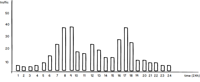
that sensor turns ON when mail has arrived and OFF when we take it out of the box. I’d like to plot a histogram of the time of day the mail arrives - ie when that sensor turns ON. X axis being the time of day, Y would be count of how many times mail has arrived during that hour. This would be a running total so we can get a sense of what hour of the day it is “most likely” we’ll see the postman. Similar to this graph:
Is this possible? I have literally DOZENS of plotly graphs (and LOVE IT BTW), but I’ve never done one like this.
Cursor value in legend
Hi,
thanks for the really great card !!!
I’ve created a card heating pump data but I just can’t get the last point to work the way I want it to.
I’ve a vertical spike on hover and what I want is that corresponding y-value is shown behind the signal in the legend. Only managed to get last data point of the signal behind the name.
like this:
name: |
$ex "VL WP "+ " " + ys[ys.length - 1]
here the overall view of the card:
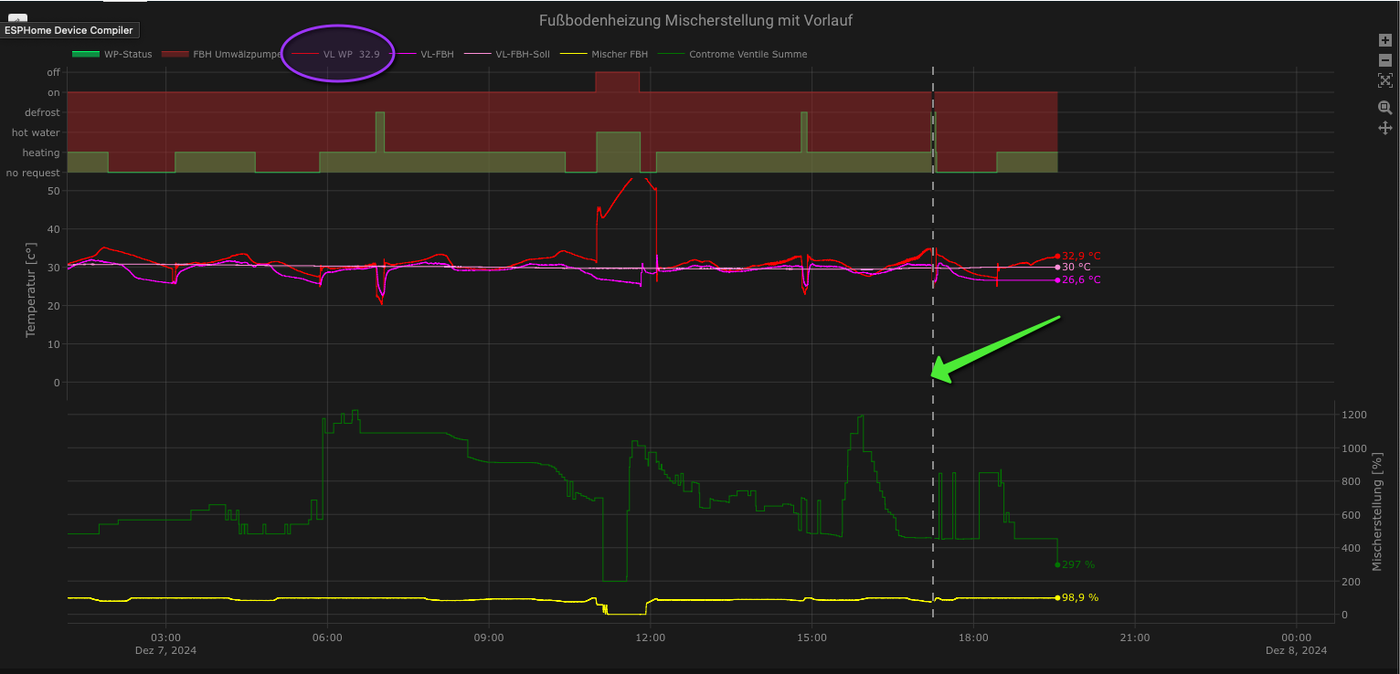
in the blue circle I got the last value, but I want to have the actual value of the cursor position (yellow arrow)
Does anyone know how to achieve this? Thanks a lot in advance.
You’ll have to search for the index of the x value that is close to where you put the vertical line. The. Use that index to return ys[i] in the label
Sure you can! Interesting use case!
You can use something like this
filters:
  - map_y: (y=="ON" && ys[i-1] != "ON") ? 1 : 0
  - map_x: |
        new Date(
           new Date().getFullYear(),
           new Date().getMonth(),
           new Date().getDate(),
           date.getHours(),
           date.getMinutes(),
           date.getSeconds()
         )
And then use the histogram plot type
Thank you for your quick response. I guess I’ve not described clear where my problem is or what I wanna achieve.
The index I want to show (position of the vertical line = hover over position with mouse) is not a fixed one it changes on hover.
It’s based on this
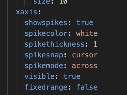
So my question is how can I get the index of the hover over position?
I see you can’t change labels on hover as far as I know. But you can control what appears in the hover tooltip
It’s close, but I have to pinch to zoom out to see the all the delivery times of each day. I’d like all the delivery times in one 12 or 24 hour time span.

Use hours_to_show to set how much data should be used, and then fix the x axis range to $ex [new Date.setHours(0,0,0), new Date().setHours(24,0,0)]
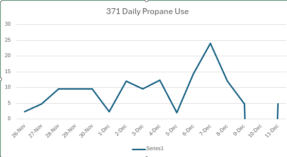
Can plotly calculate and plot the daily differences in values?
I have the following:

And what I would like is another graph/chart/table showing the daily differences.
In my case, this would be daily propone usage in gallons.
Icing on top: During days where the tanks are filled, instead of showing a negative usage, somehow indicate the amount filled (maybe assuming the day prior’s usage taken out to calculate the total delivered).
Something like:
Yes you can do that with this card. I suggest you go through the filters section of the readme.
Good luck!