Plotly code is working for me. It looks to me a problem with the entity. See Statistics support at the github for more information.
your quotation mark (Anführungszeichen) seems to be strange, try to replace it.
“%{y:.2f}” => "%{y:.2f}"
Is it possible to pull data like the History charts? So more than the default 10 days Recorder holds?
See the statistics section in the readme.
Well that was embarrassingly obvious ![]()
1 Like
Hi,
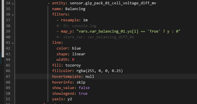
is there a way to hide the hovertemplate for an entity completely?
Add hoverinfo: skip to that entity
Thanks for the immediate answer. ![]()
hoverinfo: skip alone did not change anything.
I had to add another hovertemplate: null to make it work.
With your help I found the solution here: https://github.com/dbuezas/lovelace-plotly-graph-card/discussions/203
Hey, all! I can’t remember exactly where, but I know some other folks wanted to create something similar to the history bar graph. (I know that because I pored through here looking to see if anyone had done it already. Greatly appreciate the discussion here even if I haven’t participated so far!
Anyway, I ended up building one and thought I’d share in case anyone else comes along looking for it like I did. It’s a hacky solution, but I did my best to document to hopefully make it not too hard for someone to configure it for themselves or steal from it to build something else.
Here’s what my implementation looks like:

And here’s the link to where I shared the code for it over on the Plotly Graph Card show and tell discussion:
https://github.com/dbuezas/lovelace-plotly-graph-card/discussions/550
3 Likes
Hi @mateine
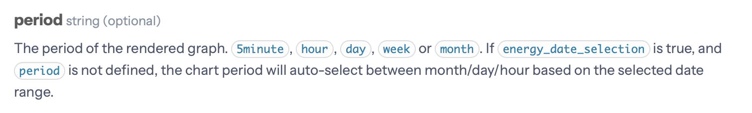
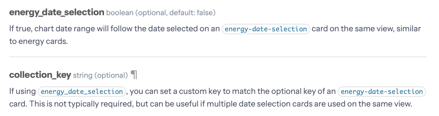
Are there any plans to make plotly working with the stock HA energy-date-selection card? It would be absolutely great to have that feature available. Also the sankey chart card has adopted it to select the period.
You can even define a collection_key to link to a single specific energy-date-selection card.
In the meantime, the stock HA statistics graph card is also able to work with the energy-date-selection card. And it’s configurable like this.
Keep up the good work! Your plotly card is amazing ![]()
1 Like

I have these energy sensors that reset each day at midnight. I would like to graph the total (highest value) each day on a bar graph.
I could never get it to work properly. Has anyone done something similar?
Daily max statistics would be perfect for that
Would you mind elaborating?
I mean:
statistic: max
period: day
See the statistics section: GitHub - dbuezas/lovelace-plotly-graph-card: Highly customisable Lovelace card to plot interactive graphs. Brings scrolling, zooming, and much more!
And what about the energy_date_selection integration? any plans concerning this subject? It is a crutial featute in my point of view.
I take PRs ![]()
I’m currently quite busy, so not taking crutial featutes
1 Like
Awesome tool, is there a way to get the change in a total_increasing variable ?
like in the standard UI statistic card ?
I have an energy meter that does not reset, and i can’t seem to graph the daily consumption with the config, unless I’m missing something ?
you could use filters:
filters:
- derivate
- filter: y>0
- integrate:
reset_every: 1dOh sorry, you said it didn’t reset so you don’t need - filter: y>0
Thanks !
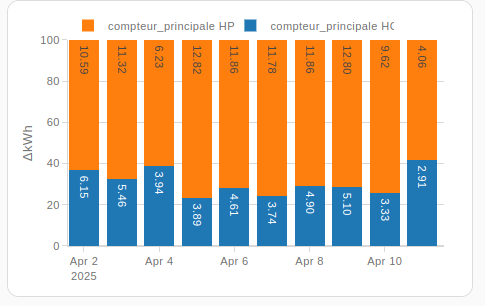
got it to work with delta :
type: custom:plotly-graph
entities:
  - entity: sensor.compteur_principale_hc
    type: bar
    statistic: state
    period: day
    texttemplate: ' %{y:.2f}'

    filters:
      - delta
  - entity: sensor.compteur_principale_hp
    type: bar
    statistic: state
    period: day
    texttemplate: ' %{y:.2f}'
    filters:
      - delta
hours_to_show: 240
refresh_interval: 10
layout:
  barmode: stack
  barnorm: percent
additional question : in a 100% stack bar graph, is there a way to show the % and not the actual value ?