I don’t understand the code but it worked flawlessly, thank you very much! ![]()
Is it possible to also scroll the second diagram below, when I click the button in the upper diagram?
(I assume the donut diagrams can’t be changed because there is no date axis?)
1 Like
That I have no ideas for. Maybe a helper entity controlling the tine offset
1 Like
Hello,
question:
Is it possible to have the TEXT opacity defined separate from the opacity of the fillcolor? I would like to have the opacity for the text closer to 1.0 but the line opacity should not change.
type: custom:plotly-graph
entities:
  - entity: sensor.power_consumption_total
    name: Verbrauch
    fill: tozeroy
    fillcolor: rgba( 3, 169, 244, 0.4)
    filters:
      - resample: 3m
    line:
      shape: spline
      color: rgba( 3, 169, 244, 0.4)
    yaxis: y1
  - entity: sensor.power_generation_pv
    name: Solar
    fill: tozeroy
    fillcolor: rgba( 255,152,0,0.3)
    filters:
      - resample: 3m
    line:
      shape: spline
      color: rgba( 255,152,0,0.3)
  - entity: sensor.power_consumption_heatpump
    name: WP
    yaxis: y1
    fillcolor: rgba( 255,0,0, 0.4)
    fill: tozeroy
    filters:
      - resample: 3m
    line:
      shape: spline
      color: rgba( 255,0,0, 0.4)
  - entity: sensor.solcast_pv_forecast_forecast_today
    yaxis: y1
    name: Prognose
    fill: tozeroy
    fillcolor: rgba( 128,128,128, 0.2 )
    line:
      shape: spline
      color: rgba( 128,128,128, 0.2 )
    filters:
      - fn: |
          ({meta}) => {
            const forecast = meta.detailedForecast || [];
            const xs = forecast.map(f => new Date(f.period_start));
            const ys = forecast.map(f => f.pv_estimate * 1000); // optionally convert to watts
            return { xs, ys };
          }
  - entity: sensor.solcast_pv_forecast_forecast_tomorrow
    yaxis: y1
    name: Prognose Morgen
    fill: tozeroy
    showlegend: false
    fillcolor: rgba( 128,128,128, 0.2 )
    line:
      shape: spline
      color: rgba( 128,128,128, 0.2 )
    filters:
      - fn: |
          ({meta}) => {
            const forecast = meta.detailedForecast || [];
            const xs = forecast.map(f => new Date(f.period_start));
            const ys = forecast.map(f => f.pv_estimate * 1000); // optionally convert to watts
            return { xs, ys };
          }
  - entity: sensor.solcast_pv_forecast_forecast_day_3
    yaxis: y1
    name: Prognose Übermorgen
    fill: tozeroy
    showlegend: false
    fillcolor: rgba( 128,128,128, 0.2 )
    line:
      shape: spline
      color: rgba( 128,128,128, 0.2 )
    filters:
      - fn: |
          ({meta}) => {
            const forecast = meta.detailedForecast || [];
            const xs = forecast.map(f => new Date(f.period_start));
            const ys = forecast.map(f => f.pv_estimate * 1000); // optionally convert to watts
            return { xs, ys };
          }
  - entity: null
    name: Now
    yaxis: y9
    showlegend: false
    show_value: true
    texttemplate: " Now"
    line:
      width: 1
      dash: dot
      color: deepskyblue
    filters:
      - fn: |
          ({xs,ys}) => {
            return {xs:[Date.now(),Date.now()], ys:[0,1]}
          }
refresh_interval: 10
hours_to_show: 3d
time_offset: 2d
min_y_axis: 0
max_y_axis: 11000
defaults:
  yaxes:
    - yaxis: y1
      side: left
      overlaying: "y"
      visible: true
      line:
        width: 3
        smoothing: 3
      entity:
        texttemplate: <b> %{y}</b> %{customdata.unit_of_measurement}
    - yaxis: y9
  entity:
    fill: tozeroy
    show_value: true
grid_options:
  columns: 48
  rows: 8
and second thing:
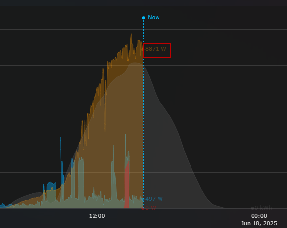
Sometimes my “Now-indicator” seems to not fully extend towards the X-axis. Does someone know what causes this?
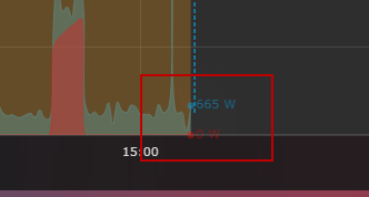
Is there any possibility of moving the indicators that I mark in the box so that they do not come out, so that they are delimited in the graph?
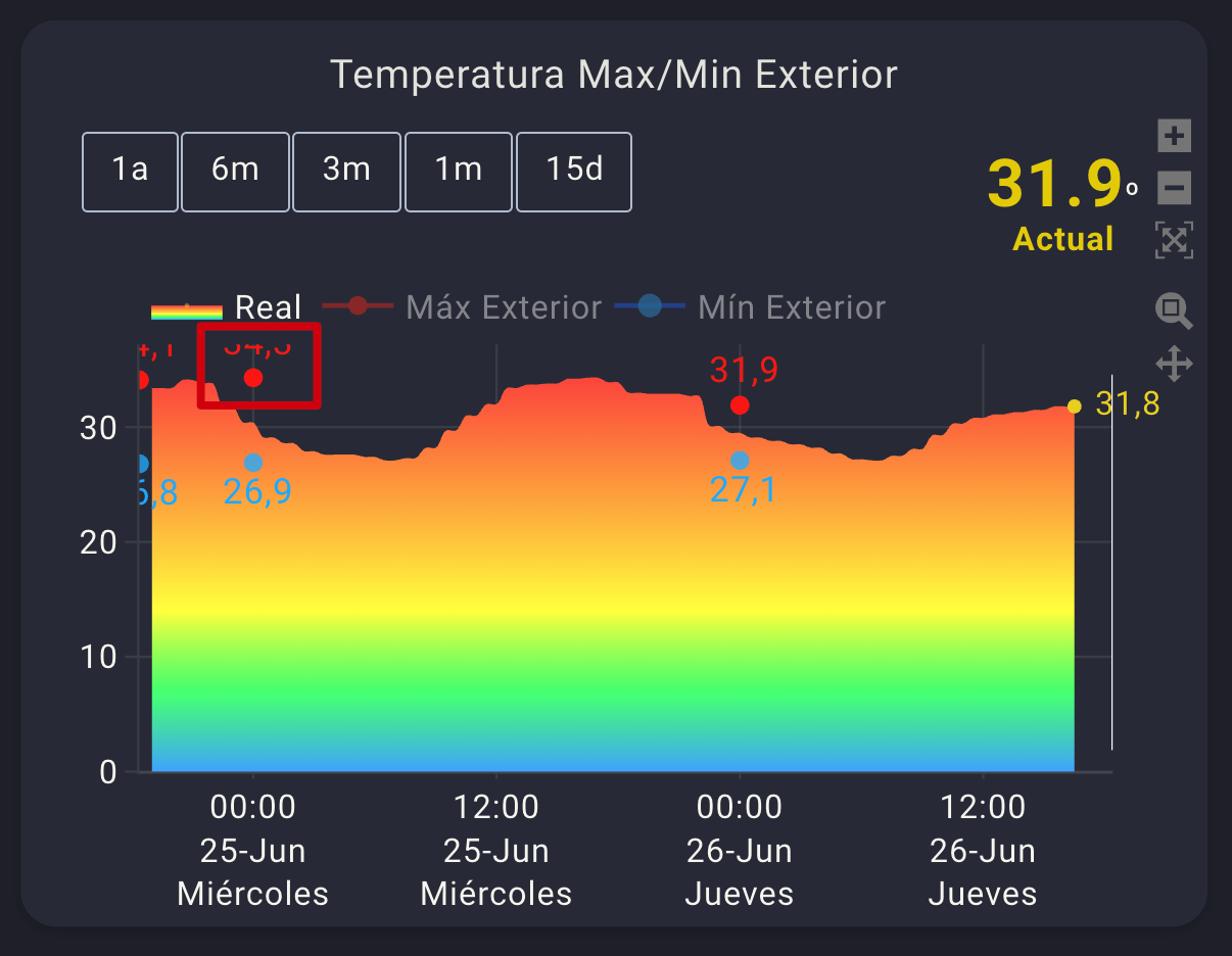
And I don’t know if it is possible to align the number with the marker on the right or left, I haven’t found information on how to do it.
That is, the red dot and the value on the right, and put the blue dot on the left so they don’t overlap.
type: custom:plotly-graph
title: Temperatura Max/Min Exterior
color_scheme: set2
autorange_after_scroll: true
config:
  displaylogo: false
  scrollZoom: true
  displayModeBar: true
entities:
  - entity: sensor.netatmo_casa_de_sh_interior_exterior_temperature
    mode: lines+markers
    show_value: true
    legendgroup: 1
    statistic: max
    filters:
      - resample: 30m
    fill: tozeroy
    fillgradient:
      start: 0
      stop: 35
      colorscale:
        - - 0
          - rgba( 76, 180, 255  , 1)
        - - 0.2
          - rgba( 76, 255, 130  , 1)
        - - 0.4
          - rgba(  255, 252, 76  , 1)
        - - 0.6
          - rgba(  255, 199, 76, 1 )
        - - 0.8
          - rgba(  255, 144, 76, 1 )
        - - 1
          - rgba(  255, 87, 76 , 1)
      type: vertical
    fillcolor: rgba(  236, 213, 40   ,.1)
    marker:
      size: 0.1
      color: rgba(  236, 213, 40  , 0.5)
    showlegend: true
    hovertemplate: >-
      <span style="text-align: center; font-size: 20px;">%{y:.1f}
      ºC</span><br>%{x}<extra></extra>
    texttemplate: " %{y:.1f}"
    yaxis: y1
    name: Real
    line:
      shape: spline
      smoothing: 1
      width: 0
      color: rgba ( 236, 213, 40  , 1 )
  - entity: sensor.netatmo_casa_de_sh_interior_exterior_temperature
    mode: markers+text
    textposition: top center
    textfont:
      color: rgba ( 255, 49, 21 , 1)
      size: 15
    marker:
      size: 8
      color: rgba(  255, 49, 21  , 1)
    statistic: max
    period: day
    showlegend: false
    hovertemplate: >-
      <span style="text-align: center; font-size: 20px;">%{y:.1f}
      ºC</span><br>%{x}<extra></extra>
    texttemplate: " %{y:.1f}"
    yaxis: y1
    name: Máx Exterior
    line:
      shape: spline
      smoothing: 1
      width: 2
      color: rgba (  255, 49, 21, 0.9 )
  - entity: sensor.netatmo_casa_de_sh_interior_exterior_temperature
    mode: line
    visible: legendonly
    marker:
      size: 8
      color: rgba(  255, 49, 21  , 1)
    statistic: max
    period: day
    showlegend: true
    hovertemplate: >-
      <span style="text-align: center; font-size: 20px;">%{y:.1f}
      ºC</span><br>%{x}<extra></extra>
    texttemplate: " %{y:.1f}"
    yaxis: y1
    name: Máx Exterior
    line:
      shape: spline
      smoothing: 1
      width: 2
      color: rgba (  255, 49, 21, 0.9 )
  - entity: sensor.netatmo_casa_de_sh_interior_exterior_temperature
    statistic: min
    period: day
    mode: markers+text
    showlegend: false
    hovertemplate: >-
      <span style="text-align: center; font-size: 20px;">%{y:.1f}
      ºC</span><br>%{x}<extra></extra>
    yaxis: y1
    textposition: bottom center
    textfont:
      color: rgba (  21, 185, 255 , 1)
      size: 15
    texttemplate: " %{y:.1f}"
    name: Mín Exterior
    marker:
      size: 8
      color: rgba (  21, 185, 255 , 0.8)
    line:
      width: 2
      shape: spline
      color: rgba (21, 120, 255 , 0.9)
  - entity: sensor.netatmo_casa_de_sh_interior_exterior_temperature
    statistic: min
    period: day
    mode: line
    visible: legendonly
    showlegend: true
    hovertemplate: >-
      <span style="text-align: center; font-size: 20px;">%{y:.1f}
      ºC</span><br>%{x}<extra></extra>
    yaxis: y1
    texttemplate: " %{y:.1f}"
    name: Mín Exterior
    marker:
      size: 10
      color: rgba (  21, 185, 255 , 0.8)
    line:
      width: 2
      shape: spline
      color: rgba (21, 120, 255 , 0.9)
  - entity: ""
    hovertemplate: "<span style=\"display: none;\"> <extra></extra>     "
    name: Now
    yaxis: y9
    texttemplate: ""
    showlegend: false
    show_value: true
    line:
      width: 1
      color: rgba (   255,255,255 , 1 )
    x: $ex [Date.now(), Date.now()]
    "y":
      - 0
      - 1
defaults:
  entity: null
  yaxes:
    fixedrange: true
fn: |
  $fn({getFromConfig, vars})=> {
    const range = getFromConfig("visible_range");
    const width = range[1] - range[0];
    vars.scroll = (label, p) => ({
      args: [
        {
          layout: {
            "xaxis.range": [range[0] + width*p, range[1] + width*p],
          }
        }, {
          transition: {
            duration: 150,
          }
        }
      ],
      label,
      method: "animate",
    })
    vars.zoom = (label, h) => ({
      args: [
        {
          layout: {
            "xaxis.range": [Date.now()-1000*60*60*h, Date.now()],
          }
        }
      ],
      label,
      method: "animate",
    })
  }
layout:
  xaxis:
    tickformat: "%H:%M<br>%d-%b<br>%A"
    tickfont:
      size: 14
    ticklen: 2
    tickangle: 0
    minor:
      nticks: 1
      tickmode: auto
      showgrid: false
      gridcolor: var(--surface)
  yaxis:
    side: left
    ticksuffix: null
    showticklabels: true
    tickangle: 0
    minor:
      nticks: 1
      tickmode: auto
      showgrid: true
      gridcolor: var(--surface)
      tickformat: auto
  annotations:
    - text: |-
        $fn ({hass}) =>
          "<span style='font-size: 28px;'><span style='font-weight: bold; color: rgba(   233, 209, 0   , 1)'>"
          + hass.states['sensor.netatmo_casa_de_sh_interior_exterior_temperature'].state + "</span></span>º<br>"
          +  "</span><span style='font-weight: bold; color: rgba(  233, 209, 0    , 1)'>Actual</span><br>"
          + (hass.states['sensor.aire_acondicionado_temperature']  ? "<br><span style='font-size: 30px;color: rgba( 0, 221, 51   , 1)'></span>":'')

      xref: x domain
      yref: y1 domain
      xanchor: center
      yanchor: top
      x: 0.95
      "y": 1.48
      showarrow: false
  yaxis2:
    side: left
    showticklabels: false
    title: ""
    tickangle: 0
    minor:
      nticks: 3
      tickmode: auto
      showgrid: true
      gridcolor: var(--surface)
      tickformat: auto
  yaxis3:
    side: left
    showticklabels: false
    tickangle: 0
    minor:
      nticks: 3
      tickmode: auto
      showgrid: true
      gridcolor: var(--surface)
      tickformat: auto
  yaxis4:
    side: left
    showticklabels: false
    tickangle: 0
    minor:
      nticks: 3
      tickmode: auto
      showgrid: true
      gridcolor: var(--surface)
      tickformat: auto
  yaxis5:
    side: left
    showticklabels: false
    tickangle: 0
    minor:
      nticks: 3
      tickmode: auto
      showgrid: true
      gridcolor: var(--surface)
      tickformat: auto
  height: 350
  margin:
    l: 50
    r: 40
    t: 100
    b: 70
  updatemenus:
    - buttons: null
      direction: right
      active: -1
      pad:
        r: 10
        t: -90
      type: buttons
      x: 1
      xanchor: right
      "y": 1
      yanchor: top
    - buttons:
        - $fn({vars}) => vars.zoom( '1a', 24*360)
        - $fn({vars}) => vars.zoom( '6m', 24*180)
        - $fn({vars}) => vars.zoom( '3m', 24*90)
        - $fn({vars}) => vars.zoom( '1m', 24*30)
        - $fn({vars}) => vars.zoom( '15d', 24*15)
      direction: right
      active: -1
      pad:
        l: -25
        t: -90
      type: buttons
      x: 0
      xanchor: left
      "y": 1
      yanchor: top
  font:
    family: Roboto,Noto,sans-serif
    size: 14
    color: $fn ({css_vars}) => css_vars['primary-text-color']
  plot_bgcolor: rgba(0, 0, 0, 0)
  legend:
    itemwidth: 1
hours_to_show: 48
I’m trying to do the same thing. Did you ever get this figured out? Can you share some code?
Thanks
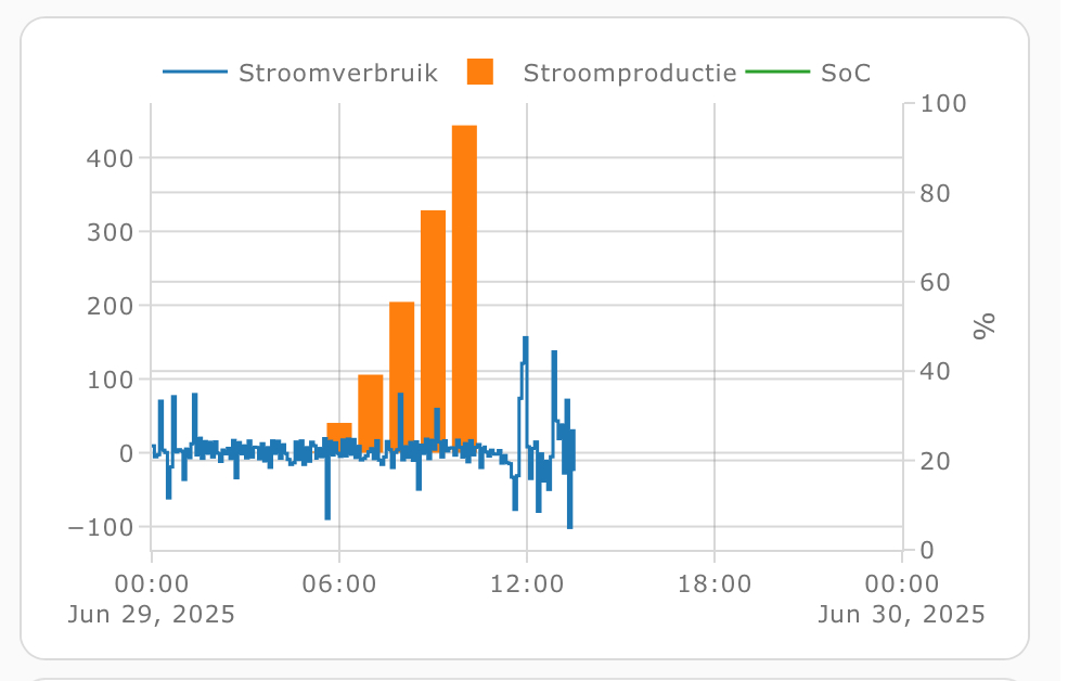
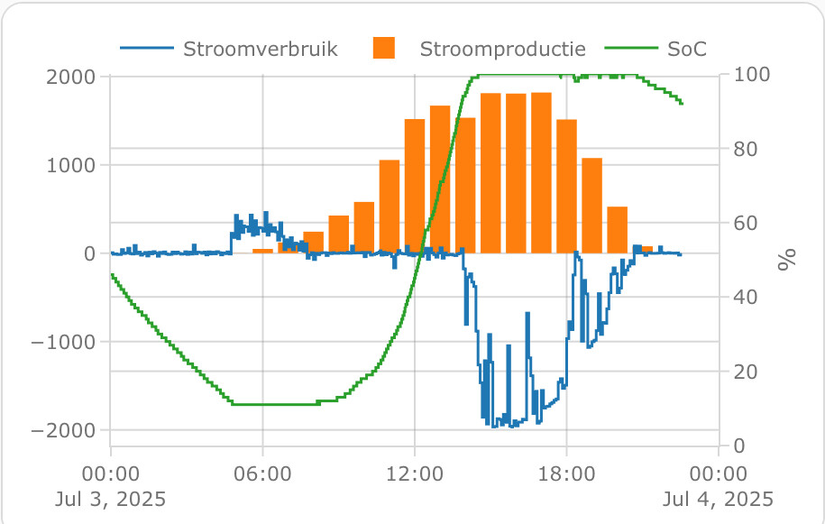
I’m trying to combine my power usage, solar power and home battery state of charge into 1 graph but I can’t get the SoC to show up. Can somebody point me to what’s wrong here? It’s been bugging me for a few days now.
  - type: custom:plotly-graph
    entities:
      - entity: sensor.p1_meter_power
        name: Stroomverbruik
        line:
          width: 1.5
        show_value: false
        yaxis: y1
        statistic: mean
        period: 5minute
        texttemplate: "%{y:.0f}"
      - entity: sensor.envoy_122227078593_current_power_production
        name: Stroomproductie
        statistic: mean
        period: hour
        type: bar
        yaxis: y1
      - entity: sensor.hame_energy_hmg_50_acd929892c43_battery_state_of_charge
        name: SoC
        line:
          width: 1.5
        statistic: mean
        period: 5minute
        yaxis: y2
        texttemplate: "%{y:.0f}"
    refresh_interval: 10
    hours_to_show: current_day
    disable_pinch_to_zoom: true
    config:
      staticPlot: true
    layout:
      yaxis:
        showgrid: true
        side: left
      yaxis2:
        showgrid: true
        side: right
        fixedrange: true
        range: $ex [0, 100]
Solution:
textposition: left center or right center
type: custom:plotly-graph
title: Temperatura Max/Min Exterior
autorange_after_scroll: true
config:
  displaylogo: false
  scrollZoom: true
  displayModeBar: true
entities:
  - entity: sensor.netatmo_casa_de_sh_interior_exterior_temperature
    mode: lines+markers
    show_value: true
    legendgroup: 1
    statistic: max
    filters:
      - resample: 15m
    fill: tozeroy
    fillgradient:
      start: 0
      stop: 40
      colorscale:
        - - 0
          - rgba( 76, 180, 255  , 1)
        - - 0.2
          - rgba( 76, 255, 130  , 1)
        - - 0.4
          - rgba(  255, 252, 76  , 1)
        - - 0.6
          - rgba(  255, 199, 76, 1 )
        - - 0.8
          - rgba(  255, 144, 76, 1 )
        - - 1
          - rgba(  255, 87, 76 , 1)
      type: vertical
    fillcolor: rgba(  236, 213, 40   ,.1)
    marker:
      size: 0.1
      color: rgba(  236, 213, 40  , 0.5)
    showlegend: true
    hovertemplate: >-
      <span style="text-align: center; font-size: 20px;">%{y:.1f}
      ºC</span><br>%{x}<extra></extra>
    texttemplate: " %{y:.1f}"
    yaxis: y1
    name: Real
    line:
      shape: spline
      smoothing: 1
      width: 0
      color: rgba ( 236, 213, 40  , 1 )
  - entity: sensor.netatmo_casa_de_sh_interior_exterior_temperature
    mode: markers+text
    textposition: right center
    textfont:
      color: rgba ( 255, 49, 21 , 1)
      size: 15
    marker:
      size: 8
      color: rgba(  255, 49, 21  , 1)
    statistic: max
    period: day
    showlegend: false
    hovertemplate: >-
      <span style="text-align: center; font-size: 20px;">%{y:.1f}
      ºC</span><br>%{x}<extra></extra>
    texttemplate: " %{y:.1f}"
    yaxis: y1
    name: Máx Exterior
    line:
      shape: spline
      smoothing: 1
      width: 2
      color: rgba (  255, 49, 21, 0.9 )
  - entity: sensor.netatmo_casa_de_sh_interior_exterior_temperature
    mode: line
    visible: legendonly
    marker:
      size: 8
      color: rgba(  255, 49, 21  , 1)
    statistic: max
    period: day
    showlegend: true
    hovertemplate: >-
      <span style="text-align: center; font-size: 20px;">%{y:.1f}
      ºC</span><br>%{x}<extra></extra>
    texttemplate: " %{y:.1f}"
    yaxis: y1
    name: Máx Exterior
    line:
      shape: spline
      smoothing: 1
      width: 2
      color: rgba (  255, 49, 21, 0.9 )
  - entity: sensor.netatmo_casa_de_sh_interior_exterior_temperature
    statistic: min
    period: day
    mode: markers+text
    showlegend: false
    hovertemplate: >-
      <span style="text-align: center; font-size: 20px;">%{y:.1f}
      ºC</span><br>%{x}<extra></extra>
    yaxis: y1
    textposition: left center
    textfont:
      color: rgba (  21, 185, 255 , 1)
      size: 15
    texttemplate: " %{y:.1f}"
    name: Mín Exterior
    marker:
      size: 8
      color: rgba (  21, 185, 255 , 0.8)
    line:
      width: 2
      shape: spline
      color: rgba (21, 120, 255 , 0.9)
  - entity: sensor.netatmo_casa_de_sh_interior_exterior_temperature
    statistic: min
    period: day
    mode: line
    visible: legendonly
    showlegend: true
    hovertemplate: >-
      <span style="text-align: center; font-size: 20px;">%{y:.1f}
      ºC</span><br>%{x}<extra></extra>
    yaxis: y1
    texttemplate: " %{y:.1f}"
    name: Mín Exterior
    marker:
      size: 10
      color: rgba (  21, 185, 255 , 0.8)
    line:
      width: 2
      shape: spline
      color: rgba (21, 120, 255 , 0.9)
  - entity: ""
    hovertemplate: "<span style=\"display: none;\"> <extra></extra>     "
    name: Now
    yaxis: y9
    texttemplate: ""
    showlegend: false
    show_value: true
    line:
      width: 1
      color: rgba (   255,255,255 , 1 )
    x: $ex [Date.now(), Date.now()]
    "y":
      - 0
      - 1
defaults:
  entity: null
  yaxes:
    fixedrange: true
fn: |
  $fn({getFromConfig, vars})=> {
    const range = getFromConfig("visible_range");
    const width = range[1] - range[0];
    vars.scroll = (label, p) => ({
      args: [
        {
          layout: {
            "xaxis.range": [range[0] + width*p, range[1] + width*p],
          }
        }, {
          transition: {
            duration: 150,
          }
        }
      ],
      label,
      method: "animate",
    })
    vars.zoom = (label, h) => ({
      args: [
        {
          layout: {
            "xaxis.range": [Date.now()-1000*60*60*h, Date.now()],
          }
        }
      ],
      label,
      method: "animate",
    })
  }
layout:
  xaxis:
    tickformat: "%H:%M<br>%d-%b<br>%A"
    tickfont:
      size: 14
    ticklen: 2
    tickangle: 0
    minor:
      nticks: 1
      tickmode: auto
      showgrid: false
      gridcolor: var(--surface)
  yaxis:
    side: left
    type: linear
    range:
      - 0
      - 50
    ticksuffix: null
    showticklabels: true
    tickangle: 0
    minor:
      nticks: 1
      tickmode: auto
      showgrid: true
      gridcolor: var(--surface)
      tickformat: auto
  annotations:
    - text: |
        $fn ({hass}) => {
          const t = parseFloat(hass.states['sensor.netatmo_casa_de_sh_interior_exterior_temperature'].state);
          let color = '#ffffff';

          if (t <= 0) color = '#2c7ef7';
          else if (t <= 5) color = '#5aaeff';
          else if (t <= 10) color = '#90d9f8';
          else if (t <= 15) color = '#a4f0d1';
          else if (t <= 18) color = '#c9f76d';
          else if (t <= 21) color = '#fff56d';
          else if (t <= 24) color = '#ffd354';
          else if (t <= 27) color = '#ff9f40';
          else if (t <= 30) color = '#ff6b33';
          else color = '#ff3b30';

          return `
            <span style="font-size: 26px; font-weight: bold; color: ${color};">
              ${t.toFixed(1)}ºC
            </span><br>
            <span style="font-weight: bold; color: ${color};">
              Actual
            </span>`;
        }
      xref: x domain
      yref: y1 domain
      xanchor: center
      yanchor: top
      x: 0.85
      "y": 1.48
      showarrow: false
  yaxis2:
    side: left
    showticklabels: false
    title: ""
    tickangle: 0
    minor:
      nticks: 3
      tickmode: auto
      showgrid: true
      gridcolor: var(--surface)
      tickformat: auto
  yaxis3:
    side: left
    showticklabels: false
    tickangle: 0
    minor:
      nticks: 3
      tickmode: auto
      showgrid: true
      gridcolor: var(--surface)
      tickformat: auto
  yaxis4:
    side: left
    showticklabels: false
    tickangle: 0
    minor:
      nticks: 3
      tickmode: auto
      showgrid: true
      gridcolor: var(--surface)
      tickformat: auto
  yaxis5:
    side: left
    showticklabels: false
    tickangle: 0
    minor:
      nticks: 3
      tickmode: auto
      showgrid: true
      gridcolor: var(--surface)
      tickformat: auto
  height: 350
  margin:
    l: 50
    r: 40
    t: 100
    b: 70
  updatemenus:
    - buttons: null
      direction: right
      active: -1
      pad:
        r: 10
        t: -90
      type: buttons
      x: 1
      xanchor: right
      "y": 1
      yanchor: top
    - buttons:
        - $fn({vars}) => vars.zoom( '1a', 24*360)
        - $fn({vars}) => vars.zoom( '6m', 24*180)
        - $fn({vars}) => vars.zoom( '3m', 24*90)
        - $fn({vars}) => vars.zoom( '1m', 24*30)
        - $fn({vars}) => vars.zoom( '15d', 24*15)
      direction: right
      active: -1
      pad:
        l: -25
        t: -90
      type: buttons
      x: 0
      xanchor: left
      "y": 1
      yanchor: top
  font:
    family: Roboto,Noto,sans-serif
    size: 14
    color: $fn ({css_vars}) => css_vars['primary-text-color']
  plot_bgcolor: rgba(0, 0, 0, 0)
  legend:
    itemwidth: 1
hours_to_show: 48
If you remove “statistics: mean” and “period: 5minute” I’m sure it’ll work.
Hello plotly experts ![]()
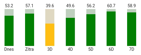
I’m plotly beginner and I’m trying to make a total daily forecast for each day, something like this:
I have this code:
type: custom:plotly-graph
title: Forecast
refresh_interval: 60
hours_to_show: 7d
time_offset: 6d
defaults:
  entity:
    show_value: true
    showlegend: false
entities:
  - entity: sensor.solcast_pv_forecast_forecast_today
    name: Today
    type: bar
    statistic: max
    period: day
    texttemplate: " %{y:.1f}"
    filters:
      - fn: |
          ({meta}) => {
            const forecast = meta.detailedForecast || [];
            const xs = forecast.map(f => new Date(f.period_start));
            const ys = forecast.map(f => f.pv_estimate);
            return {xs,ys};
          }
      - integrate:
          reset_every: 1d
layout:
  yaxis:
    side: left
    fixedrange: true
    range:
      - 0
      - 81
I need to sum values for each day (in this simplified example is only 1 entity).
I have tried to integrate values but then I need to show only the maximum (the latest) value of the day.
I have also tried “statistic: max” with “period: day” but it doesn’t seems to do anything.
Do you have any advice how to aggregate the values?
Thanks in advance!
I’ve solved my issues just by simplifying entities, e.g.:
    x:
      - $ex new Date(new Date().setHours(0,0,0,0))
    "y":
      - $ex hass.states["sensor.solcast_pv_forecast_forecast_today"].state
You have:
Try to add (I have xaxis/yaxis under layout):
layout:
  yaxis9:
    fixedrange: true
    range:
      - 0
      - 1
I would also recommend “show_value: false” for forecasted entities.
Hi. Not very techy or good with this kind of thing, so desperately hoping for some help. I’ve gone around in circles with Claude AI trying to nail what I feel like should be a very simple chart in both ApexCharts and now Plotly, but I just cannot get it working at all. Please help!
I have a weather station with a monthly rainfall sensor. Looking through the history of the sensor, it’s a cumulative line which resets back to zero at the end of / start of the next month. So the data looks as follows in the history stats:
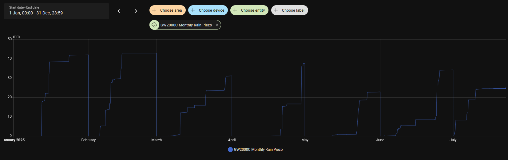
I’d like to display this data as a bar chart for the monthly total over the last 12 months. Obviously I don’t have 12 months of data yet, but once I do I don’t really want to show back much further. And no matter what I or Claude try, I can’t even get a bar chart of any description to show up. Can anyone help?
1 Like
@chemacky read this post. Start at the top but latest is the last post.
1 Like
Hey all
I would like to have a 2x1 grid with two subplots. The one on top having two y axis, one on the left showing humidity, the other on the right showing the status of a dehumidifier. So far so good, I got to achieve this.
The issues starts when I try to have a third y axis on the bottom subplot showing a temperature. I’m not getting how to move this last y3 axis into the bottom subplot.
Here what I achieved so far:
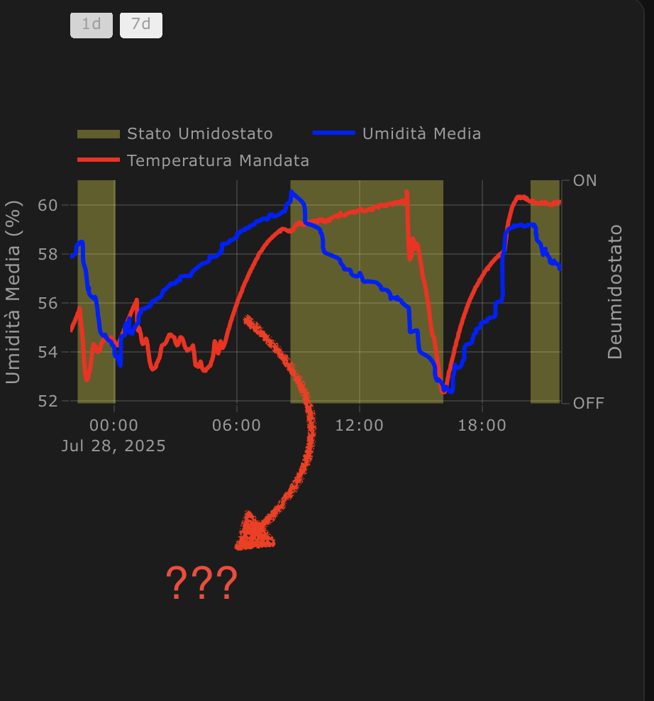
And here my config:
type: custom:plotly-graph
entities:
  - entity: binary_sensor.esphome_monitor_condizionamento_stato_deumidostato
    name: Stato Umidostato
    yaxis: y2
    fill: tozeroy
    fillcolor: rgba(260, 250, 0, 0.3)
    zorder: 1
    line:
      width: 0
  - entity: sensor.umidita_media_casa
    name: Umidità Media
    yaxis: y1
    zorder: 2
    line:
      width: 3
      color: blue
      shape: spline
  - entity: sensor.esphome_monitor_condizionamento_temperatura_mandata
    name: Temperatura Mandata
    yaxis: y3
    zorder: 2
    line:
      width: 3
      color: red
      shape: spline
hours_to_show: 24
refresh_interval: 10
layout:
  height: 500
  grid:
    rows: 2
    columns: 1
    roworder: top to bottom
    pattern: coupled
  xaxis:
    gridwidth: 0.5
    rangeselector:
      "y": 1.3
      buttons:
        - count: 1
          step: day
        - count: 7
          step: day
  yaxis:
    title: Umidità Media (%)
    side: left
    gridwidth: 0.5
  yaxis2:
    title: Deumidostato
    overlaying: "y"
    side: right
    range:
      - 0
      - 1
    tickmode: array
    tickvals:
      - 0
      - 1
    ticktext:
      - "OFF"
      - "ON"
    fixedrange: true
  yaxis3:
    title: Temperatura Media (%)
Nope. Never did. Ended up not being important enough eventually.
I’ve a small problem with timestamp and x-axis, they did not match.
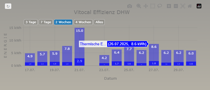
so I tried to solve the problem with time_offset: -1d but did not solved the problem.
type: custom:plotly-graph
raw_plotly_config: true
refresh_interval: 900
config:
  toImageButtonOptions:
    format: png
    filename: vitocal_ww
    height: 400
    width: 800
    scale: 1
layout:
  paper_bgcolor: transparent
  plot_bgcolor: transparent
  height: 300
  width: 700
  title:
    text: Vitocal Effizienz DHW
    font:
      size: 18
  xaxis:
    title: Datum
    type: date
    tickformat: "%d.%m."
    hoverformat: "%d.%m.%Y"
    autorange: true
    rangeselector:
      bgcolor: rgba(0,0,0,0.1)
      bordercolor: "#ccc"
      borderwidth: 1
      font:
        color: "#FFFFFF"
      buttons:
        - count: 3
          label: 3 Tage
          step: day
          stepmode: backward
        - count: 7
          label: 7 Tage
          step: day
          stepmode: backward
        - count: 14
          label: 2 Wochen
          step: day
          stepmode: backward
        - count: 28
          label: 4 Wochen
          step: day
          stepmode: backward
        - label: Alles
          step: all
      activecolor: "#1f77b4"
      x: 0
      "y": 1.02
  yaxis:
    title: E N E R G I E
    rangemode: tozero
    tickprefix: " "
    ticksuffix: " kWh"
  showlegend: false
  margin:
    l: 80
    r: 20
    t: 80
    b: 80
  barmode: overlay
entities:
  - entity: sensor.vitocal_domestic_hot_water_stats
    attribute: months_combined
    name: Stromverbrauch
    time_offset: "-1d"
    type: bar
    statistic: state
    marker:
      color: blue
      opacity: 0.7
    pariod: day
    filters: none
    texttemplate: "%{y:.1f}"
    textposition: inside
    x: $fn ({meta}) => meta.months_combined.map(item => new Date(item.date))
    "y": $fn ({meta}) => meta.months_combined.map(item => item.value)
  - entity: sensor.vitocal_domestic_hot_water_output_stats
    attribute: months_combined
    name: Thermische Energie
    time_offset: "-1d"
    type: bar
    statistic: state
    marker:
      color: blue
      opacity: 0.4
    pariod: day
    filters: none
    texttemplate: "%{y:.1f}"
    textposition: inside
    x: $fn ({meta}) => meta.months_combined.map(item => new Date(item.date))
    "y": $fn ({meta}) => meta.months_combined.map(item => item.value)
the states attributes are an json like
any idea how to solve it?
Hi
Not sure if this is possible but I thought I’d ask. Is it possible to make entities toggle with a button (so the state can be remembered) rather than clicking all the entities I do not want to see all the time.
That way I can add whatever amount of entities to the graph but only have whatever amount I want selected all the time.
Hello,
I started to use plotly a month ago (switching from apexcharts) and everything is working but one custom plot I want to create. I would appreciate if someone could take a look at my post here:
BR, Piotr
Hi,
i am also a newbie to home assistant. i want to achieve the following for my heating graph:
Wenn the target temperature of the heating is higher than the actual temperature the area between the dashed line and solid line should be filled:
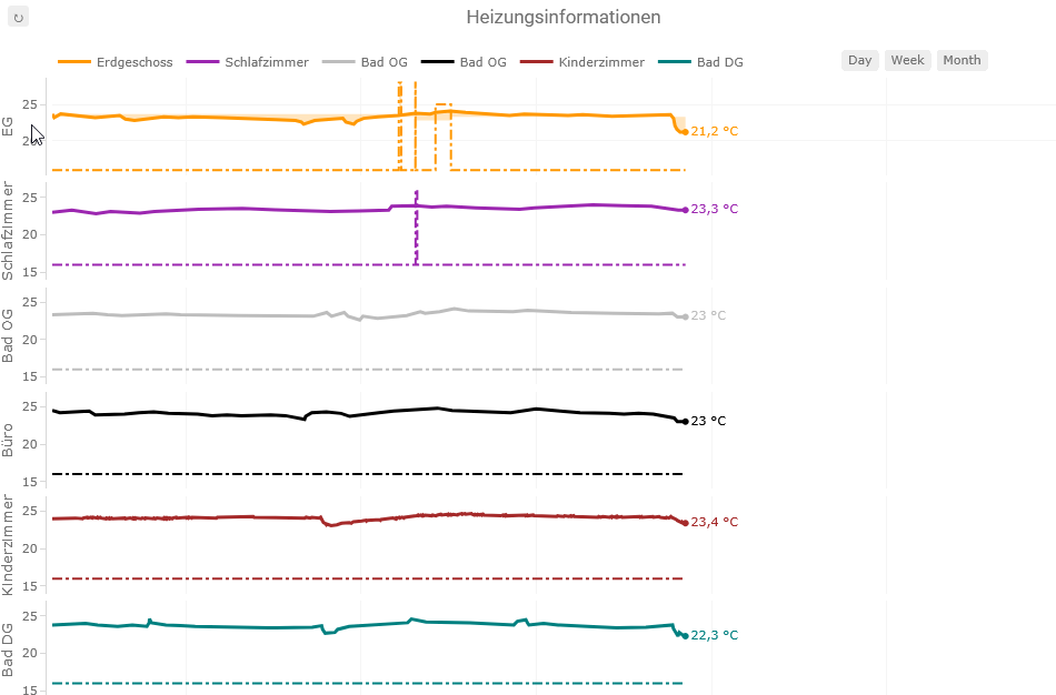
My Code looks like the following. I started for testing this with the top orange curve, but I cannot get it working as i want it. It seems that is related to the resampling? Do you have an idea how to solve?
Thanks a lot.
Best Marcus
type: custom:plotly-graph
title: Heizungsinformationen
entities:
  - entity: sensor.eg_temperatursensor_target_temperature
    show_value: false
    connectgaps: true
    showlegend: false
    line:
      width: 2
      color: rgba(255, 152, 0, 1)
      dash: dashdot
    yaxis: y1
    filters:
      - store_var: eg_temperatur_target
  - entity: sensor.eg_temperatursensor_temperature
    name: Erdgeschoss
    show_value: true
    connectgaps: true
    showlegend: true
    line:
      width: 3
      color: rgba(255, 152, 0, 1)
      shape: line
    yaxis: y1
    filters:
      - store_var: eg_temperatur
  - entity: sensor.eg_raumthermostat_aktor
    name: Heizungsmodus
    show_value: false
    connectgaps: true
    showlegend: false
    fill: tonexty
    fillcolor: rgba(255, 152, 0, 0.25)
    line:
      color: rgba(0, 152, 0, 0)
    yaxis: y1
    filters:
      - map_y_numbers: "y === \"1\" ? vars.eg_temperatur_target.ys[i] : vars.eg_temperatur.ys[i]"
  - entity: sensor.og_schlafzimmer_temperatursensor_temperature
    name: Schlafzimmer
    show_value: true
    connectgaps: true
    showlegend: true
    line:
      width: 3
      color: rgba(156, 39, 176, 1)
      shape: line
    yaxis: y2
  - entity: sensor.og_schlafzimmer_temperatursensor_target_temperature
    show_value: false
    connectgaps: true
    showlegend: false
    line:
      width: 2
      color: rgba(156, 39, 176, 1)
      dash: dashdot
    yaxis: y2
  - entity: sensor.og_bad_temperatursensor_temperature
    name: Bad OG
    show_value: true
    connectgaps: true
    showlegend: true
    line:
      width: 3
      color: rgba(189, 189, 189,1)
      shape: line
    yaxis: y3
  - entity: sensor.og_bad_temperatursensor_target_temperature
    show_value: false
    connectgaps: true
    showlegend: false
    line:
      width: 2
      color: rgba(189, 189, 189,1)
      dash: dashdot
    yaxis: y3
  - entity: sensor.og_buro_temperatursensor_temperature
    name: Bad OG
    show_value: true
    connectgaps: true
    showlegend: true
    line:
      width: 3
      color: rgba(0, 0, 0 ,1)
      shape: line
    yaxis: y4
  - entity: sensor.og_buro_temperatursensor_target_temperature
    show_value: false
    connectgaps: true
    showlegend: false
    line:
      width: 2
      color: rgba(0, 0, 0 ,1)
      dash: dashdot
    yaxis: y4
  - entity: sensor.dg_kinderzimmer_klimasensor_temperatur
    name: Kinderzimmer
    show_value: true
    connectgaps: true
    showlegend: true
    line:
      width: 3
      color: brown
      shape: line
    yaxis: y5
  - entity: sensor.dg_kinderzimmer_temperatursensor_target_temperature
    show_value: false
    connectgaps: true
    showlegend: false
    line:
      width: 2
      color: brown
      shape: line
      dash: dashdot
    yaxis: y5
  - entity: sensor.dg_bad_temperatursensor_temperature
    name: Bad DG
    show_value: true
    connectgaps: true
    showlegend: true
    line:
      width: 3
      color: teal
      shape: line
    yaxis: y6
  - entity: sensor.dg_bad_temperatursensor_target_temperature
    show_value: false
    connectgaps: true
    showlegend: false
    line:
      width: 2
      color: teal
      dash: dashdot
    yaxis: y6
defaults:
  yaxes:
    side: left
    overlaying: "y"
    visible: true
layout:
  legend:
    itemheight: 3000
  plot_bgcolor: white
  dragmode: pan
  margin:
    t: 30
    l: 55
    r: 30
    b: 50
    pad: 5
  height: 650
  yaxis:
    zeroline: false
    gridcolor: whitesmoke
    fixedrange: true
    title:
      text: EG
    range:
      - 14
      - 27
  yaxis2:
    zeroline: false
    gridcolor: whitesmoke
    fixedrange: true
    title:
      text: Schlafzimmer
    range:
      - 14
      - 27
  yaxis3:
    zeroline: false
    gridcolor: whitesmoke
    fixedrange: true
    title:
      text: Bad OG
    range:
      - 14
      - 27
  yaxis4:
    zeroline: false
    gridcolor: whitesmoke
    fixedrange: true
    title:
      text: Büro
    range:
      - 14
      - 27
  yaxis5:
    zeroline: false
    gridcolor: whitesmoke
    fixedrange: true
    title:
      text: Kinderzimmer
    range:
      - 14
      - 27
  yaxis6:
    zeroline: false
    gridcolor: whitesmoke
    fixedrange: true
    title:
      text: Bad DG
    range:
      - 14
      - 27
  grid:
    ygap: 0.07
    rows: 6
    columns: 1
    pattern: coupled
    roworder: top to bottom
  xaxis:
    gridcolor: whitesmoke
    rangeselector:
      x: 0.75
      "y": 1.01
      buttons:
        - count: 1
          step: day
          label: Day
        - count: 7
          step: day
          label: Week
        - count: 28
          step: day
          label: Month
    range: $ex [new Date().setHours(0,0,0,0), new Date().setHours(24,0,0,0)]
autorange_after_scroll: true
refresh_interval: auto
hours_to_show: 24
grid_options:
  columns: 24
P.S. Got it working by adding the following line to every filters section:
- resample: 1m