I actually have an automation that detects when Spotify is running and increases the update frequency when playing or paused. I’m not sure what your media source is, but could something like this possibly work?
alias: Spotify - Refresh Every 5 Seconds While Playing
description: ""
trigger:
  - platform: state
    entity_id:
      - media_player.spotify
    from: idle
condition: []
action:
  - repeat:
      while:
        - condition: or
          conditions:
            - condition: state
              entity_id: media_player.spotify
              state: playing
            - condition: state
              entity_id: media_player.spotify
              state: paused
      sequence:
        - delay:
            hours: 0
            minutes: 0
            seconds: 5
            milliseconds: 0
        - service: homeassistant.update_entity
          data: {}
          target:
            entity_id: media_player.spotify
mode: single
Using as_timestamp with these tile feature templates wouldn’t work since it uses ha-nunjucks for templating, which only supports a subset of Home Assistant templating functions (but renders instaneously in the front end). Adding pythonic time and timestamp functionality to ha-nunjucks is definitely an option, but I hadn’t gotten around to it since Python and JavaScript/TypeScript handle datetimes differently. There are a few npm packages that add pythonic datetimes to JS but I haven’t dug too much into them. Still the label and other templates only re-render if the hass object or an internal state changes, so I’d have to figure out how to make it re-render once per second anyway (which may end up not being that hard but I’m a backend engineer by trade so it could just be something I don’t know yet).
There’s also a visual bug with input ranges that makes it so that they stop visually updating if they are manually changed, which makes it harder to use for something like this which gets updated a lot by the backend this should hopefully be fixed in the next in progress minor version.
Also here’s a long label template to display the current and total media time.
Can this frequent rendering be an option to show also a timer countdown? Or is there already a possibility to show it as label somehow?
I tried to use a template for that, but it doesn’t work, I assume, because of the same reasons as above.
Version 3.3.0 adds spinboxes a la the climate target temperature feature! This feature allows you to increment and decrement a value, and only calls the service once you’ve stopped changing the value. You can modify both it’s center icon and label, and the icons and labels of it’s buttons. You can also override it’s buttons to behave like normal buttons.
This release also adds customizable timings for double tap and hold actions, repeat on hold actions with customizable repeat delay, momentary button mode, and a new fire-dom-event action.
This release marks the first code contributions of another developer! irakhlin contributed to the research of spinbox behavior and the actual implementation of the fire-dom-event action.
As of version 3.3.1, if value attribute is set to media_position, it will be updated twice per second using the current time and media position updated at timestamp, and accounts for the media player state and duration. Still the number jumps a little bit when media_position_update_at gets updated, and sometimes it inexplicably skips a second. Also add this style to give the tooltip a more readable value:
This project only adds to the list of available dashboard card features (formerly called tile features before they were also made available for climate cards). The tile icon and entity content area is out of scope. You can modify the icon and info fields using card-mod.
Try this, will invert the slider and the tooltip. Its almost like the original tile cover slider, the only thing it becomes grayed out at 0% or closed cover.
Ok, I figured a work around to fix the slider being grayed out / inactive when cover is closed or set a 0.
I put the range starting from -1 to 100
            range:
             - -1
             - 100
            step: 1
Then in the tap action I add template for the position data so it doesn’t send the “-1” position as it doesn’t work for the cover.
            tap_action:
              action: call-service
              service: cover.set_cover_position
              data:
                position: >-
                  {% set position = VALUE | int %} {{ 0 if position < 0 else "VALUE" }}
            value_attribute: current_position
Last, not only set direction and tooltip-offset, but you have to set the color otherwise will have gray color when cover is close as var(–tile-color) will follow the main tile icon color. I set the original light purple from original tile covers.
Now its behaving like the original slider. Just blinks inactive when you slide to -1, but quickly the slider updates to current positive which is 0 and the slider reappears.
I hope it helps. Thanks for the great work on this project! Its really awesome.
I need to rework the logic around slider display when it’s entity is “off”. As it is now it treats a value of 0 equal to the minimum slider range as off but I really should make it determine that purely by entity state. The tile and flat thumb sliders have this off when 0 minimum logic but the line thumb slider doesn’t.
Edit: I’ve tweaked slider off logic in version 3.3.3 so it will only be off when the value is undefined (like idle media players with no volume level attribute), the entity state is off, the value is not greater than the range minimum, or the entity is a timer in idle state.
Hey,
I’m trying to change the border-radius of selected selectors and sliders if active. But I didn’t found a way yet. Only for the background and generic style but it seems that is not working for active selectors/sliders. Does anyone have a small hint? thanks
I need some help with configuring my Dyson fan using the Service Call Tile. My fan has two preset modes: Normal and Auto. I want to create a single button that allows me to cycle through these preset modes.
Here’s what I’m trying to achieve:
When the button shows the “Auto” logo, clicking it should switch the fan to Auto mode.
After switching to Auto mode, the button should update to show “Normal.”
Clicking it again should then switch to Normal mode, and the button should show “Auto” once more.
I’m not sure how to set this up. Any guidance or examples would be greatly appreciated!
It looks like I’ve got some styles set on the base feature host style that shouldn’t be there, which are preventing styles like border-radius from working. I’ll try to fix it in the next patch version.
style gets applied to the element host, while icon_style, label_style, background_style, slider_style, and tooltip_style get applied to the sub elements within the element shadow-root. It looks like I have border-radius: 10px set to the host element and several sub-elements, and you have to override all of them. In the next patch version I’ll remove border-radius from the child elements since they’re redundant and doing so would make user styling easier.
As for the slider thumb, that’s a more difficult case. Slider thumbs are styled using pseudo-elements, so it isn’t really possible to allow users to apply styles to them. I could try to expose some styles using custom variables, but those values differ between slider thumb types.
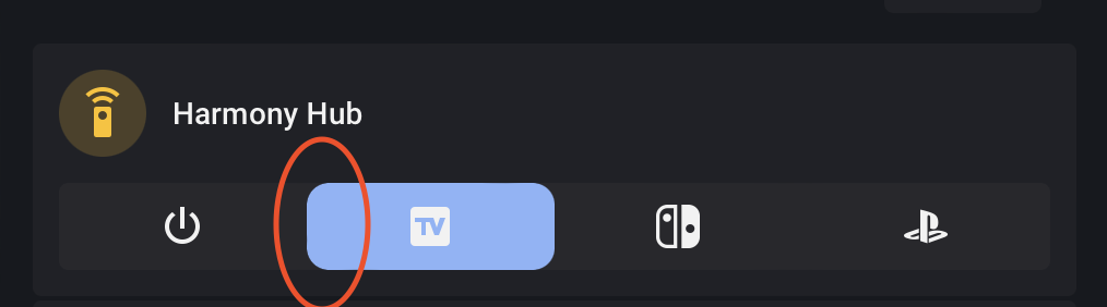
Thanks for your answer, okay this would be great. I don’t mind about the slider thumb. I mean only the border-radius of the slider itself. My mark in the screenshot was depending to the slider itself. sorry. Thank you in advance.
I was going to say use templates to change the service call data, but this is actually closer to what I do with selectors - an input select with an automation that calls scripts for each option.
I am proud to announce that version 4 of this project has been released!
This project has been rebranded to Custom Features for Home Assistant Cards to reflect it’s expanded functionality and scope. It also now has a configuration UI! No more dealing with complicated and confusing YAML, the vast majority of configuration outside of more complicated templating can be done entirely through the user interface.
Styles are now handled via pure CSS, and deprecated fields are updated by the configuration UI and saved to the YAML configuration if detected. To update your old configs, open each row in the configuration UI and slowly toggle between GUI and YAML modes until the configuration has updated itself.


 BREAKING CHANGES