Share your Themes

Thank guys! Here is another one. This time a clean flat monochrome light-grey theme. Tried to keep it as basic/clean as possible.


PmxMonolight:
  # MyVar
  huesat: '0, 0%,'
  # Primary Color
  primary-color: 'hsl(var(--huesat) 80%)'
  dark-primary-color: 'hsl(var(--huesat) 20%)'
  light-primary-color: 'hsl(var(--huesat) 90%)'
  accent-color: 'hsl(var(--huesat) 30%)'
  # Backgrounds
  primary-background-color: 'var(--primary-color)'
  secondary-background-color: 'hsl(var(--huesat) 86%)'
  paper-listbox-background-color: 'var(--primary-color)'
  paper-card-background-color: 'hsl(var(--huesat) 90%)'
  paper-dialog-background-color: 'var(--paper-card-background-color)'
  table-row-background-color: 'hsl(var(--huesat) 88%)'
  table-row-alternative-background-color: 'hsl(var(--huesat) 90%)'
  # Devider
  divider-color: 'hsla(0, 0%, 0%, 0)'
  dark-divider-opacity: '0'
  light-divider-opacity: '0'
  dark-secondary-opacity: '0.4'
  # Text colors
  primary-text-color: 'hsl(var(--huesat) 46%)'
  text-primary-color: 'hsl(var(--huesat) 46%)'
  secondary-text-color: 'hsl(var(--huesat) 56%)'
  disabled-text-color: 'hsl(var(--huesat) 30%)'
  sidebar-text_-_color: 'hsl(var(--huesat) 5%)'
  sidebar-text-color: 'hsl(var(--huesat) 5%)'
  paper-card-header-color: 'hsl(hsl(var(--huesat) 50%)'
  paper-button-ink-color: 'hsl(hsl(var(--huesat) 50%)'
  # Text Adjustments
  paper-font-headline_-_letter-spacing: '-0.5px'
  paper-font-headline_-_font-weight: '500'
  paper-font-body1_-_font-weight: '500'
  # Nav Menu
  paper-listbox-color: 'hsl(var(--huesat) 50%)'
  paper-grey-50: 'hsl(var(--huesat) 40%)'
  paper-grey-200: 'hsl(var(--huesat) 72%)'
  # Paper card
  paper-item-icon-color: 'hsl(var(--huesat) 70%)'
  paper-item-icon-active-color: 'var(--paper-item-icon-color)'
  paper-item-icon_-_color: 'hsl(var(--huesat) 70%)'
  paper-item-selected_-_background-color: 'hsla(0, 0%, 100%, 0.2)'
  paper-item-selected_-_color: 'hsl(var(--huesat) 20%)'
  paper-tabs-selection-bar-color: 'hsl(var(--huesat) 70%)'
  paper-tab-ink: 'hsl(var(--huesat) 70%)'
  paper-input-container-color: 'hsl(var(--huesat) 66%)'
  # Labels
  label-badge-red: 'hsl(var(--huesat) 80%)'
  label-badge-border-color: 'var(--label-badge-red)'
  label-badge-background-color: 'hsl(var(--huesat) 82%)'
  label-badge-text-color: 'var(--primary-text-color)'
  # Shadows
  shadow-elevation-2dp_-_box-shadow: 'inset 0px 0px 0px 3px hsla(var(--huesat) 91%, 0.2)'
  shadow-elevation-16dp_-_box-shadow: 'inset 0px 0px 0px 3px hsla(var(--huesat) 91%, 0.2)'
  paper-input-container-shared-input-style_-_background: '#000'
  # Switches
  paper-toggle-button-checked-button-color: 'hsl(var(--huesat) 50%)'
  paper-toggle-button-checked-bar-color: 'hsl(var(--huesat) 66%)'
  paper-toggle-button-unchecked-button-color: 'hsl(var(--huesat) 85%)'
  paper-toggle-button-unchecked-bar-color: 'hsl(var(--huesat) 80%)'
  # Sliders
  paper-slider-knob-color:  'hsl(var(--huesat) 45%)'
  paper-slider-knob-start-color: 'hsl(var(--huesat) 60%)'
  paper-slider-pin-color:  'hsl(var(--huesat) 60%)'
  paper-slider-active-color:  'hsl(var(--huesat) 60%)'
  paper-slider-container-color: 'hsl(var(--huesat) 76%)'
  paper-slider-secondary-color: 'hsl(var(--huesat) 10%)'
  paper-slider-disabled-active-color: 'hsl(var(--huesat) 75%)'
  paper-slider-disabled-secondary-color: 'hsl(var(--huesat) 75%)'
  #Toast
  paper-toast-color: 'hsl(var(--huesat) 45%)'
  paper-toast-background-color: 'hsl(var(--huesat) 90%)'
9 Likes

Looks awesome, what is the base-hue and base-sat for the first/black screenshot?

The base-hue and base-sat for that one are:

  base-hue: '160'
  base-sat: '0%'

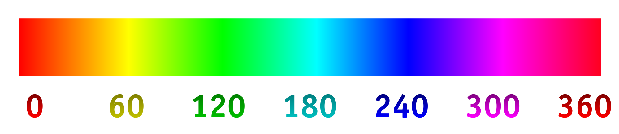
Since the base-sat on that one is set to 0, the background elements are full grey-tones and not effected by the base-hue, only the buttons and sliders (and other accents) are, so you might as well change the base-hue on that one to any color you like without it changing the background. Here is a gradient with the corresponding base-hue values (or any number in between) you could use.

2 Likes

I was wondering if anyone knows which class controls link colouring?
Example (dark green text): https://i.imgur.com/UPt6qF4.png

That should be this one:

dark-primary-color:

Although dark-primary-color may also change other elements, but I’m not sure which.

Yea, I kept digging into the config yesterday and I think it is
dark-primary-color:
as you said @PhysicalMagic. Would be great to have it split to something different in the next release though, as on dark colour themes, the links start to blend with the background.

Posted a feature request: Thread 26782

What about the second black?

The second one, is the one I used in the example code so that should be:

  base-hue: '220'
  base-sat: '16%'

(for anyone wondering)
The first one is:

  base-hue: '160'
  base-sat: '0%'

and the third one is:

  base-hue: '30'
  base-sat: '12%'
2 Likes

Physical Magic - awesome work :slight_smile:

There are definitely some nice themes in this thread, so thank you for sharing. I’m totally new to home automation, just bought a new house and I’m looking into all possibilities. For now I’m a bit stuck between OpenHAB2 and HA. What I am really wondering about is if it’s possible to have a GUI on the phone and/or via the browser that has custom icons and/or text beneath or above icons? Maybe also some custom grouping.

An example of what I mean can be seen here:
https://goo.gl/images/xSyELW

I find the end GUI to be very important as this is where we’ll spend most of our time when it’s completely setup. So if I have to invest time in development for adding and controlling items or Things, that would be fine. As long as the GUI can be made really cool.

Thank you for you help and sorry if this is the wrong place for asking. But I couldn’t really find a more custom look on the website.

1 Like

This is possible by using Floorplan, pretty easy once you get a hang of it and very powerful

1 Like

Thanks for the feedback jamrt518, appreciate it. Maybe I’m missing something but it looks totally different then the image I posted in my question. I assume it’s possible to make it look like that using Floorplan and have functionality on the buttons?

Hi @DarkLite1, Welcome to HA.
I think you’re looking for HADashboard.

1 Like

Yes VDRainer, this looks more like what I’m looking for. However, is it possible to group tiles together in say Living room, First floor and Second floor? Or is that layout fixed? See the original image I posted.

Definitely check appDaemon and more especially HADashboard. This is an example of what I did (after only a couple hours or so).

Look into the forums, there are plenty of examples of very good designs. As all is in CSS, you can basically do whatever you want. And if you are not familiar with it, you can simply copy an existing design and adapt it.

2 Likes

Thx lambtho, but all I see is the same design just with different buttons and colors. In your example I would like to have one big tile called Living room that groups Living Light and Living Humidity together. Same for the Bedroom section. Could you post a link to a very different design then all the tiles sticking together? So I have a better understanding of what you mean.

Hi Thomas can I ask you what appdaemon? I was hoping to do something similar to what you have got there.

A guide to set this up would be great.

Thanks.

I think what you are looking for is Floorplan as linked by jmart518 above. You create your own dashboard using an SVG file, so you can make it look however you want. Here’s the one I am currently working on… (still VERY MUCH a work in progress)

or a very early example of the first one I created

I don’t have an exact example of what you want to do, but that would be very easy to accomplish.

8 Likes

Great community here and very helpful people. Thank you atomicpapa, it’s a bit more clear now thanks to your example. Looks really wicked I must say!

Some questions I still have:

  • Are the items on Floorplan clickable? I mean for example does it toggle a light switch immediately on or off without any extra menus in between when clicked?
  • How does the panel scale on a smartphone? I assume this is HTML5 or do you need to create a separate Floorplan panel for each device with it’s own dimensions? I know SVG stands for Scalable Vector Graphic, but I can’t see this whole screen displayed on a phone.

In your case, floorplan might be the way to go to offer a complete modularity.
I am almost certain it could be done too with HADashboard, but that may require very advanced skills. I think I read somewhere that some people (@ReneTode @aimc maybe do you have an example or something ?) use 1px tile size and by finetuning the dimensions of everything you can have a bit more complex result.