Also, would it be possible to change/remove the centering of the card?

That part is default in Lovelace. Apply justify-content: unset; to #columns to change. unset can also be left, right, whatever you want.
Great, thanks a ton!
I give up and need to ask for help, been working on this for ages and just not getting anywhere!
I’m use this great Soft UI Theme (dark theme). I’m wanting to take advantage of the ‘Remote Control’ developed by N-l1 as part of Soft UI, its at the bottom of the repository page.
When using the code with the default lovelace theme it kind of works, when using it with Soft UI Theme the card is distorted:

Interestingly it does display correct (well nearly), when in the lovelace edit mode:

I think it’s the multiple
- entities:
that is causing the problem but I’m unable to get around it.
Any suggestions?
Yeah, utilize the theme variable. Copy the content of the soft-ui theme you use, make a new file in the themes folder, and remove the ha-card-box-shadow and all of the card-mod stuff. Make sure it doesn’t have the same name. Now set the theme property to the new theme you made, but keep using the original theme across the UI. Example using the theme variable:
type: entities
entities:
  - entity: sensor.time
theme: Light Soft UI
I never replied, sorry!
Unfortunately, that didn’t work, however suspect I was doing something wrong.
After much hacking of the remote code I did however get it display correctly. Thanks.
Does the theme include pressed button look (ON state)? The state for the light is ON, but doesn’t have the inset style applied to it.

Should I have to write extra line of code for box-shadow from here https://github.com/ilzq/lovelace-soft-ui to have the pressed look?
What code are you using?
Thanks for the quick response. Here is the code for the button.
type: button
tap_action:
  action: toggle
entity: light.porch_lights
show_name: false
show_state: false
icon: 'mdi:outdoor-lamp'
The full code.
Here
type: grid
cards:
  - type: button
    tap_action:
      action: toggle
    show_name: false
    entity: switch.lamp
    icon: 'hass:lamps'
    show_state: false
    name: Fire Place
    show_icon: true
  - type: button
    tap_action:
      action: toggle
    entity: light.porch_lights
    show_name: false
    show_state: false
    icon: 'mdi:outdoor-lamp'
    name: Front Porch
  - type: button
    tap_action:
      action: toggle
    show_name: false
    entity: light.office
    icon: 'mdi:desk'
    show_state: false
    name: Office Lamp
  - type: button
    tap_action:
      action: toggle
    show_name: false
    show_state: false
    icon: 'mdi:globe-light'
    show_icon: true
    entity: light.lobby
columns: 2
The code there uses a much more customizable custom button card. I would recommend you use it.
Hello,
I’m having trouble with the layout. Somehow on my big screens such as PC and iPad 12.9 it’s displaying the content in 3 columns instead of just one centered column like on the screenshots. Any idea why this could be happening? I already tried uninstalling and installing the theme.
Thanks in advance.
To be honest, I haven’t updated this theme in months; Do you think it would be worth it if I made a new version of it from scratch?
1 Like
I would really love to see an updated version, I really like this theme
How card-mod heavy would you want it to be? In the past I’ve went out of my way to make fancy things, like separating the title of an entities card from the shadowed-in section.
Here’s a simple version I’ve been using for the past few days:
Soft UI:
  card-mod-theme: Soft UI
  card-mod-card: |
    ha-card {
      margin: 20px;
      border-radius: 15px;
      background-color: var(--primary-background-color);
    }
  app-header-background-color: var(--primary-background-color)
  app-header-text-color: var(--primary-text-color)
  app-header-selection-bar-color: var(--primary-color)
  card-mod-root: |
    paper-tab[aria-selected="true"] {
      color: var(--primary-color);
    }
  accent-color: var(--primary-color)
  divider-color: transparent
  card-background-color: var(--primary-background-color)
  modes:
    dark:
      primary-color: "#4C3FF9"
      light-primary-color: "#7A71FB"
      primary-background-color: "#222222"
      primary-text-color: "#F7F8F9"
      ha-card-box-shadow: "-5px -5px 15px #2c2c2c, 5px 5px 15px #191919"
      soft-ui-pressed: "inset -4px -4px 5px #2c2c2c, inset 4px 4px 5px #191919"
    light:
      primary-color: "#7A71FB"
      light-primary-color: "#918AFC"
      primary-background-color: "#F3F5F7"
      primary-text-color: "#222222"
      ha-card-box-shadow: "-5px -5px 15px #ffffff, 5px 5px 15px #ebebeb"
      soft-ui-pressed: "inset -4px -4px 5px #ffffff, inset 4px 4px 5px #ebebeb"
If you wouldn’t mind, could you try to list most of the things I could change to make it better, in your opinion? Thanks in advance.
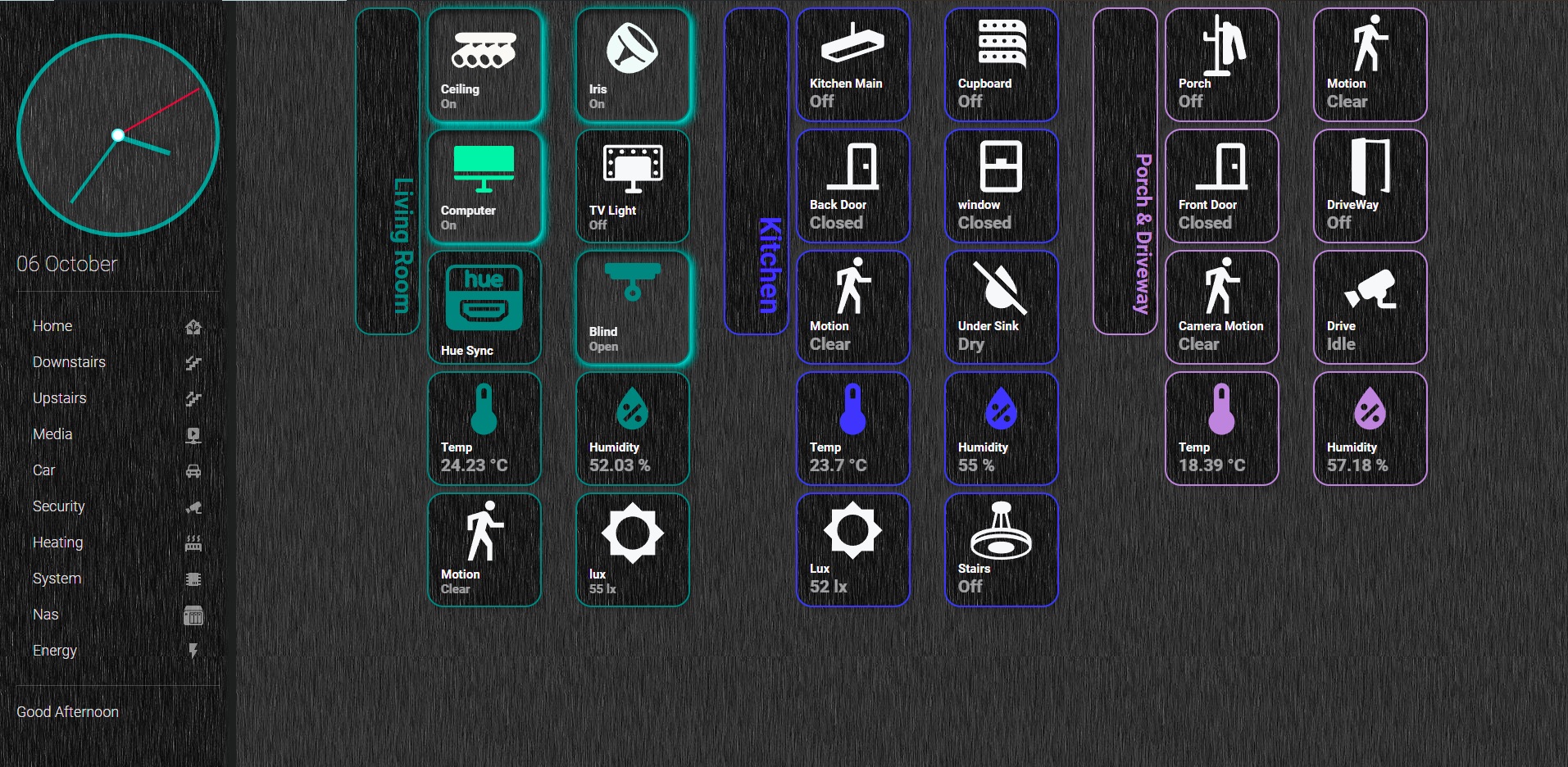
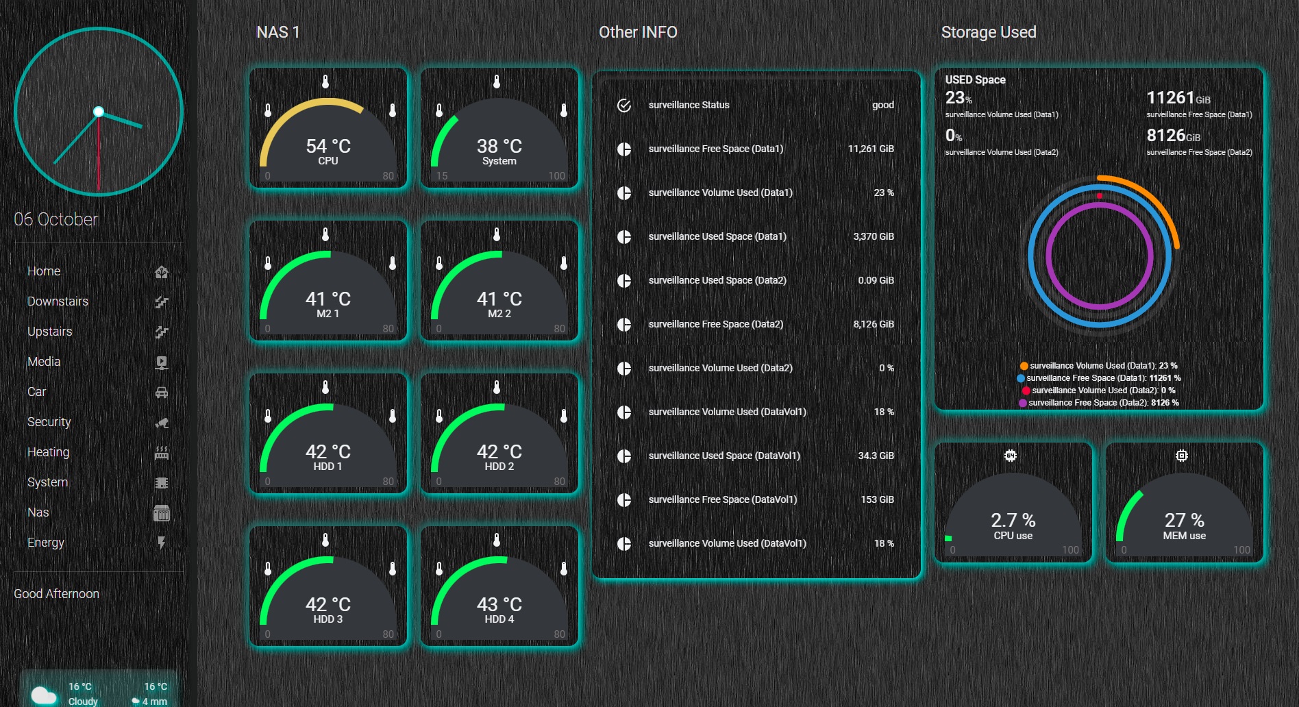
My current work in progress is based of your theme, bit rusty and new to all this but will get their in the end.


2 Likes
How do I exclude a type:divider from dropshadowing?

Is that a custom card?