So you basically just want to list the items?
Keywords: item.summary
Have a look at something similar Help, how to use: todo.get_items
Yes, and not be able to edit them by clicking on the item…
If you just want to display them, use a markdown-card and list them. This card here is only needed, if you want to have more functions and control.
For listing these, you just add them to a markdowncard and are good to go. 
This must be possible to “disable” somehow…
Why? You’re setting up something, that you directly disable without use. But there is a card, that exactly does what you want? The code above is for not disabling the click functionality. 
Anyway, sorry, but I can’t help with disabling.
He’s probably asking how to disable clicking the name to open the edit dialog, but keep the checkmark, completely legit.
I can’t help but if you figure out how to target the name only you can add pointer-event: none. Or events, don’t remember if singular or plural.
It is totally legit, but not productive… Without knowing “why”, one can’t help.  If we know, what’s the idea behind to disable this or that, one could offer a possibly better alternative.
Why so secretive? Is it something people shouldn’t know?  Must be some hell of a todo list thing…
Does anyone know how to edit or remove this line?
The fact of writing “no task” instead of “no article” annoys me…
You can hide the text and add your own if you add this to the bottom of your card_mod section in the screenshot:
p.empty::before {
  content: "Add your text here" !important;
 }
p.empty {
  /* There are probably more elegant ways to do this :) */
  font-size: 0 !important;
}
2 Likes
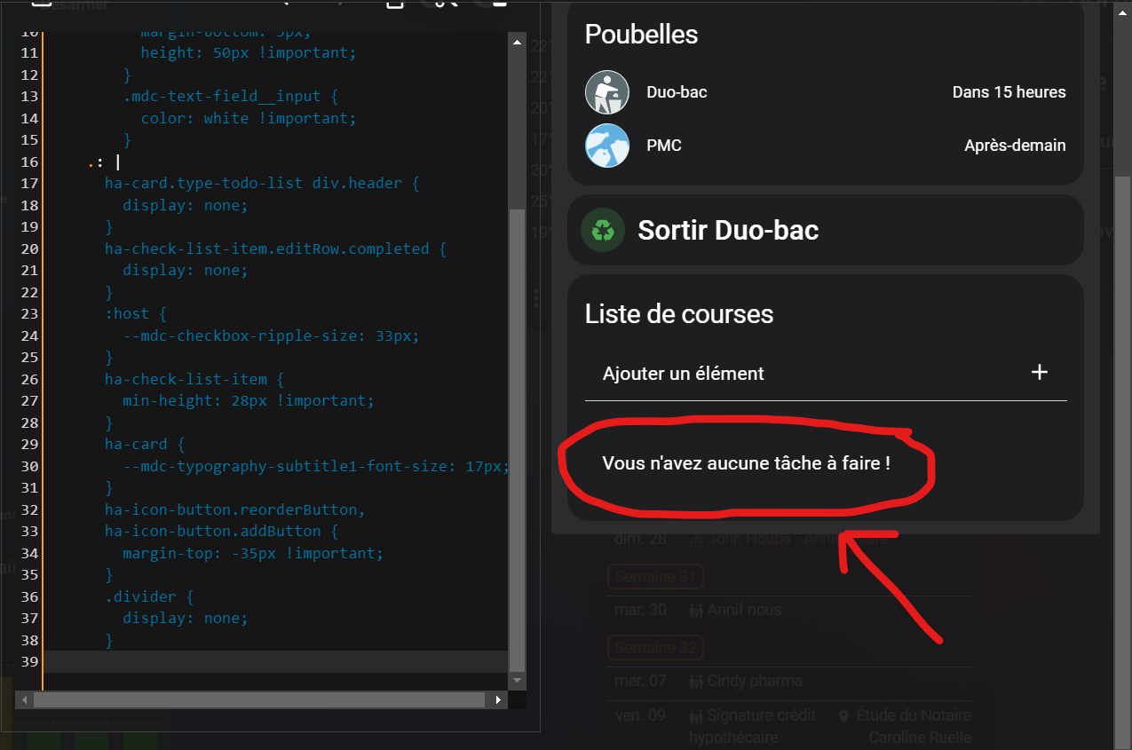
Where can i paste in my code please ?
I don’t find 
type: todo-list
entity: todo.courses
title: Liste de courses
card_mod:
  style:
    ha-textfield:
      $: |
        .mdc-text-field {
          margin-top: -28px;
          margin-bottom: 5px;
          height: 50px !important;
        }
        .mdc-text-field__input {
          color: white !important;
        }
    .: |
      ha-card.type-todo-list div.header {
        display: none;
      }
      ha-check-list-item.editRow.completed {
        display: none;
      }
      :host {
        --mdc-checkbox-ripple-size: 33px;
      }
      ha-check-list-item {
        min-height: 28px !important;
      }
      ha-card {
        --mdc-typography-subtitle1-font-size: 17px;
      }
      ha-icon-button.reorderButton,
      ha-icon-button.addButton {
        margin-top: -35px !important;
      }
      .divider {
        display: none;
      }
It should work if you put it anyhwere under the .: | section like this for example:
card_mod:
  style:
    ha-textfield:
      $: |
        .mdc-text-field {
          margin-top: -28px;
          margin-bottom: 5px;
          height: 50px !important;
        }
        .mdc-text-field__input {
          color: white !important;
        }
    .: |
      p.empty::before {
        content: "Add your text here" !important;
      }
      p.empty {
         font-size: 0 !important;
      }
      ha-card.type-todo-list div.header {
        display: none;
      }
      .......
Thanks ! It works but not possible to display custom text “add your texte here”. Everything disappear…
Try putting font-size in the ::before section as well, like this:
      p.empty::before {
        content: "Add your text here" !important;
        font-size: 12pt !important;
       }
      p.empty {
        /* There are probably more elegant ways to do this :) */
        font-size: 0 !important;
      }
Top top top, it’s ok ! Thanks
1 Like
how do i style this “edit dialog”-box then, if possible, with card-mode and css?
Anyone who knows?