nope I only grouped 3 cards at a time
Spanning cards over a specified number of grid columns and rows, i.e. card resizing, is in the works! It’s another tough nut to crack because it involves essentially redesigning every card, so please be patient.
Would it be possible to have a spacer that simply expands as much as it can; taking up whatever space is leftover? Basically what the Spacer in SwiftUI already does. If there is room left for 3 columns; it takes up 3 columns. If there is no room (like on mobile) it essentially does nothing.
The new Sections layout seems like a very good step in the right direction, grid organization is way better!
What about sizes, alignments, and content adaptation?
Here’s a view I’ve been porting to Sections:
Old:
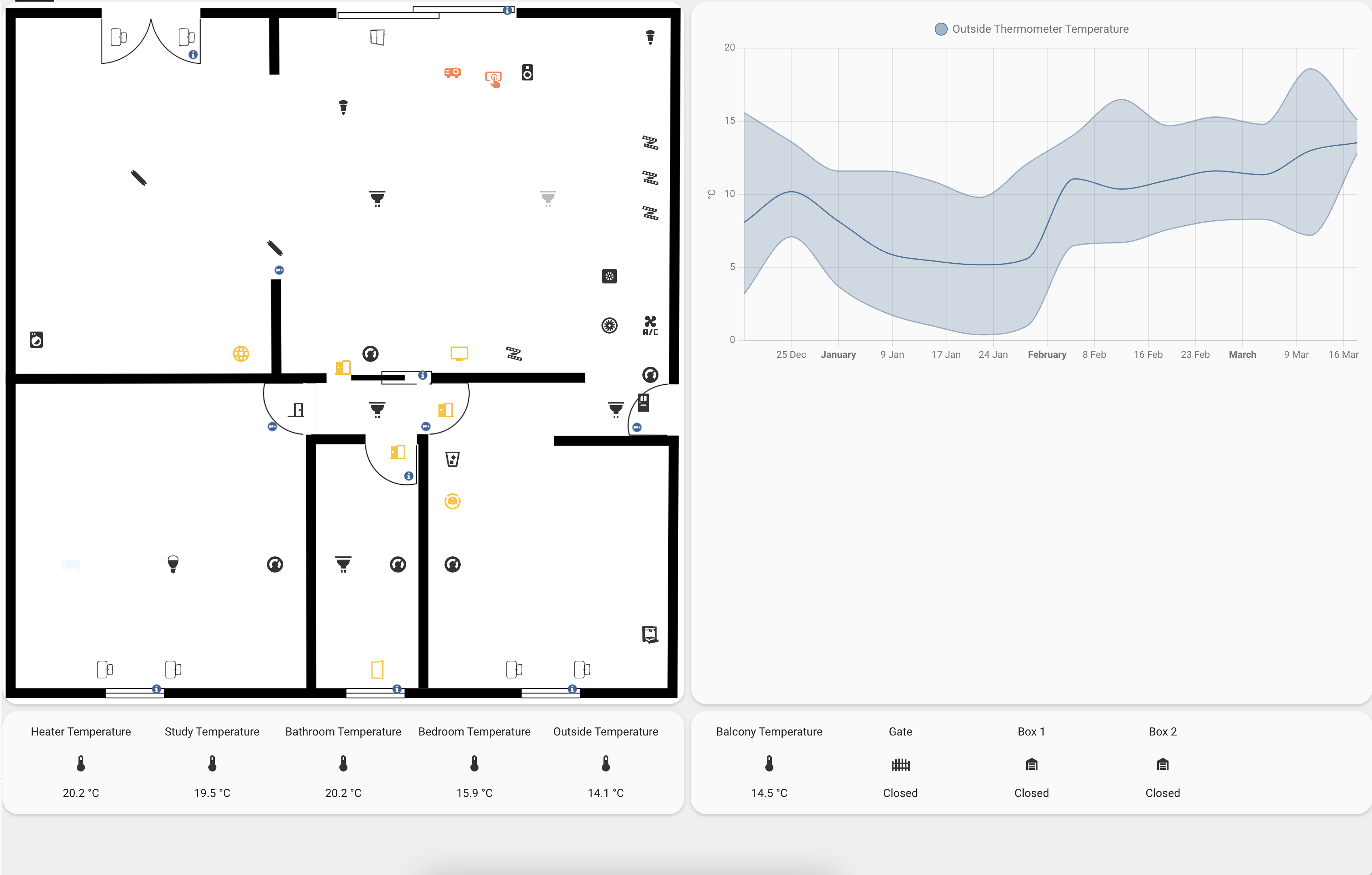
New:

The view is meant for computers and tablets, so it should stretch out the content as much as possible, rather than cramming it all in the center.
I was able to achieve this in the past with a crazy dance of grids, vertical, and horizontal layouts.
Sections are indeed a great improvement from what I had to do just to keep things in the order and alignment I wanted, and I’m very pleased the graph doesn’t expand weirdly leaving a huge blank appendage under itself, but how to make the items expand nicely?
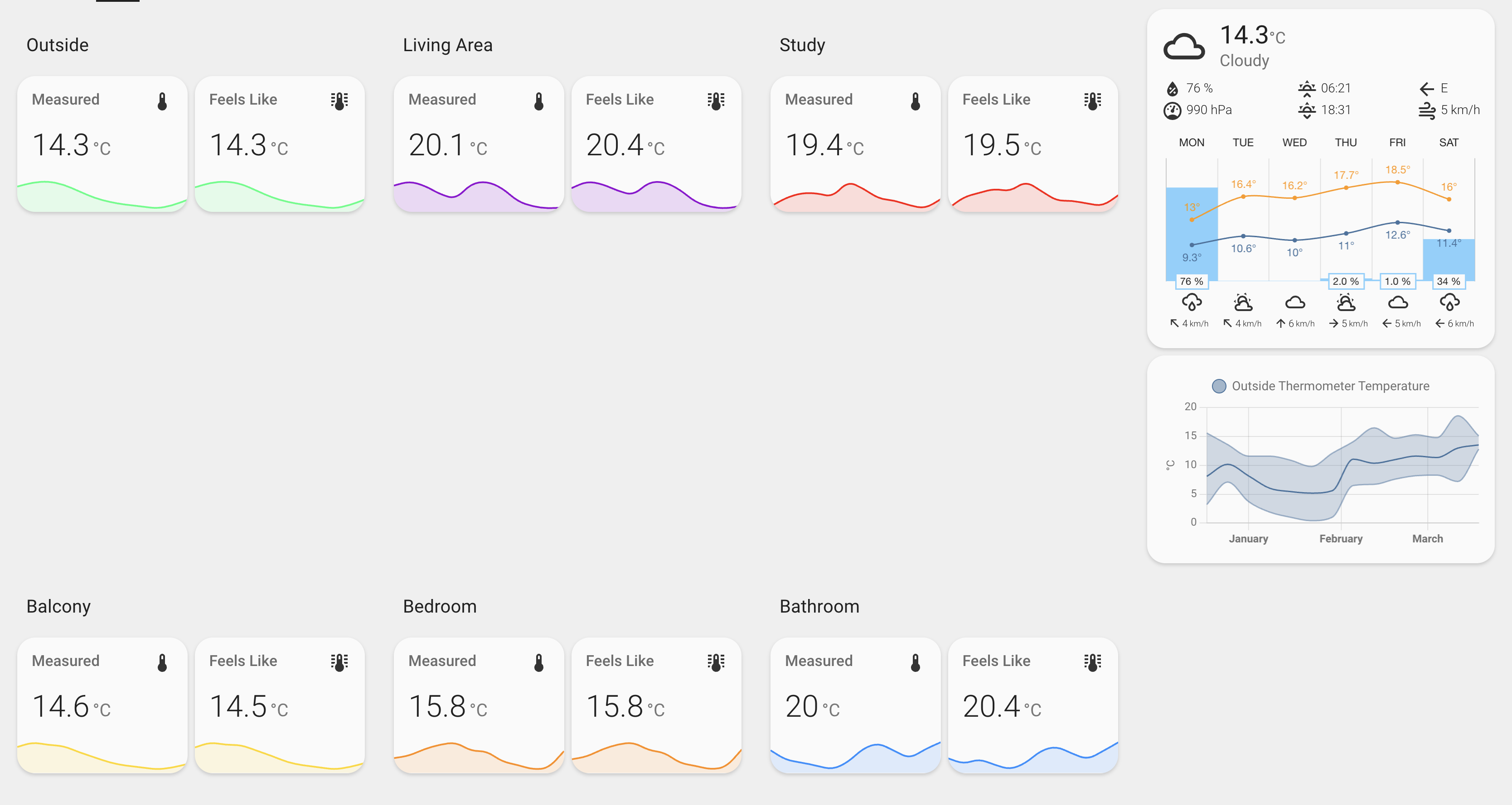
Here’s another example:

This view is meant for phones, and it works fine on those devices, but it well illustrates how things can get very sparse using Sections.
This is how it’s built:

It has huge amounts of uncollapsed space, most likely due to the map’s position, while this other one with a very similar structure:

Looks working way better:

as long as I keep the forecast and trends last, but if I put it on the side as I’d like to have it on a larger screen:
it leaves a whole orphaned row at the bottom.
I worked around these limits in the past using (or perhaps abusing?  ) vertical and horizontal layouts in great numbers. Hopefully, Sections can help us avoid such structures in the future(?)
I wonder if it’s possible when setting up a new page/view using sections to have a dropdown at the top of the screen that specifies a screen size (computer, tablet, phone) as options and then once each section is populated with the cards that are wanted, the dropdown could be changed and the view rearranged so that each screen type can be customized.
Conditional cards have this ability, so I wondered if this type of feature could be incorporated into sections?
This would allow each sections view/page to appear exactly as needed across a large range of devices / screen sizes.

Just started moving some of my old dashboards to Sections.
Not too difficult - just copy & paste the yaml code across.
One thing I noticed though was that on my old dashboard I had a vertical stack and in that stack there are some things like an auto-entities glance card that isn’t always displayed.
In the old method, this doesn’t show on the dashboard at all. With Sections, it shows a gap in the dashboard where the card would have been. I think we need a “Display if empty” type option for cards in the Sections too.
Sections are great! But I hope three layout design featurs are added to sections:
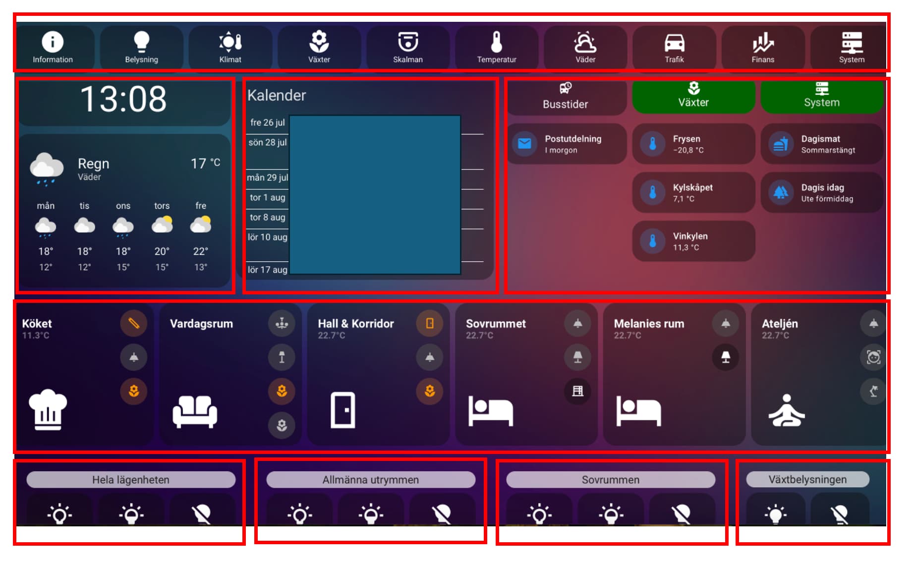
1.A feature to let a section span over several other sections (horizontally), e.g. to allow for a full width top header menu button bar above other sections that are not full-width below it, like this menu button bar above other content that is not full width layout.

-
Resizing section widths, eg if I have 3 sections side by side on an iPad, I’d like column 1 & 2 to take up 40% screen width each, and column 3 using 20%. Or in the screenshot above, the clock, calendar and button columns are all different. They would be different sections and so setting different section width is essential to build a controlled layout.
-
Make sections reusable over several pages, e.g. defineing a top header menu button section once, and adding it to all my 20 dashboard pages as top menu without recreating the button group again on every of the 20 pages i have.
I essentially want to have rows of sections, where each row can have different number of section columns, and each column having an individual width, eg 20% or 40% of screen width:
2 Likes
I agree with you. This is what I’m doing as well.
I agree with the comment about have a way to have a view span all the visible sections much like badges do. For me it would be good enough to have a header/footer than behaved like this and not necessarily more complex.
Hey @magune your first need can now be solved in some way with the new badges. You would need to write your own custom badge code or wait for people to develop something like a badge button. But this is close to what you have!