Well, I guess “consumed” means by end-devices. Not by your battery (as it’s just parked somewhere for later use).
So the solar consumption you see is your direct pv consumption (the part that you used directly instead of charging it into the battery).
But on a side note: I also don’t like this configuration.
In fact I created a custom card just because of these things for my own energy dashboard ![]()
It reuses the HA-internal Apache Echarts instance, so you get a quite native look, but a lot more options.
And it also reacts to the energy-date-picker time range changes.
Can be used to display pretty much everything from the long- or short-term history inside the database.
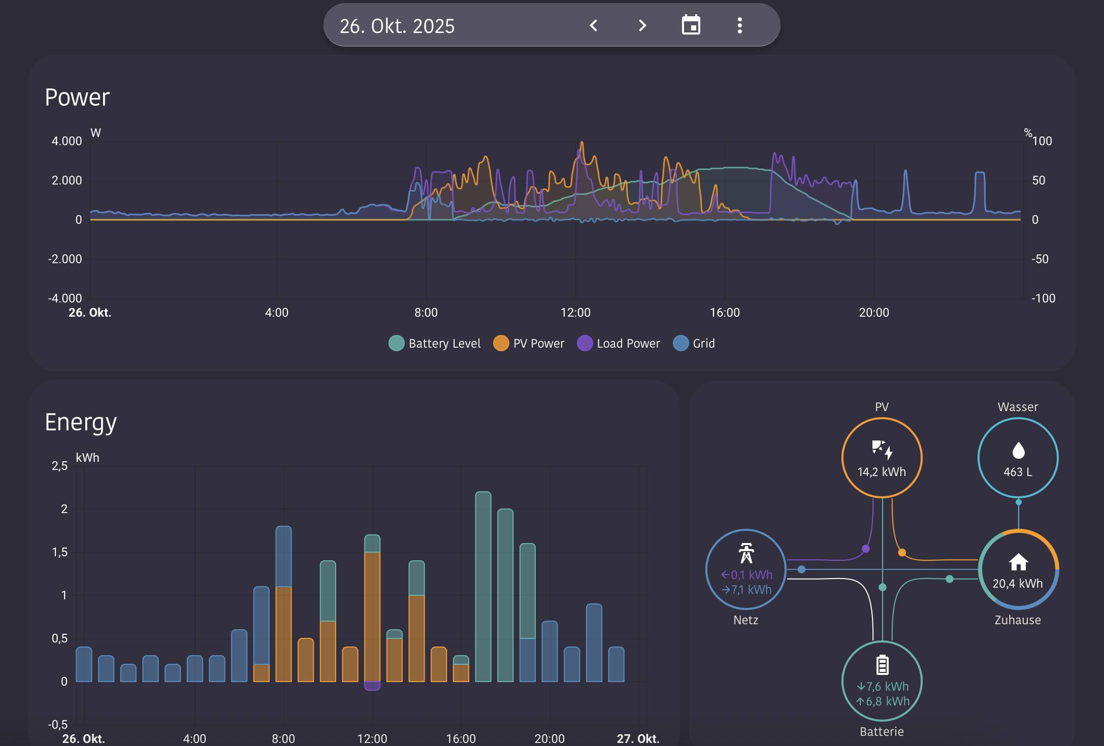
Currently I use a configuration similar to the first screenshot in the topic (Example number 4 on the Github readme is a good starting point for this chart), but don’t show the “battery-charged” entity anymore.
So I see only:
- Positive bars:
- Consumption from grid
- Direct Consumption from PV
- Consumption from battery
- Negative bars:
- Only Grid export
- Additional Info in the first screenshot of the custom cards topic:
- Overlayed line chart with battery state in % to get a better (and faster) feel what’s currently going on and why export or import started at a given moment.
Beside of that I also use a line chart with the power instead of the energy values and RAW values (the card can also use 5min aggregation if your inverter sends in too high frequency to display it in the frontend).
This often gives a better idea about what is currently happening compare to the aggregated energy values: