With Energy cards, it is great to be able to navigate by period (day, month, year) on the graph, and to have aggregate data.
We should have the same with any other statistics.
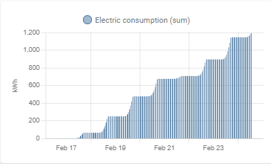
Exemple of my electric consumption:
In the “energy” module, with dedicated energy cards, I get this (and it is great) :
But with the same entity, in the statistics graph, I have this
And it is not possible to navigate per period.
This is not very usefull !!
It should be nice to extend the functionality of the energy card to the statistics graph.
I was just about to create my own WTH, but then I found this topic which matches my WTH.
On the left is my card made with apexcharts representing daily usage of my EV. On the right is a standard statistics graph from the same sensor, but it just shows the whole sum instead of daily increments.
I’d say the current representation of statistics for sensor with state class total or total_increasing is not very helpful. Especially on longer periods you can’t see anything meaningful.