So for the longest time I’ve been trying to find a way to display a decent 100% stacked bar graph showing the distribution of a quantity over several categories with no time dimension. custom:apexcharts-card is my go-to for graphing in Home Assistant but it has not implemented bar graphs and the only way it provides to achieve this is the radial graph:

This takes up a lot of space on a dashboard, especially as we only need one dimension (length) to express the relative proportions of the categories. Alternatives like
custom:bar-card can’t handle more than two categories.
So I hacked together an alternative using the venerable custom:button-card!
First, to facilitate code reuse when you need more than one stacked bar chart, declare some button card templates:
button_card_templates:
  bar_chart: # for the overall custom:button-card containing the chart
    styles:
      card:
        - padding: 0px # to make the chart take up minimal space
  bar_chart_segment: # for each chart segment, one per category
    variables:
      percent: >- # for displaying a data label for the proportion taken up by this category
        [[[ return Math.round(parseInt(entity.state) / variables.chart_total *
        100) ]]]
    name: |
      [[[
        if (variables.percent > 5) {
          return variables.percent.toString() + '%'
        } else {
          return ''
        }
      ]]]
    show_icon: false
    styles:
      card: # for a modern look based on the Tile Card
        - height: 56px
        - border-radius: 0px
      name:
        - font-size: 14px
        - font-weight: 500
Then, wherever you need a stacked bar chart, use custom:button-card:
type: custom:button-card
template: bar_chart
variables:
  all_total: >- # sum of quantities over all categories
    [[[ return parseInt(states['sensor.immich_photos'].state) +
    parseInt(states['sensor.immich_videos'].state) ]]]
  bar_segment_photos_percent: >- # proportion for first category
    [[[ return
    parseInt(states['sensor.immich_photos'].state)/variables.all_total * 100 ]]]
  bar_segment_videos_percent: >- # proportion for second category.  Keep adding bar_segment_xxx_percent for each category.
    [[[ return
    parseInt(states['sensor.immich_videos'].state)/variables.all_total * 100 ]]]
custom_fields: # create a custom_field containing another custom:button-card for each category.
  bar_segment_photos:
    card:
      type: custom:button-card
      variables:
        percent: "[[[ return Math.round(variables.bar_segment_photos_percent) ]]]"
      entity: sensor.immich_photos
      template: bar_chart_segment
      styles:
        card:
          - background: "#FF9800"  # set colors to match custom:apexcharts-card
  bar_segment_videos:
    card:
      type: custom:button-card
      variables:
        percent: "[[[ return Math.round(variables.bar_segment_videos_percent) ]]]"
      entity: sensor.immich_videos
      template: bar_chart_segment
      styles:
        card:
          - background: "#3498DB"
styles:
  grid:
    - grid-template-areas: "\"bar_segment_photos bar_segment_videos\"" # ensure all segments are listed in one row in the correct order
    - grid-template-columns: >- # using the CSS grid, column widths for each custom field is set to the category proportion
        [[[ return variables.bar_segment_photos_percent.toString() + '% ' +
        variables.bar_segment_videos_percent.toString() + '%' ]]]
    - grid-template-rows: min-content
Finally, if you still want a header in the style of custom:apexcharts-card (which looks quite nice IMO), create a card containing only the header. To facilitate code reuse:
apexcharts_card_templates:
  header_only:
    header:
      show: true
      show_states: true
      colorize_states: true
    apex_config:
      chart:
        height: 0 # hides the chart area
      tooltip:
        enabled: false # disables the tooltips, otherwise hovering over the header could confusingly show tooltips
    graph_span: 1min # optional - minimise the load on the card to compile a chart that won't be displayed
Then to create the header itself:
type: custom:apexcharts-card
config_templates: header_only
header:
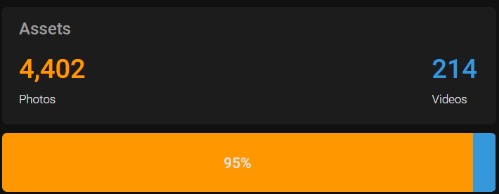
title: Assets
all_series_config:
unit: " "
series:
- entity: sensor.immich_photos
name: Photos
- entity: sensor.immich_videos
name: Videos
Put the header and the bar chart in a vertical stack to get:
This can handle any number of categories, but it is rather janky as the number of custom fields and number of columns in the CSS grid will increase by the number of categories, and you need to manually ensure that the completeness and order of the custom fields in the CSS grid is correct.
If you’ve got any suggestions on how to improve this, do let me know! For example:
- How to embed the header and the bar chart into a single
custom:button-cardso that the header and the chart appear as one card. This can work in principle but the button card seems to interfere with the justification of the text in the header, making them all centre justified when they should be left justified - How to pass entity IDs from a parent
custom:button-cardto othercustom:button-cards specified in thecustom_fields, and how to enforce the order of thecustom_fieldsin thegrid_template_rows, which allow for the entity IDs for the categories to be declared once and minimise the risk of copy-pasta.