It seems they rushed to release a version with the snowflakes effect.
There are +2500 bugs reported. They should focus in a Bug Fix Marathon, stopping new releases for a while instead of releasing new versions chaotically…
It seems they rushed to release a version with the snowflakes effect.
There are +2500 bugs reported. They should focus in a Bug Fix Marathon, stopping new releases for a while instead of releasing new versions chaotically…
That’s exactly how I feel. I can’t stop everything in life and fix everything every month. you guys got to make it either slower or not break shit all the time. I love Home Assistant but I know why no one else I know is even trying to use it. Pfff. It’s only for geeks and will always only be for geeks for sure. But I love it.=, just hate the updates that break everything.
Might be subtlety which is lost in translation, but Energy is power over time. “Now” means literally now with no time context.
That leaves you with power, which, to me at least, sounds perfectly logical.
That’s fine. You have 176 days left to get in the mood ![]()
just follow the device_class for those entities:
the Energy tab shows kWh entities, called Energy, and yes, shows it over time too
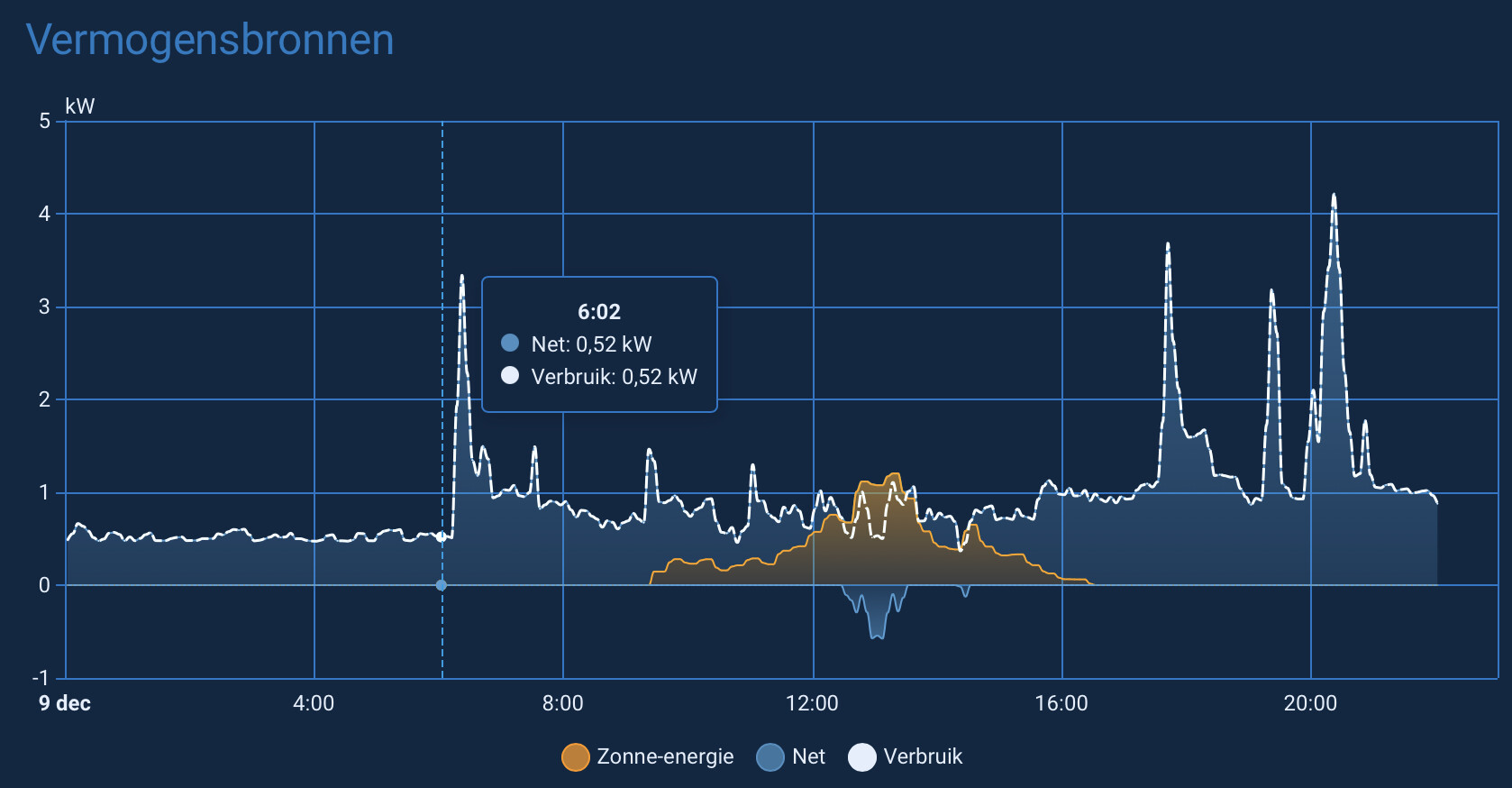
The Now tab shows Watt entities, called Power. And it also shows the power graph over time:
the only graph only showing the 'now, would be the Sankey graph on that tab.
On my own Energy dashboard, using the exact same strategies, Ive chosen to display it like that:
in Dutch the official naming for Energy is Verbruik and for Power is Vermogen.
I don’t know whose idea it was to “unpin” the date bar in the energy panel, but I’m 100% certain it was someone who didn’t use it very often.
I could submit a request to restore this incredibly useful functionality, but I wonder why. Nobody listens to our requests here anyway.
HA is getting sidetracked, and with each release, developers are increasingly disrupting what people have been working on for years.
Ah yes, smack talking the volunteers will surely get them to listen.
@MariuszT If the date bar change is blocking your workflow, the best path is to open a formal issue or feature request — with specifics about how you used it and what problem the new behaviour creates. The core team genuinely does respond when something is clearly documented and reproducible.
Also worth checking: a lot of UI tweaks are intentional experiments. Sometimes they revert them, sometimes they add a setting, but it only happens when people give targeted feedback instead of broad frustration.
I get that it’s easy to assume “nobody listens,” but the reality is that well-structured input gets far more traction than general dissatisfaction. If this mattered to you, it’s worth laying it out clearly and helping the discussion move forward. That’s how we influence the direction, not by assuming it’s a lost cause.
And if not?
Then it may be worth stepping back and asking whether HA’s way of evolving aligns with what you want from a platform. There’s nothing wrong with choosing software that fits your expectations — but if you want this one to improve, collaborating is still the most effective path.
A complaint in a forum post will not get traction, raising a frontend issue will. That way the Devs will have it in a list and will be able to give you direct feedback.
It will be pinned in a next release. There’s a PR opened
Not possible. Nobody on the team listens to feedback I thought. ![]()
![]()
Here’s the link btw.
Sticky period selector for energy dashboard by MindFreeze · Pull Request #28458 · home-assistant/frontend · GitHub
Mind Blown ![]()
Not just an issue but a PR… How do these things happen?
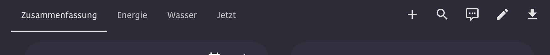
about those icons in the energy dash: is anyone seeing that pencil? The only way I can get to an edit menu is from the 3-dots icon, and I never get that pencil in the menu-bar
Chrome and Safari show like this, no pencil in sight
Shows up for me as long as the view is wide enough.
It only gets hidden when all the other icons on the left side collapse to the 3-dot-menu.
edit: Also tested with the default theme, in case it might be related to any CSS vars in the theme.
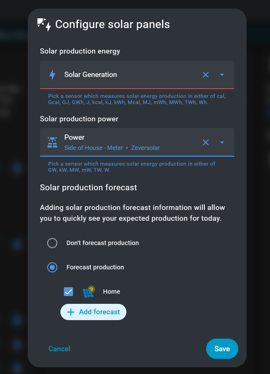
If I’m following you correctly, you’re referring to this, I’ve configured it to what I think is correct but no chart.
That said does anyone know if there is any documentation on how to setup the new 'Power" or 'Now" tab? I’ve tried going to the ‘more information’ link on the config page, but it doesn’t seem to say anything about how to get the sankey chart.
how odd.
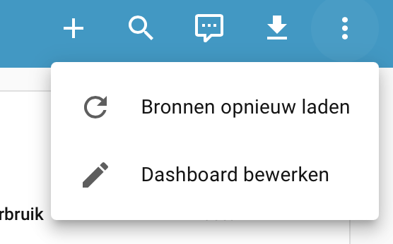
and you dont have the 3 dots…
what’s going on ![]()
also, its not to do with the view width:
no custom stuff, Kiosk-mode unloaded, and default theme.
No Pencil
Do you have more icons than the edit pencil under the 3-dots-menu?
Maybe it collapses to a maximum number of visible icons and when the 3-dots-icon has to be shown the pencil one needs to be removed.
The 3 dots menu simply isn’t visible for me as all icons are already shown.
Not sure if there could be more icons depending on <whatever-reason>. ![]()
Ok, i don’t have this reload button. And its most likely the reason why it collapses.
Not sure why it’s there for you but not for me?
And another question is why the frontend limits the space for these icons to 5, when the screen is large enough to display more of them, as long as there aren’t that much tabs that would need that space.
I hadn’t seen this before I put in the FR. Within 20 seconds Frenck showed me the plans to pin it. They do listen.
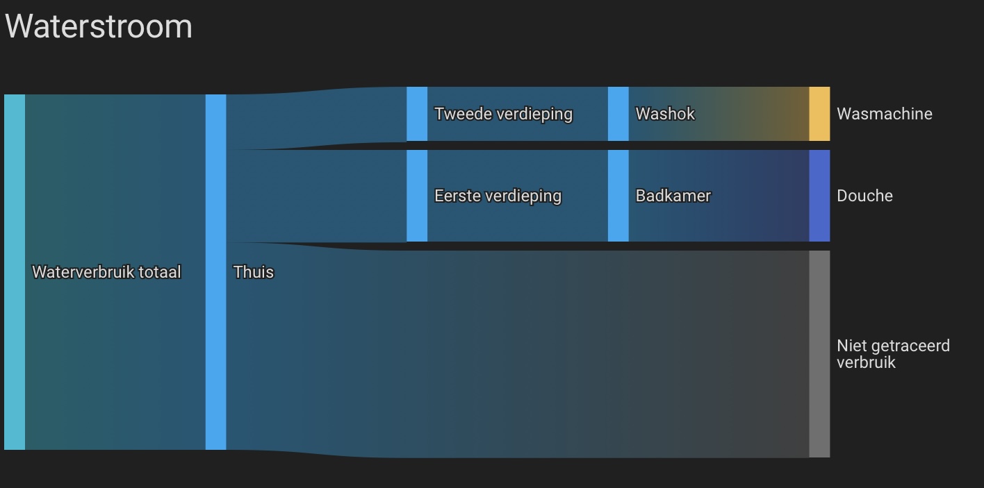
If you have multiple water meters, the new tabs do not show the same graphs. True, the top one is to be found in a smaller form on the overview. But the sankey chart splitting out where the water is being used is not.
The line graph on the now tab is one of power sensors, not energy. But more importantly: The sankey there is a live view of individual sources. If you turn on a device, you see the usage appear on the spot. Here to the power (pun intended) is in the individual power sources. So the sankey chart is actually now, not the summation over a larger period that you have in the energy tab. And it is very informative once you add mone individual sources.