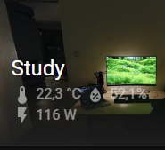
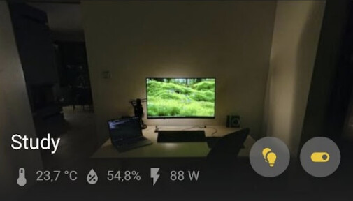
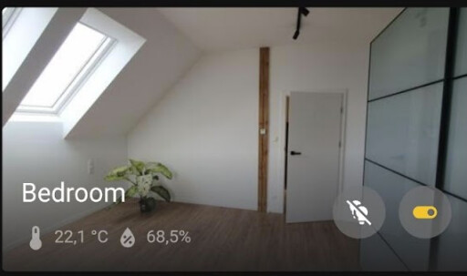
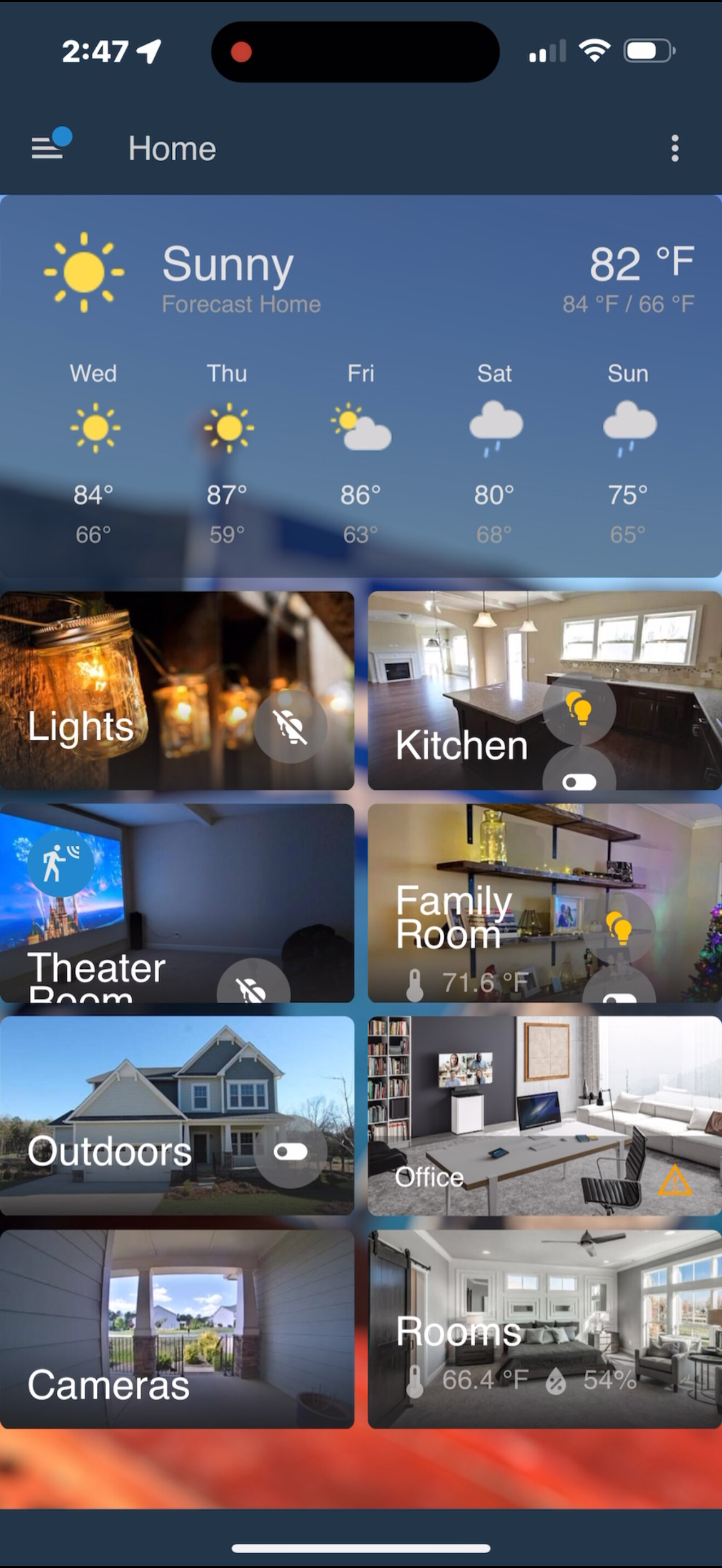
Before the recent update to 2025.7.2 sensor values like temperature, or toggles for devices like lights in the area we overlaid nicely on the area image.
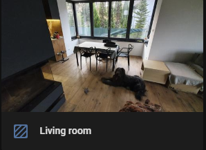
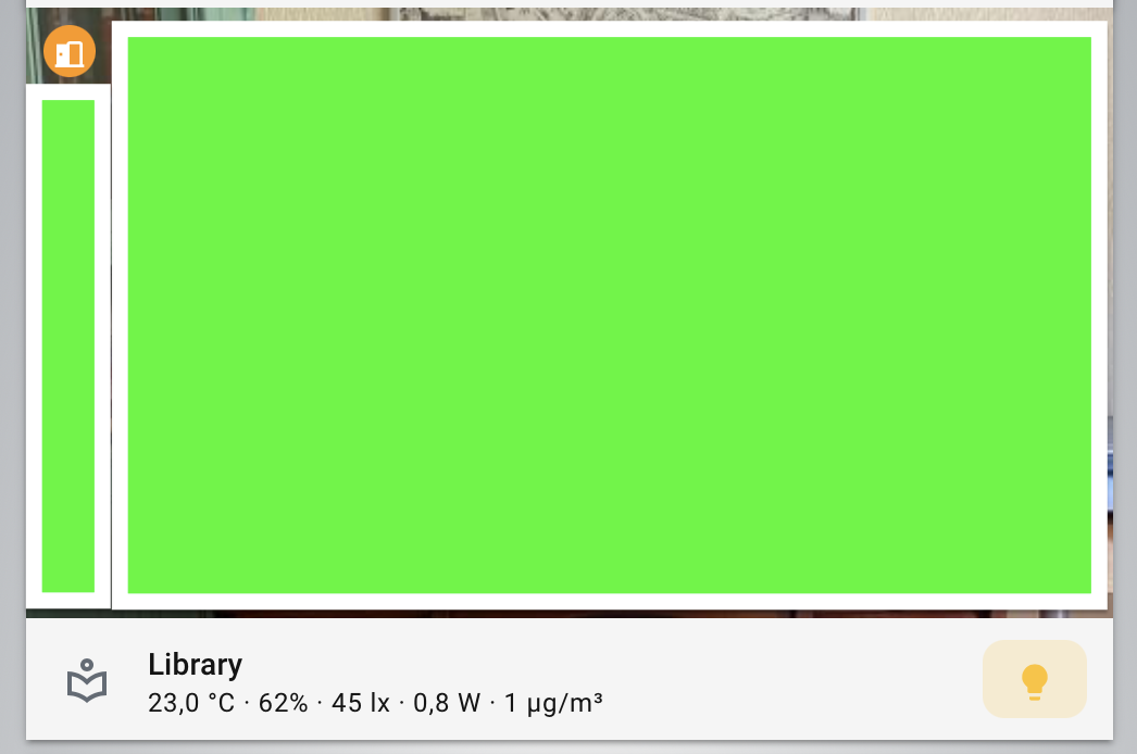
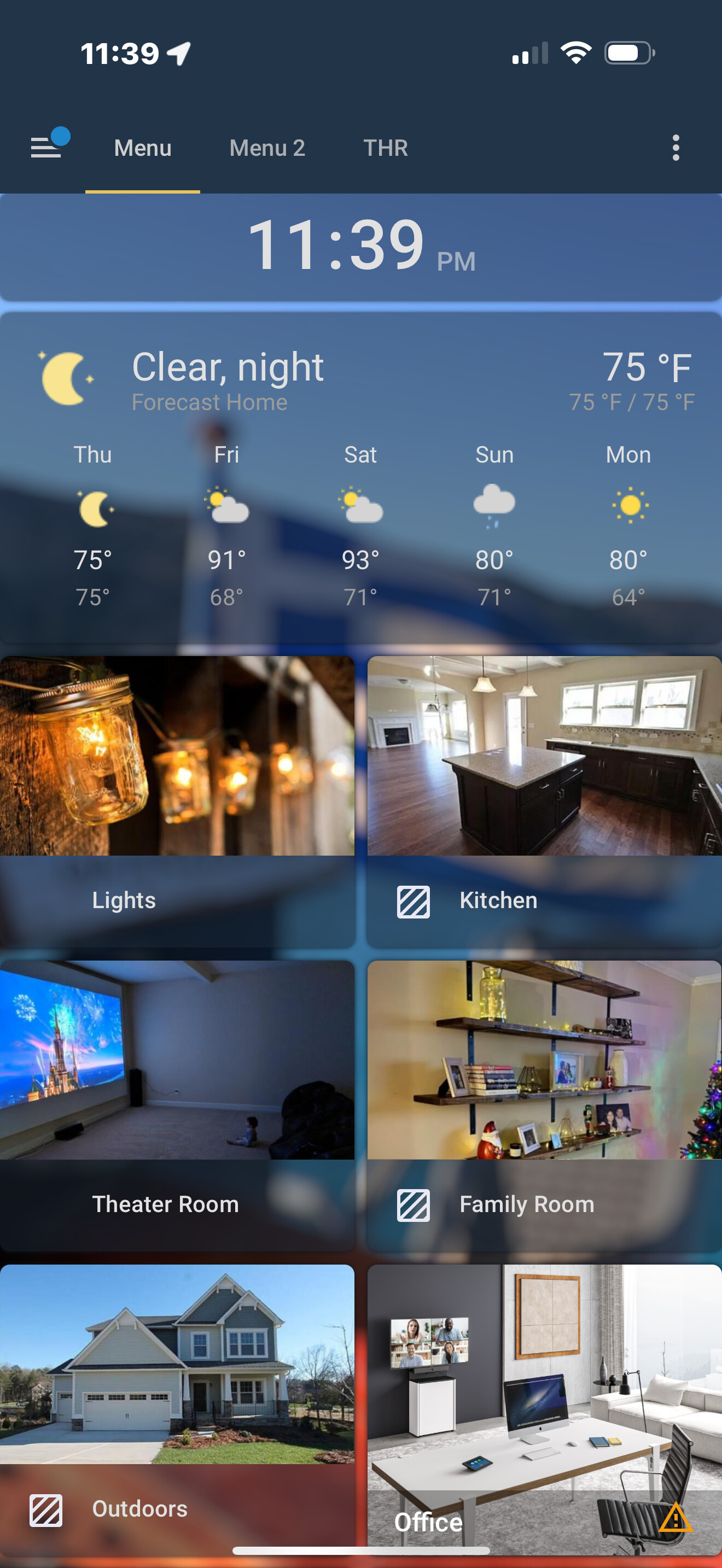
This just changed to a separate panel below the image.
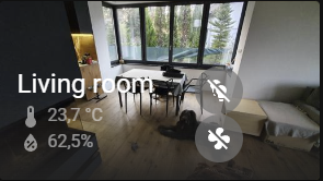
Some of the values not work anymore (missing entities Living room on screenshot below).
Do you guys know if is that a bug or a conscious design decision?
I realize now that this is a redesign decision for the new sections dashboard. I’d call this a regression as in the meantime it breaks the (very good so far) aesthetics for anyone using masonry layout.
The rework haven’t been done with avoiding breaking the masonry in mind, even by adding an option to overlay the controls on the picture (as it was before).
To mark your personal conclusion that this is a regression bug as the solution is rather confusing, unless you mean to say people should learn to live with it because it was somehow by design?
Can you show what you did, because I use a picture elements card and that works flawlessly. How exactly do you overlay things? you mention classes in the title: note that card_mod, while heavily used, is not part of the official product.
If a custom component does not work the way you want, it is not a bug in Home Assistant.They are certainly not obliged to keep custom components that interact with the inner workings of HA intact. Technically card_mod hacks parts that are not intended to be modified from the outside. You can do so, but at your own risk. The inventor of card mod does also not make guarantees. That is not to say you can’t get it to work the way you want anymoree, you just might need different mods.
If standard features like the picture elements card do not work that is an entirely other matter. But as said, I use it too without problems so I’d like to understand what is different. If you have a core card without mods that does not function as described in the documentation, you can pust a bug report in github, detailing the view and card yaml to allow them to reproduce the problem.
If you post any yaml here (including if it is custom), we can help you spot if you can make changes to make it work if it is not a bug.
Hi Edwin - have you seen the screenshots I posted? Notice the visual difference - pre update the values were overlaid on the image, afterwards they are shown (rather clunky, but that’s a personal preference) below the image itself.
None of these cards are modified in any way, neither they are custom elements.
The cards I am using, and been using pre2025.7.2 update are ‘area’ cards, config shown below:
I basically don’t - it used to work out-of-the-box before the upgrade.
The screenshots I posted in first post are unmodified area cards, with alert and sensor classes defined as on the configuration sample above (which was the default when you added the card in webui if I recall, never added them in yaml, ui is very convenient for dashboard modifications).
As in the example above, the classes were defined to be shown on card, and particular sensor entities are automatically chosen for the location the area card represented (provided they had proper “area” defined themselves).
My issue is with the visual aspect - before the update it was easier to glimpse things like temperature or power consumption in the area. Like on the screenshot below (pre vs post upgrade)
The card is now uglier and sensor values smaller and harder to read. Also it was nice that there was no spacing and acted as a header. make the text size of the sensor configurable or at least bigger. The sensor values from a room like temp amd humidity are the most useful things in an area card and it was fine as it was. Why break it? Design was good eith that overlay and large area name.
People just change stuff that works.
there is no such sensor class as the most important, so its good that we can set them as we like it.
for me the most pressing gripe (from a design perspective), is that we can not more-info those classes, but that touching them navigates the cards path.
I did file a FR for that though, maybe it will get a follow-up
I could have imagined the alerting door would be more centered… maybe that is an actual bug.
I personally also dislike the new design of the area card. I think it looks worst than the original style. But it is also less functional: by cramping everything in the bar below the image you have less space for sensor and entities.
I do appreciate the ability to customize it more but the way it works seems less functional