2026.2 Beta week

A general reminder: Beta week is not designed to fully overhaul a new feature, but to identify bugs that may be introduced with the update.

If you have an issue, please let us know here! However, the developers are very active in the #beta channel of our Discord server during Beta - it’s good to hop in there if you can. To ensure things are addressed in a timely manner, be sure to also submit issues on GitHub in their proper space:

Here are this month’s Beta notes!

These are my cliff notes for this month’s release, in order of my excitement:

  • We need your help with the new Device Database! We’ve been talking about this since last year’s State of the Open Home and now we need your real world analytics help - there’s only so much we can do without it. This is opt-in - we will never pull your data without your explicit consent. You can find it in Labs, but we’ll have a full blog explaining this early next week.
  • The Home Dashboard we’ve been iterating on is now the default standard. :tada: If you’ve never customized your default view, we will suggest the switch instead of replacing it outright. But also if you like the Overview page, you can still create it by selecting Overview (legacy) from the Create menu for dashboards.
    • This comes with another cool change imvho, discovered devices will now appear here without needing to pay attention to notifications or navigating to the device settings. You can also ignore this, so if it bothers you it’ll disappear!
    • Also there are some visual changes - the top bar is no longer blue, and themes have moved to user profiles.
    • ALSO ALSO add buttons to your card headers! Provide quick controls for whatever you need but in smaller form instead of taking up a tile (I’ll probably use this for the buttons I use for automation testing).
    • There’s more I am not mentioning here, so be sure to check out the full section for UX changes (and take a peek at the new distribution card while you’re at it).
  • Add-ons are being renamed to Apps! This was after a lengthy conversation with you all here and on the architecture discussion. Franck explains the thoughts behind it, so I highly suggest that you review the notes for specific info.
  • New triggers and conditions for the purpose-specific automations have been added. To quote Franck from the beta channel on Discord: a metric ton of options have been added!
  • Quick search! Hit Command + K or CTRL + K on macOS and Windows/Linux respectively to do a fast search with category filters. Your favorite shortcuts will still work! Tap e to open the dialog with the Entities filter preset, for example.
  • New integrations this release are Cloudflare R2, Green Planet Energy, HDFury, NRGkick, Prana, and uHoo.
  • Noteworthy improvements to existing integrations - jeez there are so many this month now that everyone is out of holiday mode. :flushed: My faves are the Sonos and Reolink changes. :smiley:
  • We had 7 integrations achieve new quality scale levels - 3 reached Platinum, 3 reached Silver, and 1 reached Bronze. Great job to those integration owners! :clap:
  • We have some integrations now available to set up from the UI. There are four, but I think the most notable one would be Proxmox VE.
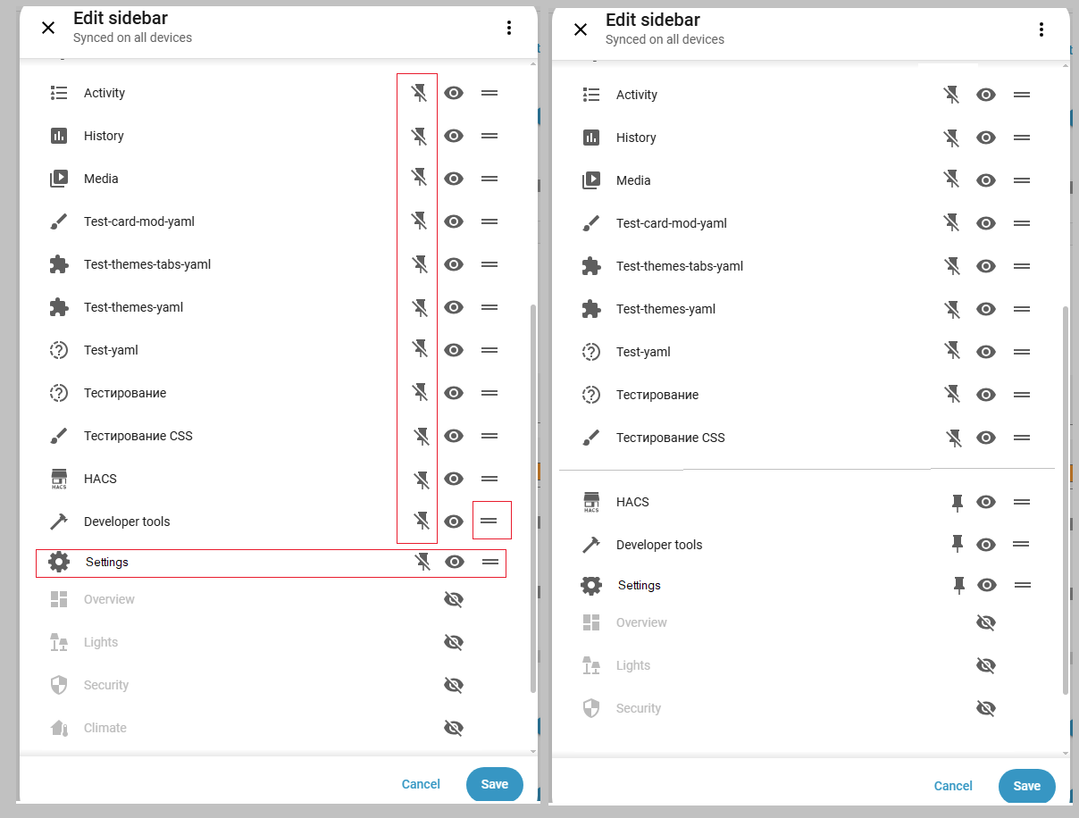
  • Other noteworthy changes - dashboards support calendar colors, the template editor now shows a live preview, the sidebar has a subtle scroll fade effect and the Settings option is now sticky, Developer Tools have moved to the Settings area to keep all administrative tools in one place, the area card now has a tap action and image tap action, entity cards now support actions, and parts per billion (ppb) has been added as a valid unit of measurement for sulfur dioxide sensors and number entities.
  • The list of backward incompatible changes isn’t that large, but the important one is probably the Group sensors change. All other changes are mostly sensor renames or removals.

Build is available for y’all. :clap:t2: Happy testing, friends!

5 Likes

Addon is now apps
Integrations no name change.

For someone new it’s still confusing.

Maybe use same naming as Music Assistant and call integrations providers?

This has been discussed in a veeery long topic elsewhere, there’s no point of starting here again… decision was made and i think we can close this chapter.

Back to beta: removing developer tools from main “menu” is a mistake. Now two more clicks are needed each time i wish to access it. For many of us dev tools are by far the most used tool in HA.

22 Likes

Agree, absolutely wrong decision.

Before:
1.Admins could hide dev-tools from a sidebar if not needed.
2.Non-admins cannot see dev-tools in a sidebar.

Now:
Admins (no idea about non-admins) need to do several clicks & cannot add it to the sidebar.

Yes, we can (I hope we still can) add a custom entry with “/developer-tools” address. Then we will see a new “dev tools” page with confusing “Back” button (which is only consistent when “dev tools” is called from a settings menu.
Yes, some smart alecks say “what the noise about removing dev tools - why not adding them as you described”. Thanks, users are not supposed to add custom stuff to recover a wrongly deleted functionality (besides, majority of users - who use devtools - do not know about custom panels).

As often, this change was made “after surveys of users etc”.
I do not recall any “survey” here.
And there are no functionality in HA analytics to collect these data.
So, some “users research” guys sit in NC and invent survey results out of their own narrow understanding.

PS. There was even a prepared PR to recover “dev tools” functionality - it was declined.

Honestly, see a little of sense posting here.
This thread is visited by a small amount of people, not a “normal release thread”.
And based on previous experience, see no hope that NC will listen.
(but anyway I will probably repeat the same post in the big release thread if the situation does not change)

P.P.S. We were told that soon a new sidebar will be presented, but what the point if that promised sidebar will still not allow users to access dev tools.

19 Likes

@frenck thank you for your reponse here. I’d like to respond to your points here.

First things first: we have not removed Developer Tools. We moved it. It now lives under Settings, which is where all other administrative and debugging functionality already resides. Automations, integrations, devices, system health… all of that is in Settings. Developer Tools was the odd one out in the main sidebar, and we’re fixing that inconsistency.

I didn’t get the sense that people thought that, but can only really speak for myself: I understand it’s being moved, as per the title of the PR. My personal view is that tools are something in itself: it’s not a normal dashboard or settings.

The main menu and dashboards are meant for daily control and use, not for administrative work. When you think about it from that perspective, having “Developer Tools” prominently in everyone’s sidebar doesn’t really fit. And let’s be honest: not every Home Assistant user is a developer or power user. Having something called “Developer Tools” front and center doesn’t help with our goal of making Home Assistant more approachable and less intimidating for the many users who just want a smart home that works.

The only administrative parts of the dev tools dashboard/panel are the YAML (badly named as well), stats and assist views. The others are really tools that aid in building your system – that’s not administrative.

That brings me to the name: I don’t think the word developer should be in the name at all. While some tools there aid in developing your system – as in building it – it’s not really related to software engineering (as the word developer normally is read). “Developer” should just be dropped from the name, which will also make it seem friendlier to other users.

I would agree it is more of a poweruser capability, especially since templating is considered an advance use of HA, but if we’re all honest, you cannot go very far with HA before you necessarily need to make use of templates. Bringing the tools that assist with this to the forefront is in my view beneficial to the majority of HA users.

There’s been no issue with recent changes to add “unwanted” default dashboards for users, which arguably is of temporary use (only to new users, and likely less useful in the long-term). This seems counter to keeping some tooling that is always useful easier to reach.

“Why not just make it an option?” I hear you ask. We have plans for sidebar customization in the future, but those capabilities simply don’t exist yet. We can’t add an option for something we haven’t built. This change is actually the start of a process toward making the sidebar more effective and feature rich. Why aren’t automations in your sidebar if you want them there? Or your devices? Logs? More control over what appears in your sidebar is something we’re actively working toward.

To be frank*, I believe this is backwards. I don’t see why this change couldn’t wait for the fundamentals to be built first. I do agree with the direction though, as I’ve done exactly some of the things you mention (automations is in my list, e.g.).

We made the bottom items sticky when you have many dashboards pinned. If Developer Tools were still there, it would be constantly visible for everyone, which isn’t ideal for a tool most people use occasionally. These improvements are part of the same effort to make the sidebar work better for everyone.

This seems like a very borderline point. I have 16 items in my left hand nav. Twelve of them are in view on the mobile app. Twelve is a huge amount, I’d argue. Plus, that list is scrollable.

I’d like to ask you to give this a chance. Think about it from a higher level: how does this fit into Home Assistant as a whole? And if you have a genuine, common use case we’ve missed, please share it in the beta feedback thread. That kind of constructive input is genuinely appreciated.

The genuine use case is that these aren’t developer tools, but tools that are generally useful (excluding the ones I’ve already mentioned as truly being admin-related) for the majority of users that has or wanted to do anything beyond the basics.

If one of the deeper issues here are access to these tools on one’s HA instance by normal users, then rather make an advanced setting to enable the tools, similar to how there’s an advanced use toggle under the user profiles. Or, even simpler: Only have these tools show up for admins.

19 Likes

100% agree on that !

The name and description should be made “beginer friendly” !

8 Likes

Earlier proposed this concept:

and even started making it…
Allows to pin frequently used entries like Dev tools, History etc.

6 Likes

Which was already done - devtools is accessible for admins only. At least in 2026.1 (have not checked earlier).

I have to admit I do not understand Home dashboard anymore.

I was initially very supportive of having a renewed default dashboard. (I liked the area one, too bad for me, the prototype was fitting my needs better than the prod version)

But we end up with a new default dashboard that is unfinished (to my opinion): Some example (list not exhaustive) :

  • not all entities are displayable despite a “visibility setting” created to hide unwanted entities => cf issue
  • mix between user display control and admin role (all new functionalities added in this release are for admin) + many in the previous also (discovered entities, assign area, unassigned entities and devive panel…) whereas these are settings, not dashboard.
  • no way to restrict the display to admin (or users) of Home or panels (when requested the answer from core team was “Home is not for admin” coherency with current evolution is questioned)
  • eratic management of group of light (no way now to shut down all light of your living room without screwing the light summary count) => cf issue
  • a lot of blank places in area sub views due to inefficient placement
  • etc…

Exactly as for the “dev tool in sidebar” issue where the answer is => its removed but in the future you will have a better way to do it.

Why not have continued to polish it in experimental (or labs now it exists) before switching to default in prod with an unfinished product ??

Many issues and FR are opened in GitHub, thus it is not only a “forum” feedback or bashing. Some proposal have been made, including in discord.

But the intentions are difficult to follow and the current state of Prod entities is not good. (Home being the new overview, it is unskippable, not only a Lab feature…) Thus FR are mixed with issues…

1 Like

We can, but it will be at the wrong place. dev tools were at the bottom, just above settings. Mixed between dashboards won’t be ok.

And, to be honest, dev tools are hardly “settings”, if we wanna be picky…

I really don’t recall seeing any thread about this, as it was about renaming addons. Is that one of those rapid HA decisions again? Why aren’t these breaking things discussed before doing them? Frenck did it perfectly for addons.

To be honest, i don’t even look at that. Even old default dashboard was useless, since it showed a couple random sensors from my thousand’s collection. I make my own dashboard, not AI, not random… But, i agree it must be something when you first start HA.

1 Like

Aha, and the initial plan was not changed after the discussion )))

5 Likes

True, but in this case majority won i guess (hope…). Personally i was against it, mainly because this renaming will break thousands of guides across internet, and i still stand behind it - it’s a mistake. We, old guys already know, but for newcomers it will be a total mess…
But it is what it is. If nothing else, at least it WAS discussed.

3 Likes

It was pushing you toward custom dashboard because it was ugly.

But it was consistent and logic, allowed customization and filtering.

It was ok to start with and build up competances before changing.


New Home is less ugly, thus may retain the new user longer. But is not finished.
Some basis are not there, some things will not be corrected because the dev have the ambition to build something better in the future.

For example, you set up a sensor (temperature for example), you assign it to an area => the temperature is displayed in the landing page on the area tile and at the top of the area (good).
The device is displayed in the area (with battery state in the heading card of the device and tile for sensor temperature) but you dont need temperature anymore thus you hide only the temp => there is no mean anymore to display the battery. Because batteries alone are not to be displayed in home ! (why? no answer in github issue…)

Who decided which entities are displayable or not? And where is it documented ?

This is only one of the “new behavior” or “feature” or “enhancement” brought by Home dashboard…


Instead of starting with a simple, solid, reliable and logic structure and then improve it and polish it to make it even more beautiful, and add some smart features to it, they have tried to have a beautiful landing page with smart gadgets, but then everything is unfinished.

Not a simple page of it is finished:

  • landing page is in constant evolution and need multiple clic for any quick action or information (but that is the tendancy in HA now). Favorites are the only way to have a few (8 max) quick info or action…
  • light panel does not allow you to control lights per area or your screw the number of lights “on” counting on first page if you set up area groups for grouped control.
  • security panel does not show all security entities (despite having a hide setting to allow to hide the one you do not want) for example motion or occupancy sensors or covers.
  • climate panel is where you have to go to control your covers (not obvious could be security…)
  • etc…

My position is that the basis should have been ensured first ( entity display, control, structure, who can access to what, etc…)

Then summaries and panels could have been added / updated / improved one by one…

My 2 cents…
but I am very disapointed to have had some experimental dashboard for long time and suddenly in the 2025.12 pushing an unfinished, undocumented, product to everybody. (this remind me of the backup issue)

I know I might appear very blaming there. But this is the consequence of the high expectations that I had seing area experimental dashboard, then home experimental dashboard, I hopped a good maturation phase.

But then everything was rushed, in the same version introducing Labs (coherency again ? )…

And we are not talking here of a “setting panel” for the admin (like for dev tool), but of the frontend that the users are intended to use everyday.

This main interface: shortcuts, information, summary have been moving/changed in each versions since 2025.12!

1 Like

Worse than that ! , Im not in the Beta Cycle anymore, but current Home-Dashboards is more a disaster, as Any User now have access to All Entities
Partly Through Areas and the new Devices -Dashboard
Users(non Admins), now have Access to All Entities, even those in Admin-Only Dashboards.
It’s a complete “Hick-Upp” a Disaster from a security perspective, as-well as a User-Only perspective.
Such a Landing-Page, should never have ended up in a Production Environment, as Not Even an Admin can Prevent Users access to the i.e Home Dashboards, Admin can Hide it, User can just Unhide it…
I honestly have very hard to understand how this could ever ended up in a Production Environment.
Are the Devs overworked, blindfolded, or just somehow “missed” this Security Disaster ?
… Upps some User just happened to switch of the HA, and All Servers

4 Likes

Fully agree.

To answer your concern:

  • admin can not hide the dashboard or its panel. (or to be 100% accurate, they can, but any user clicking on the menu can unhide it).
  • but admin can hide all the information they decide inside these dashboards

The solution is to hide (using visibility setting) entity per entity the one you do not want to show to user.

But you cannot prevent user to display home or its panel, even if it is hidden by default.

I proposed a FR to have a 3 state visibility status (visible, hidden, visible by admin only) but got no comment on it…

3 Likes

In that case, I really don’t get the need for the change – or at least, the justifications seem very weak.

7 Likes

With above in mind i really just can’t understand why on earth would anyone want to hide the main thing admins use most… More i think, less i understand… but, then again… i’m from EU, not USA… perhaps it’s just that…

Me? I’d add “devices and services” to main menu also. I hate that i have to click twice each time i want to access that… I’d totally revamped admin menu, for that matter…

I don’t know how new side-menu will look, but let’s hope for the best…

100% agree !!!

11 Likes