Hi,
I’ve added some Tellstick temprature sensors to my system and to the UI. However when i click on these sensors in the UI i get a error "Failed to call service “sensor/turn_off” is there any way to disable this?
There is no specified tap_action or hold action in for this button-card… l I dont need any tap_action for this button. I just want to display the temprature and when tapped nothing should happen. But i get the “Failed to call error” I can’t find where this “Tap_action” is located so i can remove it. 
(this seems to apply to all “sensor” entities)
There is. In the base template there’s a toggle tap action. You can override it with the none action from the link
1 Like
Thank you for leading me to the right place. I created a new template and removed the toggle to use for my sensors. 
Nice! I didn’t know about the url part at the end of your post. Works well. Thank you.
I’m just going to leave this here… so that I can possibly leave some inspiration for those still trying to figure this out…just as much as I was inspired by Mattias Persson when I first came across this post just over 3 months ago. Yes it’s been a challenging journey and spending 2-3 hours every evening on progressing to the next level but the reward has been unbelievable. It’s time to give credit where credit it due. I have achieved what I never thought I was capable of and thankfully it isn’t the end as there is still so much to learn! Thank you Mattias Persson for your inspiration and continued support! You are a Rock Star! 


4 Likes
It is a lot of hard work. And be prepared to put in a lot of hours in getting to your acquired results but trust me it is well worth the hours put in. You’re going to end with a result you will be very much proud of. Good luck and please post your progress as it instills inspiration to others.
I’m trying to do a tap_action to turn on a switch and if I do a tap_action again, provided that the switch is on, in this case it turns off the switch. How can I do that?
Je ne vois pas comment gérer avec les variables dans Button_card_template.
U can do this with the service “switch.toggle”. @antyamok
@Mattias_Persson Just WoW! Impressed! I have a question about lights. I’d like to group lights say for kitchen or living room but still be able to handle them individually. I just get a list of all the included lights, but without name or any identifier.
Having the lights friendly name listed in between the hue and brightness would be cool.
Do you have an idéa for the best approach for this? A popup with all the lights in an area with individual settings for each lights also could be an alternative of course…
BR
Runar

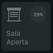
Anyone interested in a roller shutter svg? I have built this one:
  icon_cover:
    styles:
      custom_fields:
        icon:
          - width: 95%
          - margin-left: 3%
          - margin-top: 5%
    custom_fields:
      icon: |
        [[[
          const fill_color = (entity.attributes.current_position > variables.close_position) ? '#72757c' : '#00a86b';
          let common = `<svg viewBox="0 0 50 50">
              <g transform="matrix(0.00733309,0,0,-0.00934536,-0.00876259,42.68667)" fill="${fill_color}" stroke="none">
              <path d="M 95,4556 C 54,4538 12,4487 5,4447 2,4429 0,4290 2,4138 c 3,-314 3,-312 88,-355 41,-21 58,-23 207,-23 H 460 V 2311 862 L 281,858 C 118,855 99,853 74,834 23,796 5,763 5,705 5,647 23,614 74,576 l 27,-21 h 2459 2459 l 27,21 c 51,38 69,71 69,129 0,58 -18,91 -69,129 -25,19 -44,21 -207,24 l -179,4 v 1449 1449 h 163 c 149,0 166,2 207,23 87,44 85,37 85,382 0,291 -1,305 -21,331 -11,15 -33,37 -48,48 l -27,21 -2447,2 C 553,4569 120,4567 95,4556 Z M 4350,2310 V 860 H 2560 770 v 1450 1450 h 1790 1790 z" />`,
              path75 = `<path d="m 1152,3300 c -96,-59 -96,-201 0,-260 33,-20 54,-20 1408,-20 1354,0 1375,0 1408,20 96,59 96,201 0,260 -33,20 -54,20 -1408,20 -1354,0 -1375,0 -1408,-20 z" />`,
              path50 = `<path d="m 1164,2741 c -111,-51 -114,-214 -4,-272 33,-18 90,-19 1400,-19 1310,0 1367,1 1400,19 110,58 107,221 -4,272 -39,18 -96,19 -1396,19 -1300,0 -1357,-1 -1396,-19 z" />`,
              path25 = `<path d="m 1160,2152 c -104,-52 -109,-206 -8,-267 33,-20 51,-20 1408,-20 1357,0 1375,0 1408,20 101,61 96,215 -8,267 -33,17 -120,18 -1400,18 -1280,0 -1367,-1 -1400,-18 z" />`,
              path0  = `<path d="m 1152,1580 c -96,-59 -96,-201 0,-260 33,-20 54,-20 1408,-20 1354,0 1375,0 1408,20 96,59 96,201 0,260 -33,20 -54,20 -1408,20 -1354,0 -1375,0 -1408,-20 z" />`;
          if (entity.attributes.current_position <= variables.close_position) {
            return `${common}${path75}${path50}${path25}${path0}</g></svg>`;
          }
          if (entity.attributes.current_position <= variables.quarter1_position) {
            return `${common}${path75}${path50}${path25}</g></svg>`;
          }
          if (entity.attributes.current_position <= variables.middle_position) {
            return `${common}${path75}${path50}</g></svg>`;
          }
          if (entity.attributes.current_position <= variables.quarter3_position) {
            return `${common}${path75}</g></svg>`;
          }
          if (entity.attributes.current_position <= 100) {
            return `${common}</g></svg>`;
          }
        ]]]
It uses 4 variables passed to the svg icon:
close_position - position corresponding to close
quarter1_position - 25% position
middle_position - 50% position
quarter3_position - 75% position
UI lovelace instance:
          - type: custom:button-card
            entity: cover.tapparella_sala
            name: Sala
            template:
              - base_cover
              - icon_cover
              - cover
            variables:
              circle_input: >
                [[[
                  if (entity) {
                    let real_position = entity.attributes.current_position*100/(100-25)-35;
                    return (real_position < 0) ? 0 : (real_position > 100) ? 100 : real_position;
                  }
                ]]]
              close_position: 25
              quarter1_position: 50
              middle_position: 70
              quarter3_position: 85
Here is how it appears:

12 Likes
Hi @MaxBec92
I try to have a button to update HA like you did here : A different take on designing a Lovelace UI - #1519 by MaxBec92
but no luck for now. Can you give me more details about your configuration ?
Thanks
Hey @svalmorri. Do you mind posting your base_cover and cover templates? I’m eager to see this in action 
Sure, here is the base_cover:
  base_cover:
    variables:
      state: >
        [[[ return entity === undefined || entity.state; ]]]
      timeout: >
        [[[ return entity === undefined || Date.now() - Date.parse(entity.last_changed); ]]]
    aspect_ratio: 1/1
    show_state: false
    show_icon: false
    show_label: true
    label: |
      [[[
        if (entity.attributes.current_position <= variables.close_position)
          return 'Chiusa';
        return 'Aperta';
      ]]]
    state_display: >
      [[[ if (variables.state === true) return 'Scono'; ]]]
    tap_action:
      animation_card: |
        [[[
          const animation_speed_ms = 900;
          const animation = `card_bounce ${animation_speed_ms}ms cubic-bezier(0.22, 1, 0.36, 1)`;
          this.shadowRoot.getElementById("card").style.animation = animation;
          window.setTimeout(() => {
            this.shadowRoot.getElementById("card").style.animation = "none";
          }, animation_speed_ms)
        ]]]
      action: call-service
      service: cover.set_cover_position
      service_data:
        entity_id: entity
        position: |
          [[[
            return (variables.close_position == null) ? 20 : variables.close_position;
          ]]]
    hold_action:
      action: more-info
    styles:
      grid:
        - grid-template-areas: |
            "icon  circle"
            "n     n"
            "l     l"
        - grid-template-columns: repeat(2, 1fr)
        - grid-template-rows: auto repeat(2, min-content)
        - gap: 2%
        - align-items: start
      name:
        - justify-self: start
        - line-height: 115%
      state:
        - justify-self: start
        - line-height: 115%
      label:
        - justify-self: start
        - line-height: 115%
      card:
        - font-family: Sf Display
        - border-radius: var(--custom-button-card-border-radius)
        - -webkit-tap-highlight-color: rgba(0,0,0,0)
        - transition: none
        - padding: 10%
        - --mdc-ripple-color: >
            [[[
              return (variables.state === 'open') ?
                'rgb(0, 0, 0)' :
                'rgba(255, 255, 255, 0.3)';
            ]]]
        - color: >
            [[[
              return 'rgba(255, 255, 255, 0.3)';
            ]]]
        - background-color: >
            [[[
              return 'rgba(115, 115, 115, 0.2)';
            ]]]
    extra_styles: |
      #name, #state, #label {
        font-size: 1.2vw;
        letter-spacing: 0.05vw;
      }
      /* portrait */
      @media screen and (max-width: 1200px) {
        #name, #state {
          font-size: 2vw;
          letter-spacing: 0.05vw;
        }
      }
      /* phone */
      @media screen and (max-width: 800px) {
        #name, #state {
          font-size: 3.1vw;
          letter-spacing: 0.12vw;
        }
      }
      @keyframes card_bounce {
        0% {
          transform: scale(1);
        }
        15% {
          transform: scale(0.9);
        }
        25% {
          transform: scale(1);
        }
        30% {
          transform: scale(0.98);
        }
        100% {
          transform: scale(1);
        }
      }
This is the cover (I renamed it to cover_circle):
  cover_circle:
    custom_fields:
      circle: >
        [[[
          const input = variables.circle_input == null ? ' ' : `${parseInt(variables.circle_input)}<tspan font-size="12">%</tspan>`;
          const stroke_color = (variables.state === 'open') ? 'none' : '#b2b2b2';
          const fill_color = (variables.state === 'closed') ? 'none' : 'rgba(255,255,255,0.04)';
          return `
            <svg viewBox="0 0 50 50">
              <circle cx="25" cy="25" r="23.5" stroke="${stroke_color}" stroke-width="1.5" fill="${fill_color}" />
              <text x="50%" y="54%" fill="#8d8e90" font-size="14" text-anchor="middle" alignment-baseline="middle" dominant-baseline="middle">${input}</text>
            </svg>
          `;
        ]]]
    styles:
      custom_fields:
        circle:
          - display: initial
          - width: 90%
          - letter-spacing: 0.03vw
          - margin: -6% -6% 0 0
          - justify-self: end
          - opacity: 1
Cheers!
2 Likes

Hello, Thank you for your design and contribution.
I tried and found some problems and need help about sidebar. From your origin, there are 3 button cards below sidebar. I tried to change to custom-button cards. There are appeared well when in /* portrait / mode. But when change to / phone */ mode. Everything is gone.
The only way I can make some appear in /* phone */ mode is leave one of button card in.
Is there any adjustment I need to do. Please help. Thank you in advance.
Can make it work now.
I change vertical cards in sidebar to custom:grid-layout.
Thank you.
Hi @Mattias_Persson.
How do you know this combination? Where did you find out these numbers?
Thanks
      - service: media_player.play_media
        data:
          entity_id: media_player.philips_tv
          media_content_type: send_key
          media_content_id: >
            KEY_MENU+870+KEY_DOWN+470+KEY_DOWN+470+KEY_DOWN+470+KEY_ENTER+870+KEY_DOWN+470+KEY_DOWN+470+KEY_DOWN+470+KEY_DOWN+470+KEY_ENTER+870+KEY_ENTER+870+KEY_DOWN+470+KEY_DOWN+470+KEY_ENTER+870+KEY_HOME+470+KEY_HOME+470
Thanks @Mattias_Persson. The number 870 for example what does it mean?