Yaml has not been the focus yet. At this point, you should stick to UI only because your mileage may vary with Yaml. In time, Yaml will be fleshed out. Right now, the view is experimental and will most likely change in the coming releases.
Oh wow, I’ve been using HA for a while now and I was never able to make a dashboard that I really liked, even with using the layout-card plugin. This looks so much closer to what I imagine to be my perfect dashboard - can’t wait to use it myself!
Very nice! In addition to the positioning features, another reason for using grid layout card as main view wrapper in my dashboard is that I can have sticky header (and in portrait also a sticky footer). Is there any chance of combining ‘oldschool’ views with sections? Or inverted, have sections also available as a card (maybe already doable with ‘hui-’ notation?)
For now I’ll keep trying to get grid layout card inside grid layout card working to add subgrid functionality to my “grid layout auto masonry” script (1px auto rows with js loop that adds the height of the card as grid-row-end: span)
Amazing! Markdown as title cards, do you know my dashboard ?
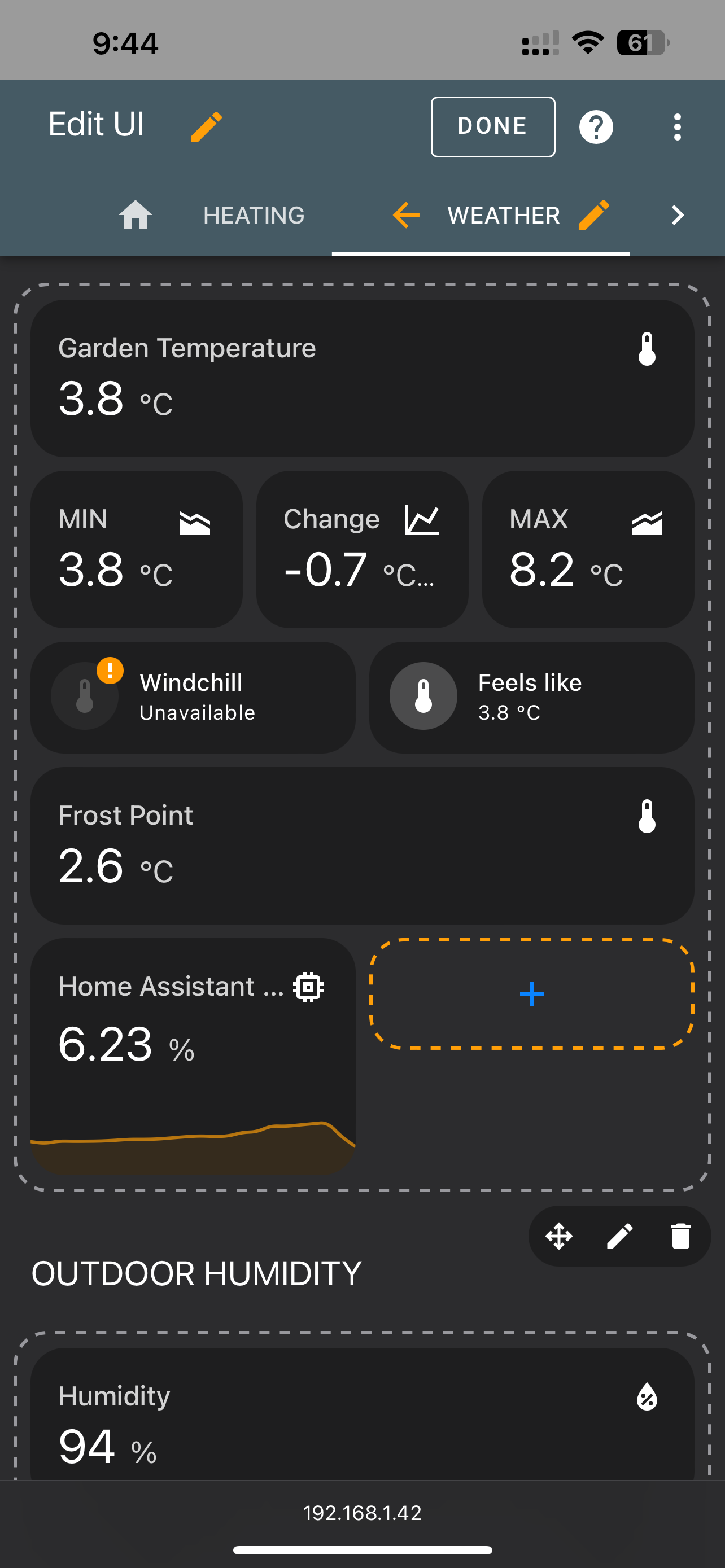
Some very first comments (knowing it is experimental):
My eyes are having problems with the gap of tile card header and functions. Personally I would prefer upper alignment. Please take care of not making things too structured.
Alternatively a horizontal compact tile card with function in the same line would also be great ( possible with mushroom)
I am missing the possibility to click on an entity in edit mode in order to open more info for entity name change.
What about the possibility to add a second title in a section? In case one section does not have many content, a second sub section could be added in order not to loose to much space with z grid layout…
Really fantastic news. The prior mechanism and need for tons of custom elements was too tough to bother mastering, so my dashboards look messy today. Really looking forward to this huge leap forward in UX. Big thanks to the whole team for all the work!
Thank you for updating the dashboards. This looks very promising
Does anybody know if the grid will be customizable, i.e. the user will be able to scale a card to be larger than one grid section?
There are cards like graphs (e.g. ApexCharts) that can be scaled to better show the relevant information.But this requires assignment to a multiple grid rows/columns.
Will this kind of grid usage (like in Thomas Loven’s mod) be part of the HA dashboard grid concept?
It might be good though, if cards could be configured to “stretch” in order to get all sections in a row to have equal height. In CSS-terms cards might need an area that is defined as “flex-grow” and thus would be allowed to stretch if a certain flag is set on the card by the user. A good example would be graphs, images and maps to adjust their height based on sibling sections, while having a default min-height applied.
Another cool thing would be if users would be able to configured the position of sections for each breakpoint (mobile, tablet, desktop). By using flexbox and the “order” CSS property, this might be doable.
edit: the cherry on top would be a “grid section” or view for expert users. So a section/view, which you can divide into n rows (and columns, defaulting to the default layout grid columns) while being able to freely merge cells. And components dragged into those cells would adjust their size accordingly (using @container CSS queries to detect if compact or wide layout should be used etc.).
In case of a grid view, breakpoints likely won’t work, but that’s probably fine as such dashboards are mostly targeted to desktop/tablet anyway.

 ?
?

 on the top of the cake … Wow… Thanks so much guys you are Wunderbar