Wow! At long last!! The stars have aligned, and our experimental drag-and-drop feature for dashboards is finally here! 🥲
Here at Nabu Casa, we strive to make Home Assistant the best smart home platform, and a smart home allows its residents to automate, control, observe, and anticipate the comfort, security, and various conveniences of their home. Besides voice assistants, dashboards are also a great way to help users do just that!
Therefore, we have been working hard to make customization and organization of dashboards as easy and intuitive as possible, and to create a default dashboard that will be more useful, user-friendly, and relevant right out of the box. Matthias and I teamed up in April last year to tackle this problem together, and we called this series of improvements over our current dashboard “Project Grace”, named after the influential and brilliant late Admiral Grace Hopper.
After months of user research and ideation to ensure that our design is “home-approved” - to be easy and intuitive to use for you, your family, your guests, your roommates, and more - we are happy to share the first fruit of our success in the upcoming release 2024.3, with the help of Paul and of course the wonderful frontend team. We hope that these features will help you take the dream dashboard for you and your home from idea to reality much faster and much more easily.
For those of you who are curious about the features and the design thinking behind them, read on and check out our special livestream last week. You can also try out our updated demo and get involved by joining the Home Assistant User Testing Group!
Enjoy!
~ Madelena 🥳
What is Project Grace?
Grace was the codename we used for the series of improvements to be built on top of Lovelace, the framework for our dashboards. We aim to preserve the strengths of Lovelace, such as its flexibility and extensibility, and to mitigate its weaknesses, such as its steep learning curve, its lack of scalability, as well as the poor responsiveness of its layouts.
The three-layout problem
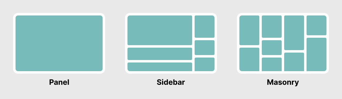 The three basic view layouts: Panel, Sidebar, and Masonry
Our dashboard came with 3 default view layout types by default: Panel, which is simply one card covering the entire view; Sidebar, which is a two-column layout for cards; and Masonry, which is the most robust of them all.
While it is excellent at creating a tightly-packed screen space-saving dashboard, Masonry lays out cards in a logic that may not be immediately clear and predictable to many users, which leads to a frustrating user experience to create and customize the layout of the cards. And as the layout logic depends on the height of each card, the varying heights of the cards available for our dashboards become a blessing and a curse: Even a difference in height of 1 pixel would mean a card one would guess to be displayed on the leftmost column getting shifted all the way to the right.
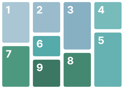 Masonry arranges cards based on size.
What’s more, unlike most other smart home apps, Home Assistant prides itself on Choice. In terms of dashboard view layouts, Choice means that dashboards should be able to be displayed on any screens that are the most convenient to our users - whether it’s a phone, a tablet, a large monitor, or other display devices. While the Masonry layout is great at making neat walls of cards, as its name also implies, it is a wall of cards which does not care whether the bricks are laid, thus the muscle memory of where users remember the cards will be lost every time the dashboard is displayed on another screen.
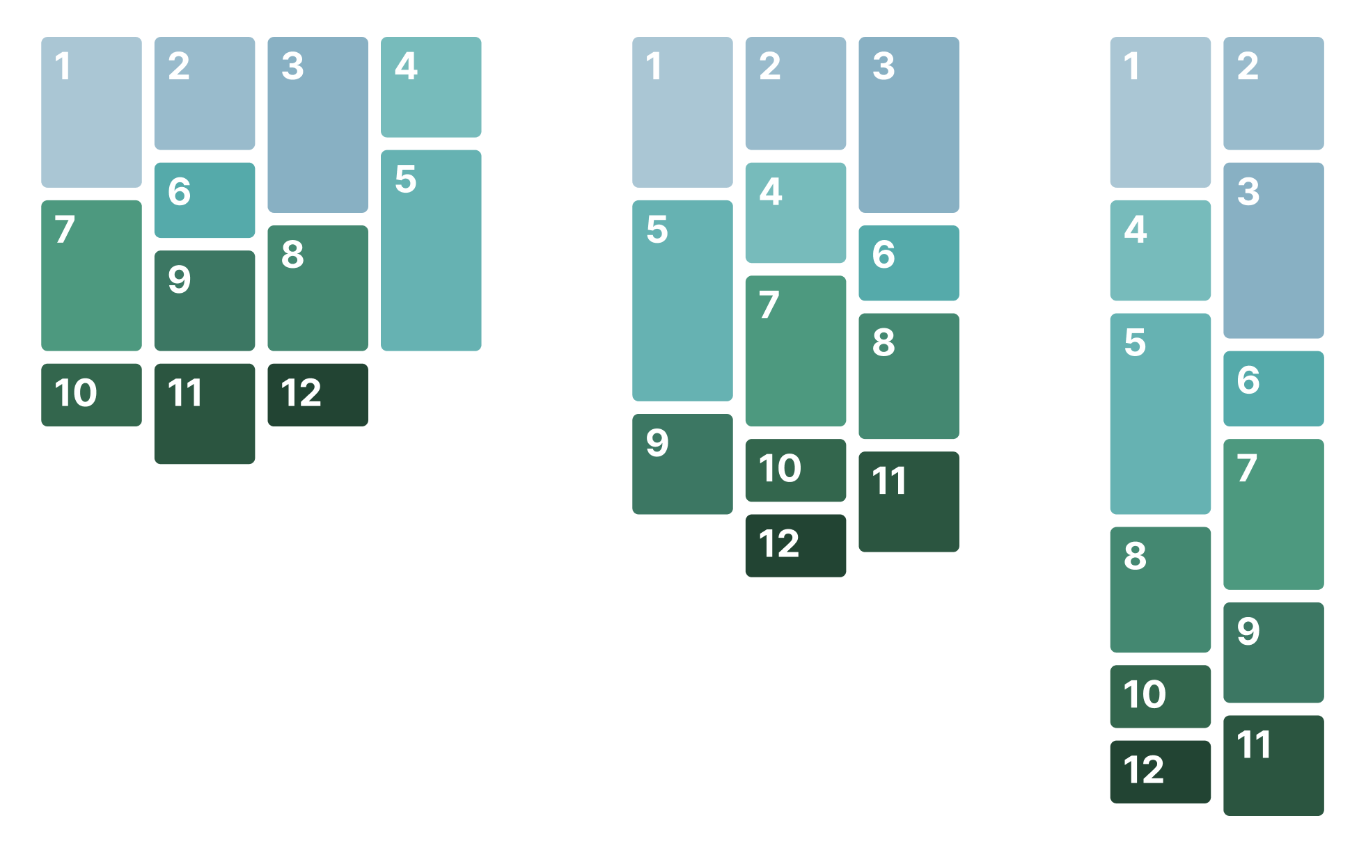 Masonry does not care about where exactly cards are placed when the screen size changes.
For the past few years, we tried to create a more intuitive solution to rearrange the cards laid out by Masonry but ultimately the solutions did not work well for multiple screen sizes. Meanwhile, our users come up with solutions of their own, with many avoiding our default view layouts so that they can create a more predictable and memorable dashboard. As it turns out, “drag and drop” is not just an engineering problem; it is also a design problem.
To solve these problems with our layout, we realized that the Masonry layout, compatibility with multiple screen sizes, and easy “drag and drop” rearrangement of cards cannot co-exist. Over the past year, we ideated and identified a few solutions, namely:
Let’s dive in each solution and learn how they work together to make your dashboards easier to customize and use!
The new Sections view
 Case studies of our users' dashboards
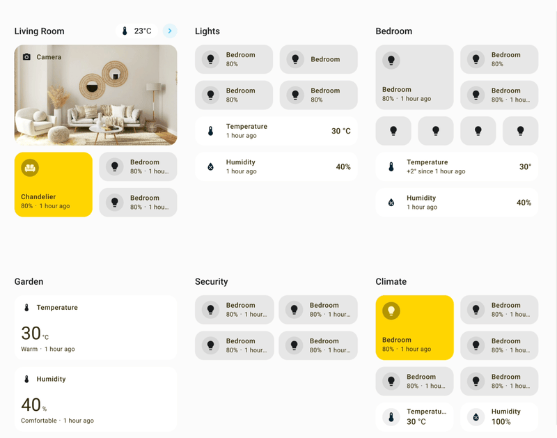
Throughout this project, we have looked at dozens of different dashboards created by you and posted on our discussion boards. One thing we notice is that our more advanced users are all naturally drawn to creating “sections”, groups of different cards delineated by a group title, manually with grids and markdown cards.
Home Assistant dashboards are robust and packed with information, and our users often place dozens of cards for all sorts of buttons, switches, graphs, indicators, and more. By grouping cards into “sections”, our users can reduce the number of items they need to scan through when they are looking for a certain card, as they will be able to look for the relevant group title first and then reduce the scope to scan that particular group for the information. And by packing cards in a section into a grid card, the relative positions of the cards within a section are affected by changes in screen sizes, and so the spatial memory of the cards are retained, leading to a faster and less cumbersome experience.
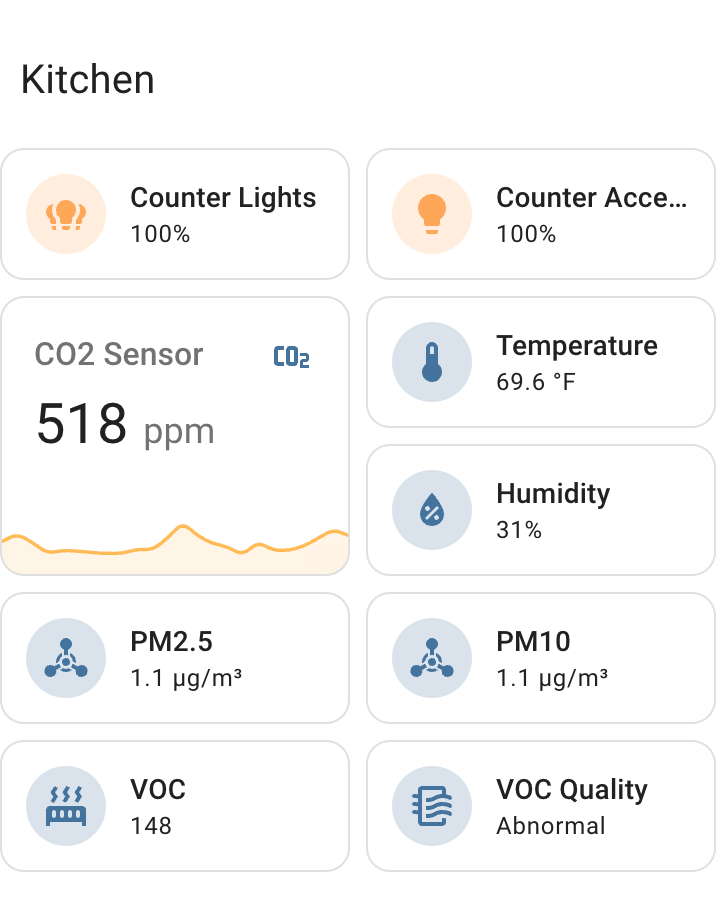 Example of a dashboard section
For our new Sections view, we are making these sections as the base unit of the view and we are streamlining its creation and editing procedures. Users will not need to fiddle around with grid cards and markdown cards to assemble a section manually, and instead a section now comes with all those amenities and much more.
Getting started with Sections
The new Sections view is experimental! Please do not build your daily dashboard on top of it yet!
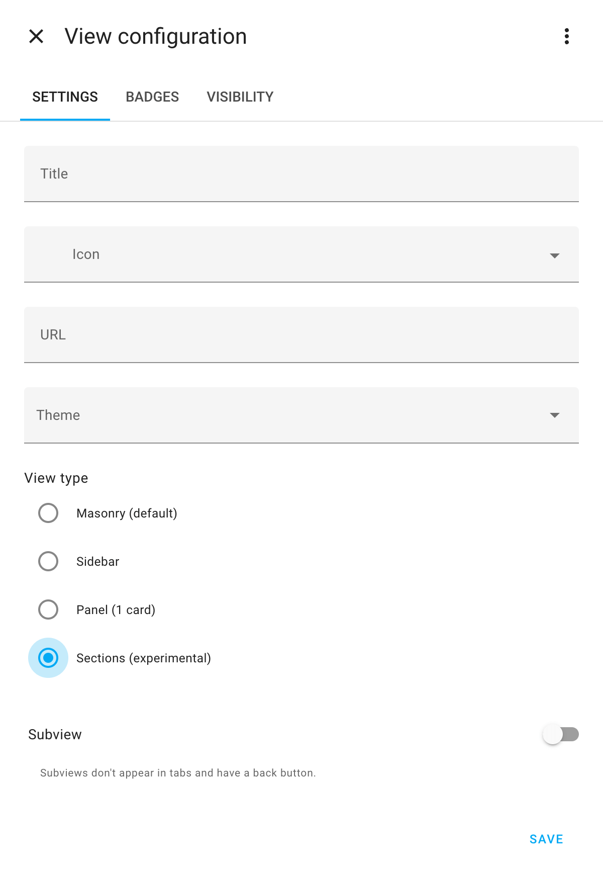 The Create New View configuration screen
To get started with the new Sections view, create a new view on your dashboard and choose Sections (experimental) as the view type. We currently do not have the option to migrate your current dashboard over yet.
 A new dashboard view laid out in Sections
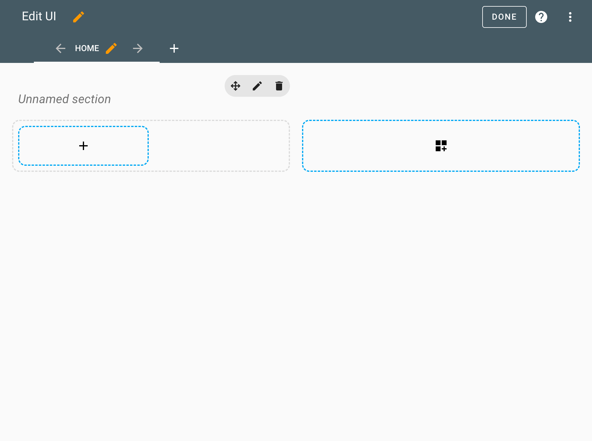
You will be greeted by a clean new dashboard view, with one section already created for you.
-
To add a new section, select the Create Section button.

-
To edit the name of a section, select the
 Edit button on the top right of the section. (Tip: You can add any descriptive text for your section, including emojis!) When the section does not have a name, the section header will be hidden.
 -
To delete a section, select the
 Delete button on the top right of the section. You will be asked to confirm the deletion.
Filling it up
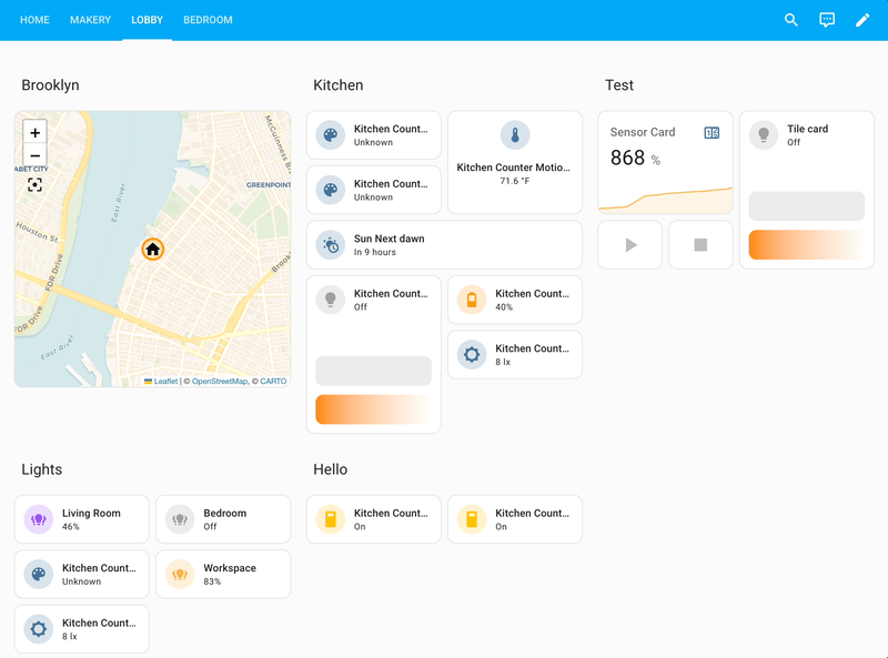
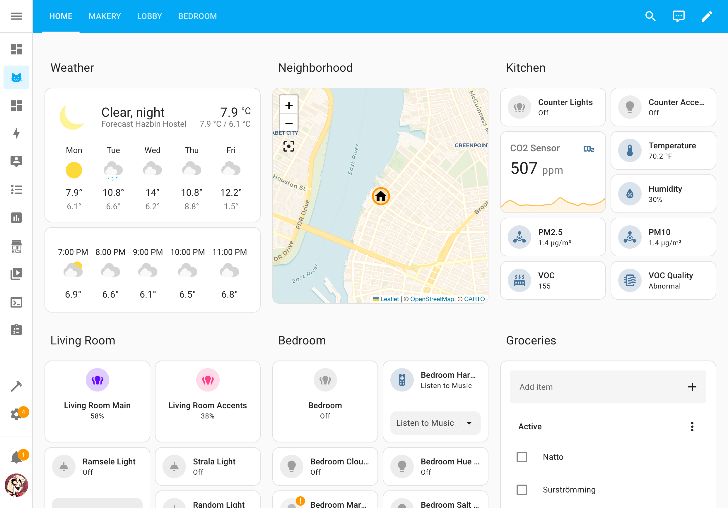 A fully populated dashboard in Sections view layout
There are multiple ways to add cards into a section and populate your dashboard:
-
The easiest way to add cards is to select Add Card [Button icon] button inside the section.
-
The Add Card dialog will appear, and there are two options:
-
By Card
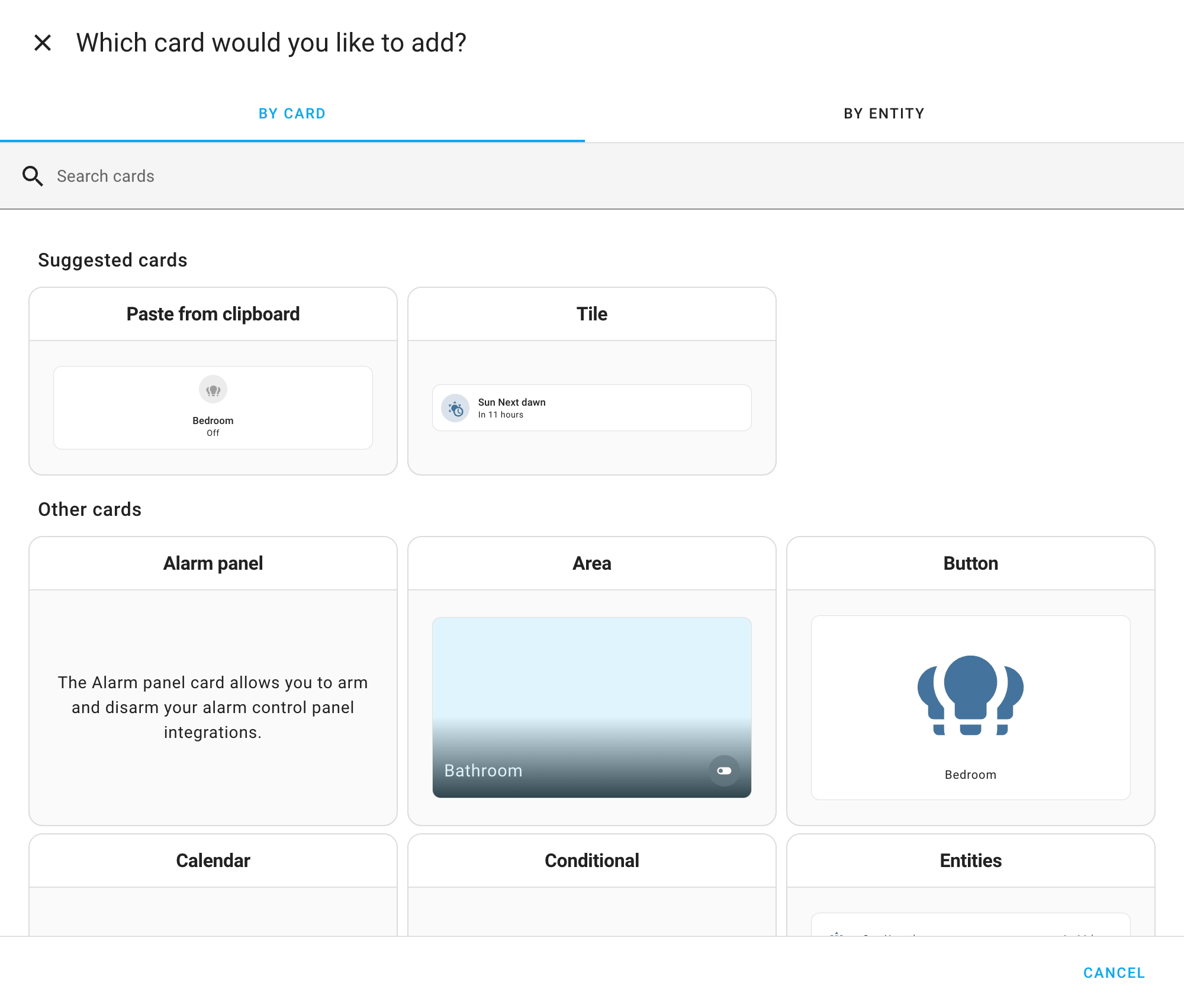 Add Card by Card type dialog
If you have a good idea of what card you want to use for an entity, browse the list of available cards on this screen. For the Sections view, we recommend the Tile card, which is now pinned to the top in a Suggested Cards section.
-
By Entity
Add Card by Entity dialog
If you want to add a bunch of entities in one go, select one or multiple entities on this list.
Home Assistant will show a preview of the cards to be added, which will be displayed in Tile cards as the default of the Sections view. Tap the “Add to Dashboard” button to complete the process. Card suggestions
-
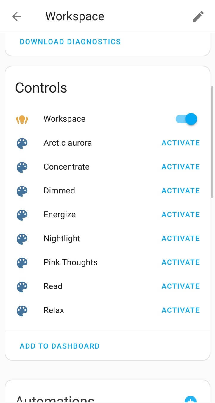 Add to Dashboard feature on the device page
Another handy method for adding a bunch of sensors or controls belonging to the same device is to add them from the device’s page.
-
Navigate to the page of the device through Settings.
-
Tap the Add to Dashboard button on the screen.
-
You will be prompted to choose which dashboard view you want to add them to. If you choose a view using the Sections view layout, the sensors or controls will be added as tile cards placed inside a new section.
Responsive design
One major benefit of the new Sections view is that it is now much easier to build dashboards that work with multiple screen sizes.
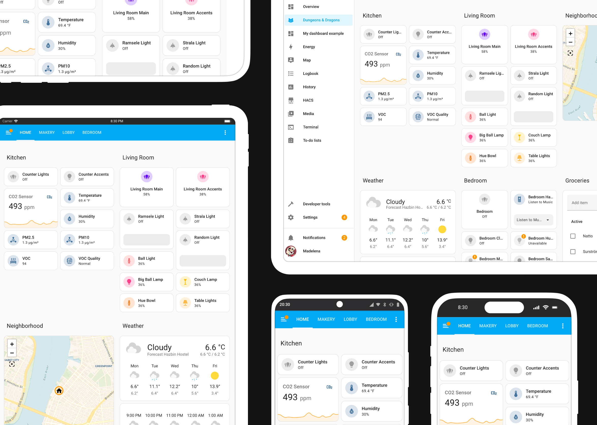 Sections view adapt nicely to different screen sizes.
The view will rearrange the sections according to the amount of space available horizontally, while the number of columns of cards within each section stays the same, thus preserving your muscle memory of where the cards are located.
The grid system
Our current dashboard views are organized in columns with cards of varying heights, and with masonry layout by default. As cards can vary in height in small amounts, it becomes hard to predict where cards will “land” when one moves a card to another column, or when screen size changes and moves all the cards, such as when viewing a dashboard on tablet vs on mobile. This creates friction in the customization experience of the dashboards.
Enter the grid system, a bastion of graphic design principles.
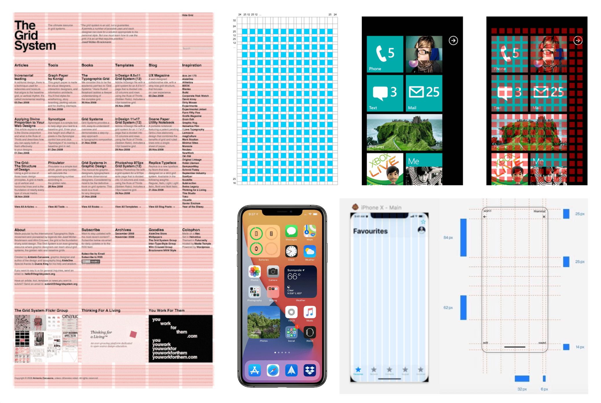 Examples of grid systems in use
Typographic grid systems have a long history in modern graphic design and print publishing, starting from its rise in the early 20th Century during the Constructivist and Geometrical art movements in Europe, which concerns the hidden rhythm behind a visual image. They are easily repeatable and, therefore, practical for generating an infinite amount of pages, yet also ensure aesthetic proportions and consistency for printable matter. They also bring order to a page. It helps users understand the relationship between each element on the page and whether one element belongs to another.
 The Home Assistant dashboard grid system
When a UI is designed with a structured layout, that feeling of structure and organization comes through to the user in their first impression.
By introducing a grid system with cards of regular row height and column width multiples, we can help users rearrange cards more easily in a predictable manner, make Home Assistant adapt the dashboards to different screen sizes more easily, and, of course, make dashboards look tidier and more aesthetically pleasing.
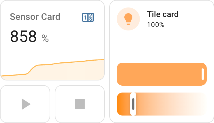 Cards currently optimized for the grid system: Sensor card, Tile card, and Button card
To implement the grid system, we are now in the process of standardizing the widths and heights of our cards, starting with the Tile card, Button card, and Sensor card. These cards will occupy the right amount of space in the grid, while other cards will occupy the full width of a section by default at the moment.
For card developers, we will have more information on how to adapt your custom cards to the grid system soon.
Drag-and-drop rearrangement of cards and sections
With sections and a grid system in place, we can finally implement a way to arrange cards and sections that is intuitive with drag-and-drop, predictable with how the cards will rearrange, while creating a dashboard that is easy to navigate and remember by visualizing the information hierarchy and not disturbing the spatial relationship between cards. Users will not need to pray and guess where the cards will land when they change their orders anymore!
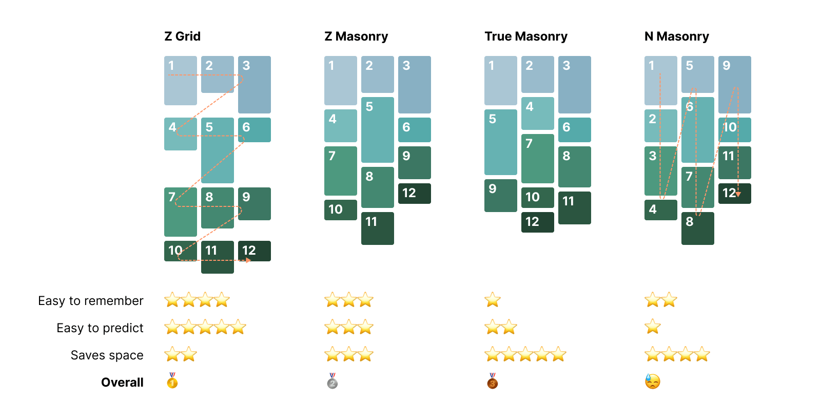 Comparison of four card arrangement methods
Throughout the design process, we looked at a few different ways of how cards should be arranged. Ultimately, we chose the “Z-Grid” due to its simplicity, predictability, and memorability as the default, despite it may take up more space than other solutions. The Z-Grid works simply by laying out sections from left to right, and starting a new row when the row is full. The heights of the rows are determined by the tallest section on the row, while the width of the columns remain constant for responsive design.
How to drag and drop
While your dashboard is in Edit Mode:
 Rearranging sections with drag-and-drop
- To rearrange sections, simply tap and hold the Move handle and then move your cursor or finger towards your desired location. Other sections will move out of the way for where the selected section will drop.
 Rearranging sections with drag-and-drop
- To rearrange cards, tap and hold anywhere on the card and then move your cursor or finger towards your desired location.
(Don’t you love when instructions are so short? Yay to simplicity! 🦄)
What’s next? Get involved!
The new Sections view with drag-and-drop is just the first step of Project Grace, a Home-Approved Dashboard. We have a good idea of where we want to head next in our design and development process, but we want to hear from you first before we proceed so that we can prioritize and build a product that will help you the most.
To get feedback from all of you and your household members, we decided to release this early in its incomplete form as an experiment for you to try out the new Sections view. For those who are curious, feel free to check out our updated demo to play around and have fun!
We want to make sure that the new default dashboard will not only work for you, but also everyone who lives in your home. We would love to hear what they think as well. Please do not hesitate to leave your comments below!
Join the Home Assistant User Testing Group!
From time to time, we will send out user tests to help us make the harder product and design decisions we identify. By joining our user testing group, you will help steer the direction of our product and will also get a sneak peak of potential designs that are work in progress.
Please fill out this form to join the Home Assistant User Testing Group!
Big thanks to all the folks who joined us for user interviews, Lewis from Everything Smart Home for sharing his treasure trove of dashboards for our case studies, and of course, the fabulous Nabu Casa team. 💖
That’s all for now! Thank you for reading. Can’t wait to show you what’s next!
~ Madelena
This is a companion discussion topic for the original entry at https://www.home-assistant.io/blog/2024/03/04/dashboard-chapter-1

 ?
?