Looks good so far! Just had a play and I see the potential, I think for it to work for me though it still needs a bit more control. As others have mentioned a header and footer area would be great for adding a page title, chips, navigation elements etc. Plus the ability to grow sections over more than one column.

I’ve said it at times during the live release parties. Home Assistant (Nabu Casa) developers are engaging big times onto the Home Assistant newbies and/or the not so tech-savvy in coding users.
This is one of my main reasons I not only started with Home Assistant instead of others platforms, but that I’m still onboard this platform. Kudo’s to all for making this my user experience at a top notch level.
1 Like
This is dope! It will clean my dashboard so much!
I tried the beta on a dashboard, and here are the things that are missing for me to reach perfection:
- The ability to customize the section width: I do have a markdown card that I want to take 100% height before the rest of the content
- The possibility to customize the grid layout: I’m using a custom set of lovelace cards to make my dashboard to fit my needs, but these card can be smaller than the grid, 50px in my case
- (Might be already possible, but I can figure out how) I’d like to customize the amount of columns a card can take.
Anyway, it’s a beta, and I’m sure you have a lot of possible evolutions on your mind, so keep up the good work!
3 Likes
maybe you can place them in a native grid/vertical/horizontal-stack_card
but i agree, i use custom:grid-layout, for the same reason
But im sure someone would soon create a Theme, to address the root, and the huge gap between columns

PS: With card-mod You can already set the hight of individual cards.
1 Like
I am definitely watching for the “header” and “sidebar” to become an option.
3 Likes
Awesome work on the sections!
I feel like I can stop maintaining completely different dashboards for mobile, tablet and desktop use.
Can we get some conditions on them?
E.g. I would like to hide the swimming pool stuff in winter and replace it with heating.
If not dynamic, at least a ‘hide: true’ checkbox to manually do that would be great.
1 Like
Wow, really great work. I’ve been waiting for this since I use homeassistant.
Reworked my dashboard in only a few ours. Finally a UI-editable dashboard for me.
@balloob please add the option to restrict the quantity of columns. This is nice for much bigger screens.

4 Likes
Truly a surprise! Fantastic work…I’m racking my brain with my wall dashboard because of that annoying side scroll bar: thanks to the Team I solved it in 30 seconds…incredible! My gross incompetence is directly proportional to your greatness. 
Thanks so much, I’m sure we will have a lot of fun in the coming days/months/years: long live Home Assistant and his squires!
I like the new sections and will try them out soon.
Unfortunately the 2024.3.0 update introduced a bug in lovelace where buttons no longer display the state:
UPDATE: This was fixed in 2024.4.0 Thank you!

These used to be colored yellow when on:

Here is the yml code for this section:
type: entities
entities:
  - type: section
    label: Kitchen
  - type: buttons
    entities:
      - entity: switch.fridge_switch
      - entity: switch.washer_switch
      - entity: switch.dishwasher_switch
      - entity: switch.microwave_oven_switch
      - entity: switch.airfryer_switch
      - entity: switch.kettle_switch
  - entity: sensor.fridge_power
  - entity: sensor.washer_power
  - entity: sensor.dishwasher_power
  - entity: sensor.microwave_oven_power
2 Likes
what trick did you use to get the bottom right sensor to take the whole horizontal space of the grid?
Looking for that when using tile card for my covers that keep doing this:

even though the card editor shows it the way I want it… not having selected vertical

edit
adding a horizontal-stack does it:

result:

which is much better, and also shows the standalone cover taking 3 vertical spaces, which doesnt help the visual attractivity
4 Likes
This is a card from mushroom. This automatically extends to the whole width.
But i would also recommend, to gain something like you have, to use horizontal and vertical stacks.
If every button should be the same site, I would reccomend using grid.
right, thanks.
trying t go all core here, I figure the same author wlll probably also extend core tile with that functionality 
1 Like
Coming soon it seems , hope they enjoy their work, as much as we do 
6 Likes
I’ve been playing with the new dashboard to recreate my current production one , and it’s quite nice , excellent job guys !
As it is a wip and at the very first stage , I use it as is without trying to force anything my way and the first improvement I would seek is selectable (with default) grid width (and height) for sections and cards.
Once again , good job !
1 Like
So right now, I am recreating all of my dashboards with a new, experimental dashboard using the new Sectional Layout - and so far, I really like it.
Althought - I still need too many “horizontal stack-cards” to get what I want - I could get rid of nearly all other, nested stack-cards 
Anyway - there are still areas that needs to be improved…
here are some examples of what I found:
-
conditional Card is taking two columns

In this case, I would like to use the condidtional card to hide another tile card.
But the tile card will be automatically spread over two columns instead of the one that it usually has. - While this isn’t a big issue in my case, as I do have two tiles I want to hide with the same condition, I need to add another horizontal stack to show both tiles in the same row… else, I would have made two conditional cards - which would be helpful if you would have two different conditions -
Resizing Picture Cards:
On one of my dashboard tabs I do have a “switch” / “tile” to enable or disable the guest-Wifi.
if the guest-wifi is enabled, a conditional card will show a picture entity with the Wifi-Code.
It would be great, if the picture card could be resized - to use the “two rows” left near the button-tile card…
Instead of using a complete new row

1 Like
Same here. No state color change on buttons with 2024.3.0
1 Like
I believe this is the default behavior of a “grid-cell” in this case named “section” (group of cells, or an “area” ) (, there is however a pull-request upon enhancing, i don’t know whether this will/could be addressed there, with options to choose horizontal/vertical ) … othervice the outcome will follow how the individual cards are build
this is really going to be a nice playground:
    - type: grid
      title: Library
      cards:
        - graph: line
          type: sensor
          entity: sensor.library_hygro_temp_temperature
          layout_options:
            grid_rows: 4
        - graph: line
          type: sensor
          entity: sensor.library_sensor_temperature
        - type: tile
          entity: light.bureau_links
        - type: tile
          entity: light.bureau_rechts

        - type: tile
          entity: climate.heater_library
          layout_options:
            grid_columns: 4
            grid_rows: 1
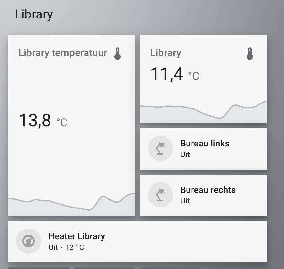
couldnt resist setting up ‘dev’ today…
no more need for intermediary stack-cards
5 Likes
If I may ask, how did you change the color of the sensor graph to grey?