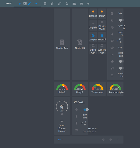
It would be great if the number of columns in the grid-card could be defined based on the width of the screen size.
May be good in core, but for now, I assume you know you can emulate this now with layout-card?
This would be great!
Was about to create a item for this.
How it now works, great for mobile, but not so much for browser
How i looks in browser when adding more columns
How i would like it to show when adding more columns. achiefed this by setting the with to 100vw of the column div
Second this request. It would be great if we could have something like:
Number of columns (default): X
Number of columns (mobile): X
1 Like


