Ambient Glass - An expressive dashboard concept
Hi everyone,
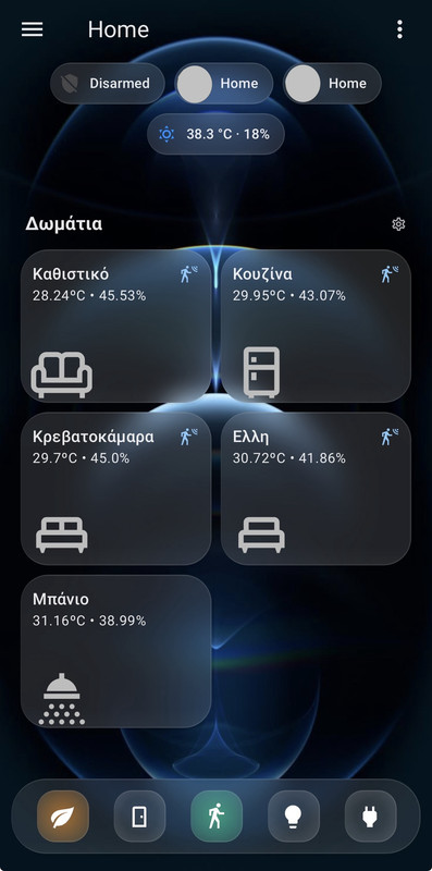
Inspired by many of the beautiful tile card concepts shared by the community and by the feeling of walking past softly lit windows at night, I wanted to create a dashboard that captures that ambient, quiet atmosphere, where each room feels alive without saying too much.
It also features a dock-style footer, with backlit glass buttons representing sensor types (e.g., motion, openings, lights). When one of those sensors is triggered, a light behind the corresponding button subtly turns on, just like an active icon in a taskbar or dock. It adds a secondary layer of awareness across the home, sensor-wise.
After some experimentation, I’m excited to share a UI concept I’ve been working on for Home Assistant, which I call Ambient Glass UI.
The goal was simple: create a dashboard that feels calm, minimal, and yet alive, giving you a quick sense of what’s happening at home without overwhelming you with details.
Concept
Each room panel is designed to look like frosted glass, subtly tinted by the actual color and brightness of the room’s light. When a light turns on, the panel softly “glows,” reflecting the ambient conditions of the space. When it’s off, the panel returns to a neutral, dimmed look — as if you’re peeking through a quiet, unlit window.
The concept is built on the idea of sensing, not reading. You don’t need to interpret numbers or icons to understand what’s going on — the light, tone, and layout do most of the work visually. While you are 1-click away from actions.
Interaction
The dashboard works on two intuitive levels:
- Room Level – Tapping a room opens a subview showing detailed sensor information, neatly grouped by type.
- Footer Level – A minimal footer provides a quick glance at all sensor types (motion, temperature, contact, etc.), updating dynamically based on activity.
This dual-axis layout helps you either zoom into a specific room or get a quick overview of a whole sensor category across the house.
Design Philosophy
- Minimalism with context – Avoiding unnecessary visual clutter or animation while still conveying the current state of each space.
- Visual rhythm – Light transitions and soft color tints draw your attention without distraction.
- Mental clarity – The blurred background and quiet interface help reduce the feeling of digital “noise” — something I find important in daily use.
- Consistency – Every panel behaves the same, follows the same styling, and remains readable in all lighting conditions.
Under the hood
Screenshots
Here’s the dashboard in action:

Glass UI Dark Theme
Glass UI Dark:
  accent-color: rgb(174, 174, 178)
  app-header-background-color: rgba(19, 19, 20, 0.01)
  app-header-edit-background-color: rgba(19, 19, 20, 0.4)
  app-header-edit-text-color: var(--secondary-text-color)
  app-header-selection-bar-color: rgba(19, 19, 20, 0.5)
  app-header-text-color: var(--primary-text-color)
  border-radius: 30px
  bubble-accent-color: rgb(22, 22, 24)
  bubble-select-arrow-background-color: rgb(92, 184, 255)
  bubble-select-list-item-accent-color: rgb(54, 54, 56)
  bubble-sub-button-light-background-color: "var(--md-sys-color-secondary-container-dark, #414659)"
  card-background-color: rgb(22, 22, 24)
  card-mod-theme: Glass UI
  checkbox-border-radius: 30px
  checkbox-checked-border-color: rgb(0, 145, 255)
  checkbox-checked-icon-color: rgb(255, 255, 255)
  checkbox-unchecked-border-color: rgb(199, 199, 204)
  checkbox-unchecked-icon-color: "var(--md-sys-color-on-surface-dark, #e3e1e9)"
  dark-primary-color: hsl(from var(--primary-color) h s calc(l - 20))
  disabled-text-color: "#ffffff80"
  divider-color: var(--primary-background-color)
  error-color: rgb(255, 97, 101)
  font-family: >-
    Figtree, "Google Sans", Roboto, -apple-system, BlinkMacSystemFont,
    "Segoe UI", Helvetica, Arial, sans-serif
  footer-height: 82px
  ha-card-background: linear-gradient(180deg, rgba(255,255,255,0.13) 88%, rgba(255,255,255,0.15))
  ha-card-backdrop-filter: blur(12px)
  ha-card-border-radius: 30px
  ha-card-border-color: rgba(255,255,255,0.1)
  ha-card-border-style: solid
  ha-card-box-shadow: 2px 2px rgba(0, 0, 0, 0.05)
  ha-card-transition: all 0.5s ease-in-out
  ha-card-header-font-family: var(--font-family)
  input-background-color: rgb(52, 52, 54)
  input-ink-color: var(--primary-text-color)
  input-fill-color: var(--input-background-color)
  light-primary-color: hsl(from var(--primary-color) h s calc(l + 20))
  link-text-color: var(--primary-color)
  lovelace-background: rgb(20, 20, 22)
  md-switch-checked-track-color: rgb(74, 217, 104)
  md-switch-unchecked-track-color: rgb(174, 174, 178)
  mdc-theme-primary: var(--primary-color)
  mdc-theme-secondary: var(--accent-color)
  primary-background-color: rgb(20, 20, 22)
  primary-color: rgb(0, 145, 255)
  primary-text-color: rgba(255, 255, 255, 0.9)
  scrollbar-thumb-color: rgb(44, 44, 46)
  secondary-text-color: rgb(174, 174, 178)
  state-icon-color: rgb(174, 174, 178)
  switch-checked-track-color: var(--md-switch-checked-track-color)
  switch-unchecked-track-color: var(--md-switch-unchecked-track-color)
  text-primary-color: var(--lovelace-background)
  title-font-size: 28px
  title-font-weight: 600
  view-background: rgb(19, 19, 20)
Room Tile Card
A glowing panel for each room, softly changing based on the current light’s rgb_color and brightness.
On the right side of the card, small vertical icons appear only when sensors are triggered.
type: custom:stack-in-card
card_mod:
  style: |
    ha-card {
      min-height: 133px;
      border-radius: 24px;
      background:
       {% set light = is_state("light.photistiko_kathistiko", "on") %}
       {% if light %}linear-gradient(145deg,
          rgba({{ state_attr('light.photistiko_kathistiko', 'rgb_color')[0] }}, {{ state_attr('light.photistiko_kathistiko', 'rgb_color')[1] }}, {{ state_attr('light.photistiko_kathistiko', 'rgb_color')[2] }}, {{ state_attr('light.photistiko_kathistiko', 'brightness') | float(0) / 255 }}) 10%,
          rgba({{ state_attr('light.photistiko_kathistiko', 'rgb_color')[0] }}, {{ state_attr('light.photistiko_kathistiko', 'rgb_color')[1] }}, {{ state_attr('light.photistiko_kathistiko', 'rgb_color')[2] }}, 0.15)) !important;
       {% else %}
       {% endif %}
        }
cards:
  - type: custom:mushroom-template-card
    primary: Καθιστικό
    secondary: >-
      {{ states('sensor.living_room_4fac_temperature') }}ºC • {{
      states('sensor.living_room_4fac_humidity') }}%
    icon: ""
    card_mod:
      style: |
        ha-card {
          border-color: transparent !important;
          backdrop-filter: none !important;
          background: none !important;
          transition: top 0.5s ease-in-out;
          top:
            {% if is_state("light.photistiko_kathistiko","on")%}25px;
            {% else %}0px;
            {% endif %}
            }
    tap_action:
      action: navigate
      navigation_path: /lovelace/kathistiko
  - type: custom:mushroom-template-card
    layout: horizontal
    primary: ""
    secondary: ""
    icon: mdi:sofa-outline
    icon_color: null
    tap_action:
      action: navigate
      navigation_path: /lovelace/kathistiko
    card_mod:
      style:
        mushroom-shape-icon$: |
          .shape {
            --shape-color: none;
            }
        .: |
          ha-card {
            backdrop-filter: none !important;
            border-style: none !important;
            --icon-size: 80px;
            margin-left: -15px;
            margin-bottom: -55px;
            margin-top: -10px;
            box-shadow: none;
            background: none !important;
          }
          mushroom-badge-icon {
            margin-right: 48px;
            margin-top: -56px;
            --badge-icon-size: 18px;
            --badge-size: 24px; !Important;
          }
    badge_icon: >
      {{ 'mdi:vanity-light' if is_state("light.photistiko_kathistiko", "on")
      else '' }}
    badge_color: none
  - type: custom:stack-in-card
    card_mod:
      style: |
        ha-card {
          background: none !important;
          backdrop-filter: none !important;
          margin-top: -100px;
          margin-left: auto;
          margin-right: 5px;
          width: 16%;
          border: 0px;
          box-shadow: none;
        }
    cards:
      - type: custom:mushroom-template-card
        primary: ""
        secondary: ""
        layout: vertical
        icon: mdi:motion-sensor
        entity: binary_sensor.ld2410_living_room
        tap_action:
          action: navigate
          navigation_path: /lovelace/kathistiko
        icon_color: "#86c9fc"
        visibility:
          - condition: state
            entity: binary_sensor.ld2410_living_room
            state: "on"
        card_mod:
          style:
            mushroom-shape-icon$: |
              .shape {
                --shape-color: none;
                }
            .: |
              ha-card {
                border: 0px;
                --icon-size: 24px;
                margin: -10px!important;
                background: none !important;
                backdrop-filter: none !important;
                box-shadow: none !important;
              }
      - type: custom:mushroom-template-card
        primary: ""
        secondary: ""
        layout: vertical
        icon: mdi:door-sliding-open
        entity: binary_sensor.door_window_sensor_eff1_opening
        icon_color: "#86c9fc"
        tap_action:
          action: navigate
          navigation_path: /lovelace/kathistiko
        visibility:
          - condition: state
            entity: binary_sensor.door_window_sensor_eff1_opening
            state: "on"
        card_mod:
          style:
            mushroom-shape-icon$: |
              .shape {
                --shape-color: none;
                }
            .: |
              ha-card {
                border: 0px;
                background: none !important;
                --icon-size: 24px;
                margin: -10px!important;
                backdrop-filter: none !important;
              }
      - type: custom:mushroom-template-card
        primary: ""
        secondary: ""
        layout: vertical
        icon: mdi:window-open-variant
        entity: binary_sensor.parathuro_opening
        tap_action:
          action: navigate
          navigation_path: /lovelace/kathistiko
        icon_color: "#86c9fc"
        visibility:
          - condition: state
            entity: binary_sensor.parathuro_opening
            state: "on"
        card_mod:
          style:
            mushroom-shape-icon$: |
              .shape {
                --shape-color: none;
                }
            .: |
              ha-card {
                border: 0px;
                background: none !important;
                --icon-size: 24px;
                margin: -10px!important;
                backdrop-filter: none !important;
              }
      - type: custom:mushroom-template-card
        primary: ""
        secondary: ""
        layout: vertical
        icon: mdi:door-open
        entity: binary_sensor.esp32_bluetooth_proxy_2486c8_front_door
        icon_color: "#86c9fc"
        tap_action:
          action: navigate
          navigation_path: /lovelace/kathistiko
        visibility:
          - condition: state
            entity: binary_sensor.esp32_bluetooth_proxy_2486c8_front_door
            state: "on"
        card_mod:
          style:
            mushroom-shape-icon$: |
              .shape {
                --shape-color: none;
                }
            .: |
              ha-card {
                border: 0px;
                background: none !important;
Footer Dock with Active Sensor Backlights
A floating footer styled like a translucent dock bar with glowing buttons depending on state.
type: custom:stack-in-card
mode: horizontal
card_mod:
  style: |
    @media (min-width:180px) {
      ha-card {
        background: linear-gradient(180deg, rgba(255, 255, 255, 0.1) 85%, rgba(255, 255, 255, 0.12)) !important;
        z-index: 1;
        position: fixed;
        left: 10px;
        width: calc(100% - 20px );
        padding: 14px;
        height: 65px;
        bottom: 15px !important;
        }
    }
    @media (min-width:800px) {
      ha-card {
        left: calc(25%);
        width: calc(50%);
        }
    }
    @media (min-width:1000px) {
      ha-card {
        width: calc(30%);
        left: calc(37%);
        }
      }
cards:
  - type: custom:mushroom-template-card
    icon: mdi:leaf
    layout: vertical
    primary: ""
    secondary: ""
    tap_action:
      action: navigate
      navigation_path: "#temperatures"
    badge_color: ""
    badge_icon: ""
    icon_color: white
    card_mod:
      style:
        mushroom-shape-icon$: |
          .shape {
            --shape-color: none !important;
            }
        .: |
          ha-card {
            height: 45px !important;
            width: 45px !important;
            left: 8px !important;
            background:
             {% set aqi = states("sensor.home_aqi") | int(1) %}
             {% if aqi == 1 %}
               radial-gradient(circle, rgba(0, 0, 255, 0.6) 0%, rgba(0, 0, 255, 0.2) 80%) !important;
             {% elif aqi == 2 %}
               radial-gradient(circle, rgba(3, 201, 136, 0.6) 0%, rgba(3, 201, 136, 0.2) 80%) !important;
             {% elif aqi == 3 %}
               radial-gradient(circle, rgba(255, 255, 0, 0.6) 0%, rgba(255, 255, 0, 0.2) 80%) !important;
             {% elif aqi == 4 %}
               radial-gradient(circle, rgba(255, 138, 24, 0.6) 0%, rgba(255, 138, 24, 0.2) 80%) !important;
             {% else %}
              radial-gradient(circle, rgba(255, 0, 0, 0.6) 0%, rgba(255, 0, 0, 0.2) 80%) !impotant;
             {% endif %}
            top: -5px !important;
            border-radius: 16px !important;
            }
  - type: custom:mushroom-template-card
    icon: mdi:door
    primary: ""
    secondary: ""
    tap_action:
      action: navigate
      navigation_path: "#openings"
    icon_color: white
    badge_color: ""
    badge_icon: ""
    card_mod:
      style:
        mushroom-shape-icon$: |
          .shape {
            --shape-color: none;
              }
        .: |
          ha-card {
            height: 45px !important;
            width: 45px !important;
            left: 8px !important;
            background:
              {% if is_state('binary_sensor.multi_openings', 'on') %}
                radial-gradient(circle, rgba(134, 201, 252, 0.6) 0%, rgba(134, 201, 252, 0.2) 80%) !important;
              {% else %}
                radial-gradient(circle, rgba(0, 0, 0, 0.05) 50%, rgba(255, 255, 255, 0.1)) !important;
              {% endif %}
            top: -5px !important;
            border-radius: 16px !important;
            }
  - type: custom:mushroom-template-card
    icon: mdi:walk
    icon_color: white
    primary: ""
    secondary: ""
    tap_action:
      action: navigate
      navigation_path: "#motion"
    badge_color: ""
    badge_icon: null
    card_mod:
      style:
        mushroom-shape-icon$: |
          .shape {
            --shape-color: none !important;
            }
        .: |
          ha-card {
            height: 45px !important;
            width: 45px !important;
            left: 8px !important;
            background:
              {% if is_state('binary_sensor.multi_occupancy', 'on') %}
                radial-gradient(circle, rgba(3, 201, 136, 0.6) 0%, rgba(3, 201, 136, 0.2) 80%)!important;
            {% else %}
              radial-gradient(circle, rgba(0, 0, 0, 0.05) 40%, rgba(255, 255, 255, 0.1)) !important;
            {% endif %}
            top: -5px !important;
            border-radius: 16px !important;
            }
  - type: custom:mushroom-template-card
    icon: mdi:lightbulb
    primary: ""
    secondary: ""
    tap_action:
      action: navigate
      navigation_path: "#lights"
    icon_color: white
    badge_color: ""
    badge_icon: ""
    card_mod:
      style:
        mushroom-shape-icon$: |
          .shape {
            --shape-color: none !important;
            }
        .: |
          ha-card {
            height: 45px !important;
            width: 45px !important;
            left: 8px !important;
            background:
              {% if is_state('binary_sensor.lights_on', 'on') %}
                radial-gradient(circle, rgba(255, 182, 20, 0.6) 0%, rgba(255, 255, 0, 0.2) 80%) !important;
            {% else %}
              radial-gradient(circle, rgba(0, 0, 0, 0.05) 40%, rgba(255, 255, 255, 0.1)) !important;
            {% endif %}
            top: -5px !important;
            border-radius: 16px !important;
            }
  - type: custom:mushroom-template-card
    icon: mdi:power-plug
    layout: vertical
    icon_color: white
    primary: ""
    secondary: ""
    tap_action:
      action: navigate
      navigation_path: "#power"
    card_mod:
      style:
        mushroom-shape-icon$: |
          .shape {
            --shape-color: none;
        .: |
          ha-card {
            height: 45px !important;
            width: 45px !important;
            left: 8px !important;
            background: radial-gradient(circle, rgba(0, 0, 0, 0.05) 40%, rgba(255, 255, 255, 0.1)) !important;
            top: -5px !important;
            border-radius: 16px !important;
            }