Hi folks,
I’m using Apex Chart to visualize energy prices, I get from Tibber. I’d like to have an entity (let’s say sensor.priceThreshold) and all columns above the threshold shall be grey and all values below in orange.
What I currently have is the following:
type: horizontal-stack
cards:
  - type: custom:apexcharts-card
    graph_span: 48h
    update_interval: 5s
    apex_config:
      chart:
        height: 150px
        width: 100%
      legend:
        position: top
        horizontalAlign: right
        float_precision: 2
      tooltip:
        intersect: false
        fixed:
          enabled: true
          position: bottomleft
          offsetY: 30
        x:
          show: false
          format: HH:00 - HH:59
    show:
      last_updated: true
    span:
      start: day
    header:
      show: false
      title: Strompreise
      show_states: false
      colorize_states: true
    yaxis:
      - id: price
        min: ~15
        decimals: 0
        apex_config:
          tickAmount: 5
    series:
      - entity: sensor.tibber_strompreis
        yaxis_id: price
        show:
          extremas: true
          offset_in_name: false
          legend_value: false
        type: column
        color: orange
        float_precision: 2
        curve: stepline
        stroke_width: 2
        unit: ct/kWh
        data_generator: |
          var xnow = moment().startOf("day").add("days", 2);
          var strtwoday = xnow.format("YYYY-MM-DD HH:mm:ssZ");
          console.log(strtwoday);
          var result = await hass.connection.sendMessagePromise({
              type: 'call_service',
              domain: 'tibber',
              service: 'get_prices',
              return_response: true,
              service_data: { end: strtwoday }
          }).then((result) => {
              var data = Object.values(result.response.prices)[0];
              return data.map((p) => { return [p.start_time, p.price * 100]; });
          }).catch((error) => {
              console.error('Error calling service:', error);
          });
          return result;
      - entity: sensor.tibber_strompreis
        name: Aktueller Preis
        yaxis_id: price
        show:
          extremas: true
          offset_in_name: false
          legend_value: true
        stroke_width: 5
        float_precision: 2
        type: line
        unit: ct/kWh
        extend_to: false
        group_by:
          fill: "null"
        data_generator: |
          var now = new Date();
          return [
           [ now.getTime(), entity.state * 100.0],
           [] // This avoids a strange s-curve...
          ];
    view_layout:
      position: main
grid_options:
  columns: full
I get something like this:
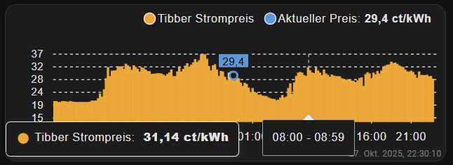
Let’s say the threshold in sensor.priceThreshold is 23 Cents. How can I achieve to look the chart something like in the frontend of my EV-Charger:
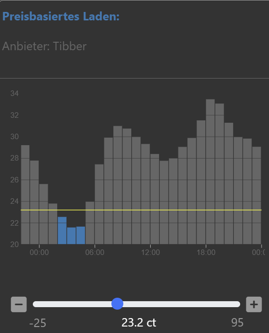
Additionally I need this horizontal line indicating the threshold.
Thanks for your help in advance