Hello, I write this code:
type: custom:apexcharts-card
apex_config:
  plotOptions:
    bar:
      horizontal: false
      columnWidth: 50%
      dataLabels:
        position: top
  tooltip:
    enabled: false
  yaxis:
    min: 0
    decimalsInFloat: 0
    title:
      text: kWh
  xaxis:
    type: category
    categories:
      - Dic-Gen
      - Feb-Mar
      - Apr-Mag
      - Giu-Lug
      - Ago-Set
      - Ott-Nov
  stroke:
    show: true
    width: 2
    curve: smooth
  chart:
    height: 140%
    type: bar
  legend:
    show: false
    showForSingleSeries: true
    horizontalAlign: right
    position: top
  dataLabels:
    offsetY: 7
    style:
      fontSize: 11px
      colors:
        - "#000"
    background:
      enabled: true
      borderColor: "#fff"
      borderWidth: 2
      borderRadius: 2
      opacity: 0.4
      foreColor: "#ccccff"
      dropShadow:
        enabled: true
        top: 2
        left: 2
        blur: 1
        color: "#000000"
        opacity: 0.5
  fill:
    type: gradient
    gradient:
      type: horizontal
      shadeIntensity: 0.1
      opacityFrom: 0.25
      opacityTo: 1
      inverseColors: true
      stops:
        - 0
        - 90
        - 100
header:
  show: true
  title: Consumo bimestrale
series:
  - type: column
    color: green
    show:
      datalabels: true
    name: Consumi
    entity: sensor.consumo_bimestrale_serie
    data_generator: >
      const arr = entity.state.replace(/[\[\]]/g,"").split(',').map(x =>
      Number(x.trim()));

      const categories =
      ["Dic-Gen","Feb-Mar","Apr-Mag","Giu-Lug","Ago-Set","Ott-Nov"];

      return arr.map((v,i) => ({ x: categories[i], y:v }));
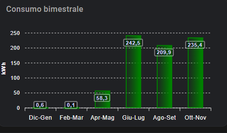
And I get this apex chart:
But I’d like two decimals on labels for every bar. I tried many methods but no-one worked.