Apexcharts bar-chart now line problem

I got a problem where the now: line is 12 hours too far ahead

type: custom:apexcharts-card
graph_span: 144h
span:
  start: day
now:
  show: true
  label: Now
  color: "#ff0000"
header:
  show: true
  title: Solar production forecast (7 days)
apex_config:
  chart:
    height: 260
    type: bar
  plotOptions:
    bar:
      columnWidth: 80%
  xaxis:
    type: datetime
    labels:
      format: ddd
      show: true
series:
  - entity: sensor.solar_forecast
    name: Forecast
    unit: KWh
    type: column
    color: "#ff9800"
    data_generator: >
      if (!entity || !entity.attributes) return []; const d = new Date();
      d.setHours(0, 0, 0, 0);
      const startTime = d.getTime(); const dayLen = 24 * 60 * 60 * 1000;

      const getVal = (val) => (val !== undefined && val !== null) ? parseFloat(val)/1000.0 : 0;

      return [
        [startTime, getVal(entity.attributes.day_0)],
        [startTime + 1 * dayLen, getVal(entity.attributes.day_1)],
        [startTime + 2 * dayLen, getVal(entity.attributes.day_2)],
        [startTime + 3 * dayLen, getVal(entity.attributes.day_3)],
        [startTime + 4 * dayLen, getVal(entity.attributes.day_4)],
        [startTime + 5 * dayLen, getVal(entity.attributes.day_5)],
        [startTime + 6 * dayLen, getVal(entity.attributes.day_6)]
      ];

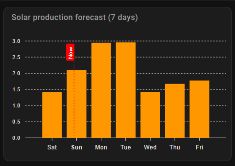
I have tried to use offsets to move the line, without luck, managed to get the data to be the right place according to the line, but then there is a large empty space to the left in the chart.

Any suggestions to how I can get Now to actually indicate now?

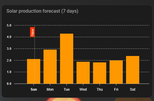
Now is being plotted at ‘now’. You just have your data plotted at midnight, not the middle of the day at 12:00.

Using d.setHours(0, 0, 0) puts the plot time at midnight. Try d.setHours(12,0,0).

If, then, you don’t like having the label ‘Sat’ at 00:00 (which is correctly the start of the day) then you will have to leave the label at 00:00, and the data at 00:00, and then plot your own ‘now’ 12 hours earlier than it really is.

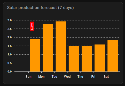
If you turn off the in-built ‘now’ (set ‘show’ to false) you can easily add your own annotation 12 hours earlier than it really is

apex_config:
  annotations:
    xaxis:
      - x: EVAL:Date.now()-(12*60*60*1000)
        label:
          text: Now
          position: top
          borderWidth: 1

Thank you for your suggestion. I tried the annotation, but if I use (12*60*60*1000) the line disappear.

Using d.setHours(12, 0, 0, 0); makes the line be at the right position, but instead there is a blank space in the left side of the chart.


I can offset the text underneath the bars so they are under the corresponding bar, but I haven’t found a way to get rid of the empty space.

You have 7 days in your graph, try with set start: day -1

A negative offset makes the space larger, a positive offset makes the space smaller.
The problem there is that as soon as I put a positive offset in, the name for the current day disappear.

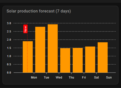
Getting exactly what you want in an Apex Chart graph is often a matter of experimenting and making adjustments with several of the various settings. The one you probably need now is span ‘offset’ which shifts the anchor point of the graph start.

I don’t have your sensor, so I made the data up. I have set the graph_span to 6 days, set the span start to ‘day’ and added an offset of -2 hours. This setting often requires experimentation to get the graph and the x-axis labels to show what you wish.

For myself, the annotation works perfectly, and adds a new ‘now’ line, leaving the label plotted at midnight, and the data plotted at midnight, and the “now” line showing at an arguably more appropriate point in the ‘day’ (it now being 10:30 in the morning for me)

type: custom:apexcharts-card
graph_span: 6d
span:
  start: day
  offset: "-2h"
now:
  show: false
  label: Now
  color: "#ff0000"
header:
  show: true
  title: Solar production forecast (7 days)
apex_config:
  annotations:
    xaxis:
      - x: EVAL:Date.now()-(12*60*60*1000)
        label:
          text: Now
          position: top
          borderWidth: 1
  chart:
    height: 260
    type: bar
  plotOptions:
    bar:
      columnWidth: 80%
  xaxis:
    type: datetime
    labels:
      format: ddd
      show: true
series:
  - entity: sensor.forecast_home_hourly
    name: Forecast
    unit: KWh
    type: column
    color: "#ff9800"
    data_generator: >
      const d = new Date(); d.setHours(0, 0, 0); const startTime = d.getTime();
      const dayLen = 24 * 60 * 60 * 1000;

      let getVal = (val) => (val !== undefined && val !== null) ?
      parseFloat(val)/1000.0 : 0;

      return [
        [startTime, getVal(6)],
        [startTime + 1 * dayLen, getVal(1)],
        [startTime + 2 * dayLen, getVal(2)],
        [startTime + 3 * dayLen, getVal(3)],
        [startTime + 4 * dayLen, getVal(4)],
        [startTime + 5 * dayLen, getVal(5)],
        [startTime + 6 * dayLen, getVal(6)]
      ];

2 Likes

That did it! :partying_face:

Only problem left now is to make the annoration red. I expected color: to do it, but nothing happened.

After looking a bit at annotations – ApexCharts.js I tried some of the references from there, and borderColor: changed the color of the border, but fillColor: had no effect.

<s>apex_config</s>
<s>now:</s>
<s>     show: true</s>
<s>     color: "#8e24aa"</s>

Try this “red”

PS: the indention got fu when i CP

Edit: Nope, wont work in your Config :slight_smile: , not sure why you have the “Annotation-config” as in my "world, “now” is Now !

The extra apex configs are very tricky, and I find that most of them don’t always work.

We have switched off the standard included ‘now’ and we are doing our own annotation (the standard now conflicts with annotations, and we want to move ‘now’ by 12 hours as well).

Annotations have fillColour and borderColour options, and these apply firstly to the annotation line or area defined, then when used under “label” to the label text, and then when used under “style” to the label box itself.

I can’t get all of the options to work, however this does give a red-filled box for the label text. Quite why in most places a colour red is defined as ‘red’ or ‘#ff0000’ but in style I have to use just ‘#f00’ I have no idea. There comes a time when my patience for experimenting runs out and I need to stop.

        label:
          borderWidth: 1
          text: Now
          position: bottom
          style:
            background: "#f30"
            color: "#fff"

No idea why this works, but I get a red box with white text for the label…

1 Like

Why not move the “Bar”, so the bar is “between” Sun/Mon, sunday starts at 00 till 24, i prefer the Bar “inbetween” so the x-marker Sun is the breakpoint

Thank you!

This is exactly the look I was trying to achieve!

I spend most of the evening last night just trying to get it to show the bars correct, and when I finally got that, Now was out of position. :grimacing: Ending up running in circles with always one thing being off.

1 Like