I don’t think that is ever going to happen 
But don’t worry, for now, I have no plan to stop maintaining it and adding new features
5 Likes
I hope it is, it’s insanely superior to ChartJS which is used by Lovelace now.
It’s much more touch friendly.
And it also looks much nicer.
That did the trick, thank you!
Hi, just discovered this amazing card, thanks for making it!
I am trying to compare the energy consumption (here we have three different tariffs) of the current day (or week) and the current month.
To the moment I managed to configure two separate pie charts, with monthly and daily data:

Is there some way to have two (or more) concentric donut charts? (paintbrushed image attached)

I have the following code
type: 'custom:apexcharts-card'
header:
  show: true
  title: Humidity Trend Ensuite
  show_states: false
  colorize_states: true
graph_span: 24h
series:
  - entity: sensor.tmr01_htu21_humidity_ensuite
    name: HTU21
    type: line
    stroke_width: 2
  - entity: sensor.ensuite_humidity
    name: Xiaomi
    type: line
    stroke_width: 1
  - entity: switch.deta01_fan_ensuite
    transform: 'return x == ''on'' ? 1 : 0;'
    type: area
    curve: stepline
    stroke_width: 0
apex_config:
  yaxis:
    - show: true
      decimalsInFloat: 0
    - show: false
      decimalsInFloat: 0
      min: 0
      max: 1
      tickAmount: 1
  chart:
    width: 100%
    height: 313
This is a test to compare two humidity sensors. sensor.ensuite_humidity data comes in via MQTT and I see on MQTT.fx that data is submitted every 5 mins (Tasmota). I also see the correct humidity on the graph footer but can’t see the graph itself.

When I create a std sensor with entity sensor.ensuite_humidity in lovelace I see the graph.
Any idea why this is not plotting on ApexCharts?
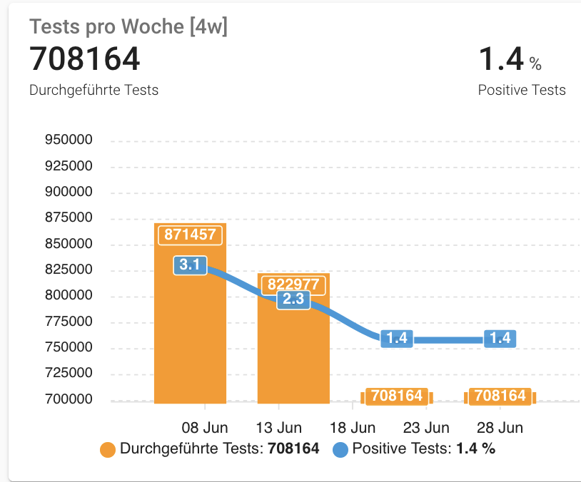
The total covid test sensor gives the number of tests done in a week and changes every Wednesday afternoon. I wonder how I could display the sensor with bars for the last 4 week. My history includes the last 32 days.
Here is my code, but that often (depending on the weekday) does not display the last four weeks (inlcuding the actual one):
type: custom:apexcharts-card
graph_span: 28d
update_interval: 1h
span:
  start: isoWeek
  offset: '-21d'
header:
  show: true
  title: Tests pro Woche [4w]
  show_states: true
apex_config:
  markers:
    size: 2
    colors: white
    strokeColors: black
    strokeWidth: 2
    hover:
      size: 7
  tooltip:
    x:
      format: ddd dd MMM
  yaxis:
    - id: first
      show: true
      forecNiceScale: true
      decimalsInFloat: 0
      opposite: false
      min: 700000
      max: 950000
    - id: second
      show: false
      tickAmount: 2
      decimalsInFloat: 0
      title:
        text: Thumbnails
      opposite: true
series:
  - entity: sensor.rki_covid_germany_tests_performedtests
    name: Durchgeführte Tests
    yaxis_id: first
    type: column
    group_by:
      func: last
      duration: 1w
    show:
      datalabels: true
  - entity: sensor.rki_covid_germany_tests_positivityrate
    name: Positive Tests
    yaxis_id: second
    type: line
    unit: '%'
    group_by:
      func: last
      duration: 1w
    show:
      datalabels: true
    extend_to_end: false
With that, a Friday’s result is what I expect. But on a Monday it looks like the right screenshot…

Hello all, quick question. I use one chart that has a mix of Area and line. When I use a gradient on the Area, the stroke width for the line isn’t honored.
If I remove the gradient then the stroke shows up on the line graph. Is there a setting I can use so that the opacity of the gradient doesnt affect the line graph?
The blue is area and the red is the line graph.

Any ideas on this? The data does flow into Home Assistant but it just doesn’t plot on ApexCharts. As mentioned when I create a std sensor with entity sensor.ensuite_humidity in lovelace (created via the mqtt platform) I see the graph.
You have 3 series and 2 yaxis, probably the reason.
Check the latest version’s documentation for native multi yaxis support.
I’m not sure I understand the problem (that is my understanding):
- Chart 1: 4 weeks displayed, from Monday 1st of June to Sunday 27th of June
- Chart 2: 4 weeks displayed, from Monday 8th of June to Sunday 4th of July:
- The current day being a Monday, it just takes the last value of the sensor (from the previous week) and use that for the current week
Since I don’t know what your data looks like, it’s hard to tell if something’s really wrong.
Without your config, it’s going to be hard to help ![]()
@RomRider here, is my config

type: custom:apexcharts-card
header:
  title: Tank Percent
  show: true
  show_states: true
show:
  loading: true
graph_span: 24h
apex_config:
  yaxis:
    - id: first
      max: 90
      min: 0
      forceNiceScale: true
      decimalsInFloat: 0
      opposite: false
    - id: second
      max: 60
      min: 0
      forceNiceScale: true
      decimalsInFloat: 0
      opposite: true
  xaxis:
    axisBorder:
      show: false
    labels:
      style:
        fontSize: 10px
        fontFamily: Segoe UI Light
  chart:
    height: 315
  grid:
    show: false
    borderColor: '#404040'
    strokeDashArray: 3
    position: back
  legend:
    show: false
  dataLabels:
    enabled: false
  fill:
    type: gradient
    gradient:
      type: vertical
      shadeIntensity: 0.8
      inverseColors: false
      opacityFrom: 0.6
      opacityTo: 0
      stops:
        - 0
series:
  - entity: sensor.400_gal_water_tank_level
    yaxis_id: first
    name: 400 gal Tanks
    type: area
    color: 2eb9ff
    stroke_width: 1
    group_by:
      func: avg
      duration: 5min
    float_precision: 0
    show:
      extremas: true
  - entity: sensor.wasa_line_pressure
    yaxis_id: second
    name: WASA Line Pressure
    type: line
    color: ff2e51
    stroke_width: 2
    group_by:
      func: avg
      duration: 5min
    float_precision: 0
    show:
      extremas: true
now:
  show: false
  color: 2eb9ff
  label: Now
style: |
  ha-card {
     --ha-card-background: rgba(0, 0, 0, 0);
     box-shadow: none;
     margin: 8px 0px 28px 8px;
     font-size: 15px;
     font-family: Segoe UI Light;
   }
   div#header__title {
     font-size: 10px;
   }
I may be off here but it seems you have duplicate entries here?
  yaxis:
    - show: true
      decimalsInFloat: 0
    - show: false
      decimalsInFloat: 0
Yep. Had to define it using yaxis: and refer to it via yaxis_id as per the example
How to Change Title Color in ApexCharts card?
I want to change title color in ApexCharts card because it is difficult to read title with dark theme.
Title color does not change even if I change the option colorized_states…

header:
  show: true
  title: Power consumption last 3 days
  show_states: false
  standard_format: false
  colorize_states: false
@RomRider… awesome card - thanks! Question about group_by… using group_by: 24h or group_by: 1d seems group data by the 24 hours preceding the current moment (as far as I can tell). Is there a way to make the buckets exacts days/dates (i.e. 12am to 12pm each day). I believe mini-graph uses a kind of group by “date” for this?
Try with:
  fill:
    type: ["gradient", "solid"]
    gradient:
      type: vertical
      shadeIntensity: 0.8
      inverseColors: false
      opacityFrom: 0.6
      opacityTo: 0
      stops:
        - 0
The title uses var(--secondary-text-color) for the color. If you want to change the color, you’ll have to use card-mod
Yes, using the span and start option (see documentation):
span:
  start: day # or hour for exemple
2 Likes
Here the export of the entity data from my history used for the bars.
What I would like to see is one bar per week but not with the same data for the actual week until the new value is there - which should be on Thursdays (or Wednesdays evening). Or in other words: Don’t display the bar starting Mon 28, till data for that week is available.
And even much better would be, if the scale instead of e.g. displaying Mon 14th shows Mon 7th, because the data got on a Wednesday shows the test done the week before. But that would be the jiker.
Thanks for this wonderful addon! I love the immense freedom in configurability it gives!
I’m having a tiny snag – I’m trying to configure tick amount for all y axes, but I’m unable to do so. I know I can do it when I have configurations for individual y axes, but I’d like to have one configuration point for all of my series:
type: custom:apexcharts-card
header:
  show: true
  show_states: true
  colorize_states: true
apex_config:
  grid:
    show: false
  legend:
    show: false
  tooltip:
    shared: true
  chart:
    height: 100px
  yaxis:
    apex_config:
      tickAmount: 2 # this has no effect
all_series_config:
  stroke_width: 2
  opacity: 0.8
series:
  - entity: sensor.bathroom_temperature_sensor_temperature
  - entity: sensor.temperature_sensor_2_temperature
  - entity: sensor.temperature_sensor_3_temperature
  - entity: sensor.temperature_sensor_4_temperature
And a second thing is that I haven’t seen shared: true working either. All my charts require me to hover over each individual line to see the value, which is not ideal:

hello can you post last worked code?
here you are:
type: custom:apexcharts-card
graph_span: 7d
cache: true
update_interval: 1hour
header:
  title: Assorbimento
  show: true
  show_states: true
  colorize_states: true
yaxis:
  - id: t
    min: 0
    max: 40
    apex_config:
      opposite: true
      forceNiceScale: false
      decimalsInFloat: 0
  - id: w
    min: 0
    max: 5500
    apex_config:
      forceNiceScale: false
      decimalsInFloat: 0
series:
  - entity: sensor.mqttpower
    yaxis_id: w
    type: column
    name: Mid
    group_by:
      func: avg
      duration: 1d
    color: orange
  - entity: sensor.mqttpower
    yaxis_id: w
    type: column
    name: Max
    group_by:
      func: max
      duration: 1d
    color: blue
  - entity: sensor.mqttpower
    yaxis_id: w
    type: column
    name: Min
    group_by:
      func: min
      duration: 1d
    color: green
  - entity: sensor.temp_ext_temp
    stroke_width: 3
    yaxis_id: t
    type: line
    name: Esterna
    group_by:
      func: avg
      duration: 1d
    color: red
apex_config:
  xaxis:
    labels:
      format: dd
      show: true
      showAlways: true
  chart:
    type: area
    height: 300
  legend:
    show: false
  dataLabels:
    enabled: false
    distributed: true