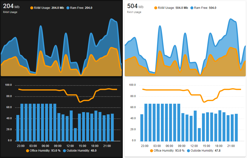
ApexCharts card - A highly customizable graph card

Hi folks,

I've built a new card to display some graphs in Lovelace :bar_chart::chart_with_upwards_trend:. It is in its early stage and is not meant to replace the mini-graph-card at all.

It gives some new possibilities to display data in Home-Assistant and has some extensive customizability.

It is based on ApexChartsJS, and you'll find all kind of examples of what you could build over here

Usage

  • stable releases documentation can be found here
  • beta/dev releases documentation can be found here


Please give it a try, you can build crazy stuff :slight_smile:

Roadmap

Not ordered by priority:

  • :white_check_mark: Support more types of charts (pie, radial, polar area at least)
  • :white_check_mark: Support for binary_sensors
  • :white_check_mark: Support for aggregating data with exact boundaries (ex: aggregating data with 1h could aggregate from 2:00:00am to 2:59:59am then 3:00:00am to 3:59:59 exactly, etc...)
  • :white_check_mark: Display the graph from start of day, week, month, ... with support for "up to now" or until the "end of the period"
  • :white_check_mark: Support for any number of Y-axis
  • Support for logarithmic
  • :white_check_mark: Support for state mapping for non-numerical state sensors
  • :white_check_mark: Support for simple color threshold (easier to understand/write than the ones provided natively by ApexCharts)
  • :white_check_mark: Support for graph configuration templates à la button-card
130 Likes
Lovelace: mini graph card
HomeWizard Energy (Wi-Fi P1 meter, kWh meter, Energy Socket and Water Meter)
More detailed charts?
Json data array to graph (bar)
Display future values in a graph
Lovelace: Button card
ApexCharts cards weekly or monthly
History-graph for thermometer
History graph show attribute
Is there any way for making weekly/monthly sensor graphs in lovelace?
Time gets somehow converted to numeric
Help with attribute_templates on a Custom Sensor
Lovelace: Swiper card
History graph for state_attr
Apexchart 2.1.2 issue
Community Highlights: 10th edition
How to change line colour in lovelace history graph
Graph from midnight to midnight instead of last 24 hrs?
EMHASS: An Energy Management for Home Assistant
ApexCharts Question about graph
Problem: Apexcharts-card does not display dataLabels
Best lovelace card for graphing sleep?
Statistics Graph
REST API command/platform fails on POST to external URL (solcast)
Set graph axis range on history graph?
History graph with more options
Unit for temperature is % rather than °F when graphed
Stacked bar graph
24h precipitation forecast / 24u buienradar buienalarm
🔹 Card-mod - Add css styles to any lovelace card
Airtouch 4 integration (AUS)
Floorplan UI with Color synced lights
History-graph Alternative
Graph that layers solar production of x days on top of each other?
Is there a pie or doughnut chart that works?
Triple Gauge
Show off your favourite dashboard creations!
ApexChart not displaying correctly. Monthly Offset Issue
Apex Charts: Horizontal lines, Tooltips and Legends challenge
Lovelace: mini graph card
Is there a pie-graph available somehow?
Count switches of binary sensor
Lovelace: mini graph card
Looking for a card to display forecasted value data against time
Guage card for multiple entities
Energy Dashboard use Wh instead of kWh
History: Make all times line up on the history page for easy comparison
What is the best approach to create history_stats for the last 7 days but showed by each day seperate without enormous amounts of code?
A different take on designing a Lovelace UI
Lovelace: Flipdown Timer card
Graphing question
Energy Consumption Aggregated Per Day?
How to just show actual value in history chart?
Statistics-Graph and utility_meter sensors
Lovelace: mini graph card
Count state change from sensor
Mushroom Cards - Build a beautiful dashboard easily 🍄 (Part 1)
Changing Graph Scale
Display data for the future in a card
Creating forward looking charts
Create a sensor for gas consumption
Solcast Global Solar Power Forecast Integration
Apex Chart - Help with scaling
Not Sure How Apex Chart "Statistics" Function
Templates in Lovelace dashboard?
🔹 Card-mod - Add css styles to any lovelace card
How to hide entity-name in apexchart-card
Y-axis caption for ApexCharts
Amber Electric (Australia) Custom Component
Using Maria DB for Long Term Statistics
Multiple energy dashboards for several buildings
SQL to insert missing statistics rows
ApexCharts suddenly displays more than 10 significant digits crowding out graph
Configurable colours in History graphs
ApexCharts update to V2.1.2 Breaks - max: auto
Newbie with error messages
A problem with a display that the system is not in the English language
Any Apex Charts experts out there?
Apexchart offset depending on boolean
Make a chunky card smaller - general, or specific way?
Apexchart card – dynamic maximum for yaxis
Apexcharts-card stacked area chart will not stack

Love it! Thanks.

ok so… How do I define a =header? If I set header to true it uses the first sensor name and value?
Can I change the colour of the lines?
image

Yes, for now. Did you want to define a title instead?

Not yet, but it’s coming, very soon :blush:

Best way for me to track the requests is to open them on Github. You’ll automatically be notified once released in beta and stable. :blush:

Yes define a title… is that an option? Like your traffic sources…

It’s not yet possible but I’ll add it. Would you mind opening the 2 feature requests on GH? I’ll work on this tomorrow. It should be released by the end the day for me tomorrow (CET timezone)

1 Like

yep will do right now
DONE

1 Like

This is amazing, Thanks alot! :tada:


This is a browser_mod popup.

            tap_action:
              action: call-service
              service: browser_mod.popup
              service_data:
                title: Leistungswerte
                style:
                  .: |
                    :host .content {
                      width: 80em;
                    }
                card:
                  type: custom:apexcharts-card
                  header:
                    show: false
                  apex_config:
                    chart:
                      height: 450
                    stroke:
                      width: 2
                      curve: smooth
                  series:
                    - entity: sensor.e3dc_battery_power
                      name: Batterie
                      group_by:
                        func: avg
                        duration: 5min
                    - entity: sensor.e3dc_house_power
                      name: Haus
                      group_by:
                        func: avg
                        duration: 5min
                    - entity: sensor.e3dc_net_power
                      name: Netz
                      group_by:
                        func: avg
                        duration: 5min
                    - entity: sensor.e3dc_pv_total
                      name: PV
                      group_by:
                        func: avg
                        duration: 5min
                deviceID:
                  - this

Waiting for colors support. :slightly_smiling_face:

9 Likes

Nicely done. Can’t wait for the time line boundaries. Should help in troubleshooting my update problems on the OS from 5.2 to 5.10. I should be able to see what is going on when my Pi4 freezes.

Installed.
I am missing the ability to change line width,
I’ll keep testing!

Here is an example that might help:

  - type: custom:apexcharts-card
    header:
      show: false
    series: 
    - entity: sensor.backyard_govee_temperature
    - entity: sensor.backyard_sensor_temperature
    - entity: sensor.backyard_atc_mi_temperature
      curve: straight
    update_interval: 30s
    hours_to_show: 24
    cache: true
    apex_config:
      stroke: {
          show: true,
          width: 1
      }

You can change the line width. See just above

type: custom:apexchart-card
series:
  - ...
apex_config:
  stroke:
    width: 2  # Change to your liking
1 Like

Just for general knowledge:
This:

    apex_config:
      stroke: {
          show: true,
          width: 1
      }

Is the same as this:

    apex_config:
      stroke:
        show: true
        width: 1
4 Likes

1.1.0 (2021-01-26)

:warning: BREAKING CHANGES

  • Replace hours_to_show with graph_span. Takes a time string instead of a number of hours.

Features

  • Replace hours_to_show with graph_span. Takes a time string instead of a number of hours. (e7ed408)
  • color: Define your own color option for each serie (#7) (3a15db2), closes #4
  • header: More header options and title support (#8) (2cbd769), closes #5
  • Add update_interval config option (357db9a), closes #2

Bug Fixes

  • tooltip: Values where following the selected point (0145ca2)
  • Error was not displayed if duration couldn’t be parsed (2e2212f)
  • Name and units displayed (fe5526b)

Documentation

  • Add examples and fix documentation (c71b76a)
  • Fix typos and broken links (7789b8f)

Chores

  • changelog: Add doc and chores sections (58d7f5f)
  • release: 1.1.0-dev.1 [skip ci] (e15f7b9), closes #2
  • release: 1.1.0-dev.2 [skip ci] (f01afd7), closes #4 #5
5 Likes

This is released in beta. Feedback welcome :slight_smile: Check the README in the dev branch for updated documentation.

1 Like

Love this already… Kudos!

1 Like

Thanks for this incredible work!

I love this card!

1 Like

It woks. Now is there a simple way to load a specific time range? I.E yesterday at 3PM to 5PM. What I see for the current code is a offset from the current time (which is always changing as the time is changing). Not sure how many people need this but there are times I want to see my history at a known time.

For yesterday 3pm to 5pm you can do it this way:

graph_span: 2h # 2h from 3pm = 5pm
span:
  start: day # from midnight this morning
  offset: -9h # from midnight this morning minus 9h = 3pm yesterday
1 Like

Got it. Thanks.