Any idea how to force my chart Y axis to always start at zero?

Guys need help here.
I am trying to plot apex graph with this code and got error:
Entity not available: nordpool_kwh_oslo_nok_3_10_025
Entity not available: nordpool_kwh_oslo_nok_3_10_025
This is the code:
type: custom:apexcharts-card
header:
  show: true
  title: Nordpool Prize -> 48 hours
  show_states: false
graph_span: 2d
span:
  start: day
series:
  - entity: nordpool_kwh_oslo_nok_3_10_025
    name: Today
    data_generator: |
      return entity.attributes.raw_today.map((entry) => {
        return [new Date(entry.start), entry.value];
      });
    type: column
    show:
      legend_value: false
      in_header: false
    extend_to: end
  - entity: nordpool_kwh_oslo_nok_3_10_025
    name: Tomorrow
    data_generator: |
      return entity.attributes.raw_tomorrow.map((entry) => {
        return [new Date(entry.start), entry.value];
      });
    type: column
    show:
      legend_value: false
      in_header: false
What am I doing wrong?
Entity IS available and I use it in some other chart.
Shouldn’t it be sensor.nordpool_kwh_oslo_nok_3_10_025 rather than just nordpool_kwh_oslo_nok_3_10_025?
1 Like
Hi Mirek and thank you for help.
I figure it out last night and everything set in place. Have had both today and tomorrow prices. But since this morning, I got just today price for some reason…
When using long term statistics I can’t get Apex to show the current month, only previous months. So now in September the chart shows data until end of august, and I wouild like the numbers for September (so far to be shown in the graph. Has anyone been able to solve that?

graph_span: 32w
update_interval: 5min
series:
  - entity: sensor.last_meter_consumption_vagen
    name: ' '
    type: column
    color: 2eb9ff
    statistics:
      type: sum
      period: month
      align: middle
    group_by:
      func: diff
      duration: 4w
      fill: last
      start_with_last: true
2 Likes
Some time ago I tried and failed to embed apexchart into custom button card in a way to fill button card without any margins.
That time I was asking in several places for help but got no answer. Few days ago I decided to do another go and finally, I managed to achieve it myself. Hope it will help others.
There are two crucial things to remember:
- the parent element which contains the chart, must have set
displayCSS property toblockallowing ApexChart (not the card) to know the wrapping element size. In HA scope it’s display is often set to flex. - in order to remove completely various elements allocating space around the graph,
sparkline: enabled: truehas to be set in ApexChart config (not the card).
Hope it help others
Here is the result:

And the code:
    - type: custom:button-card
      template: customcard_31wrapper
      custom_fields:
        graph:
          card:
            type: custom:apexcharts-card
            style: |
              }
              ha-card .apexcharts-legend-text {
                color: var(--tile-state-text-color, rgba(0, 0, 0, 0.4)) !important;
                font-size: 14px !important
              }
            hours_12: false
            graph_span: 72h
            apex_config:
              chart:
                sparkline:
                  enabled: true
              legend:
                position: top
                floating: false
              grid:
                show: false
            yaxis:
              - id: temp
                min: ~0
                max: ~35
                show: false
              - id: hum
                show: false
                min: ~0
                max: ~90
            series:
              - entity: sensor.childroom_temperature
                yaxis_id: temp
                color: var(--accent-color)
                name: temp
                stroke_width: 1
                type: area
                opacity: 0.2
              - entity: climate.trv_childroom
                transform: return entity.attributes.temperature
                yaxis_id: temp
                color: var(--accent-color)
                name: target
                stroke_width: 1
                type: line
                opacity: 0.2
              - entity: sensor.childroom_humidity
                yaxis_id: hum
                color: '#3498db'
                name: hum
                stroke_width: 1
                type: area
                opacity: 0.1
and button card templates used in the snippet above:
  customcard_style:
    styles:
      card:
        - padding: 10px
        - padding-top: 3px
        - padding-bottom: 3px
        - box-shadow: rgba(0, 0, 0, 0.3) 0px 1px 3px 0px
        - border-radius: var(--ha-card-border-radius, 12px)
        - user-select: none
      name:
        - justify-self: start
        - padding-left: 0px
        - font-weight: 500
        - font-size: 14px
        - align-self: middle
        - padding-top: 20px
      img_cell:
        - justify-content: start
        - align-items: start
        - margin: none
      icon:
        - margin-top: 5px
        - width: 30px
        - height: 30px
  customcard_31wrapper:
    template: customcard_style
    aspect_ratio: 3/1
    variables:
      entity_temp: ''
      entity_hum: ''
    styles:
      card:
        - padding: 0px
      grid:
        - grid-template-areas: '"graph"'
        - grid-template-columns: 1fr
        - grid-template-rows: 1fr
      custom_fields:
        graph:
          - padding: 0px
          - margin: 0px
          - align-items: end
3 Likes
Is it possible to plot a point every time a sensor changes?
I track my mileage between charges on my ev. This value is set every time the EV is plugged in. This might be often or might be not so often. No set schedule.
Right now my graph is covered over a period of time and the value is tracked daily which isn’t what I want.
Question from a ApexCharts noob. I would like to color my thresholds using a state, like the example below. Is this supporded and if so, what would that syntax for that be?
color_threshold:
  - value: 2
    color: midnightblue
  - value: { { states('sensor.mysensor) } }
    color: steelblue
And/or is it possible to achieve this using an state_attr?
Wouldn’t be every 30m or 1h often enough?
I don’t think so, for example
01/01 = 80
07/01 = 75
10/01 = 25
20/01 = 100
The sensor value stays the same until it’s changed. I would want the 4 points above plotted but instead I get 7 points at 80 then 3 at 75 and then 10 at 25 and so on….
Does someone know how to have sensor value as well as the mean over 7 days of that sensor value in the same graph?
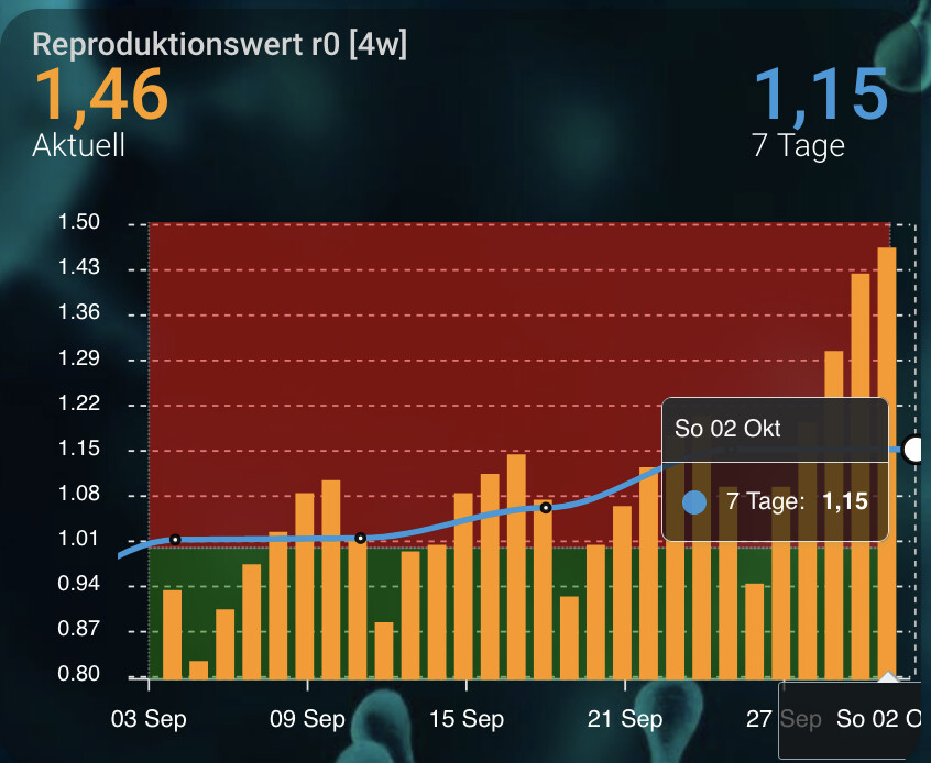
Here my config:
type: custom:apexcharts-card
card_mod:
  class: top-level-graph
graph_span: 28d
span:
  end: day
header:
  show: true
  title: Reproduktionswert r0 [4w]
  show_states: true
  colorize_states: true
yaxis:
  - align_to: 0.1
    decimals: 2
apex_config:
  yaxis:
    forceNiceScale: true
  markers:
    size: 2
    colors: white
    strokeColors: black
    strokeWidth: 2
    hover:
      size: 7
  stroke:
    width: 3
  annotations:
    position: back
    yaxis:
      - 'y': 0
        y2: 1
        fillColor: green
        opacity: 0.5
      - 'y': 1
        y2: 50
        fillColor: red
        opacity: 0.5
  legend:
    show: false
  tooltip:
    x:
      format: ddd dd MMM
series:
  - entity: sensor.rki_covid_germany_r7
    type: column
    float_precision: 2
    name: Aktuell
    group_by:
      func: last
      duration: 1d
  - entity: sensor.rki_covid_germany_r7
    type: line
    float_precision: 2
    name: 7 Tage
    group_by:
      func: avg
      duration: 7d
style: |
  ha-card {
    font-size: 20px;
  }
But with that, I see a value for tomorrow and it displays only one value every 7 days but not the 7 day mean for all days.
I eventually managed to solve it myself. Just add another sensor with the correct attribute/value and hide it from the chart.
header:
  show_states: true

series:
  - entity: sensor.nordpool_kwh_se3_sek_0_10_0
    name: Timpris just nu
    color: orange
    type: column
    show:
      in_chart: false
I would love this as well. The energy dashboard uses it for the tracked device chart. I don’t think we can apply that style yet though.
1 Like
Hey! I have a montly utility meter that resets each month. How could I get this to show montly usage in Apex Chart?
Thanks!
2 Likes
Hi, Nice graphs. How do you get the max and min values marks?
Thanks 
Take a look at “extremas” here:
1 Like
I set my ac cooling state as represented with the blue lines to 70 for each time its cooling with this
transform: ‘return x === ‘‘cooling’’ ? 70 : 0;’.
how can I represent the blue lines to equal the current temperature of? so instead of the on off states set to 70 no matter what, I would like it to match the current temperature.
could someone guide me

type: custom:apexcharts-card
update_delay: 3s
update_interval: 1min
apex_config:
  chart:
    height: 250px
    yaxis:
      - id: first
        opposite: true
      - id: second
now:
  show: true
  label: Now
  color: red
graph_span: 1d
series:
  - entity: climate.lyricstat3db4c9
    attribute: current_temperature
    stroke_width: 3
    curve: stepline
    color: rgb(125, 0, 250)
    yaxis_id: first
    type: area
    opacity: 0.1
    show:
      extremas: true
  - entity: climate.lyricstat3db518
    attribute: current_temperature
    stroke_width: 3
    curve: stepline
    color: rgb(69, 0, 196)
    yaxis_id: second
    type: area
    opacity: 0.1
    show:
      extremas: true
  - entity: climate.lyricstat3db4c9
    attribute: hvac_action
    transform: return entity.attributes.current_temperature
    stroke_width: 1
    color: rgb(157, 154, 252)
    type: column
    show:
      legend_value: false
  - entity: climate.lyricstat3db4c9
    attribute: hvac_action
    transform: 'return x === ''heating'' ? 70 : 0;'
    stroke_width: 1
    color: rgb(252, 154, 154)
    type: column
    show:
      legend_value: false
yaxis:
  - min: 60
    max: 80

Thank you!
Much appreciated.
I copied the “Now” feature and it works but only copying “extremas: true” didn’t change anything. Maybe it will come later when the data is actually updated?
Hello everyone,
I would like to fill the area underneath a line but I would like it to only be filled until it hits the next line below it.
Can this be done?
Our do I need to create two areas (one below each line so the lower line’s area prevents the upper line’s area from showing)?
So here the area underneath the yellow line should remain empty:

Thank you 
Hi!
I’m playing around with my own energy usage graph and found one strange issue. I want to use a stacked bar graph but the stacking doesn’t work as intended, it’s missing some values!
The strange thing is that for my hourly usage it seems to work, but not for my daily graph.
Look here:

For example, “Freezer” is missing in the daily graph.
Here is the configuration:
type: custom:apexcharts-card
graph_span: 2days
stacked: true
header:
  show: true
  title: Daily Energy Usage
  show_states: false
all_series_config:
  type: column
  group_by:
    func: last
    duration: 1day
series:
  - entity: sensor.computer_desk_daily_energy
    name: Workdesk
  - entity: sensor.washing_machine_daily_energy
    name: Washingm
  - entity: sensor.dishwasher_daily_energy
    name: Dishw
  - entity: sensor.fridge_and_freezer_daily_energy
    name: Freezer
  - entity: sensor.heatpump_hallway_daily_energy
    name: Heat Ds
  - entity: sensor.heatpump_livingroom_daily_energy
    name: Heat us
  - entity: sensor.it_network_daily_energy
    name: IT Netw
  - entity: sensor.kitchen_media_daily_energy
    name: Kitchen media
  - entity: sensor.media_bench_daily_energy
    name: Livingr meadia
  - entity: sensor.ps4_setup_daily_energy
    name: PS4 setup
  - entity: sensor.drying_machine_daily_energy
    name: Dryer
  - entity: sensor.unknown_energy_daily
    name: Other
Anyone have a clue?
EDIT: Found it, for some unknown reason, my hourly utility meters were set to 0 when created but not all of the daily ones (was N/A). Using the utility meter calibration service setting the N/A values to 0 fixed the problem.
1 Like