Thanks, works perfect ![]()
Can anyone help me?
hi,
i am trying to generate a graph with fixed paired values
i tried this code
type: custom:apexcharts-card
series:
  - entity: sensor.bayesian_prob
    data_generator: |
      [[10, 4.99], [11, 1.41], [12, 4.96]];
but it does not work ( it display a blank graph with “loading” )
could someone give me an example of what a fixed Numeric Paired Values in two-dimensional array would look like ?
Hello,
I would like to display a share of energy consumption by different devices. While not all devices are monitored, I measure total consumption generated by the whole house.
All values are handled by Riements integral sensors (so their values increase to infinity)
I managed (I hope so) to render the view of those sensors using group_by/diff method. But don’t know how to easily calculate “the rest” which should equal total consumption reduced by consumption of measured individual devices.
Is there some convenient method to achieve that?

type: custom:apexcharts-card
chart_type: pie
header:
  show: true
  title: ApexCharts-Card
  show_states: true
  colorize_states: true
all_series_config:
  group_by:
    func: diff
    duration: 1d
    start_with_last: true
series:
  - entity: sensor.network_components_power_consumption
  - entity: sensor.tv_power_consumption
  - entity: sensor.washing_machine_power_consumption
  - entity: sensor.total_electric_consumption
I get this also
maybe with transform:
something like :
          series:
  - entity: sensor.network_components_power_consumption
  - entity: sensor.tv_power_consumption
  - entity: sensor.washing_machine_power_consumption
  - entity: sensor.total_electric_consumption
    transform: "return x - hass.states['sensor.network_components_power_consumption'].state - hass.states['sensor.tv_power_consumption'].state - hass.states['sensor.washing_machine_power_consumption'].state;"
wouldn’t now how to in the apexcharts, but why not create a template sensor for that? (supposing you have a smart meter and have your net power consumption on that?)
or use the sankey chart card that has an option to show ‘all the rest’… but that too ofc needs the smart meter sensor for total power consumption
I can’t figure out how to create a chart that :
- Display a curve for the living room temp

- Display temp threshold for my thermostst
- Fill the area underneath the temperature curve, when the heater is working

Here’s how I’d like the whole thing to look (taken from a standard hisotry-graph-chart)

With the help of transform, I did manage to end up with something similar if I plot the whole area on a secondary y-axis :
I was hoping to achieve a better look though.
Any idea on how to do this ? Thanks for any help you can provide 
I would suggest checking out the powercalc integration. This allows grouping and create virtual (for instance lights that do not have metering) energy and power devices. Then create a sensor that subtracts all powercalc group from total usage (like @Mariusthvdb also suggests). Add that sensor to the pie chart.
Mine is below (still a bit messy). In my case “delta energy” is the sensor I made myself:

1 Like
I was thinking about this. The complex thing is that mentioned sensors don’t provide the final value. The value is always calculated from those sensors as a delta between the first and the last value from a defined time period (see group_by)
It would be great if transform provide access to the last values from all defined axes. Then it would be doable in the way you proposed. But I didn’t find this in docs.
Yes, I was thinking about this as a last resort. I was hoping for a way provided by charts themselves (like one discussed a few lines above)
I will definitely do.
Thank you all of you for suggestions
Thanks! Do you also have the grid_chart template?
config_templates: grid_chart
Has anyone been able to get 24h display of the time in the “now” popup. Graph is showing 19:00 but “now” is showing 07:00 


Can’t find anything in my code that forces the 24h display.
Thanks for your reply, it made me test something and now it works 
apex_config:
  forceNiceScale: true
  tooltip:
    enabled: true
    x:
      format: H:mm
Does someone know how to scale the yaxis (i.e. divide by a constant).
I know, that I could do some math on the displayed sensor values, but I haven’t found a way to manipulate the yaxis.
In this example, it’s number of days and I would like to see i.e. 6a … for the yaxis.

Ok, and I guess you never found out the root cause?
I filed a future request for ApexCharts to open access to the current value of other series in the transform method. Hope it will be found useful.
This is ingenious. Thank you
Meanwhile found this post and derived this solution:
yaxis:
  - align_to: 365
    decimals: 2
    apex_config:
      tickAmount: 4
      labels:
        style:
          fontSize: 15px
          fontWeight: normal
          colors: rgb(150,150,150)
        formatter: |
          EVAL:v => `${(v/365).toFixed(2)} a`

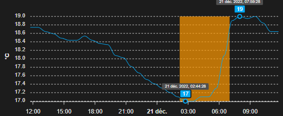
Is there a way to show markers for arbitrary data points on a time series line graph? Like the extrema but for any particular given x value.
I’ve been mucking around with
apex_config:
  annotations:
    points:
        - x: ${new Date(states["sensor.myradar_daily_mintime"].state).getTime()}
          y: ${ states["sensor.myradar_daily_min"].state }
          marker:
            size: 5
            shape: circle
but not having much luck. Do I need to create a second scatter series for any points that I’m interested in?
this charts looks amazing maybe you can share your config?