ApexCharts card - A highly customizable graph card

Is it possible to change the colour depending on value ?

I have this

YAML:

series:
        - entity: sensor.p1_meter_5c2faf04a1f2_active_power
          name: Actueel verbruik
          color: >
            [[[
              let state =  states['sensor.p1_meter_5c2faf04a1f2_active_power'].state
              if(parseFloat(state) > 0 ){
                return 'red' }
              return 'rgb(30,227,137)'
            ]]]      
          float_precision: 0

but that’s changing the whole chart from green to red :frowning:

            color_threshold:
1 Like

Well, you r right, spite you “deleted” your commend … but 1 you didn’t show your whole code, who would have guessed you had line-series, and 2. that you seems to want “gradient” … no mind-readers here :wink:

PS: Use area instead of line

I became special colours and dit not know what was wrong. but in all series config there was also color threshold defined…

all i am looking now is how to show the last hour …

Is this not possible with gradient then ? (because you mention this)

all_series_config:
        type: area
        curve: smooth
        stroke_width: 2
        group_by:
          func: avg
          duration: 5min
        color_threshold:
          - value: 0
            color: rgb(30,227,137)
          - value: 1
            color: red
          - value: -4000
            color: red
      series:
        - entity: sensor.p1_meter_5c2faf04a1f2_active_power
          name: Actueel verbruik
          color: rgb(30,227,137)
          stroke_width: 0
          float_precision: 0
          extend_to: now          
      span:
        end: hour

ok, well i do think your thresholds are abit “odd” , did you copy/paste that from some example ?, without knowing what it means/do …

:face_with_hand_over_mouth:🫣 yes indeed. I just copy paste because it is to difficult for me

If you are good at scripting , your might be able to show the last hour of your line-chart in rainbow-colors, if you like

I will look a bit further for a solution

sure, some of the posts above might give you some inspirations to go on !

Yes, (sorry) you can have color_threshold as gradient, but not in columns-charts here apexcharts( i was tired in my head when i wrote it ) . It is like “color up until various thresholds” , i.e <7 (green) from 8>20(blue) from 21>XXX(red),

For area-charts , and line !. … But specific color as you mentioned for the “last” entry, there are 2 examples in above posts, to accomplice something like that.

example:( Threshold /Gradient ) area
treshold

Good day,
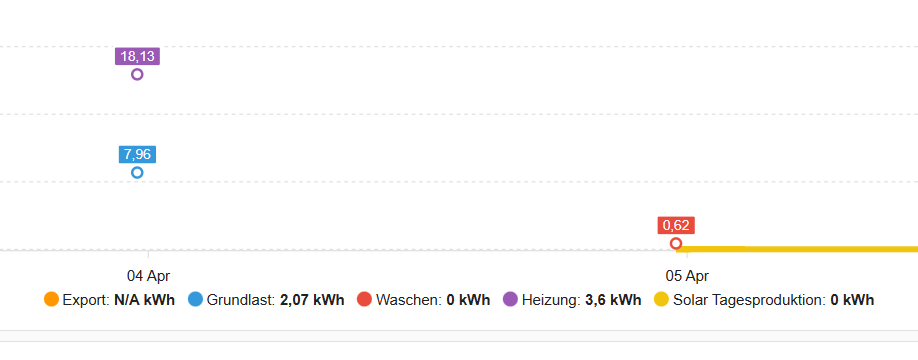
I have noticed that suddenly entities with state = 0 woudl end up with N/A information and do not show the graph at all. What could be the reason for that? Any help is appercaited. JJ

type: custom:apexcharts-card
header:
show: true
title: Energiebilanz
show_states: false
colorize_states: true
stacked: true
apex_config:
chart:
height: 350
zoom:
type: x
enabled: true
autoScaleYaxis: false
toolbar:
show: false
autoSelected: zoom
xaxis.type: datetime
series:

  • entity: sensor.energie_import_tagesverbrauch
    name: Import
    type: column
    group_by:
    func: last
    duration: 1d
    show:
    extremas: true
    float_precision: 2
  • entity: sensor.energie_eigenverbrauch_tag
    name: Eigenverbrauch
    type: column
    group_by:
    func: last
    duration: 1d
    show:
    extremas: true
    float_precision: 2
  • entity: sensor.energie_export_tag
    name: Export
    type: column
    group_by:
    func: last
    duration: 1d
    show:
    extremas: true
    float_precision: 2
  • entity: sensor.solar_tagesproduktion
    name: Solar
    type: line
    group_by:
    func: last
    duration: 1d
    show:
    extremas: true
    float_precision: 2
    graph_span: 6d
    span:
    end: day

Is it possible to emulate the Statistics Graph “sum” behaviour? The Statistics Graph starts at zero, but Apexcharts carries forward a non-zero value.

chart_type: line
period: hour
days_to_show: 2
type: statistics-graph
entities:
  - sensor.site_net_import_export_value
stat_types:
  - sum
title: Statistics Graph - Site Net Import Export
type: custom:apexcharts-card
chart_type: line
graph_span: 2d
header:
  show: true
  title: Net cost
  show_states: true
series:
  - entity: sensor.site_net_import_export_value
    type: column
    name: Net cost $
    statistics:
      type: sum
      period: hour

afbeelding

How do I get rid of the ugly yellow ? And is it possible to have the “291” in the actual color ?

prob set the stroke_width: 2 to 0 , but I want a line …

GitHub - RomRider/apexcharts-card: 📈 A Lovelace card to display advanced graphs and charts based on ApexChartsJS for Home Assistant :wink:

And yet another hint

https://apexcharts.com/docs/options/

Notice the search, in left menu, works similar as the search function in this forum :slight_smile:

I would like an action to take place when I click somewhere in the graph. I am studying the documentation on this, but I cannot get anything done. And since there is no debugging or logging (that I know of), I am stuck.
I am trying to call a service in home assistant, but nothing happens when I click the graph.
First question: the option is called tap_action. It is not really explained what that means. I am just assuming it is possible to click on one of the bars (I am using a type: column graph), and then something happens.
But nothing happens. I have also added the confirmation (to at least get any action) but nothing.

Any experience here with the tap_action option?

Never tried it but the documentation says header_actions so maybe you need to click the header?

Yeah, I figured that as well, but the header is not clickable. The columns in my bar graph change color when I move the mouse pointer over them, and if I click one of the bars/columns, it gets a different color.

I have an entity that contains electricity prices for today + tomorrow.

I plot these prices using

    data_generator: >
      return entity.attributes.data.map((entry, index) => { return [new
      Date(entry.start_time).getTime(), entry.price_eur_per_mwh]; }); 

How would you need to write the JS to limit the plot to only the prices for today?

Is there an issue with the stacked bar chart function for this card? It seems like they don’t actually stack but are in front of or behind the other.