Graph looks beautiful! do you mind sharing your Neerslag card code? Thank You
With 2023.9 release, weather forecast do not have forecast attributes any longer. Forecast data now are cached and can be retrieved via a service: weather.get_forecast.
I have no idea how to use this service to return data for apex, in my case, to display forecasted temperature in a graph, as well as forecasted rain volume and wind.
Below an example on how to populate a sensor by calling this service. Which I can use to store forecast data in a sensor as its attributes for sure… but this is not elegant nor would take advantage of data being cached. Any idea?
template:
  - trigger:
      - platform: time_pattern
        hours: /1
    action:
      - service: weather.get_forecast
        data:
          type: hourly
        target:
          entity_id: weather.home
        response_variable: hourly
    sensor:
      - name: Weather Forecast Hourly
        unique_id: weather_forecast_hourly
        state: "{{ now().isoformat() }}"
        attributes:
          forecast: "{{ hourly.forecast }}"
As wrote in my question this not elegant nor taking advantage of caching
hi wanted to share this beautiful radial bar chart I created using ApexCharts documentations Gradient Gauge Chart in React.js – ApexCharts.js
type: custom:apexcharts-card
header:
  show: false
chart_type: radialBar
apex_config:
  plotOptions:
    radialBar:
      startAngle: -135
      endAngle: 225
      hollow:
        margin: 0
        size: 70%
        background: '#fff'
        position: front
        dropShadow:
          enabled: true
          top: 3
          left: 0
          blur: 4
          opacity: 0.24
      dataLabels:
        name:
          offsetY: -25
          show: true
          color: '#888'
          fontSize: 17px
        value:
          color: '#111'
          fontSize: 36px
          show: true
          offsetY: 0
      track:
        background: '#fff'
        strokeWidth: 67%
        margin: 0
        dropShadow:
          enabled: true
          top: -3
          left: 0
          blur: 4
          opacity: 0.35
    background:
      enabled: true
  fill:
    type: gradient
    gradient:
      shadeIntensity: 1
      type: horizontal
      opacityFrom: 1
      opacityTo: 1
      colorStops:
        - offset: 0
          color: '#2adea8'
          opacity: 1
        - offset: 50
          color: '#4e8cd6'
          opacity: 1
  stroke:
    lineCap: round
  legend:
    show: false
series:
  - entity: sensor.bedroom_climate_humidity
    name: Humidity


official vs mine
11 Likes
The sensor code only showed half of it (browser issue with me). If you followed the large poll on keeping fc then you see plenty of people wanting to keep it. The technical reasons may all be valid but the end-user (,e/us) are stuck with card that are not up-to-date and apex/plotly that have no solution …and these highly will never have a solution as this is very sensor-specific.I am not sure why you would need / want cached data…I only need access to the data, dot-end, care to elaborate why cache is important to you?
If you have a smart technical solution or an evidence that service/cache cannot be retrieved please share it. We can discuss but personal opinion on breaking change due to 2023.9 is not what I am looking for 
I have none and again, I donot see any need for it neither are you presenting a reason for needing cached data…why make it complex if the solution is ‘simple’
How do you know this is complex? Please share.
What I mean is…you state to want to use cached data and I donot know why if you have the workaround available. To embed this event-drive collection in weather-specific cards is easy but I would not know why a generic tool as apex or plotly would provide this, not saying they would not…just not seeing the point
EDIT: I will stop this dicussion now as it has too many entries and is not reall apex specific imo  If others have ideas/opinion ??
1 Like
Hello
I want to do this :

with this configuration:
type: custom:apexcharts-card
hours_12: false
graph_span: 1d
header:
  show: true
  title: Power Source
  show_states: true
  colorize_states: true
all_series_config:
  show:
    extremas: true
series:
  - entity: sensor.onduleur_pv_watt
    name: Solar1
    type: area
    stroke_width: 2
    opacity: 0.1
    color: blue
    yaxis_id: watt
  - entity: sensor.pv2_charging_power
    name: Solar2
    type: area
    stroke_width: 2
    opacity: 0.1
    color: red
    yaxis_id: watt
  - entity: sensor.onduleur_conso_maison_watt
    name: Load
    curve: straigh
    stroke_width: 3
    color: rgb(255, 152, 82)
    yaxis_id: watt
  - entity: sun.sun
    transform: 'return x === ''below_horizon'' ? 1 : 0;'
    color: grey
    type: area
    curve: stepline
    opacity: 0.2
    stroke_width: 0
    yaxis_id: timeofday
    show:
      datalabels: false
      in_header: false
      extremas: false
  - entity: sensor.onduleur_batt_battery
    name: Charge
    type: area
    stroke_width: 2
    opacity: 0
    color: rgb(128, 128, 128)
    yaxis_id: pourcentage
    show:
      extremas: false
yaxis:
  - id: watt
    apex_config:
      labels:
        show: true
      axisBorder:
        show: true
      axisTicks:
        show: true
      title:
        text: kW
  - id: percent
    min: 0
    max: 100
    opposite: true
    apex_config:
      labels:
        show: true
      axisBorder:
        show: true
      axisTicks:
        show: true
      title:
        text: '%'
  - id: timeofday
    max: 0.1
    apex_config:
      labels:
        show: false
      axisBorder:
        show: false
      axisTicks:
        show: false
But I have this error:
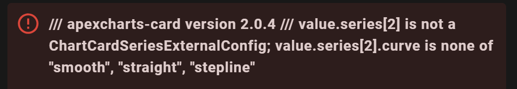
Any idea what’s wrong in my configuration ?
Thx
your config for the 3rd entity is
curve: straigh
looks like a simple typo, the “t” is missing,
Armin
Oh my god
noob error
An another error in this code :
yaxis_id: pourcentage
yaxis: percent
do not match
use:
yaxis_id: percentage
yaxis: percentage
How do i add a centered entity-value into a donut-chart?
I already have done it the “total” way, but this is not an entity ond for that reason no details are available.
type: custom:apexcharts-card
chart_type: donut
layout: minimal
color_list:
  - cornflowerblue
  - orange
header:
  show: true
  title: Verbrauch
  show_states: true
  colorize_states: true
series:
  - entity: sensor.daily_imported_energy
    show:
      legend_value: false
      datalabels: percent
    name: Netzbezug
  - entity: sensor.daily_direct_energy_consumption
    show:
      legend_value: false
      datalabels: percent
    name: Photovoltaik
apex_config:
  legend:
    show: false
  dataLabels:
    formatter: |
      EVAL:function(value) {
        return value.toFixed(0) + "%";
      }
  plotOptions:
    pie:
      startAngle: -120
      endAngle: 120
      donut:
        size: 55
        labels:
          show: true
          name:
            show: false
          total:
            show: true
            formatter: |
              EVAL:function(w) {
                return w.globals.seriesTotals.reduce((a, b) => {return a + b}, 0).toFixed(1).toLocaleString()+ " kWh";
              }
hello, I am still a little difficult with the X axis.
On the one hand I have set max:80 and it shows max60 and how do I get °C to my Y axis.
Thank you Andi
type: custom:apexcharts-card
header:
  show: false
  title: '---'
  show_states: true
  colorize_states: true
apex_config:
  yaxis:
    min: 0
    max: 80
    decimals: 0
graph_span: 10d
all_series_config:
  stroke_width: 1
  show:
    in_brush: true
    extremas: true
experimental:
  brush: true
series:
  - entity: sensor.sonoff_temperature
  - entity: sensor.aqara_temperature

Hi Team,
I would like to use the Apex Charts as I prefer the design over the built-in charts in HA. The issue I am experiencing is that some lines on a line chart are interrupted - this is not the case with the HA standard charts.

My configuration is:
type: custom:apexcharts-card
experimental:
  color_threshold: true
graph_span: 24h
series:
  - entity: sensor.spa_wifi_controller_spa_temp_c
    name: Current Temp.
    type: area
  - entity: sensor.spa_wifi_controller_spa_target_temp_c
    name: Target Temp.
    type: area
Does anybody know why that is and what can be done to fix it?
Thanks.
Look at the fill_raw options for the series, you’d probably want to use “last.” You’re missing data which is why you’re seeing “holes.” This will fix that and use the last known value to fill in the gaps (for the “last” option, there are others…). This won’t fix your missing data, it will still be missing in the database. This just makes it not show on the graph.
1 Like
Thank you. That did the trick.
Hello chart-addicts!
It seems I have a problem in at the same time defining yaxis “logarithmic” AND setting min/max AND forceNiceScale.
What I want to achieve: All of my energy consumers and the total consumption in ONE chart.
Migrating from OpenHab where I did my charts with influx and grafana I want to concentrate the charts with the built in database and cards.
the following code is faulty and does not set minimum or maximum range:
     yaxis:
        - max: 8000
          min: 100
          apex_config:
            logarithmic: true
            forceNiceScale: true
          decimals: 0
          opposite: true
It produces this:

but I want something like this:

I would appreciate a hint, what to do, to set min/max values with logarithmic scale. I found out, that max values sometimes are taken when they reflect the fitting logBase - but min values are somehow “immune”.
Second question: Is it possible to set the yaxis in a way, that it starts with “W” and changes to “kW” later.
Thank you for any tips.
It does for me. But the axis can only have 10^x as value. If you set e.g. max to 1000, it will cut-off at 1000.
The min cannot be changed, that is true. Not sure if that is a bug or intentional.
Is forceNiceScalestill working?
It does not seem to have an effect on my charts.
Example
    apex_config:
      yaxis:
        forceNiceScale: true
      markers:
        size: |-
          ${
            if (((states['input_datetime.end_datetime'].attributes.timestamp-states['input_datetime.start_datetime'].attributes.timestamp)/60/60).toFixed(2)<25)
              { '3' }
            else
              { '0' }
          }
        strokeWidth: 0
      legend:
        show: false
      grid:
        show: true
        position: front
        xaxis:
          lines:
            show: true
        yaxis:
          lines:
            show: true
        borderColor: darkgrey
        strokeDashArray: 1
        row:
          colors:
            - white
            - transparent
          opacity: 0.1
        logarithmic: true
      dropShadow:
        enabled: true
        color: green
        top: 18
        left: 7
        blur: 100
        opacity: 0.5
      dataLabels:
        enabled: true
    all_series_config:
      stroke_width: 2
      group_by:
        func: raw
      type: line
      opacity: 1
      curve: stepline
      fill_raw: last
      show:
        extremas: true
        datalabels: false
    chart_type: line
