Hi,
is it possible to refer (create a variable) to the state of another entity in the javascript section of data generator?
e.g.:
var test = states['sensor.time_water_plot'].state;
Hi,
is it possible to refer (create a variable) to the state of another entity in the javascript section of data generator?
e.g.:
var test = states['sensor.time_water_plot'].state;
Hello, I love the apex graph chart card, but i have run into a question. Currently my graph of body stats looks and functions how i want it, but i would like to add a sensor that displays a weight goal…the trouble is, that all entities currently displayed are ‘stacked’ and so if I were to add the weight goal entity, it stacks it in addition to the current weight.
Is there a way to overlay(?) this data without stacking it? Preferably I want just a simple green line over the top of the existing data to display a weight goal.

Here is my graph card.
type: custom:apexcharts-card
header:
  show: true
  title: Andrew Body Stats
  show_states: true
  colorize_states: true
all_series_config:
  type: area
  stroke_width: 1
cache: true
stacked: true
graph_span: 10d
series:
  - color: Brown
    entity: sensor.andrew_withings_weight
    show:
      in_chart: false
    name: Total Weight
    group_by:
      func: last
  - color: white
    entity: sensor.andrew_withings_bone_mass
    name: Bone Mass
    group_by:
      func: last
  - color: red
    entity: sensor.andrew_withings_muscle_mass
    name: Muscle Mass
    group_by:
      func: last
  - color: goldenrod
    entity: sensor.andrew_withings_fat_mass
    name: Fat Mass
    group_by:
      func: last
apex_config:
  dataLabels:
    enabled: true
    dropShadow:
      enabled: true
card_mod:
  style: |
    ha-card {
      background-color: rgba(0,0,0,.7);
      color: #fff;
    }
The chart if i try to add the weight goal enitity. It looks correct, but it adds extra bars to the Y-Axis so i presume that it’s trying to stack the weight goal data…
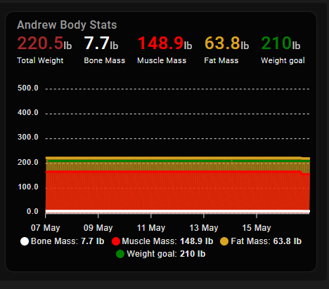
update ok, i think i have this solved by enforcing the y-axis to a specific number…seems hacky, but that’s the way i did it. My next question is, how/why is there a texture thing happening behind the graph (notice the square texture behind the colors, also notice that it does not exist in the first screenshot)

Latest code…
type: custom:apexcharts-card
header:
  show: true
  title: Andrew Body Stats
  show_states: true
  colorize_states: true
all_series_config:
  type: area
  stroke_width: 3
stacked: true
cache: true
graph_span: 10d
yaxis:
  - min: 0
    max: 250
series:
  - color: Brown
    entity: sensor.andrew_withings_weight
    show:
      in_chart: false
    name: Total Weight
    group_by:
      func: last
  - color: white
    entity: sensor.andrew_withings_bone_mass
    name: Bone Mass
    group_by:
      func: last
  - color: red
    entity: sensor.andrew_withings_muscle_mass
    name: Muscle Mass
    group_by:
      func: last
  - color: goldenrod
    entity: sensor.andrew_withings_fat_mass
    name: Fat Mass
    group_by:
      func: last
  - color: green
    entity: sensor.andrew_withings_weight_goal
    type: line
    name: Weight goal
    stroke_width: 5
apex_config:
  dataLabels:
    enabled: true
    dropShadow:
      enabled: true
card_mod:
  style: |
    ha-card {
      background-color: rgba(0,0,0,.7);
      color: #fff;
    }
Can someone explain me how to do a Basic Radar Chart like this:
I tried really hard but… no. ![]()
Thx!
Is there a way to have the legend (now not shown) give the data at present time? So the value at the blue dotted line?
I can’t exactly remember when the output changed, but I assume it was with a change of the neerslag-card or buienalarm data, as the current card is showing a lot of bogus.
Do you see the same on the y-axis @watermarkhu ?
Most of the time it is not correct, sometimes I think it is…Until it is going to rain again, and it does rain a lot…
I was hoping you already had a solution ![]()
I see the same behavior. I think it has to do with the data_generation. But I’m unable to see the logica ![]() .
.
When check the code of the neerslag-card it looks like they also do the “-109 /32” but I’m not able to. Change that in the code.
@watermarkhu, I hope you can do something with this information ![]()
@galaxy_explorer I really admire the simplicity of this sun chart. Would you be willing to share your YAML for it?
I have a few questions, maybe someone can help me find out exactly what I’m doing wrong.
I have 3 identical sensors for my solar production.
East(Ost), west, and total:
east:
Yaml:
        - type: custom:apexcharts-card
          now:
            show: true
            color: blue
          header:
            show: true
            show_states: true
            colorize_states: true
          graph_span: 24h
          span:
            start: day
          series:
            - entity: sensor.energy_production_today
              data_generator: |
                return Object.entries(entity.attributes.wh_period).map(
                  ([key, value]) => [new Date(key).getTime(), value]
                );
            - entity: sensor.energy_production_today_2
              data_generator: |
                return Object.entries(entity.attributes.wh_period).map(
                  ([key, value]) => [new Date(key).getTime(), value]
                );
            - entity: sensor.energy_production_today_all
              data_generator: |
                return Object.entries(entity.attributes.wh_period).map(
                  ([key, value]) => [new Date(key).getTime(), value]
                );
Outcome:
Question:
a) Why does total(red) have this 0 line across the entire chart and the others don’t?
b)Why do the values above always show 0 kwh and when I click on them the correct values come up?
e.g.
Anyone have an idea what I can test?
I am not sure but the order of total in time is reverse, so I guess it tries to connect the end with the start… check that maybe?
These are the last values of the series, 0,0, and 0.25 (=0.3), depending on what graph you use these have no added avlue, e.g. for running measurements ‘now’ yes…but for historical…less
Good catch let me check what happen when I have the same order.
Ah ok then it make sense. Can I show the entity value here instead of the last value of the series?
Not sure what that would be but this is one option
Header to provide option to show entity value at current time · Issue #86 · RomRider/apexcharts-card (github.com)
Ah nice thanks that is the option I want:
show:
  in_header: raw
And the order fix the issue with the red line.
Thanks a lot
Hi all,
Entirely new to apexcharts card so silly question (that I can’t see has been answered, but forgive me if it has).
Is it possible to have distinct sensors form the x-axis? I’m looking at building something like this:
with the aim of displaying current values of sensors/helpers, maybe if I’m feeling fancy have shadow twin columns for ‘yesterday’ values.
I need a hand with aggregating data into buckets for a particular month, not just a time period 30 days.
FULL DETAILS
The below image shows 87.7mm for January. This is accurately added up in SmartMixn
CARD I WANT TO MAKE MORE ACCURATE
APEX CHARTS Monthly Rain Fall Graph
I am using the Rain Per Hour Sensor. It is close but not quite right because of the uneven shift of data over the month. Using the long term statistics option in this card is key.
The below graph shows 82.3 for January, because of the shift in data, and being on the 12 June Currently (Last 30 days is not in line with the months)
          - type: custom:apexcharts-card
            graph_span: 365d
            header:
              show: true
              title: Monthly Rainfall
              show_states: false
            apex_config:
              fill:
                type: gradient
                gradient:
                  type: vertical
                  shadeIntensity: 0.0
                  opacityFrom: 1
                  opacityTo: 0.5
                  stops: 10
              chart:
                height: 150px
              grid:
                show: false
                borderColor: darkslateblue
                strokeDashArray: 2
              dataLabels:
                background:
                  borderWidth: 0
                  opacity: 0
                  foreColor: white
                offsetY: -10
              plotOptions:
                bar:
                  borderRadius: 0
                  dataLabels:
                    position: top
            span:
              start: month
              offset: '-334.5833333333333d'
            series:
              - entity: sensor.netatmo_devonport_tas_indoor_rain_rain_last_hour
                color: deepskyblue
                type: column
                group_by:
                  func: sum
                  duration: 30.41666666666667d
                  fill: zero
                statistics:
                  type: state
                  period: hour
                  align: end
                show:
                  name_in_header: false
                  datalabels: true
Is it possible to show the minimum value of the Serie in the header?
I managed to fix the graphs:
See the link below for the full code.
@MelleD following the above, yes you can show the minimum value in the header, you will need to put a second series in your chart and hide it. The value can then be shown in the header.
Ok thanks. I will try that
hello can you post code?
Tell me how to remove the names of the sensor when showing the state of an object?
Hi there.
I need help with filling the stepline with solid color, if the boolean enitity is 1. Any recommendations?

type: custom:apexcharts-card
experimental:
  color_threshold: true
graph_span: 2h
apex_config:
  chart:
    height: 100px
header:
  show: false
  title: Main Boiler
  show_states: false
  colorize_states: true
series:
  - entity: input_boolean.jablotron_motion_detector_all
    transform: 'return x === ''on'' ? 1 : 0;'
    curve: stepline
    invert: false
    stroke_width: 2
yaxis:
  - show: false
    apex_config:
      tickAmount: 1


